
COLLAGES
let’s pretend this never happened

Photos by Yves Callewaert
“Let’s Pretend This Never Happened” is a one-of-a-kind presentation at Stockholm Design Week by Portuguese furniture brand De La Espada and Studio Astolfi. The event – which ran for four days in a series of performances – is a heartfelt theatrical presentation set in a stunning 1920s apartment in Stockholm. Actors Fernando Nobre and Vania Rovisco play a couple who inhabits the house – a luxurious, elegant apartment once owned by ABBA’s manager – dancing, singing and running around the space, while the audience follows them.
One by one, the couple uncovers beautiful pieces of furniture – a total of fourteen new designs by Neri&Hu, Jason Miller, Matthew Hilton, and Luca Nichetto – through vignettes of everyday life. In the office, they pound on a vintage typewriter trying to find the right words while melancholic music fills the room – they look at each other with complete understanding, an acknowledgment of love. Later on, a sing-along and musical chair games with the audience take place in the living room. In the dining room, we witness the couple fight without words but through intense glares and tears, sadly staring at each other across the table. The performance ends in the bedroom where the couple tenderly makes up, ending the scene by inviting the audience to place an object in the cabinet of curiosities.
Once intimate and interactive, the emotional presentation felt like witnessing someone else’s private life. Or being a part of it. What makes it unique is that the performance brings the furniture to life, instead of taking it out of context as in usual presentations. It brings us to the very heart of the home, where furniture is ultimately used. It also makes one think of the intimacy of the spaces we inhabit, and the special moments that happen in our everyday lives. Given its limited run, it only adds to the specialness of it – of being part of something that’s transient and fleeting, something we can look back on and ask if it really happened.
Angel Trinidad
Angel Trinidad is an editor, writer and creative strategist based in Amsterdam. She is the author of 'Scandinavia Dreaming: Nordic Homes, Interiors and Design', and co-author of 'Night Fever 5: Hospitality Design'. She is also the founding editor of Keen On Walls, a website which features inspiring interiors, design and spaces.

Photos by Yves Callewaert

Photos by Yves Callewaert

Photos by Yves Callewaert

Photos by Yves Callewaert

Photos by Yves Callewaert

art of the in-between

The exhibition “Art of the in-between” at The Metropolitan Museum of Art (MET) in New York City shows the work of Japanese designer Rei Kawakubo for Comme des Garçons womenswear. With her abstract, alienating forms she is constantly stretching boundaries and questioned concepts as beauty, body, fashion and taste. She has the ability to change high-fashion womenswear. After Yves Saint Laurent in 1983, Kawakubo is the second living designer having a show dedicated solely at the MET.
The exhibition showcases 140 designs, dating from the early eighties until now. The overall theme in the exhibition is about interstitiality, which means the space between two dualisms and refers to Kawakubo’s infinite experiments. It’s divided in nine dualisms: Absence/presence, Design/Not design, Fashion/Anti-fashion, Model/Multiple, Then/Now, High/Low, Self/Other, Object/Subject, Clothes/Not Clothes.
Andrew Bolton, curator at the MET, explains how the spatiality of the exposition was influenced by Zen concepts of Mu (emptiness) and Ma (space). An overall white space with different layers and boxes, “The designs feels as abstract as the indecipherable qualities of Kawakubo’s work. Clothes are hidden between cracks and crevices or set back away from the viewer, inviting you to discover them like a game of hide-and-seek”, he says.
Furthermore, the exhibition is free from texts like labels or descriptions, because Kawakubo doesn’t like her work to be interpreted or explained. You’ll only see numbers to identify the designs, which corresponds with the numbers in the booklets people can take at the beginning of the exposition.
In 2002, when Bolton joined the MET, he wanted to curate an exhibition for Rei Kawakubo and show people that fashion is a living art. “Art of the in-between” comes at the exact right time. “We are in a period where fashion, and designers, are increasingly regarded as disposable”, he said, “I wanted to focus on someone who has been singularly dedicated to creative vision, to remind everyone of how valuable that is.”
Nine van der Wal
www.metmuseum.org


art basel miami 2016

After having visited Artissima in Turin and FIAC in Paris, I closed my “winter art tour” in Miami to attend Art Basel. The Art world moves around all over the places every year until the last international fair in Miami: what best place to be in December to enjoy art but also a temperate climate and beautiful beaches and pools?
Here is a selection of the artworks I loved the most in Art Basel Miami 2016 and some tips to enjoy Miami
Gideon Rubin’s portrait without face and his painting of girl’s napes hit me at the first glance for their gentle and delicate aura: there is a nostalgic and tender attitude in his character. Rubin is an Israeli artist based in London, he won several prizes and exhibited all over the world and is now represented by Galerie Karsten Greve
Ugo Rondinone doesn’t need a presentation.He was one of the star of this edition as there were some artworks inside the fair, but there was also a big installation, “Miami Mountain” in Collins Park, together with a lot of artworks selected to be part of this open air exhibition called Ground Control. The other artworks are going to be removed on December 4th: Miami Mountain will remain permanently installed on the site, and it will surely become a new symbol of the city. Eva Presenhuber Gallery presented a whole evocative stand with Rondinone’s artworks, Gladstone Gallery showed three Magic Mountains. I wish I could see the Seven Magic Mountains in Nevada !
I usually don’t like video art installations but I was impressed by Daniele Puppi’s one. Puppi is an Italian artist based in Rome. His installation was based on mixing scenes from the famous film Psyco (Hitchcock and Gus Van Sant versions) Daniele Puppi is rappresented by Magazzino Gallery.
One of the most frequent scene seen in Art Basel was people making selfies…
This explains why the Nicolai Wallner Gallery ‘s stand was so busy. Because of Jeppe Hein’s mirror artwork. An open air natural environment would valorize for sure this kind of installations but even in the fair I felt the value of this idea.
It was quite impossible for visitors to miss this huge artwork form John Armleder. A real explosion of incredible colours shining and sparkling on the wall of Massimo De Carlo Gallery space. A kind of glitter version of a Richter painting. Armleder is a Swiss performance artist, painter, sculptor, critic, and curator that started his artistic path in the seventies.
Since I visited his last solo exhibition this summer at Serpentine Galley in London, I’ve been fascinated by Alex Katz’s work. Several artworks were exposed in Art Basel. The one I loved most was the big one presented by Richard Gray Gallery. Unfortunately I cannot buy an original Katz painting, so I went to H&M on Lincoln Road to have at least a paper bag. The company commissioned the artist to design a capsule collection of clothing for men and women, in addition to homewares.
The stand of Societé Gallery would have been maybe more appropriated in a Design trade show but differences between art and design becomes smaller and smaller. Kaspar Mullen colourful glass balls were the most joyful things I’ve seen in Art Basel 2016. Muller is a 33 years old Swiss artist; I guess we will hear more about him.
Last but not least at all. My favorite artwork in Art Basel Miami 2016 was by the Amy Yao. Simply made of Fake flowers and plexiglas, Yao’s work seems like a blooming window. The artwork was presented by VSF (Various Small Fires) gallery that hosted her first solo exhibition this year.
Art makes hungry and thirsty and also tired sometimes, so this are some good places to in Miami : Freehand is a really nice Hostel with an excellent cocktail bar - Broken Shaker - and a good restaurant.
In Bodega Taqueria y Tequila you will find the best tacos and burritos in Miami and there is a hidden cocktail bar behind the fridge door!
If you want to feel like in a movie go to Delano Hotel, it’s one of the most famous Art Deco hotel in Miami.
Chiara Apperti
galerie-karsten-greve.com
gladstonegallery.com
magazzinoartemoderna.com
nicolaiwallner.com
massimodecarlo.com
richardgraygallery.com
societeberlin.com
www.vsf.la
thefreehand.com
bodegasouthbeach.com
morganshotelgroup.com/delano
Fashion Designer and trend researcher, Chiara lives trying to catch every kind of inspiration. Based in Milan, four years ago she founded a lifestyle magazine with her best friends.
www.modalitademode.com

ugo rondinone - ground control

the hall hotel miami

rondinone


rondinone-gladstone-gallery

amy yao

john armleder

kaspar muller

alex katz


gideon rubin

jeppe hein


unlocked

The constantly changing, ever-evolving stream of naked images displayed through social networks and adult entertainment flood our screens and our minds, yet what does it all mean? We are a lot more accustomed to the changes in the depiction of beauty and fashion throughout the decades and the centuries, however a more taboo subject, comes in the most natural form; nudity. The way we see our bodies, in which situations we imagine ourselves being naked, whether it is lounging in our homes, or taking a shower, how comfortable we are with our bodies can say a lot about us, not only as individuals, but also as a variety of cultures in our society.
Unlocked is a photo narrative by Vassilis Zidianakis, co-founder of Atopos cvc, a non-profit, cultural organisation created in 2003 and based in Athens. Zidianakis takes us on a journey through a 512-page visual publication, with the participation of more than 140 international photographers, to gain a greater perspective on a very contradictive relationship; the one that lasts us our whole lives. The images we find in the book bring strength to the characterization of the purest yet most sullied of forms, subject to great scrutiny and lavishly adored; the human body.
As an original interpretation of our post-photographic digital era, Unlocked represents a new visual language. The book emerged as the first official recording sourced from contemporary digital platforms, and can be seen as evocative, political and leaning towards the subject of anthropological evolution. Daringly crude and delicately intimate images form a way to gain an understanding of our psyche; what shocks, traumatizes, protrudes uncontrollable urges, and unbalances the way we think is exactly what this book aims to do, and it undeniably succeeds in doing so.
For the launch of Unlocked, Atopos cvc hosted an exhibition, where the book was presented as an art object. Through a number of site-specific installations Zidianakis unravelled his research and the production process of the book. The installations included the original aluminium offset printing plates, which were used for the production of Unlocked, alongside an announced performance of a nude, young man and woman strolling through the Atopos library and reading or playing with the book completed Zidianakis’concept.
As an artist, curator and the Artistic Director of Atopos cvc, Zidianakis studied Ethnology and Anthropology as well as History and Civilization at the École des Hautes Études en Sciences Sociales, Paris. His main focus for the past ten years has been the human body and the various forms and ways of its expression.
Charlotte Hoareau


game of garden thrones

Palace Soestdijk used to be the residence of princes Juliana and prince Bernard. It was their home for over six decades until their deaths in 2004. Since spring 2006, it has been possible for public to visit, pending a decision about its future use. From the 25th of June to the 25th of September 2016 the exhibition Bal, curated by Anne van der Zwaag, exhibits 40 dutch artists and designers whom have been asked to create something around the theme: Bal Game of garden thrones.
As child princes Juliana dreams of a 'normal' life. As queen she is more approachable than her mother Wilhelmina and daughter Beatrix, she stands closer to the people. However hard she tries to live normally her position always stayed quite unique.
Frank Tjepkema (born 1970) a famous Dutch designer based in Amsterdam is an early collaborator of Droog and his work is part of the permanent collection of the Stedelijk Museum in Amsterdam and the Museum of Art and Design in New-York. Tjepkema is one of the designer selected to create for this unique exhibition.
"When asked to design furniture for the palace garden we thought a throne would be appropriate, and not just any throne, a 'normal' throne. Is it possible to design a 'normal' throne? We took the most democratic imaginable of all chairs, the one chair affordable to just about everybody and anybody and tried to make it very special. This became: Game of garden thrones.
To achieve the most 'normal' of all thrones we designed a special add on inspired by the very gardens so much cherished by Juliana. Using parametric design algorithmes imitating the structure of leaf cells we had the computer generate a transformations from the ordinary garden chair, the result is a very normal chair uplifted to royal appearance through the addition of a special ornamental collar.
The materialization consists of many hundreds of laser cut parts assembled together by hand to form an elegantly curved form. We displayed 6 different chairs varying from bright orange (the royal colour) to white, transparant and radient. "
www.paleissoestdijk.nl
www.tjep.com


manifesta

Manifesta, the experimental contemporary arts biennial, migrates to a new location for each of its editions. It seeks to investigate the changing Europe, and as a nomad must always keep renewing its critical and curious approach. This year, for its 11th edition, it’s hosted in Zurich, Switzerland. The curator, artist Christian Jankowski, has titled the biennial ”What People Do For Money—Some Joint Ventures.”
The focus of attention for this biennial is ’work’. What does work mean to you? In spirit of his own artistic career, Jankowski has proposed 30 artists to team up with local representatives of different professions to form collaborative art pieces—joint ventures.
I think collaboration is a hard art. It can slow you down or lift you up, anyway it makes you do what you’d never do otherwise and that’s interesting. Located around the city in spaces like a dentist’s office the collaborations are the main attraction of Manifesta 11: Maurizio Cattelan makes an athlete glide on water in a wheelchair, John Arnold presents The Imbissy: fast-food versions of historical diplomatic state dinners served in various food stands around the city, Michel Houellebecq lets us examine his health—and the price it comes with—in cooperation with a doctor. I want to see it all.
’Excuse me sir, would you show me the way to the Hyatt?’ Manifesta opens up slowly, but it’s worth it to look for the joint ventures in satellite locations all around the city and their counterparts within the main venues; art institutions Löwenbräukunst and Helmhaus. Adding depth to the works are the fun and insightful documentaries made by high-school students about them, which are screened at the Pavillon of Reflections; a floating raft built in lake Zurich.
Walking around the financial district I finally find the Hyatt hosting Franz Erhard Walther’s piece. Hotel staff members are clad in orange art-workwear in the lobby. I can’t afford to stop here for cocktails, but stay and look at the art from afar. They notice, look back, smile and pose.
The show at the main venues is installed as if it were a construction site. The works of 130 artists are scattered around in themed rooms and have a lot of variety in style and texture. From classic August Sander photography it’s a walk up the stairs to an installation of human waste: a collaborative 80,000 kg piece made by the citizens of Zurich and artist Mike Bouchet. Walking around the installations, dust, dirt and fingerprints of art handlers are left visible.
A highlight of the biennial is the Zunfthaus Voltaire, the legendary Cabaret Voltaire—important in this year of the centenary of Dada—turned into an artists’ guild for the duration of Manifesta 11. To gain entrance you must collaboratively perform onstage. Having created your own joint venture, you’ve earned membership to the guild of artists. Exclusive entry is thus not reserved to the well-connected, but rather the weirdos and outsiders who show some courage. This makes me happy and it feels right at the original house of Dada. For the opening night, an act to remember was Austrian Gelitin, a group of artists coming together in styrofoam, plaster and sensations.
The clear water surrounding the pavilion feels soothing and I’m happy I’m here. Manifesta 11 wants to be inclusive and celebrate interdisciplinary acts. It wants to bring art to the urban context where it always should have been. I think it succeeds, my time got rich discovering the city.
Eeva Rönkä
manifesta.org
Eeva Rönkä is a freelance writer and designer living in Berlin.
eevaronka


open air

Felice Varini - @MAMO - photo André Morin
Following in the footsteps of Xavier Veilhan, Daniel Buren and Dan Graham, Felice Varini goes face-to-face with Le Corbusier’s architecture in the South of France.
MAMO is an art centre created by Ora Ito, a young, hyperactive and gifted creator who has lived between Paris and Marseille for 15 years. In 2013, Ito created MAMO on the roof terrace of Cité Radieuse built between 1945 and 1952 in Marseille.
For Ito, Felice Varini is one of few great contemporary artists “able to use, underline and highlight a single architecture equally as well as a whole city. The space is his natural medium, I am very proud to have introduced him to this roof terrace that he had only previously seen in a photo.”
Varini, the French-Swiss artist living in Paris finds himself in a unique situation, “This is the first time that I have exhibited on, in and with architecture designed by Le Corbusier. This place is a landmark, a huge influence. It is a true microcosm, designed as a small city with its range of complex volumes, a small city with a view over the large city of Marseille. It is extremely exciting!”
Varini always operates in situ. Each place is different and each time his work evolves in relation to the location. “I generally scour the venue taking in its architecture, materials, history and function. Based on its varying spatial data, I define a viewpoint around which my initiative takes shape. For me a viewpoint is a point in the space that I choose carefully: it is usually situated at my eye level and preferably located in a key passageway, for example where one room leads to another, a landing, etc. I don’t make a rule of it, as spaces don’t all systematically have an obvious path. The choice is often arbitrary. »
At MAMO, Varini spans the whole terrace with three pieces (red and yellow) offering three different viewpoints. Of course, Varini’s painted forms make sense when the spectator is at the particular spot but, the richness come from the many perspectives one can have on this historic roof terrace.

Felice Varini - @MAMO - photo André Morin

Felice Varini - @MAMO - photo André Morin

Felice Varini - @MAMO - photo André Morin

Felice Varini - @MAMO - photo André Morin

Felice Varini - @MAMO - photo André Morin

Felice Varini - @MAMO - photo André Morin

Felice Varini - @MAMO - photo André Morin
photoshopped food is as boring as selfies

photo by Vanessa Gürtler
For the past seven years I have taken photos of food waste: scraps, compost, the mess left after a party, and sometimes even cow shit.
It started as a bit of fun. I found a dish of pumpkinseed oil dressing simply beautiful, almost like a Jackson Pollock painting. Effortless, not designed. Real food porn.
Many food blogs focus only on beauty, a romanticized version of life. There is nothing wrong with beautiful food blogs, but don’t you ever roll your eyes when someone posts a photo of his perfect muffins again? Isn’t it often just the photographer’s thinly disguised grandstanding? He wants to remind us that his life is as perfect as his #nofilter images.
But Photoshopped food is as boring as selfies. Food shouldn’t be so serious.
My blog shows what is left over. It’s like a bomb has struck my kitchen.
Over the years, I’ve noticed the symmetry of nature reflected in vegetable scraps, or a stalk of lettuce. It all starts with a seed, which needs warmth and water to begin to grow.
From the flower comes a fruit. The fruit is eaten, but the rest ends up in the compost. There, it becomes fertile ground again. It sounds esoteric, but it’s the effortless cycle of nature. And the best part: Nature leaves only biodegradable shit.
That’s the most serious aspect behind the photos. We produce too much, throwing away more than 1.3 billion tons of food each year. We pack everything in plastic, contaminating our produce. We pollute the Earth with innovations, and require more and more energy to keep it all in check.
For that reason, we should spend just as much time looking at the food we throw out as we do the food we eat.
Vanessa Gürtler
leftoverfoodporn.blogspot
This post was originally published at munchies.vice.com

photo by Vanessa Gürtler

photo by Vanessa Gürtler

photo by Vanessa Gürtler

photo by Vanessa Gürtler

photo by Vanessa Gürtler

photo by Vanessa Gürtler

photo by Vanessa Gürtler

photo by Vanessa Gürtler

photo by Vanessa Gürtler
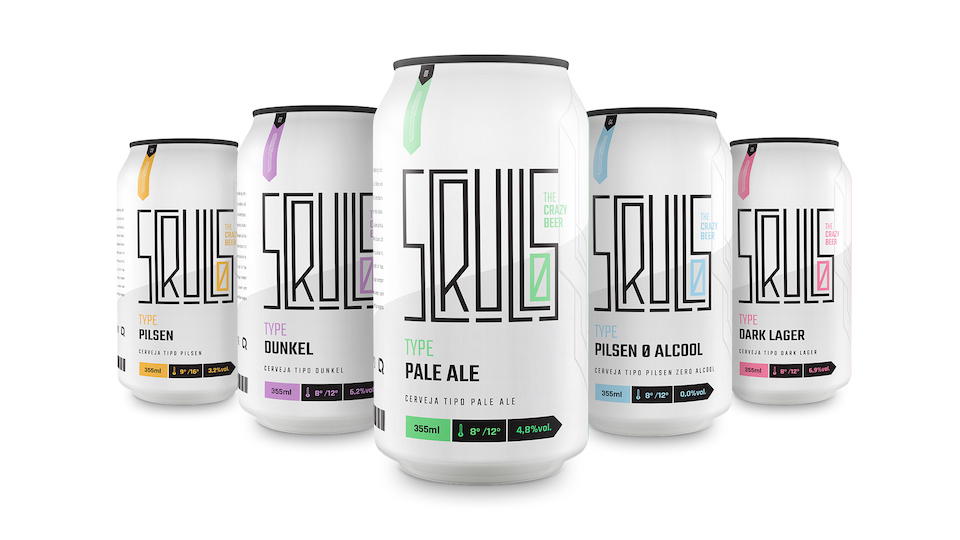
beer is back

design Iskren Marinov
From mainstream to high end
: beer is back. It was until recently that this four ingredients counting beverage was the champagne of the poor. Now this golden liquid has reinvented itself, today beer is for the cool, champagne for the boring.
For those who thought beer was out, think again. Beer is more popular than ever, not the simple beer you might now, it is craft beer that is conquering the alcoholic beverage market. When it comes to “cool” beers, crafts are king. But it is not only beer as a beverage that is taking over, it is the guidance for many new designs, products and services.
The market of craft beers is a feast for the taste buds as well as the eyes. From coffee infused beers, till stouts that have a donut flavour. Authentic brand designs, simplistic of over the top, it is a war on the dance floor if it comes to brand design. A particularly appealing design is Scrullos by Designer Rod Quina of Sao Paulo, Brazil. He made the beer can into a modern piece of art, with a crazy graphic tight design.
Another cool example of how beer is innovating into our current Zeitgeist is 0101 Beer, which is a beer that is based on human emotions. Together with IBM, Havas Helia developed a beer based on statistic research on emotional behaviour, this project arise out of the vision that beer is being consumed with different emotions regarding to the occasion. 0101 beer turns this vision around by not linking beer to special occasions but specific emotions.
That beer is also an inspiration for design is not only visible in the diversity of different perfectly designed craft beers, also in the fact that the well-known beer bottle is used in interior design. The Iskren Marinov’s Industrial Wall Lamp, is a stunning example of how the beer bottle is used in other objects. The Bulgarian-Based industrial designer uses the authentic brown glass bottle as a main subject is his design.
Lastly beer as we know it, is being reviewed into different purposes, the purpose of wellness. The Beer Spa is a perfect example of this shifting attitude as this spa features beer as it’s main ingredient for relaxation and rejuvenation, giving visitors the chance to benefit the healing characteristics of hops.
Some might say it is just a coincidence, they might even claim that preferences simply change over time. I as a trend expert believe this shifting attitude has everything to do with current consumer trends. To begin with back to nature, which is the consumer trend that is deriving out of our need for dematerialization. We seek for simplicity, for normality in this omnivorous consumption society. Moreover, this reassessing of a known product is fitting our reviewing trend perfectly, we are seeking for new ways to utilize this product within current Zeitgeist.
Cecile Cremer
Beer Spa
Scrullos Beer
Brew By Data
Iskren Marinov
Extremely curious and always searching for little weak signals that tell us things are changing. Cecile is a trend researcher and creative concept developer with the wanderlust of a cosmopolitan.Her aim in life is to develop things that matter to others and to help others change their strategy to be ahead of the future. Because she believes “The future is ours”.
![]()
colourful creatures

Transgender issues are in the international spotlight like never before: &Other Stories, Airbnb and even Google ran ads advocating for diversity and trans-inclusion.
This particular colourful project with social relevance show South African transgender sex workers in a different light. ’Sistaaz of the castle’ is a collaboration between photographer Jan Hoek and fashion designer Duran Lantink. In the South African media transgender sex workers are mostly presented as criminals or victims but the Sistaazhood girls have a wish to be shown in a positive way.
Lantink and Hoek documented how these girls live in the streets of Cape Town and still find a way to live theirs lives, dream and even manage to look extraordinary fashionable. The two artists created a series of photographs and a fashion collection around this group of girls that have the creativity to produce beautiful looks from found garments. Duran recognised this way of working as he’s using collage techniques and different recycling techniques also in is own collections.
For the project they documented the lives of six girls: Coco (25), Cleopatra (23), Sulaiga (30), Gabby (29), Flavinia (33) and Joan Collins (57). The girls look cool so naturally that Hoek and Lantink asked each of them to brainstorm about their dream appearance. For this project fashion designer Lantink created for each girl her dream outfit, these fantasies are turn in to the dream-couture capsule collection: this transformed them into fashion icons captured by photographer Hoek.
The collection is presented during Amsterdam Fashion Week at the Gashouder on January 16. The exhibition at the Foam Photography Museum opens on January 13 at 17:30 and is on view until January 20.
Bamboo van Kampen
Bamboo van Kampen, 26, is an all-round creative specializing in visuals and colors; she forms half of the Berlin-based duo Arturo Bamboo.


thinking time

Photography taken at Edelkoort Inc.’s West Village offices by Anne Willem Schenk & Chloe Sos
Most creativity does not take place within the confines of a traditional office. Thinking time – a process most creatives are never paid for and which many clients undervalue – pops up best when the psyche is most at ease: in bed at 4 in the morning, under the shower, on the plane, while walking the dog… In order to think more creatively one needs to relinquish control over the brain, allowing it to intuitively meander until the solution presents itself.
Sometimes the thinking gestation period takes weeks or months and is informed by years of references – visual or otherwise – which glide back and forth within the thought process. For creative people, taste and aesthetics have been developing since early childhood in the same way that good writers draw upon a lifetime of reading and vocabulary. For them, creative thinking is like breathing.
While employees in most sectors spend the majority of their day answering emails, corporations now ask their staff to also process more creatively. Since they want to promote thinking outside the box, office spaces need to become incubators of the intuitive moment; relaxing us rather than aggressing us, enlightening us rather than forcing productivity. Therefore the modernist and minimalist grids that for decades have laid out the workplace in the name of organised efficiency need to be rethought in order to welcome this more fluid timeframe. A generation of people who will use reason and emotion daily in the decisions they make.
In big cities with a faster pace, many workers no longer truly break for lunch, eating their food out of disposable containers at their desks while constantly checking their smartphones or computer screens. According to a recent American study, at least 54% of employees in the U.S. begin and end their day checking emails in bed; exposed to the negative effects of blue light emitting from electronics. This out-of-hours behaviour adds 1 day to the workweek, not calculated into remunerations or long-term benefits let alone people’s stress levels. To combat this, caring companies turn off access to their personnel’s emails between 8 PM and 8 AM, while other systems bank-up emails only to schedule their release during work hours, something that is today considered more professional in many parts of Europe. These firewalls already work to identify online misconduct, bullying and aggression but could one day promote a more controlled sense of wellness at organisations that value workers’ private lives as much as their professional ones.
Because of the swarm of electronic messages that engulf us daily, including those with large numbers of co-workers in copy, people no longer have time to read or respond to all of them. Non-responsiveness is often mistaken as “ghosting” at a time when it’s OK to ignore others. In the United States, emails have been reduced to mere sentences, sometimes only one word long. Attachments, PDFs and PowerPoints are instead used to provide more detailed information; proudly paraded by the sender as if they are the product of some extraordinary effort. It is perhaps only in more formal societies like Japan, France or Germany where the art of “letter writing” still persists in digital communication. Paradoxically, the most direct way to reach someone now seems to be by telephone (even if tens of emails are sometimes required to set up that conversation). And in Japan, handwritten faxes, paper documents and printed invitations remain the most revered form of personalised messaging. The only way to get someone’s attention in a world that is desensitised by its digital age.
The Amazon scandal, ignited by the New York Times’ August 15, 2015 exposé, clearly illustrated how some corporations value business far over people. Companies are surely haunted by recent memories of mass suicides such as those at Orange or Foxconn – and more deaths will follow. By contrast, other businesses have learned that providing healthier and ethical conditions is a better way of maintaining productivity and loyalty alike. Beyond fringe benefits or bonuses, it’s the simple things that count, like multiple-position desks to protect posture, improved lighting and access to daylight and fresh air.
Yet it takes much more than a communal table tennis table to foster team spirit. With people’s fingers turning into claws because of too much hyper texting, Friday afternoon hand massages could become the best way to send people home for the weekend. Yoga studios and onsite showers are also good ideas, located not far from the unisex lavatories that now replace the segregated ones of the past. In-house haircuts and manicures save time and add a folly of appreciation for both men and women. Full kitchens and dining rooms should be used as places where workers can restore themselves and eat properly, perhaps even blocked from wifi connectivity during lunch in order to force them to stop – unless employees really want to set up their office in the kitchen. These spaces should offer real leaf teas, real coffee coffee machines and filtered tap water for bottling so as to encourage constant hydration. Why distract people with free candy sugar hits when treating them like adults can innately enhance their performance skills?
After nearly a decade of austerity measures in businesses – the infamous cut-backs that remind staff how insignificant they are like sensor-activated light bulbs, using half as many light bulbs (!), scratchy-sheet toilet paper and train-quality-scented hand soaps – it’s time to rethink how to get people to come back to the office rather than have them work from home. Already now, companies in central and northern Europe understand that having their employees work outside the office is detrimental to their long-term lifestyle, valuing them more as human beings since rewards for the firm can be obtained in other ways. If happy wife equals happy life, then surely happy worker equals happy banker!
Society is in a period of major flux. Our hybridic lifestyle means that we move like liquid between work and leisure and that time is considered in very different measures. Slow time, fast time, down time, family time, personal time and interactive time each allow us to design our lives on our own clock, choosing to do things when they are most convenient. This includes work time which is voluntarily dispersed throughout the day, often rewarded by indulgence time as a balance.
Corporate organisations must evolve to mirror these societal changes. The distance between hierarchies will continue to dissolve, with employees reporting to team leaders in big companies and sometimes to no one at all in smaller firms. In contrast to the pyramid structures of last century, horizontal workforces encourage collaborating together and working independently. Staff’s individual assets are allowed to shine while responsibility and credit are shared. This philosophy of sharing is what will guide the office spaces of tomorrow.
Young people today are not concerned with the need for owning everything; they’re more willing to embrace the sharing economy in order to redistribute their modest wealth. Already now, shared office spaces have popped up in our cities: public domains where one can work at a desk, host a meeting, access facilities and a receptionist.
Yet these spaces still lack physical stations where one can store actual materials, often leaving such items at home where they procure a sense of disorder. Lockers, focus rooms and even bedrooms could be added to these sites in order to make the venues more flexible, for when working late or needing to set up early. Since our metropolises are getting larger and some people live at the suburban frontier, multiple-location workspaces may be needed, organised like chains of communal gyms with subscription members. Sharing rent and sharing equipment means that small business can flourish faster, matched by the sharing of ideas in a freer way too.
As we become more and more immaterial, new sectors and services will become the thing to sell. We will divide into merchants of ideas or merchants of commodities, not unlike during the Renaissance when thought, trade and commerce were the pillars of a thriving society.
At larger organisations, the work area has already changed. To reflect uniqueness within the horizontal work ladder, companies like Google now carpet their floors in a different colour per level; almost to remind everyone that each colourful part in the chain is as important as the other. Open-plan offices embolden people to work together and provide them with comparatively spacious environments. Yet panelling is needed in order to absorb noise in such places, as well as isolated “telephone booths” for confidential conversations whenever needed. Annexes and pop-up structures become the architectural method of bringing back a sense of intimacy to this new egalitarian workscape.
With the borders between life and work blurred, smaller offices could embrace a more family-style set-up. Retailers, hotels and showrooms have already established warmer ways of receiving clients; now the office space needs to turn domestic too. At companies that believe in green, buildings can be turned into contemporary “farms” with wooden beams, landscaped campuses, bicycles for staff, solar powered energy, fresh organic catering, a whisky bar and even deliveries of fresh eggs to take home.
At The Edelkoort Group’s company studios in Paris, Tokyo and New York, we have all but eliminated the need for desks. Our team works from laptops and smartphones, adapting position depending on mood or where the light is warmest. In New York, we moved into a West Village townhouse where we have taken the live-work module to an entirely new level. With domestic quarters on different stories, we hold client meetings on dining tables or in the cosiness of the kitchen, we take breaks to do a spot of gardening and we host functions in our cinema room or on the parlour floor by the fireplace… With the possibility of multiple events taking place in various rooms throughout the day, the home becomes a showroom and the showroom feels like a home. Enticing clients to come see us rather than the other way around has become a whole lot easier.
This style of branding reflects how we collaborate with our clients as partners. We bond with them and appreciate the human connections we forge in life as in business. The idea of impressing them with a haughty loft space or pretentious props is no longer relevant. Instead we sit upon shaker furniture and bake them homemade cakes. And cocktail time of course becomes the most sought-after moment to set up appointments, with everyone ready to come join us for an end of day drink.
Philip Fimmano
This essay was originally published as THINKING TIME, Essay #10/10, November, 2015-Commissioned by PROOFFLab Magazine- Curated by Studio Makkink & Bey
Photography taken at Edelkoort Inc.’s West Village offices by Anne Willem Schenk & Chloe Sos
up in lights

Despite recently facing the prospect that it could be banned permanently, Neon is blazing a new and invigorated trail, through art and advertising campaigns.
Neon lights function as a glowing reminder of the city as a liminal space: suggestive of the many lives and experiences to be inhabited therein. The underwear of the urban worn as flashy, evocative outwear, by the buildings and billboards of the city scape; flaneuring purposefully between the worlds of art and advertising, since the 1920s.
Neon signs have become synonymous with the identity of whole city cultures (Las Vegas, for example) and a widely adopted medium for artists from Keith Sonnier’s neon nuanced representation of natural forms, to the art produced to launch London’s night tube service, in time for 2015 Rugby World Cup yet despite this, neon sign makers have recently fought to stave off a ban that would have shown their art, and all associated manufacturing, the red light, quite literally.
EU legislation which was due to come into effect within the next year, proposed to ban the use of mercury; a move that would have restricted the colour of all neon signs to red, removing mercury’s blue hue from the mix. Fortunately, the British Sign Association, and European Sign Federation, have negotiated an extension to 2020, allowing companies, such as KEMP London’s oldest sign company to breathe a sigh a relief and respond to a real resurgence in the popularity of neon, as Steve Earle, KEMP’s Managing Director, explains: “suddenly neon has become cool again and design studios have recognised the trend. The marketplace is particularly diverse at the moment with work coming in from the large multiples, TV, film, fashion and photographic industries, as well as art commissions from both the corporate sector and private individuals.”
This particular resurgence, could partially be driven by the allure of that which is considered restricted: the possibility of a mercury prohibition, of sorts, injecting an urgency into demand, while reminding us of the continued attachment to the “rebuilt heritage” trend, identified in recent years. In the same way that the consumer continues to reach out to products which evoke a sense of storytelling, manufacturers such as FIAT, recognise neon’s long history: contracting KEMP to create neon pieces for their recent UK wide FIAT 500 campaign. Neon’s enigmatic urban cool and encapsulated romance, continues to remains a blaze with Neon Artists, like Steve Earle, incorporating retro flavour and drawing inspiration from vintage sources: “One of my latest pieces combined a beautiful old patterned Victorian toilet pan with lemon yellow neon glass, entitled The Shit has hit the Pan.”

Interview with Steve Earle, Managing Director of KEMP London.
As London’s oldest established sign company, at what point did the creation of custommade neon / illuminated art works become part of the studio mix and since this introduction, have you seen a growth in the demand for such works?
We have been manufacturing neon at Kemp’s for the best part of 70 years and during this period we have seen the popularity of neon go full circle on more than a few occasions, recently we have had major concerns that neon was going to be banned completely with new EU legislation banning the use of mercury due to come into effect within the next year, fortunately the British Sign Association with help from colleagues in the European Sign Federation have managed to negotiate an extension to the new regulations coming into force until 2020 which has allowed us to breathe a sigh of relief here at Kemp’s as currently we are experiencing a real resurgence in the popularity of neon, suddenly neon has become ‘cool’ again and design studios have recognised this trend. The market place is particularly diverse at the moment with work coming in from the large multiples, TV, film, fashion and photographic industries, as well as art commissions for both the corporate sector and private individuals.
Are there any common themes / trends among the commissions you receive and / or any aspect particularly that you could identify as being frequently requested ?
With Kemp’s being based in the heart of the UK’s largest creative community in Hackney, East London we regularly receive work from the many local and internationally acclaimed artists and creatives who come in to see how we can assist in turning their drawings into neon reality. Apart from the artistic side of things we regularly make neon’s for photo shoots, film and T.V., recent projects have included neon for the national rollout of the Fiat 500 ads and Nike photo shoots.
Talk us through the process (at KEMP) of creating a neon / illuminated piece: from commission, to actualisation.
Quite often the client will present us with nothing more than a very rough pencil sketch of their idea or concept, from this sketch we would normally enlarge the drawing up to full size and draw the glass onto the design in the required diameter that we intend to bend. The drawings areor argon gas depending on the colour required. Blockout paint is applied to certain sections of the glass that are not to light and finally the glass is aged by connecting it to a transformer to ensure the gases stabilise. done in mirror image and are used as a template to bend the glass in a hot flame to the required shape, each glass section is electroded at both ends before being connected to the vacuum pump to remove air, a very high voltage is then passed through the tube to burn off impurities and anneal the glass. The glass is then pumped with either neon.
Is there a particular project that stands out / is a company favourite, and why?
We were certainly enthused here at Kemp London when Transport for London approached us to manufacture neon artworks for the launch of the night tube service in time for the 2015 Rugby world cup. The neon commissioned was to be representative of the actual tube lines with the glass crossing above and below each other creating an amazing tube map, the neon was initially displayed at the top of the Shard reflecting in the glass over the London skyline and was visible from across the City. The neon’s later went on tour being displayed at various iconic locations across London.
Are there any particular designers / reference points that your creative team regularly use as inspiration when creating a new piece?
When creating my own neon artworks I normally draw inspiration from vintage items of yesteryear giving the artwork a blend of the modern mixed with a retro flavour.I quite often upcycle old enamel signs that are between 50 and 100 years old mounting them on aged mild steel mounts and facing them off with neon highlights. One of my latest pieces combined a beautiful old patterned Victorian toilet pan with lemon yellow neon glass entitled ‘The Shit has hit the Pan ».
Becky Willoughby
www.kemplondon.com
Becky Willoughby is a UK based Fashion Writer and Digital Content Curator with a passion for cutting edge, young independent design. She contributes to magazines and trend agencies, focusing on cool kids and cultural innovation. Excited by all current and emerging symbiosis between visual and material futures, she CoCurates Ello’s official community about tech, culture and innovation, ‘Ello Future’ and is a Staff Writer for Fizzy Mag, in Germany.
beckywilloughby


the right to remain silent

Left: Invitation Card, Photo Atelier Ted Noten - Right Birdbag from Paper Replica Series, Photo Atelier Ted Noten
Curator Annemartine van Kesteren, artist Ted Noten and editor at large Jules van den Langenberg meet in an empty atelier space in Amsterdam to review the exhibition ‘Non Zone’ currently on view at Museum Boijmans van Beuningen in Rotterdam.
With any deconstruction comes creation. Several months ago a moving truck arrived at Atelier Ted Noten and transported everything in the workspace of the Dutch artist based in Amsterdam to Museum Boijmans van Beuningen in Rotterdam. From the contents of his atelier, ranging from furniture to machines, sketches and prototypes, a tower was constructed. Noten sets himself free from strongly-held beliefs and behaviours by emptying his studio space. Lost for words he now spends time in his ‘Non Zone’ developing a new alphabet.On a daily base an update from his atelier is send and printed for display in the exhibition space of the museum.
The installation, Ted Noten’s own ’Tower of Babel’, is the centre piece of an oeuvre exhibition of the artists turned sixty at the Boijmans van Beuningen. The stacked tower is accompanied by a series of yellow paper replica’s of the jewellery he has made over the past ten years and a museum gallery space which is filled with a mound of sand and mechanical digger that can be controlled by the visiting audiences on sundays. Noten did not approach the exhibition as a literal retrospective but as tool to progress his future.“I don’t want it back.” Noten points out to curator Annemartine van Kesteren and me. “I need more time. Sitting in an empty space is what I want to do right now.” The artist refers to the relatively short period of time he has had since the exhibition opened and the pressure of the outside world he already felt. “I think the most frequently asked question I get from people is what the result of the Non Zone is thus far and when they can expect new work.”
For Ted Noten the collaboration with Boijmans van Beuningen is about breaking his habits by not having the regular impulses around. The tools and materials of the artist have defined the vocabulary of his artistic practice for several decades, now is his time to remain silent.
The aesthetic language of Noten’s work varies from gold-plated pistols encased in acrylic resin to 3d printed rings and interventions on Prada bags.
Paradoxically, instead of experiencing freedom in his Non Zone the artist instead has become very aware of the restrictions of his profession and career and the public hunger for newness. His audience seems to want more and wants it now.
Annemartine Van Kesteren, design curator of the museum: “Ted Noten’s installations in the museum are an intervention in our regular programming. The idea of an exhibition that generates a new work ethic appealed to me. We are curious for the results on the long term and hope to contribute to it with this exhibition.”
As Noten wants his new ways of working to evolve gradually so did the invitation for the exhibition at Boijmans van Beuningen came about. He sent a postcard from the museum shop, depicting The Tower of Babel by Pieter Bruegel on the cover, to the director of the museum requesting it for a loan for an earlier exhibition he was curating. Sjarel Ex met with Ted Noten and gave him a ‘no’ for borrowing the masterpiece, the conversation did however end up in the installation of Noten’s own tower of stacked items from his atelier and two new projects presented in the museum.
Next to the tower a dark room with gold coloured furniture showcases a selection of objects created by the artist in the past ten years, all 3d prints constructed out of layers of yellow paper. This monotone series of reproductions are an iconic example of the mindset of the artist as we know it today. “What is value? What is originality? What is the difference between an original and a reproduction? Isn’t art always a reproduction of an idea or a perception? These are questions that preoccupy Ted Noten.” states curator van Kesteren.
“Should all my actions lead to a product?” Ted Noten wonders.
Ted, you have the right to remain silent. Everything you say can and will be held against you.
On the 16th of October 2015 Ted Noten’s ’Tower of Babel’ will be dismantled, students can apply for a scavengers hour and an auction for collectors and those interested takes place.

Interview Photo by Jules van den Langenberg

Tyrap, Photo Atelier Ted Noten

Interview Photo Jules van den Langenberg

Left : Super Bitch Bag from Paper Replica Series. Photo Atelier Ted Noten - Right: Zaaloverzicht Ted Noten, Non Zone. Photo Lotte Stekelenburg.

Zaaloverzicht Ted Noten, Non Zone. Photo Lotte Stekelenburg.

Interview Photo Jules van den Langenberg

Left: Non Zone Update day 18, Photo Atelier Ted Noten- Right: Non Zone Update day 19, Photo Atelier Ted Noten
treasure room

A confirmation of Lidewij's trend book called MUSEUM - The Curiosity Cabinet of Natural History: :
Last week, in one of the rooms of the historical Singer Museum, Edward van Vliet created a personal office environment just like a 3D diary…
Van Vliet got inspired by the glass Cabinets of Curiosities we know from museum or biology class at school. The ones with bizarre objects and glasses with body parts in it. “I wanted to make a filing cabinet full of beautiful, curious objects, that tell a special story. A cabinet like a 3D diary.” The rest of the room was furbished in the same style of Art, Science and Dutch Old Masters. The clouds on the ceiling looked like a Rembrandt painting. The portraits on the wall – pictures from Rademakers Gallery – were also in Old Masters style.
With his filing cabinet, Edward Van Vliet wants to inspire the makers of office interiors. “Show the beautiful and curious objects that tell a story about you or your work in your office environment. Any professional can do this. With a filing cabinet made partly out of glass, all offices can have a Cabinet of Curiosities on their own. “
vlieland / into the great wide open

If you have planned to visit the Into the Great Wide Open festival on Vlieland this weekend it’s hard to miss the Strandtuin (beach garden) from Weltevree, a pop-up pavilion that is completely self-supporting:
- Groundfridges for fish-bars and beer-cooling facilities,with this design art-director Floris Schoonderbeek is nominated for a Dutch Design Award…
- Where you can prepare your own meal (fresh from the sea) in the outdoor ovens.
- And if you can find a spot in one of the Dutchtubs filled with salt water and heated by fires from driftwood or locally cut timber,you can enjoy your drink looking out over the waddensea.
- Energy from wind and sun for lighting and music.
- Sand landscapes that offer privacy and shelter from the wind
We predict that the strandtuin wil be THE place to be on Vlieland…
Extra special this sunday 6 september the Strandtuin will host a alternative church service ‘Welcome to Tomorrow’,were several well known speakers will tell about the future and their vision on it.
Floris Schoonderbeek (about the Strandtuin), Tijl Couzij (Lab Vlieland), Bas Heijne about ‘the perfect human’ and Pauline van Dongen about Wearable technology.
Photos: Tatjana Quax & Ben Lambers /studioaandacht.nl
Studio Aandacht is styling director Tatjana Quax, art director Ben Lambers and the people they surrounded themselves with since they started their studio for ‘commercial culture’ back in 2001. Both national and internationally reknowned museums, publishers, magazines, brands, designers and manufacturers choose to hire this creative couple to do their creative work. Studio Aandacht is sharing with Trend tablet’s community their latest travel and « coup de foudre »


all the world’s futures

Huma Bhabha
"All the World’s Future" (La Biennale Arte 2015 di Venezia) is an event that aims to be an evaluation of the relationship between Art and the artists, in the current state of affairs.
For years the Art world continues to question himself about the meaning of making art and about the evolution of the Art system. The answers to these questions are no longer clear and defined as before. Sometimes they are very detailed and complex and sometimes the answer is right in the change (metamorphosis). To look at what is in evolution is an enriching experience much more than look at pompous form of what has already found all the answers in a plasticity without cracks, no loopholes, no spaces of penetration for free interpretations.
Through its access to the indefinite,the art work opens the way of exploration and endless knowledge.
In the Spanish Pavilion’s the artists Cabello / Carceller revolves around the idea of multiple identities as non-definition. Their Installations and videos made possible a critical approach of the original aspects of the intimate life of Dali. The indefinite in this case becomes a weapon of seduction expressed through a Drag Queen, just like a work of art can accommodate in itself the indefinite as coexistence (harmonious or conflictual) of opposites.
The connection between different worlds apart from each other is the basis of Chinaru Shiota’s installation: a red thread that binds keys collected in different places of the planet. The visual effect is that of a suspended red sea, under which are moored two old boats. The explanation for this exciting installation comes to us by the artist himself: « Keys connect us to each other, boats carry people and time ».
In totemic sculptures of Huma Bhabha live charm of science fiction with archaic images from Aboriginal and African sculpture, like a masque that makes possible the coexistence of different identities on the same person.
The liquid paint of Marlene Dumas allows us to wander through faces without race or gender that make us retreat and intrigue at the same time.
Camille Norment in the Nordic Pavilion probe the limit beyond which it is possible the coexistence of glass and sound, confronting the essence of the story, that needs to be write everyday, through balance and breaks, so that the limit becomes a means to go further.
Photos and text by Magda Di Siena
www.labiennale.org
Magda di Siena is an architect, an interior stylist and an art consultant.Her work is focused on projecting and setting exhibitions,fair stands, paper advertisements.
Magda’s web site


neo-pop

hand drawing by A.Mendini
In December 2014 Comforty met for the first time Alessandro Mendini and decided to invite him to work with them on special pieces. Paweł Kubara, Design & Communication Manager explains us the history of this lovely collaboration.
« A. Mendini and his brother have a long story of relations with Poland; they participated in the study trips during the reconstruction and redesign of the capital - Warsaw that was demolished in 84% during World War II; they visited then the Office for Capital Reconstruction, and other institutions responsible for urban and architecture modernization plan.
Alessandro Mendini collaboration is also a nice continuation of his previous experiences with Polish designers. Dorota Koziara, with whom we are working on Comforty stands and some products, had worked in Atelier Mendini for almost 10 years. Maja Ganszyniec, the designer of Mellow collection, this year novelty, spent 4 months in the atelier.
In 2004, at the occasion of the EU accession, the first big exhibition of A. Mendini was curated by Dorota Koziara. In December 2014 his huge retrospective was curated also by Koziara in Wroclaw Architecture Museum. And this is when we met for the first time and decided to invite Mr Mendini to work with us on the pieces for Comforty.
The idea for the pieces was to create a jewelry like, precious objects that will have a very contemporary use in the interior. I also dreamed about the « contra point » to the pieces by younger generation of designers working with us this year; a piece that would contain all the characteristics of Comforty brand - it’s feeling of sophistication mixed up with modern thinking about the function and technology; our references to the traditional craftship, techniques and use of wood blended with the contemporary spirit, that Comforty has thanks to the collaboration with the talented young designers from across the Europe, from the different design and cultural circles.
Mendini took this opportunity to propose something that will bring back the old craftship technique, but applied here with the modern technology of the precise cutting the veneer on the plotter. The objects receive this very contemporary look, they are light and perfectly manufactured yet very modern and rational. So the artistic, decorative effect seems almost like a play with the past, also in this personal aspect. Besides the artistic expression of Mendini different periods and fascinations, the name refers to Dorota Koziara, with whom Mendini worked on so many projects.
By placing the concept of the products designed for Comforty between the traditional and the contemporary, Alessandro Mendini introduced versatile pieces into the collection – tables and stools, and a rare inlayed wood technique. Traditional craftsmanship merged with new technology results in perfect shapes that become a medium for neo-pop and abstract compositions. In a return to basic forms, the archetypal geometry allowed for the design of three cylindrical forms of different heights and diameters that can shift from one function to another. Depending on the need, they are easily adaptable to various settings as seats, tables and stools. The geometric simplicity is made sophisticated through the generous texture of the natural wood – walnut, ipe lapacho and elm veneer.
However, the geometry doesn’t play the key role only as a physical characteristic; thanks to the seize of the surfaces, the form becomes a medium for neo-avangarde and neo-pop graphics, referring to 3 different periods of Mendini artistic activity. «
Here are the words of Mendini about Do-Ro-Ta collection: “The cylinder is a perfect geometric shape. These three little pieces from Do-Ro-Ta furniture feature cylinders of different heights and diameters. The first is a very low, wide stool suitable for two or three people; the second is a conventional stool for one; and the third is a small coffee table. Their decorative look is provided by a composition of three different types of inlaid wood that generate naturalistic and abstract figures with a neo-pop character. The wood confers a poetic and organic feeling on these three objects. They are like geometrized tree trunks brought inside the home.”
www.comforty.pl

Comforty at SaloneDelMobile 2015 - photo Ernest Winczyk

Comforty at SaloneDelMobile 2015 - photo Ernest Winczyk

Comforty at SaloneDelMobile 2015 - photo Ernest Winczyk

Comforty at SaloneDelMobile 2015 - photo Ernest Winczyk
awakening of feminine energies

photo by Sarah-Jane Perman
All over the planet I see signs.
Goddess retreats – get-togethers where women are allowed to play, dance and embrace their femininity. I see Sisterhood gatherings, allowing women to hang out and be emotional beings for a while. I see Women circles more and more, sharing stories of women’s secrets…
Nothing to do with political feminism, lesbianism, it is not a man hating thing. Both men and women have both masculine and feminine energies, of course. It is an awakening. Re-awakening of feminine energies, to balance the now dominating masculine.
Most probably this movement is a part of one of the unquestionably most prominent trends during the last 15 years or so - the so called new spirituality fronted by yoga and meditation, affecting most other constant changes and movements in different ways, from conscious food to slower living etc.
Nowadays we also seem to acknowledge our soft skills, softer values, and our emotional heart – as great companions to our minds, our logic, and hard facts. In a time when spirituality and science actually are using the same vocabulary; where new age is called now age – and mindfulness is a constructive tool also in large masculine structured corporations. Our economic systems seem to soften too, and very fast becoming new ways of sharing and circular economies…
So yes, the feminine energy I define as something to do with softness, with emotional and compassion too.
Facts are that during the economic disaster in 2008-9 it was in the American news media called a “mancession”, since the fall of the conventional structures affected men more than women. For the first time in American history the work force was dominated by women, several other countries reached this point in 2010. Note also that worldwide more women today have higher educations than men, except in Africa. Did you know this? Another example, women in poor parts of India are learning English faster than men - and women own 40% of private businesses in China. (Source Hanna Rosin’s book The end of men and rise of women.) In Sweden and Norway there are an uprising of feminism in politics (perhaps a bit of feminine energies there), and it is stated that the core of feminist politics is to be a voice for those who can’t make themselves heard., making environmental issues, animal welfare important and such topics to address.
The softer stuff.
No wonder there is a feminine energy awakening happening, and needed for. Because women have different needs to men. Different strengths and qualities. Women are naturally created to become mothers, yet more women than ever are resorting to IVF. More young women than ever are burning out in their 20’s and 30’s. (Source forbes.com.) A result of women building their work-ethos on that of the alpha male , ”go out and hunt for it”.
In India the demonstrations against group rapes continues, women in many African countries make magic with micro loans and provide for the next generation. Education for girls in poor countries also empowers growth in a measurable way. And the examples goes on – happening now.
To receive respect and rights, women first have to know, understand and value themselves. So why we long for artefacts such as goddesses, or mirror each other in sisterhood is not anomalous, is it? And remember that for thousands of years women have sat together in circles sharing stories - a healing practice and a female medicine.
The feminine energies are rising for the greater good, beginning with the women themselves.
By Petra Dokken
Photos Sarah-Jane Perman
See more work by Petra Dokken, trend researcher and storyteller.
Learn more about yoga teacher and coach Sarah-Jane Perman’s goddess retreats.

photo by Sarah-Jane Perman
the beginning of standing

Founded by architect Ronald Rietveld and philosopher Erik Rietveld, studio RAAAF has been developing location- and context specific works since 2006. Their latest strategic intervention ‘The End of Sitting’ redefines the cult of work and transforms our sitting society into a working landscape in which we stand, lean, hang, and lie. The architectural installation RAAAF developed functions as a real-life thinking model that enables us to experience and explore the possibilities of a more healthy working environment.
“The End of Sitting is an architectural installation at the crossroads of philosophy, architecture, visual art, and empirical science. In our society almost the entirety of our surroundings have been designed for sitting, while evidence from medical research suggests that too much sitting has adverse health effects. RAAAF and visual artist Barbara Visser have developed a concept wherein the chair and desk are no longer unquestionable starting points. Instead, the installation’s various affordances solicit visitors to explore different standing positions in an experimental work landscape.”
RAAAF’s future vision is being tested during 2015, as an element taken from their first installation will travel throughout The Netherlands with the support of The Art of Impact fund, enabling people to visit and try out new and various working positions. The End of Sitting will also be presented in Chicago at ‘The State of the Art of Architecture’ at the new Chicago Architecture Biennale.
www.raaaf.nl
chicagoarchitecturebiennial.org
Jules van den Langenberg graduated at Design Academy Eindhoven and developed himself as design curator and exhibition maker through self initiated projects and freelance works. Through associative thinking the young, Willy Wonka like, visionair develops narratives and concepts which form fundaments for a variety of curatorial projects.As Editor at Large, Jules shares with us some of his discoveries and « coup de coeur .
www.julesvandenlangenberg.nl
the korean dream

Dutch Pavillion at Seoul Design Festival - Exhibition design by Jacques & Andre - photo by Bruno Vermeersch
Invited by the Dutch Creative Industries Fund ten designers recently embarked on a journey to explore the cultural landscape of Seoul. Their homebase during the one week stay was the Dutch Pavilion at the Seoul Design Festival where all participants presented their projects related to the theme of the festival; ‘Well-Aged Life, Well-Balanced Design’. A generation of young designers that share an interest in the concept of ageing and how design can alter elderly life. Amongst others Julia van Zanten who challenged incontinence, a key problem of daily life that can negatively impact quality of life and mental well-being. Disposable adult diapers do nothing to address the emotional side of dealing with incontinence and are an unsustainable solution. By developing washable textile protective underwear, she researched the stigma of the daily living aid and how designers could re-think the experience of an aid. This topic was approached through inclusive design principles where the needs of a wider audience are considered, irrespective of age or ability and understood further using active participatory methodologies such as interviews, experience and observation.
Bruno Vermeersch, founder of design/architecture agency Jacques & Andre, designed the Dutch Pavilion and wrote a striking essay introducing our mission, an excerpt of the text; AAA-WARE.
These days doctors are like car mechanics. The two professions are becoming increasingly similar. Just like dentists, or surgeons − their services come too late. We are too busy. We only seek help after an accident; a dent in our bodywork. With prevention increasingly pushed to the sidelines, the doctor is left to focus on the repair job. We only take action once problems are obvious and inevitable. Our bodies are allowed little more than the odd emergency pit stop; the aim is always to get straight back onto the road.
Yet, that same doctor, the one we do our best to try and avoid – after all, being ill costs time and money – has put us in an incredibly luxurious position. He and his science have given us a better life! Armed with improved prevention methods, medicines and rosy future prospects, he has given us extra years. Gone are the days of biting the dust at the first cough. Now we are getting older. In the Netherlands, South Korea and everywhere in the world, except for Botswana. Yet, it appears that evolution occurs at different speeds. While science has rapidly overcome our body, for the time being, our constitution does not look like it can live up to a prolonged existence. Across the ends of the earth, we still crumple and whither. It’s a problem that current healthcare, with its scientific parameters, will not be able to address in the coming decennia. The doctor needs help − help that the creative industry can offer.
Better life. We always wish people ‘a healthy and happy New Year’. However, as with many of our new resolutions − losing weight and exercising more, giving up cigarettes and alcohol, paying off our debts or learning something new − so this resolution too is quickly relegated to the scrap heap. In addition, ‘healthy’ is often a synonym for being ill as little as possible, and ‘happy’ frequently seems to boil down to wealth. Neither of these embodies the ‘better life’ that Dutch artist and founder of De Stijl movement, Theo Van Doesburg, described in his Nieuwe Beelding theory. Light, air and space, a balance in colour and proportion, these were the keys to a healthier life.
Proponents of De Stijl, or modernism in general, were aware of the limited power of the medical apparatus and put themselves forward as alternative aides towards a better life − a ‘better world’ that one could set about shaping. Eighty years later, the creative industry takes up the gauntlet of this alternative road to health. Long live the new ‘quacks’!”
A design fair is a pauze that should reflect the current status of culture, besides merely presenting new works it is a time for questioning and discussing the spirit of times, in order to move on. Design and applied arts are represented at various locations throughout the year in Seoul, making it hard for the international community to grasp its full scope when visiting only one of the events in the metropolis. What resonates from the people I met and the places I have visited during the Seoul Design Festival is their ambition to become the ‘Salone del Mobile’ of Asia, this eagerness for growth made our exploration journey very enjoyable. In the coming year I will research which position Dutch design could take in this Korean dream.
Jules van den Langenberg
The Dutch Pavilion at Seoul Design Festival was made possible with the support of the Creative Industries Fund NL, East-West Education Center and DesignHouse Korea
Participating designers:
Studio Dumbar – Visual Identity Alzheimer Nederland
Anne Feikje Weidema – Re-covered
Inge Kuipers – Tea-Set Touch
Studio Toer – Moti
Julia van Zanten – Protective Underwear
Juliette Huygen – Euthanasia, Tales of Happily Ever After
Lisa Mandemaker – Zero Hour
Harm Rensink – Bed of Olfaction
Michou Nanon de Bruijn – The NewGrey
Jules van den Langenberg in collaboration with La Bolleur – The Medicine Called Fun
Jules van den Langenberg graduated at Design Academy Eindhoven and developed himself as design curator and exhibition maker through self initiated projects and freelance works. Through associative thinking the young, Willy Wonka like, visionair develops narratives and concepts which form fundaments for a variety of curatorial projects.As Editor at Large, Jules shares with us some of his discoveries and « coup de coeur .
www.julesvandenlangenberg.n


Protective Underwear by Julia van Zanten
bricolage

Exhibition design by Studio Makkink&Bey - photo by Johannes Schwartz
The contemporary era is characterized by radical technological, economic, cultural and social shifts. Het Nieuwe Instituut aims to illuminate and map a rapidly changing world while at the same time fostering discussion of topics related to the vast field of design. All the institute’s activities are grounded in the principles of design and innovation – two concepts bound up with changing value systems and conflict.
Het Nieuwe Instituut organises exhibitions, lectures and fellowships, carries out research and development projects, and publishes reports on the outcomes of its projects. The office for design, applied art and architecture Studio Makkink & Bey created the spatial design for the series of archive exhibitions entitled ‘Surprising Finds’ at Het Nieuwe Instituut, . For each installment, the curator Studio Makkink&Bey carries out a spatial intervention in the interior originally designed by OMA, freeing up the plan of the archive room and creating space for the collection, and curates guest interventions by young designers and artists. The interior changes in response to the exhibition seasons. Modular wall components were developed for the exhibition The Netherlands builds in brick, and totems of stacked podiums simulate a construction landscape that echoes the Anker building blocks.
Intervention ‘Brick Factory’ at the entrance of the exhibition is a new work by visual artist Leon de Bruijne who explores the sense and senselessness of stuff in his kinetic installations, elevating daily routines to hypnotizing rhythms. With a revolving wheel of chutes, his work introduces a construction landscape that visitors encounter in the basement.
Designer Govert Flint collaborated with choreographer Rodrigo Alves Azevedo questions the influence of space on movement, and how an environment is shaped when it is created through dance. As a second intervention they developed an in-situ experiment around the glass circle in the basement.
Govert and a team of designers used pre-fabricated material to respond to the movement of a dancer, to build, to move, to build and so on. The dancer searches for new movements, the designer for new forms.
In the glass circle the third guest intervention took place during the opening, Spatial designer Harm Rensink develops installations based on wellness and relaxation rituals.
As an alternative to ‘taking a break’, he offers a poetic place of repose that is somewhere between a sand carpet and a warm sand bath. During the opening interaction of the public with the Sauna site was filmed, and the resulting film is on display at this exhibition.
Jules van den Langenberg
The exhibition 'The Netherlands built in brick' runs from 24/01/2015 – 26/04/2015
Exhibition design & intervention curators : Studio Makkink&Bey (team Jurgen Bey, Rianne Makkink, Bruno Vermeersch, Jules van den Langenberg)
Intervention guests: Leon de Bruijne, Govert Flint & Rodrigo Alves, Azevedo Harm Rensink
Commissioned by Het Nieuwe Instituut
nederland-bouwt-in-baksteen.hetnieuweinstituut.nl/en
Jules van den Langenberg graduated at Design Academy Eindhoven and developed himself as design curator and exhibition maker through self initiated projects and freelance works. Through associative thinking the young, Willy Wonka like, visionair develops narratives and concepts which form fundaments for a variety of curatorial projects.As Editor at Large, Jules shares with us some of his discoveries and « coup de coeur .
Video Shaped. Dialogue Between Motion and Matter by The Institute for Applied Motions with Rodrigo Alves Azevedo

Exhibition design by Studio Makkink&Bey - photo by Johannes Schwartz

Exhibition design by Studio Makkink&Bey - photo by Johannes Schwartz

Exhibition design by Studio Makkink&Bey - photo by Johannes Schwartz

Exhibition design by Studio Makkink&Bey - photo by Fred Ernst

Guest intervention - Brickfactory by Leon de Bruijne curated by Studio Makkink&Bey - photo by Sarah van den Bosch
Miguel Angel Yrazazabal

My team in Paris and I are mourning the tragic loss of Miguel Angel Yrazazabal, the respected artist and Trend Union's artist-in-residence who created our most memorable imagery from the 1980’s to the beginning of this new millennium.
Michel-Ange lived up to his namesake - a true Renaissance master who handled all artistic mediums with absolute fervour, from gouache to collage via watercolour, painting, pastel and sketching. His expressive painterly style was reflected in his own artwork which was shown in galleries across Europe. His work for Trend Union and Studio Edelkoort captured the essence of our message, giving us custom-made iconic visuals, inspiring textures and dense beautiful colour harmonies.Michel-Ange’s intuitive sensitivity connected with our clients who used their own intuition to make the most beautiful yarns and textiles in the world. You see, to capture the zeitgeist in a fast swoosh of colour is a special phenomena - it strikes at the heart of an idea and starts creative juices flowing. Michel-Ange’s work was magic.
Michel-Ange’s art was often the centrepiece of our trend forecasts and forums for Première Vision, Indigo and Pitti Filati. His work made its way into trend books, our magazines View on Colour and InView and countless other studies for our private clients. The only thing that outshone his art was his own gregarious character; making each of us feel like the most beautiful individual on earth, Michel-Ange was also famous for cooking for teams of 25 people during shoots, catering massive lunches and dinners by filling shopping carts until they overflowed with food and wine and stretching dining tables out the door. With a heavy heart, we all remember those carefree creative days. Our crazy company has always been one big family and Michel-Ange was our archangel.
Lidewij
inside
An open invitation to look inside oneself; the exhibition begins in the foyer with the work of Numen/For Use. This fluid structure, comprised of only scotch tape, welcomes guests into the consuming space that is ‘Inside’. Organically shaped by the forces of tension, the transparent sculpture is suspended by its outstretched arms and beckons guests to clamber into its naturalistic limbs, and feel their way through it’s responsive veins. The group exhibition showcases the work of 31 artists, who each metamorphose areas of the exhibition space.
A startling, and at times disconcerting odyssey into their newly transformed spheres results in a exploration of the depth within the viewers own head. Plunged from room to room into the psyche of the artists, both sensorial and emotional, to take us to the core of our being and challenge and explore this through the artists conception. The spaces range from the bizarre; Abraham Poincheval documents his autonomous living inside an inhabitable sculpture of a bear, to the macabre; a wax body has been laid on a table, it’s head trapped inside a doll-sized house, by Andro Wekua.
Throughout the journey, our interpretations of self and security are subverted and disturbed, and commonplace identified notions in our modern world become dubious. Our convictions are challenged with the reversal work of Stéphane Thidet, who has engineered heavy rainfall within a wood cabin. Perceptions about protection, shelter, refuge are called into question, when the safest place to be is standing outside the cabin, sheltered by only our flesh.
The transformation of Palais de Tokyo seeks to draw us inside the organism it has become, but also within our own psychology. It allows the art within to transcend objectivity boundaries and forces us to explore our innermost emotions, binding artist, viewer and gallery irretrievably in the memory.
Saskia Hadley
20 October 2014–11 January 2015
www.palaisdetokyo.com
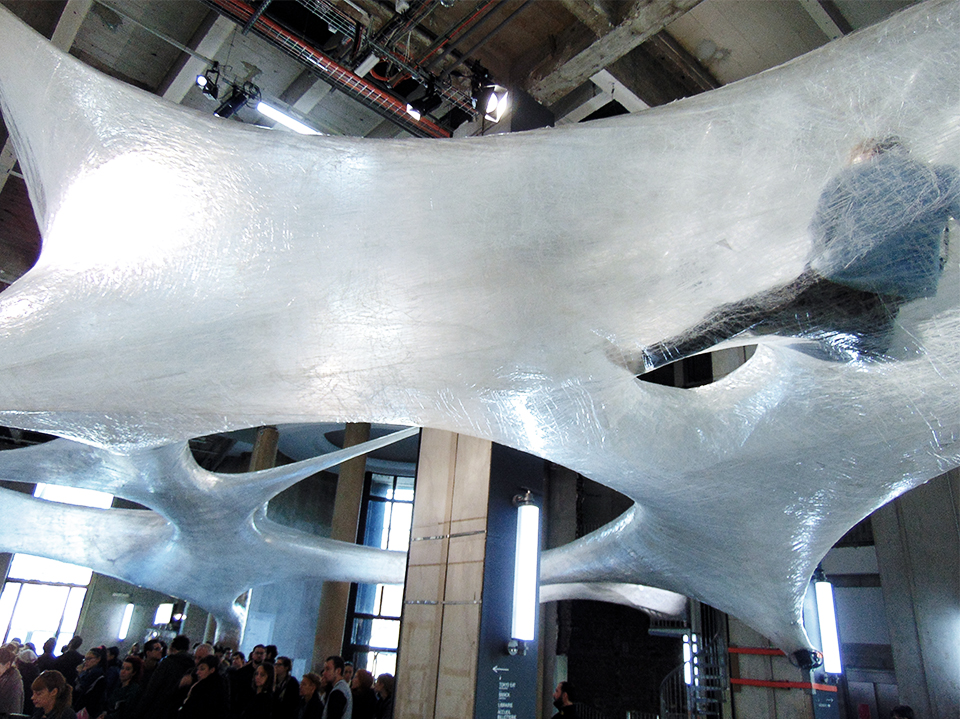
persiennes / an interview with rahill jamalifard

Habibi Self Title Album Cover
Nilufar Khalessi is journalist & trend forecaster. Founder of web magazine "Persiennes, Correspondances Paris-Téhéran" and associate with Pauline Chiusso, they create this magazine providing a new look at cultures and aesthetics of Iran. It's a shot of mind - opener. Crossing boundaries in art, fashion, beauty, lifestyle, food, thoughts, spirits, inspiration and more. Persiennes offers a journey in Iran, from flowers of Isfahan to fashion in Tehran. A spiritual trip in the oldest civilization coming back on stage now.
We will share on a regular base a curation of Persiennes. We are very excited about this cooperation. Sharing is the new black!
We discussed with Rahill Jamalifard, the frontwoman of Habibi, a New York music group where Iranian soul meets 60’s Motown. A complete and inspired artist. She’s sharing with us new artistic projects we really love. Enjoy!
When & why did you start the adventure of Habibi?
I started Habibi (Means My love, in arabic) in 2011 with my friend and guitarist, Lenny. We had a mutual love for music, specifically for the middle eastern psychedelic music of the 60s and 70s. We both come from creative backgrounds and so playing together just happened naturally.
You are iranian and we can feel direct persian influence in your music, how do you mix this Motown 60’s sound with your persian roots?
Well I grew up first generation Iranian outside Detroit, Michigan, which is the birth place of Motown. So I think i am a composite of my lineage, my environment, and whatever i chose to expose myself to. This translates musically, i love minor scales, I also love crystalline harmonies, and I love rock n roll. I think the music i write reflects all of that.
What are your favorite aesthetics from Iran?
Thats hard to say, the aesthetics from Iran are all so rich. Persian miniatures from centuries past are some of the most beautiful paintings I’ve ever seen. The islamic architecture built during the Safavid period : Shah Mosque, Chehel Sotun, Hasht Behest. I visited these places in Isfahan as a child growing up, and they all have influenced my love and appreciation for art heavily. I am also really captivated by Iran’s nomadic art and jewelry. My fathers lineage traces back to the Qashqai tribe outside Shiraz, they make the worlds most beautiful tribal rugs, and are known for their original colorful way of dress and jewelry.
What’s next on music?
Well Habibi is now on hiatus, but a couple months ago I started a new project Roya (Means Dream in persian) with Hamish Kilgour of The Clean and two other close friends, so i have really been enjoying creating in a different way, with different people. I’m still doing solo stuff, which is very involved with cultural background. But right now my main focus is writing and recording with Roya, my new band.
You are a complete artist, tell us more about your drawings ? Is it a new project?
Drawing was my first facet of creativity, I’ve always been artistic. I didn’t learn to play music till much later. But my medium for art changes quite often, for the longest time i was making collages, then I started doing pen and ink drawings and then watercolors, then crayons, etc. Most of my art is directly influenced by my iranian heritage, it all tends to speak to how I see myself as, who I see my people as, and the relationship between my western upbringing and my deeply rooted eastern ancestry. Its very personal, like self reflection.
Now, something we ask to all people we meet. A sort of tradition… Please give us your 3 favorite places in Tehran?
Well my father is from Shiraz and my mother is from Isfahan, I have spent very little time in Tehran so I will give you my favorite three places between the two cities I’m familiar with : Hafezieh - Persepolis - Naqshe Jahan Square
Your favorite musician in Iran?
Kourosh Yaghmaei
Three favorite places in New York (Brooklyn)
Coney Island - Prospect Park - Green Wood cemetery
And to finish, 3 favorite american musician?
Velvet Underground (Lou Reed) - Pharoah Sanders - The Stooges
Nilufar Khalessi
www.lespersiennes.com
habibi.band


Habibi, Rahill Jamalifard on the top right
local heroes

Atelier Ted Noten - Local Heroes curated by Jules van den Langenberg - photo by Otto Snoek
On sunday the 25th of May 2014 the Dutch small town Boxtel transformed into an exhibition landscape with site specific work of 27 designers, artists and architects. Curated by Jules van den Langenberg, Imperial architect for a day, these Local Heroes did not design to save the globe but use form and thinking to blow the dust of daily life in plain contexts.
A summary of the one day exhibition is presented in the Klokgebouw during Dutch Design Week 2014 as part of the program Future Boxes, a selection of exceptional projects which function as conversation pieces in Klokgebouw; curated by studio Maarten Kolk & Guus Kusters.
Participants: Asnate Bockis, Jelle Mastenbroek, Leon de Bruijne, Michael Kluver, Anneke Jakobs, Bart Eysink Smeets, Erik Kessels, Tom Loois, Elise van Mourik, Atelier Ted Noten, Olaf Mooij, Willem van Doorn , Joram Raaijmakers, Floor Wesseling, Guus Voermans, Dagmar de kok, Aliki van der Kruijs, Skin Architects, Maarten Ponjee, Student Puck van Iersel, Student Nick Gniewyck, Student Pippi Dijkstra, Student Liede Hofstee, Student Cindy Trilsbeek, Student Corinne Hendriks, Student Willem van Hooff , Student Aline Gerards
Concept and curator: Jules van den Langenberg
Organisation and management: Daniëlle de Jongh
Graphic design: Knut Stahle
A short conversation between Jules van den Langenberg and his alter ego Willy Wonka.
Willy Wonka: What’s up with the confetti?
Jules van den Langenberg: The public space is in desperate need of randomness. I dropped 27 confetti’s on the map of a small town in The Netherlands then visited the 27 sites and based on my findings invited artists, designers and architects to install their work in specifically given contexts or create new in-situ projects on the various locations. All for a one day exhibition.
WW: A one day exhibition, what does it mean to create that?
JVDL: Investing time. From formulating a concept to fund raising, studio visits and defining commissions. I wanted to create an alternative landscape, a momentum in daily life, which is why the one day exhibition format is interesting to me. The temporariness evoked generosity- and hospitality of volunteers, government and locals. It also resulted in a challenging program of demands for participating artists, designers and architects.
WW: What’s it like to walk through a village turned exhibition space like that?
JVDL: It felt like being a museum director that uses the ‘real’ world as both archive and platform.
WW: Where does this eagerness of exhibition making come from?
JVDL: I grew up as the son of a creative entrepreneur, matured at Design Academy Eindhoven and am developing myself through freelance works at Studio Makkink&Bey in Rotterdam and Studio Edelkoort in Paris.
Besides that I started my own practice working on projects as designer, curator and exhibition maker. For me it’s all about context awareness. I’m interested in the impact of applied arts and design. Eager to expand the notion of curating and the exhibition as a medium.
WW: Could you elaborate on how you defined the selection of participants for this exhibition?
JVDL: After the confetti’s were thrown on the map I took a cordon that has the periphery of the confetti and translated its measurements to 1:1 scale. Each location was mapped and in a very associative way existing works or specific work methods of artists, designers, architects and makers of all kinds came to mind. Often right away, sometimes after studying the context or program of the location. The participants vary from local artists like Guus Voermans to internationally renowned designers such as Erik Kessels, who actually studied in Boxtel, to students of the local art school SintLucas but also many makers that have never heard of the village or its quirky whereabouts. An eclectic group.
WW: Ted Noten or Leon de Bruijne for instance?
JVDL: Right, one of the confetti’s fell on the industrial area of Boxtel, in a street right in front of a big slaughter company. Each day thousands of pigs arrive in trucks and disappear into the factory. It was clear to me that Atelier Ted Noten, who have been using the pig in their oeuvre regularly, should participate on this specific location. Their ‘Wanna Swap Your Ring’ project is in itself about site specificity so it felt both natural and exiting to install a continuation of that project in the Local Heroes Boxtel context. Where the pig diminishes within the industrial walls of the slaughter company, Atelier Ted Noten multiplies the pig and offers hundred ‘Miss Piggy’ rings, for swapping, to the visitors of the exhibition.
WW: How did you pull this off organizational and financially?
JVDL: Charm, wit, and an ambitious plan? Who knows, but the whole thing would have not been possible without the support of many volunteers, three main sponsors and a handful of local companies that financed the new projects that were developed specially for the exhibition. Especially at the start of the project I worked with Daniëlle de Jongh who is responsible for a part of the organisation and management of the project, also graphic designer Knut Stahle generously contributed to the visual identity of the exhibition.
WW: What’s next?
JVDL: The exhibition format is very suitable for a continuation, a second edition in so called ‘sister’ village Wittlich in Germany is on the agenda. Local Heroes Wittlich would be interesting to realize by the end of 2015. For the upcoming Salone del Mobile in Milan I’m researching the possibilities of creating an indoor in-situ exhibition. Contact me if you’re interested in collaborating.
WW: Will do.

Left - Buurtbus Tour. Right - Jelle Mastenbroek - Local Heroes curated by Jules van den Langenberg - photo by Otto Snoek

Leon de Bruijne - Local Heroes curated by Jules van den Langenberg - photo by Otto Snoek

Buurtbus Tour - Erik Kessels - Local Heroes curated by Jules van den Langenberg - photo by Otto Snoek

Willem van Doorn - Local Heroes curated by Jules van den Langenberg - photo by Otto Snoek
about whether weather

photo daniel costa
Catharina van Eetvelde and Stéphane Sautour have been working together for over two years. They have a large workshop in Montreuil, which doubles as a meeting place for a surprising bunch: as well as the two artists, a seismologist, an anthropologist, two video makers, a composer and the odd visitor. Something is in the making there, something collective showing its face for the first time in the installations.(*)
These strange installations explore fragile balances and gravity – sometimes balance and gravity at once. They look like a collection of accidents, or a dramatic mise en scene which deals with the "paradoxical sequence which occurs 'against all logical expectations' or if you prefer 'inexorably with surprise'" (Patricia Falguières). They are "marvels" or mirabilia, so appreciated in the sixteenth century, using heterogeneous materials and procedures to make them hold together: 'delicate links', mouldings, swelling, crumbling, contagion, friction or spills. “CARBON(ROCK) to LATEX COLLOID(BAND) to METHYL METHACRYLATE(RESIN) to PROP-2-ENOYL, AEROSOL(COATED) to PAPER, INK (FOLDED) to PAPER, INK(FOLDED) -REPEATED - to COTTON(THREAD)”: for Catharina and Stéphane, composition is a language in itself. Enumerating the components, saying what is happening without describing its content. Staying on the fringe of meaning. Just below the level of narrative.
This economy serves an argument. It takes us with the necessary caution into the zone peopled with incommensurables, opened up by the tragic and obsessing event, which occurred in Japan in March 2011. What happened then is still happening now. Ever since, undesirable particles have been floating in the air and the earth has echoed with what it can do.
Disruption. Trouble. A trouble agent: an agent whose motives are unknown. Who causes disruption in an initially homogeneous environment. Who makes ambiguity evident.
Catharina and Stéphane's installations respect this trouble. As we explore them, we do not go towards analysis or understanding. We enter into a field of disruption in which what is sought is the preservation and stabilisation of ambiguous states; precision in confusion. "Staying with the trouble" (Donna Haraway): that means simply "learning to let yourself be affected by the dense tangle of malaises and hesitations that "terrestrial" situations impose upon us" (Isabelle Stengers).
Text by Sophie Houdart
(*) The seismologist is Alexandre Schubnel, the anthropologist, Sophie Houdart, the two video makers, Véréna Paravel and Lucien Castaing-Taylor and the composer, Ernst Karel. The collective was set up on the initiative of Marc Boissonnade, director of F93
Whether Weather by Van Eelvelde Sautour is open for public from the 2nd of until the 25th of October 2014 at Trend Union headquarters; 30 BD Saint. Jacques in Paris, France. The gallery is looking forward to receive you from 2PM until 6PM from Monday to Saturday.

photos daniel costa
Rives de la Beauté

"Rives de la Beauté" is a special event in Paris offering for the sixth year in a row, a week dedicated to celebrating a vision of contemporary and aware, responsible beauty.
This innovative circuit is organized as an open and inspiring itinerary through Paris. The event is designed for a public of informed consumers and inquisitive professionals, Rive gauche and rive droite : installations, presentations and special treats are displayed in a selection of venues. By the very essence of its culture and its history, Paris might well be the only place in the world where so many people working with and in beauty are united.
During five days, from september 17th to 21st , the "Rives de la Beauté" event aspires, together with the professional participants to move people through a series of original experiences, to arouse senses, to surprise with discoveries, to share emotions, to confront new ideas and to explain the know-how secrets within the beauty and perfume fields...
While the participating brands, designers and artists, as well as boutiques and unusual places jostle for creativity in terms of atmospheres and experiences, a selection of multi-disciplinary satellite events ‘les Passerelles’ explore the interdisciplinary nature of beauty (fashion, photography, literature, film, jewellery, art...)
The original idea and main objective are to bring about the creativity and the expertise within the ‘beauty’ field on all levels (perfumers, colorists, photographers, designers make-up artists, consultants, scientifics, formulators...) and to create new links and dialogues in a transforming global environment.
For this new edition we just pick out a few events but there is much more in the full program! For some events reservation are needed.
Shiseido will propose an art exhibition/performance with two of Shiseido's artists, Noriko Okubo (make-up) and Hirofumi Kera (hair),at Mirror Gallery in the Paris' Marais area with portrait photographer Georges Meran. The trio will realize a live action photo shoot covering the theme 'La beauté Parisienne'. The gallery will be open for visitors during the shoot, allowing a new 'behind the scene' experience.
The Guerlain Francs-Bourgeois boutique invites you to explore the raw materials most favoured by their perfumer Thierry Wasser. Discover olfactory creations that tell real or imaginary stories inspired by a romantic encounter, a work of literature or a journey to a far-off land.
For the first time you will enjoy an evening of shopping and fragrance experience in the Marais district ( Thursday 18th from 6.00pm to 10.00 pm).
Lidewij Edelkoort will be part of this event : on Friday September 19th at Trend Union's headquarters in Paris "Beauty & Fragrance"an inspirational program will be presented at 11.00 am.
Download the full program on PDF

Shiseido - Hair&Makeup/Hirofumi Kera - Photo/Joichi Teshigahara - Stylist/Seiko Irobe - Accessory/Yuko Katayama
poor tools

‘Poor tools require better skills’ | John Cage
Studio Fludd is a multidisciplinary creative collection consisting of Matteo Baratto, Caterina Gabelli, Sara Maragoot and Valeria Sanguin and is based in Venice. They are named after the eclectic alchemist sir Robert Fludd and weave together design, art, craft, styling, graphics and illustration.
Studio Flood was invited, together with photographer Rachele Maistrello, to be part of a project that was organized by the group of artists How We Dwell. The project was set in a very clear and strict timeframe of a week and took place on the designated Island of La Certosa, nearby Venice somehow in the middle of nowhere. The goal was to create its own residence with found materials and tools contained in a kit assigned to them. They had to take care of their selves in a very traditional and artistic way in terms of building an environment and revealing their selves in the basic outer space, there arose an intriguing dialogue between the environmental space and Studio Fludd.
‘We decided to live and interpret the entire island as spread residence, following the natural suggestion of the several room-like spaces. We carefully collected natural and artificial finds, relics and trash, that we put together in order to create furnishings and furniture.’
Studio Fludd arranged five rooms: the kitchen/livingroom, bedroom, meditation beach, alchemical laboratory and wunderkammer.
The artist group How We Dwell that consists of Christian Menchini, Andrew Grotto, Marco Gobbi and Adriano Valeri created via this project a very refreshing, alternative and extraordinary approach to design and craft. It creates involvement in the ecology of the island and it makes people aware of the value of re-using materials to create a more sustainable and environmentally friendly space. The group aims to shed the terms of the traditional artistic residencies away by reversing the situation.
Looking at the result of the artistic design pieces of Studio Fludd, the space and present freedom led way to a huge amount of creativity with wonderfully intertwined imperfect, humble, natural and artificial objects. A poor object is formed into something new without losing its identity.
Britt Berden


tactile illusion

Aisling & Carrie
Marble owns the ability to exploit our vision and mislead our aerials. No wonder marble has been generating fascination and obsession for centuries due to its ability to make a flexible switch from one purpose to another. Marble; so strong and still so easy to shape and reshape. Expressive statues made out of marble from the Ancient Greece are able to capture the tactility of silk within their adamant density. Craved fabrics and costumes of the Roman Empire are loosely draped around age-old marble figures, capturing the magic of frisky textile better than any other material.
The preciseness in processed marble has led to new interpretations of visualizing the metaphoric limestone. Marble prints are used upon textiles and by using precious felting techniques poofs, chairs and cushions are marbleized. Marble is being softened and the already treacherous king of stones is continuing to fool around with our senses. Scotland based Alasdair Thomson is exploring the way fabric hangs and folds, and is attempting to capture that lightness and gracefulness in stone.
His work is rediscovering the idea and connotations we have with heavy and light materials. By turning their characteristics around, the works of Thomson are somewhat between sculptural garments and costumed carvings. His refined work is challenging us to touch it and even tickles our imagination, how will his stone garments hang around the curves of our human frames? It’s the lightness of his work that makes it grab our attention.
Thomson’s work is currently exhibited during on form 2014 at the Asthall Manor in Burford, United Kingdom.
Anne Willem Marcus Schenk

Hannah & Lucy
a dialogue with dries van noten's mind

photo courtesy dries van noten
“For me it is really about my way of working, the connections I make. It’s about intuition and emotion.”
The exhibition “Dries van Noten, Inspirations” in Les Arts Decoratifs Paris is the first personal show of Mr. van Noten. With an emphasis on the personal, the exhibition is a work of introspection and a reflection of van Noten’s fascination for creation in a broad sense. Dries van Noten and Pamela Goldin [the museum’s chief curator] explain that from the beginning on, it was clear that this exhibition was not going to be retrospective of van Noten’s work. Instead, the exhibition shows the intimate process of van Noten’s method and process of creating, a suitable choice of approach for the reserved Mr van Noten who masters the translation of his inspiration like no one else does.
Entering the first exhibition-compartment, a range of silhouettes are lined-up showing creations of Claude Montana, Georgio Armani, Thierry Mugler, Kenzo, Kansai Yamamoto and even Gianni Versace. All looks belong to collections, which were shown on the catwalks during the beginning of van Noten’s career. The designers on show serve as an introduction to the exhibition as they express the influential power they had on that period.
The obscured first floor is dedicated to collages of themes within the past collections of the Flemish designer. The overwhelming power of the selected creations of artists and designers in dialogue with the work of van Noten offers intimate snapshots of the private mind of the creator. Damien Hirst fills up the centre of the installation in the “Butterflies” vitrine with a piece from his Transgressor collection where Butterflies from all colours are ordered within a mandala shaped stained glass window interpretation. Elsa Schiaparelli parades in the foreground with her Butterfly printed dress from 1937. On both sides Dries van Noten is present with creations from his spring/summer 2000 collection. A collection inspired by the transformation of boys emerging into men and all of the aggression and vehemence that are involved in this metamorphoses.
The touching installation called “The Piano” is inspired on infinity and the cycle of birth and rebirth, our inexhaustible drive to survive and exist. Together with museum archive pieces of Schiaparelli and Worth, the work of van Noten’s spring/summer 1999 is combined with one of his favourite paintings; Mer montée by Thierry De Cordier, a painting of a black furious infinite sea which came straight from the Biennale in Venice. The Mussel Pot, by Flemish artist Marcel Broodthaers is coherently exhibited in front of all of the precious pieces on the floor.
While leaving the descriptive themes full of art, videos, sculptures, paintings and fashion on the first floor, behind the second floor visitors are welcomed into the personal botanical garden of Dries van Noten himself. His fascinations for the horticulture and the exotic have been present since the beginning of his career, and probably even before. From summer flowers to Bollywood and from flower power to orientalism, the work of van Noten is categorized in the breathtaking environment of the museum. The intimate dialogue amongst Mr. van Noten and his inspiration offers the visitors an indefinable experience of personal value. The exhibition is on until the 31st of August 2014 in Les Arts Decoratifs and will travel to the city of Antwerp in Belgium afterwards.
Willem Schenk

photo courtesy dries van noten

photo courtesy dries van noten

photo courtesy dries van noten

photo courtesy dries van noten

photo courtesy dries van noten

photo courtesy dries van noten

photo courtesy dries van noten

photo courtesy dries van noten

photo courtesy dries van noten

photo courtesy dries van noten
Design Indaba 2014

Design Indaba- Lidewij and the work of danish designer Henrik Vibskov Photos Sergio Machado
The conference centered on a few main topics that somehow came from most amazing speakers. I saw many cats in all videos and audios, it made me long for my cat Adam who died two years ago during Design Indaba. (Tear)
Most designers, architects and artists used perforation to create texture, lightness, dimension and play. From a perforated poster, to a perforated conceptcar, to a perforated facade to a perforated building. People slicing out inner parts of buildings as if emptying an apple from its core. And then the stairs and bridges and tables that connect people in big corporations and public spaces. Like ribbons these stairs and bridges and tables stream through space for happiness.
The body was omni present in hybrid constructions between gender, past and future, man and animal and man and design. The body as a chair.
Storytelling was another potent correlation between several designers.
Lidewij Edelkoort
cult of the object

Left - OBJECT Rotterdam 2014 - De Rotterdam - nhow hotel - Photo Ossip van Duivenbode - Right - OBJECT Rotterdam 2014 - Pepe Heykoop - Skin collection
Beginning of February, inside one of the latest architectural additions to the
skyline of Rotterdam; the new building of Rem Koolhaas, I met Anne van der
Zwaag, initiator and curator of contemporary design fair Object Rotterdam.
A stroll through the exhibition she has set up there on the ground floor was
interesting but the excursion to the apartments high up in the building was
truly a pleasant surprise. Several recently constructed apartments accommodated
works of designers, which stood out perfectly in the rough interiors of the
building. Amongst other Stichting Zetel and young gallery The House of Ababa
filled the domestic spaces, providing scale to the otherwise empty apartments
that were still for sale. In one of them Studio Makkink&Bey installed an
overview of their oeuvre, like visiting a model home visitors entered a
scenography that emphasized possible arrangements in the different rooms of
Koolhaas' architecture. The scenery was beautifully dramatized by the panoramic
views in the newly built homes.
The Object Rotterdam fair focusses on design, crafts and applied arts and by
doing so counterbalances the Art Rotterdam event and the Raw Art Fair that all
take place in the same week in the city of Rotterdam. As Curator with a refined
sense for colour and tactility, Van der zwaag invited a variety of Dutch
creatives to present themselves. Ranging from recently graduated Peter Hseih
and Maayan Pesach to established names such as Fransje Killaars, Galery Judy
Straten and PROOFF.
On the ground floor I was drawn too Lex Pott's collaboration with Woes van
Haaften (New Window). Titled 'Diptych' their latest project was displayed
while still in development, the duo thoroughly researched the qualities of wood
and started a material experiment in which they partially sandblast thin slices
of wood.
Lex Pott: “The aim of our project is to design and create objects that
show a way of dealing with the inner anatomy of wood. The outcome will be a
step towards the material’s true identity. The annual rings become tangible and
might lead to surprising new functions that result from the material itself.”
The final results of their collaboration will be presented at the Salone del
Mobile in Milan. The cult of the object is under construction.
Jules van den Langenberg
Jules van den Langenberg recently graduated at Design Academy Eindhoven. He initiates-, curates- and exhibits projects in which applied art and design are used as a medium to cultivate culture. Jules approaches the world as a library full of potential, with an inexhaustible resource: humans and their skills. Within this wonderland of opportunities the young -Willy Wonka like- artistic industrialist travels to meet people and research the social- and cultural impact of all that is man made.Through associative thinking Jules develops narratives and concepts which form fundaments for publications, exhibitions and self initiated projects as well as commissioned works.

OBJECT Rotterdam 2014 - 30th floor of 44-floors - Studio Makkink&Bey

Totems by Mayaan Pesach, photo by Mayaan Pesach

New Window x Lex Pott - photo Raw Color

Galerie Judy Straten, Anamorphosis Bee by Lachaert & D'Hanis, photo Joris Luyten
the blues

credit Glamcult
During the past Amsterdam Fashion Week denim brand G-star RAW manifested itself not in a selfish runway show but by generously supporting designers and artists with creating a new work. Glamcult studio organized and curated the event Raw&Rising, the gallery of arts and crafts, for one of the biggest Dutch fashion brands. Ten Dutch creatives were invited to develop a project supported by the G-star RAW atelier, during a one night pop up exhibition the results were displayed.
Leendert Sonnevelt from GlamCult explains: "we carefully selected participants working in the field of fashion, applied art and design which went on a creative joyride with the RAW atelier. In collaboration unique one off objects were created in which personal creativity was combined with contemporary craftsmanship and RAW denim."
Amongst others The Boyscouts, Dufarge, Lex Pott & David Derksen, Pepe Heykoop and The Phoney Club were invited. The Phoney club, good girls gone bad, worked on a denim bomberjacket with a bright red lining onto which numerous of gold lighters were applied. The embroidery on the back, 'Burn Baby Burn', makes the object boldly speak for itself. The Boyscouts, a young and upcoming accessory label, created a delicate denim hat with the skilled hands of the G-Star atelier. And Pepe Heykoop continued his Skin collection with a special edition made out of left over pieces of several RAW denims.
Jules van den Langenberg
www.glamcult.com
www.thephoneyclub.com
www.theboyscouts.nl
www.pepeheykoop.nl
Jules van den Langenberg recently graduated at Design Academy Eindhoven. He initiates-, curates- and exhibits projects in which applied art and design are used as a medium to cultivate culture. Jules approaches the world as a library full of potential, with an inexhaustible resource: humans and their skills. Within this wonderland of opportunities the young -Willy Wonka like- artistic industrialist travels to meet people and research the social- and cultural impact of all that is man made.Through associative thinking Jules develops narratives and concepts which form fundaments for publications, exhibitions and self initiated projects as well as commissioned works
www.julesvandenlangenberg.nl

credit Glamcult

credit Glamcult

credit Glamcult

credit Glamcult
exercising happiness

Stefan Sagmeister by John Madere
Happiness seems to be one of the most controversial topics of today. Whereas before more materialistic minds would consider money as the ultimate goal in life. Nowadays happiness is the ultimate perfection, and when you haven’t reached that ultimate form of happiness, you better start taking action to uplift our hearts. The article “ Why Generation Y Yuppies Are Unhappy”, which got published in September 2013 by the Huffington Post caused an intense debate amongst young professionals. Whether people agreed on the article or not, this happiness issue is definitely a sensitive subject.
The Happiness Show by Stefan Sagmeister - born 1962 - features his personal hunt for “le Bonheur”. Mr. Sagmeister is neither a psychologist, nor a philosopher but he is a graphic designer. Austrian born artist runs his own graphic company Sagmeister & Walsh in New York where he designed covers for the Rolling Stones as well as branding, packaging and graphics for the Guggenheim museum and Time Warner. While taking a sabbatical year in Indonesia, which he initially wanted to dedicate to making furniture, he decided to work on a documentary simultaneously. Although mister Sagmeister is a reasonable happy person himself, he has been fascinated by: If he could train his mind to be happy, the same way one trains one’s body. “The Happy Film” was born.
Entering the exhibition an upbeat and stimulating sound is surpassing the noise of the many visitors in the Parisian Gaité Lyrique. Energetic yellow walls dominate the overall atmosphere and handwritten texts humorously indicate were the restrooms are. The introduction text explains that this exhibition is not made to help becoming a better or happier person but instead it should help the visitors get a better understanding of the concept of happiness.
On the lower level the exhibition continuous with statistical facts about happiness - couples with kids are equally happy to those without kids and marriage actually does increase happiness. All of the information is designed with Sagmeisters’s signature. The dialogue between the playful design of the exhibition and the psychological research to happiness makes this exhibition unique and incredible interesting for all visitors. A crowd is waiting in front of the gumball machine installation which challenges visitors to twist the machine with the number on it that indicates their happiness, I decided to look for my luck at machine number seven, no gumball rolled out.
The exhibition continuous with more facts about happiness, illustrated with photographs, interactive installations and film screenings of Sagmeister’s documentaries and graphic illustrations.
I’m certain that every person has once woken up with the resolution to be nicer to our fellow human beings; the girl behind the counter at the supermarket, the bus driver or your colleague. In the first part of the documentary “the Happy Film”, Sagmeister explains how he had run after a lady exiting the subway. Incredibly impressed by her appearance, he had told her she’d looked outstanding. He could see that the comment had moved her and he had probably made her day. Many years later he’s demonstrating a similar situation where he tries to flatter random people walking by on the street. With a flower in his hands he’s spreading compliment after compliment, obviously without success. Maybe we can only make others truly happy in indefinable situations or at least if the moment is uncontrolled?
In second screening we can see Sagmeister’s participation in a meditation course in Indonesia. With his entertaining voice and choice of words he explains how much he’s suffering from his backache during the meditation sessions. The breaks within the sessions are his happy moments as he’s finally able to stretch his back.
Throughout the exhibitions phrases like “drugs are fun in the beginning but become a drag later on” are painted on the wall. His casual and fresh way of writing that almost can be interpreted as poems. Sagmeister expresses the idea that happiness can be found in different situations depending on your personality. More money doesn’t always generate more happiness and becoming happy is definitely something you can work on but admitting that you’re happy already is a major step in life.
The exhibition is on until the 9th of March in the Gaité Lyrique in Paris for the first time on the European continent after having travelled through the U.S.A.
Stefan Sagmeister will be one of the speakers at the INDABA DESIGN conference 2014, which will take place in Cape Town, South Africa from the 28th of February until the 2nd of March.
Willem Schenk
the-happy-show
www.sagmeisterwalsh.com

design by stefan sagmeister

happy show photo by vinciane verguethen

happy show photo by vinciane verguethen

happy show photo by vinciane verguethen

happy show photo by vinciane verguethen
sustainable fashion, for real

eva kruse
A more sustainable fashion future. Most of us say yes to that, without hesitation. We know that the fashion and textile industry is one of the most polluting industries in the world. But then it comes down to action, to change – and some of us lose our way.
It is a Thursday morning in January, snow is falling, but the streets are buzzing with movement in Denmark’s capital as the Copenhagen Fashion Week has just begun. I am at the press conference held by the Copenhagen Fashion Summit.
The Danish designer David Andersen is describing how he works according to zero waste. The discussion continues to talk about circular ways of thinking including new materials, life span, how the ecological footprint of a garment is already decided in the design, recyclability… Since the Danish Minister of Energy and Climate is also attending, we learn that the Minister is wearing a suit made by David Andersen. “And as you can see it looks completely normal”, says the designer. The audience giggles. But that is really the message; sustainable in every possible way is completely normal.
It all started in 2009, Eva Kruse, a Copenhagen Fashion Week pioneer and Danish Fashion Institute initiator took the next step. She is today the spokesperson and the face that many of us now associate with the Copenhagen Fashion Summit network.
NICE, Nordic Initiative Clean & Ethical Fashion, is a joint commitment between the Nordic countries and it is an educational process. The Copenhagen Fashion Summit, the last one held in 2012 and the next one on 24 April 2014 is where we put light and focus on these questions, says Eva Kruse.
How do you see the future, can we do this?
I really believe in this, otherwise I wouldn’t be fighting for it. When we start digging into this the possibilities and solutions are endless, it is about how we can make them accessible to designers and companies.
What about conveying the message to the consumers?
That is the next step. I don’t think we will see consumers jumping up and down wanting organic fashion, they want to buy clothes because it is beautiful or the colour red… It is a push strategy from the companies; it is not going to be a pull. The cooler the brands the better for the cause. Once the companies start doing something sustainable of course they will have to start communicating. Otherwise how will we know if a garment is made of tencel, and who does even know what that is…
Today we think that organic fashion has to be brown, hippie-like and dull – but it doesn’t have to be! You can even have pink, it is not like there is only possible to have a certain organic colour range.
Are the Scandinavian companies a driving force, or is this evolution happening parallel all over the global market in your opinion?
I think the Scandinavian companies can be a driving force. But do I think that Scandinavian companies are more sustainable than others, no. But we can be, I think that it is in our culture to care. Therefore we have met receptiveness in our countries, and we also have a lot of small and medium sized companies that want to do this.
Most companies want to do this, if it was easy! That is why we have tried to make solutions easy and accessible.
Is it really correct to say that it is has to be more expensive, financially, for the companies to do this transition, to become more sustainable?
No, not in the long run. To change your production, to source new material, to look into chemical list and so on requires time and effort and might be a luxury that not everybody has. But that is the short run. In the long run it does not have to affect the cost. And the more it will grow the cheaper it will become. I do not want to kill the industry, we just have to consume more wisely.
Eva Kruse talks about the efforts in progress to form an international organization too.
So it will be an international NICE too?
Everything that we do, the tools that we create we want to share with our colleagues in other countries so that they can share with the industry of theirs. There is no reason we shouldn’t share this, there is no competition. Instead it is the more the merrier.
The next Copenhagen Fashion Summit is held 24 April 2014
www.nordicfashionassociation.com
Interview by Petra Dokken, Creative Editor and Writer based in Sweden, but always in motion. Trends and Travel, Online and Offline.
NormAll by matthijs holland

by matthijs holland - left : Henri III - right: Pope Joan
Every sex is enclosed in by a strict socially imposed norm. Masculinity belongs to the man and femininity to the woman. Everything that falls outside of this measure does not belong to the bigger majority and is unfamiliar territory. The unknown doesn’t fit into the social straitjacket and can’t easily be placed anymore. Because of that it causes fear and rejection with the greater number. Dominant women are being attacked in their femininity and sensitive men aren’t seen as real ‘men’. People whose gender role don’t fit the social imposed norm have to justify themselves to society. However between the stereotype of a man and the stereotype of a woman lies a broad spectrum that gradually blends together and falls outside of the norm.
If you look back in history you will again and again find historical figures that were standing outside the social convention.
The timeline of portraits shows five inspiring examples that each in their own way could not conform to the prescribed expectations. Hatshepsut that in a male dominated world did the unthinkable and crowned herself as pharaoh. Pope Joan who by disguising herself as a man could escape the female straitjacket of the Middle Ages and be acknowledged in her talents.The Japanese actor Segawa Kikunojo III who was so feminine that he became the role model for Geisha’s. Or Henry III of France and Charlotte von Mahlsdorf that each in their own time chose to step outside of the expected gender roles to truly be themselves.
They at their time, and even now, break through the social imposed norm. All these figures from the past did not fit the role that was created for them. They could not conform themselves to these restrictions an broke free from these norms.
They show us that questioning gender isn’t something that only belongs to out time is from all times. It has always been there. The norm as regards to gender is much to limited and not realistic.
But where are we standing now as to gender in the 21st Century? In many places in the world women still have to fight for a voice, feminine men and homosexuals are being attacked with violence or even punished with death and transgender people still are being seen as a curiosity.
Have we moved forward throughout history or have we become even stricter and where are we going? Which stories of our Century will we add to this timeline in 10 years?
Matthijs Holland.

by matthijs holland - left : Segawa Kikunojo III - right : Charlotte von Mahlsdorf
issey miyake

Issey Miyake's SS14 collection designed by Yoshiyuki Miyamae is a futuristic take on the modern woman. From sportswear influenced wedges over comfortable yet fashionable clothing made of hybrid textiles that boldly combine different materials and ever-evolving technologies.
With his special interest being illuminating light the show featured 3 different themes: Starlight, Moonlight and Sunlight. Starting off with his trademark silhouettes in white he mixes metallic textiles representing the sky at night. White, clean and like a dream. Followed by the Moonlight, seen through the grid knit series the silhouettes become darker blending into grays and beiges, demonstrating the glistering white moonlight. Open weave jackets and coats with a soft and distinctive silhouette, made by spiral cutting, uses a hybrid soft technique of innovative yarns on old style knitting machines.
The last but not least Sunlight collection pops with red and different blue gradations, based on the blue skies and deep red sunsets on the horizon. The 3D thick mesh series created a light and shade with the movement when worn on the body. For the grand finale, all the different elements of the sky blended and created a night sky and a dream.
During the show live music was played by Ei Wada, who is part of the experimental performance project Braun Tube Jazz Band. The music is created using cathode-ray tube television screens as musical instruments.
Keeping up with his reputation he delivered yet again an innovative unforgettable show.
Chloé Sos


acmé

Acmé is a new graphic design studio based in Paris created by two young women: Elodie Mandray & Caroline Aufort. Sharing similar views on their job, they decided to team up, using their complimentary expertise in art direction, print, visual identity and typography. Among their clients are Lacoste, Golden Hook, Ikea, Le Coq Sportif, Stylist ...
The human size of the studio lets them define each project’s scope and ensure close following of the project all the way to the print, in close ties with the client. This hand-crafted dimension is for them a quality pledge.
Considering creativity as something playful, they toy with codes, symbols and graphic tools until they find that ideal shape and resolve the problems at hand. The infinity of possible combinations and inherent restraint of each project create their playground, where they evolve in constant search of meaning.


Il Palazzo Enciclopedico

Art by Ai Weiwei
Magda di Siena is an architect, an interior stylist and an art consultant. Her work is focused on projecting and setting exhibitions, fair stands, paper advertisements. She visited the last edition of Venice Art Biennale and shares with us her thoughts and photos.
The 55th edition of Venice Art Biennale is titled "Il Palazzo Enciclopedico" (The Encyclopedic Palace) in tribute to an ambitious work of Marino Auriti: an architecture model for an ideal museum, conceived in 1955 to store all the human knowledge. This work has been chosen as an emblem of the prestigious event by the curator Massimiliano Gioni , due to its conceptual analogy with the present state of culture. Collect, store, catalog, connect, all these transactions are directly linked to knowledge, which shifts its axis on, in a continuous tension towards the infinite. The work of art often becomes an intermediary between earth and cosmos, between cognitions we have achieved and what represents still a pure horizon. This reflection has allowed to create a wide-ranging exhibition which spans not only art classified as such by the laws of the market, but all of those creative works (including collections of objects) that in some way have tried, in different forms, with various means, to understand the relations between different things or placing themselves in a position of dialogue with the laws of nature. In particular with regard to the latter point is interesting the space in the central pavilion, where are exposed the designs made during some lectures by Rudolf Steiner, the founder of anthroposophy, which represent, together with the Red Book of Jung at the entrance, the opening to a broader conception of art itself as synonymous of imagination; a conception which makes art more approachable, less absolute and bounded, more relative, or better puts the absolute and the relative as intersections.
So, not only artists, but scholars, philosophers, scientists, polyhedral figures or simple obsessed with the idea of accumulation, who have tried to give sense of certain phenomena or to express, in a visionary way, the unexplained. The sense of incompleteness of knowledge, imperfect and superficial, as it appears today in its form accessible to all through the web, is a source of additional important considerations. In the world we live in the knowledge looks like a huge block notes full of sketchs, some of which are clear and open the door to the rooms of study, others are almost indecipherable tracing the road toward the riddle.
Yet all this is today residing in one large container.
The Venice Art Biennale want to represent the concept of co-existence in its exhibition space where one can admire the statuary and totemic works in the Egyptian pavilion from the eloquent title: "Treasuries of knowledge" (with a reference to ancestral symbols of knowledge), and then go on toward the Polish pavilion and his relativism expressed in the title: "Everything was forever, until it was no more" by Konrad Smolenski. One can be accompanied in the path of the Swiss pavilion by a metal sculpture in the shape of a serpent (archaic symbol of knowledge), or find a precise location through triangulation proposed by Sara Tse in "triple point" in the United States Pavilion; one can lose itself among the shades of natural stones collected by Roger Caillois (Central Hall), looking for a connection with the land and its minerals, or pass through the works of Simryn Gill (Australian Pavilion): compositions of circular artificial objects.
A multitude of objects perhaps insignificant individually, but showing striking compositional effects if grouped , such as the spatial articulation that Ai Weiwei creates through connections of Chinese traditional stools (Bang, 2010-2013). It may be noted the alienating and distancing isolation of the work Untitled of Cathy Wilkes (Central Pavilion) and then be captured by woman’s beauty as expressed in its fragility through a thin red silk thread by Yiqing Yin (Venice Pavilion); admire the moebius strip ( Max Bill in the Brazil pavilion) which relates art with mathematical formulas and than admire unplayable forms related to the here and now created by Ron Nagle (Central Pavilion).
Totem and ephemeral, symbols and contradictions, academic painting and tribal painting: everything exists in the same moment and different things, such as files on a PC, can be saved all together in a single folder. This folder may become, as in this 55th Venice Art Biennale, a physical space and more: an attitude, a new ability, starting from collections or combinations, to tell new extraordinary stories.
Photos and text by Magda Di Siena

Art by Ai Weiwei

Art by Ai Weiwei

Australian Pavilion Title: Here art grows on trees Artist: Simryn Gill

Australian Pavilion Title: Here art grows on trees Artist: Simryn Gill

Egyptian Pavilion - Artist: Mohamed Banawy, Khaled Zaki Curator: Khaled Zaki Title: Treasuries of Knowledge

BRASILIAN PAVILION Artists: Hélio Fervenza Odires Mlászho Lygia Clark Max Bill Bruno Munari

Brasilian Pavilion Artists: Hélio Fervenza Odires Mlászho Lygia Clark Max Bill Bruno Munari
")
Central Pavilion : Marisa Merz, Testa, 1984-95 , (Argilla cruda, cera, stagno, piombo, metallo, base in ferro)

Central Pavilion : Peter Fishli and David Weiss

Central Pavilion : Peter Fishli and David Weiss

Central Pavilion - Cathy Wilkes, Untitled 2013, materiali vari

Central Pavilion - Cathy Wilkes, Untitled 2013, materiali vari

Dutch Pavilion- Artist : Mark Manders Title : Room with Broken Sentence - Curated by Lorenzo Benedetti - Commissioner: Mondriaan Fund

Dutch Pavilion- Artist : Mark Manders Title : Room with Broken Sentence - Curated by Lorenzo Benedetti - Commissioner: Mondriaan Fund

Dutch Pavilion- Artist : Mark Manders Title : Room with Broken Sentence - Curated by Lorenzo Benedetti - Commissioner: Mondriaan Fund

Dutch Pavilion- Artist : Mark Manders Title : Room with Broken Sentence - Curated by Lorenzo Benedetti - Commissioner: Mondriaan Fund

Venice Pavilion - Marya Kazoun, Of selves, pixies and goons

Venice Pavilion - Marialuisa Tadei, Il castello di sole
passion

Our digital lives bring us to the urge of rediscovering real objects and things we can touch.The touch of paper, the smell ok ink are some of our new drugs. Fanzines are there to express this need and the desire of an alternative voice. We choose to share with you one of our 'coup de coeur' made in Paris by talented young people!
Passion is a fanzine, created for all works longing in cupboards, hard drives and brain tubes.Passion publish the unpublished : censored or forgotten projects, parallel or experimental works, all from famous artists and upcoming young wolves. It's publish at night, with little regards towards the biological clock, sleeves are rolled up in empty offices , abandoned agencies and available apartments. To create a scene’s snapshot, that of a way of life.To seduce too!
"Passion mirrors our lifestyles, and this issue: “the good life on the other side” reflects troubled times. See our faces, wan, ghostly forms only revealed by cars’ headlights crossing our paths at dawn. In clubs, we would be glowing under the black light; but there’s no room for clubbing on wrap up nights.
Via Passion, we strive to publish novel works, be they produced by artists we admire, or those we found in our mailboxes on Monday mornings. And works from our friends, of course - for they make us who we are.
We were associated with palm trees and sunsets on heavenly Caribbean seas: the truth is we can’t even swim. As Lord Byron floating on his back in Venice’s Grand Canal, we keep our cigarette butts locked between our teeth to make sure we don’t “loose sight of the stars”. Clouds may hide them from us, it’s OK it’s not like we’re about to drown!"
Passion #3 is 11 artists, 100 pages printed on Arjowiggins Creative Papers, bounded in Swiss tradition, and 500 numbered copies. By: Foucauld Duchange – Gildas Durel – Grégoire Dyer – Caroline Aufort – Antonin David. The content is both in French and English. On the edge: “the good life on the other side”. You get the idea!


linen incredible

by Agence Hilton Mc Connico
In Paris, on Place du Palais-Royal from June 3-9, and in Florence, on Piazza Santa Maria Novella, from June 18-22, a teleportation of the agricultural kind places us in the middle of a parcel of linen flax, in bloom and being harvested. This project, focused on the general public acts as a reminder that linen flax isn't some sort of exotic plant; that 85% of global production takes place here, in Europe, in a swathe of land stretching from Caen to Amsterdam.
The only textile fibre of plant origin from Europe is being showcased to the general public for the first time via all the avenues of its application. The juxtaposition of objects has a surprising effect. A motorcycle helmet, skis, a bicycle, an armchair, a suitcase, a surfboard, street lamps and a chair.
What's the common link? The answer is linen in composite form, a new material in fiber and resin that is proving so inspiring to contemporary designers. And why the sneakers and knitted sailor top? Once again, the answer is linen: outerwear and waterproof for the former; Nm 39 yarn (requiring 39km of thread per kilo, giving ultra-light knits) for the latter.
The exhibition route leads to a vast 10-meter-tall structure, with a spectacular but ephemeral nave, whose double-door entrance - being textile and sensorial - immerses the public in the diversity of linen: a selection of over 300 pieces to discover, touch, brush against, and so on, all highlighting the savoir-faire of European linen spinners and weavers. Fabrics range from ultra-light batiste voile to upholstery fabric coming in at a hefty 1kg-per-m2.
Photographic exhibition. Some forty exclusive black and white images by Sébastien Randé puts the focus on the human aspect of linen production, highlighting our proximity to this industry, its European position, and the unique interaction between grower and scutcher.

Photo by Sebastien Randé for Lincroyable Récolte

Photo by Sebastien Randé for Lincroyable Récolte

Photo by Sebastien Randé for Lincroyable Récolte
beforelight

Beforelight - workshop interior while collecting the lights
Dimitra Sotirchos is a trendwatcher specializing in fashion, arts & culture. With an MA in Innovation for Trend forecasting, she is currently developing a visual arts practice studying Environmental Art at The Glasgow School of Art. She has contributed to AnOther magazine and Dazed Digital and is also involved with the electronic dance music In London and loves yoga, currently training in Ariel yoga.
Beforelight is a Greek-based collective experimenting artistically with light. Staging urban interventions with innovative lighting design, their experiential projects provoke community interaction in public spaces, encouraging human encounters with artificial light.
Opportunities for artists to make work in and for other contexts and places are increasing. Through my interest in environmental art I contacted the group to find out more about their practice.
How do you feel light affects the community?
Light is very important in order to create atmosphere, mood and make a space inviting or hostile. In urban spaces, it is usually hard to change public lighting, thus you feel unable to have any saying in the way our cities are lit.However, we must not forget that public space lighting is a very recent commodity and there is a long way to go in developing it further, either in terms of technology or of artistic expression. We feel light is a very important factor on how we perceive space and it is also a "playful" element that should be more accessible to citizens.
What project have you created that you believe most reflects a hybrid between organic and digital materials?
"I see no sea" is the most hybrid, we believe. The visitor finds a wooden jetty inside an exhibition room. A wooden structure stands elevated over a thin layer of salt, tinted bleu by fluorescent lights. The installation is escorted by the multiplied sound of the visitors' footsteps. The organic materials of wood, and salt create the platform for an outlandish environment, enhanced by the digitally reproduced and processed sound of footsteps.
Their latest project is installation ‘Under a different light’. The inventive public art happening is a collaborative initiative between Beforelight and Imagine the City, a cluster for regeneration. Local community members were invited to participate in the creation of the work, donating quirky lighting fixtures that were restored and hung in a small street in Athens. The space is redefined with celebratory spirit creating a warm and homely place to explore.
Dimitra Sotirchos


last look for casa vogue brasil "public atmospheres"
 by John Pawson, a temporary installation in Milan made in collaboration with Alfredo Salvatori Srl photography: Jens Weber")
Stone House (2010) by John Pawson. Temporary installation in Milan made in collaboration with Alfredo Salvatori. Photo: Jens Weber
Public Atmospheres.When designing public space for our new buildings, offices, retail outlets, hotels and spas, architects have come to embrace a sense of wellness to define the 21st century's chapter in minimalism. This contemporary zen focuses on clean lines, honest materials and the use of light as a second architectural plane; created in relation to the site and honouring the surrounding environment.
We will elevate our stores to the status of churches in which to discover calming merchandise and experience softer forms of selling. A hotel will be a sanctuary in which to be protected from the stress of everyday life. The well-being spa or beauty laboratory will become a true temple in which to realign our minds and bodies.
And work time will be measured in portions, enabling us to control it on our own terms and find a balance between business and pleasure, public and private, commerce and concentration.
These quiet buildings and annexes look may like concepts from the future when contrasted by the presence of the existing elements around them; yet they actually are considered in harmony by designers and architects intent on offering us moments of beauty and spirituality on a day-by-day or moment-by-moment basis. Well-being will infiltrate every aspect of design.By Lidewij Edelkoort
individuals

by team Peter Stigter
We are leaving an individual era behind us. Thank god, we start to realize that the only way to improve our idea’s is to share them with others and adapt them to visions of our fellows. Combing our expertise's will double our result and will open doors that remained closed until now. Students of academies for applied art and design picked up the idea of collaborating way before all of us. They work together as “camarades”, sharing their tools, knowledge and creativity.
We invite you to discover a platform of creativity, born in the heart of the city of Amsterdam. Individuals features a changing collective of young creatives that contribute their own chapter to a continuing fashion story. Recently Individuals showed their 14th collection to the public. This time they opened Amsterdam Fashion week with their AW13 collection called Element. To understand the structure of the brand we will have to take you back to the roots of Individuals. Individuals is a brand, set up by AMFI-Amsterdam Fashion Institute, a fashion school which is unique in its kind. The institute offers three graduation specializations, all being taught in the same building. The specialization, Fashion & Design, and Fashion & Management and Fashion & Branding, each have their own study program and are independent from each other. Though at the same time, the disciplines very often cross each other’s path. In every Brander there is a little bit of a Manager and vice versa, in every Designer there is a bit of Brander and so on... During the four year program, many projects are set up where the three specializations will have to collaborate and show a strong overleap in way of thinking. The students are becoming all-rounders,having their own specialization as the center of their future career.
The ultimate collaborative project being taught at AMFI is Individuals . The project is a semester course where students of all three specializations create a clothing collection from beginning to end. All facets from constructing the collection’s identity, to designing and producing the garments,are part of the job. The inspiration for each new collection comes from a collective translation of the evolving Zeitgeist the students are living in.
On the occasion of Paris Fashion Week, Individuals will present itself at the Trend Union headquarters in Paris. Three collections will be shown in the form of a pop-up shop, carrying the names of Duals, Roots and Element.
Willem Schenk
The pop-shop will celebrate its festive opening at the 28th of February with a cocktail drink from: 5:00 until 8:00 pm. The shop will be open for public from the 1st until the 5th of March, from 12:00 to 6:00 pm at: Trend Union 30 boulevard Saint Jacques 75014 Paris - France.

by team Peter Stigter

by Petrovsky & Ramone

by Petrovsky & Ramone
last look for casa vogue brasil "home beautiful"

Armchair by Sir Laurence Alma-Tadema, late 19th century - photo © Victoria & Albert Museum
Home Beautiful. Like in Oscar Wilde's day, tomorrow's interiors will once more embrace the idea of decorating, heralding the revival of co-ordinated textiles for curtains and upholstery, highly-patterned wallpapers, beautified home accessories and furniture crafted with style. Fireplaces will once again become elaborate, even decorated with tiles, and their mantles will display vases and other artefacts collected on our journeys. Mosaics will flourish with small pieces of stone, surfaces will once more be inlaid with different woods, walls will yet again be treated in layers of material or colour, and floors will welcome back rugs of varying weights and textures.
A decadent and joyful form of decorating will offer a stark contrast to the sombre times from which we emerge, beautifying our lives with aesthetic objects and personal flair, and even exalting in eccentricity; for as Wilde himself once said, “I find it harder and harder every day to live up to my blue china...!" By Lidewij Edelkoort
In Praise of Doubt

art work by nauman
Magda di Siena is an architect, an interior stylist and an art consultant. Her work is focused on projecting and setting exhibitions, fair stands, paper advertisements. She visited " In Praise of Doubt" and shares with us her thoughts and photos.
In Praise of Doubt is an enchanting journey through stand over questions about people and objects soul.The works in exhibition create a strong connection between representation and pensive attitude on topical subjects as human identity in contemporary society. Anthropology become thread of discourse also when (like in the first exposition room) the human figure is not represented as form. Here is the observer, with his presence, to play the part of measurement element of works exhibited.
Donald Judd’s works, with their rigor and sense of proportion let the visitor in front of perfect elements which can be completely understood in their dimensional ratio and calibrated aestheticism.This perfect vision is contrasted by Maurizio Cattelan’s work (Untitled, 2007) a sort of anti-hunting trophy in form of a body horse. Usually associated to freedom, the horse is an animal which finds in this representation a double interpretation sense: from one side it seems go through the wall to let itself free from interior space, from other point of view it seems hanged in reverse as the trophy would be represented by its body in place of an head. In the same room, in dialogue with Judd and Cattelan’s works, is posed the David Hammons work Untitled. The american artist creates a basket (hanged at a regular heigh) make precious with crystal pieces and lights which let the observer in front to important questions: what is really of value? And for whom? The relativity of richness and aestheticism (proposed as absolute value from Judd) and especially its significance in society is fundamental for Hammons who put in evidence art pervasive powerful and basic part on growing consciousness human thought.
All the works are good balanced in space by curator Caroline Bourgeois who creates an occasion (through the space of Punta della Dogana, restructured with silent elegance by japanese architect Tadao Ando) to pass through an investigation of human body significance. Roxys of Edward Kienholz projects the observer on woman body reputation. He represents women and maÎtresse of a brothel in 1943 like puppets with horror characters. Here scenography shows a realistic set contrasting with almost unrealistic disfigured bodies. Once more bodies are elements of attention for Paul McCarthy who creates a cold and plastic scenery with pirates (as virility symbol) whom visage is a tridimensional collage of phallic forms and woman (with opened legs) whom face, not definite in its characters, could be the face of everybody or also a non-face.
Forward are the great figures of Thomas Huseago: tribal totemic indefinable figures and further on the Efficiency Man of Thomas Schütte, no distinguishable one to another except for their visage colour. Personages without soul, who are similar a mechanical zombies who let the observer reasons about sense of disorientation and depersonalization caused by automatism. In a reciprocal visual (through the intermediate windows which make visible more rooms in the same moment) and conceptual (through connection between the significance of exposed works) reference, the observer moves through human figure representation and works (like the Judd works) for which he become measurement unit. So in successive space Well and Truly by Roni Horn are maybe only light presence, made of water or something else… till one is close enough to touch and to reveal what they really are: transparent glass blocks. Interesting research which put the experience as basic condition to objects definition.
The inability to give, for figures and objects here presented, a precise definition (when not related to something else), is one of the major argument of this exhibition and represents trait d’union for all works which a first look seems unconnected. The indefinable is just the praise of doubt, which brings us to pose questions about categories, sex, race, social classism to explain a reality which comprehend all indistinctly. The indefinable let also everybody the necessity to praise questions, interrogations, doubts which represent maybe the best way to understand the society we live in.
Magda Di Siena
"In Praise of Doubt" Punta della Dogana, François Pinault Foundation, Venice.Until 17-03-2013
Artists: Adel Abdessemed, Marcel Broodthaers, Maurizio Cattelan, Chen Zen, Subodh Gupta, David Hammons, Roni Horn, Thomas Houseago, Donald Judd, Edward Kienholz, Jeff Koons, Paul McCarthy, Julie Mehretu, Bruce Nauman, Sigmar Polke, Charles Ray, Thomas Schütte, Sturtevant, Tatiana Trouvé.

art work by addessemed

art works by cattelan

art work by chen zen

art work by horn

art work by houseago

art works: left by gupta - right by hammons

art works : left by judd - right by sturtevant

art work by mccarthy

art works : left by kienholz-right by schuette
streetcombing

by margo weijer
Streetcombing is a poetic project by Margo Weijer:
"My roots are in textile design. The last 10 years my main activities were styling for magazines and decorating spaces and interior design.
Half a year ago I ran out of energy. It was as if creativity was reduced from a free flowing river to just a tiny stream. Something had to change since I wasn't happy with the way I worked. To clear my head I started running regularly.
While running I noticed things on the road in which I saw beauty such as twigs, paper, feathers, rubbish and lost items. The idea of streetcombing was born there. I started to collect all these items from the street. It began while running but now I also stop and pick up items while walking or cycling.
Fragility, transience, weathered, brittle and poetic have always been reoccurring themes in my work but I always struggled to apply these in the styling work. Also, I am worrying about over-consumption (always more, more, more).
In the streetcombing project, everything comes together. I am returning to myself and my own creativity. For me, the combings are a way to put forward a poetic image with findings that don't strike most people with beauty and which don't have material value. Using composition, combination and photography, I hope to be able to show the beauty of transience. I started this project in August 2012. By now, I notice people get inspired and I encourage artists to connect on Facebook on the streetcombing page.
It would be great if artists from all over the globe will join in.
My plan is to close this project September next year (2013) by organizing an exhibition of streetcombings of mine and who knows from other artists as well. "

by margo weijer

by margo weijer

by margo weijer

by margo weijer

by margo weijer

by margo weijer

by margo weijer

by margo weijer

by margo weijer
common ground
In the 13th Architecture Exhibition in Venice (in its final days until November 25, 2012), director David Chipperfield's idea of a Common Ground mirrored the connectivity of our times, providing us with the interesting threads that will bind tomorrow's world.
The Biennale's theme was summed up at the entrance to the Arsenale by Norman Foster in 'Gateway', a multimedia installation with projections of architectural images juxtaposed by swarming texts, with photography of newly emerging and often crowded urban centres: the texts detail the names of architects and designers who have influenced the architecture since antiquity; the flashing images confronting the audience are brought together by film-maker Carlos Carcas, denoting the common ground that connects us in and around buildings. The intended meaning of architecture was also considered in another projected installation there, by London-based Iranian-born Farshid Moussavi, proposing that categorization should be determined by the affects a building has on us.
The human figure's place in history was studied by Peter Märkli (Switzerland) in collaboration with Steve Roth, in response to both the pillars of the Arsenale and the presence of columns throughout art and architectural history.
At the other end of the spectrum, Zaha Hadid placed her new 'Arum' forms in lineage with the pioneering work of Felix Candela and Heinz Isler, supplementing them with a beautiful material wall displaying the shells and shapes of other recent structures from her studio.
The idea of interactivity with a site was expressed in different ways throughout the Biennale, captivating, engaging and informing visitors all at the same time. Architects that interact with the constructions around them, as poetically explored by Sheila O'Donnell and John Tuomey (Ireland), who reflected on the intellectuality and physicality of important architectural contexts. 'Folk-in-a-box' by London-based Cristina Monteiro and David Knight took place in different venues during the Biennale's opening week; a performance pop-up space-for-one in which to experience a single acoustic song (this mobile mini-theatre also doubled as an open bar afterwards). Elsewhere, at the 'REVISIT' installation from Cyprus, members of the public lay back in beach-chairs to consider how tourism can become a regenerator of public space, rethought by visitors and locals alike.
Philip Fimmano

Brazilian Pavilion photo by philip fimmano
In the Brazilian Pavilion at the Giardini, guests were even invited to relax in hammocks at 'Riposetevi', possibly taking up a guitar to play a tune, resonating the importance of leisure, rest and reflection when considering architecture.
As the great Brazilian modernist Lucio Costa (to whom the installation is an homage), said: "The same people who rest in hammocks can, whenever necessary, build a new capital in three years' time."
The idea that that space in unused buildings needs to be reconsidered was addressed by Petra Blaisse at the Dutch Pavilion, circling the visitors along a choreographed path, also illustrating versatility and ephemeral space. If these textile walls could talk!

museum of copying photo by philip fimmano
At the Arsenale, London-based collective FAT addressed mimicry and citation through a large scale model of Palladio's Villa Rotunda and a 'Museum of Copying' which questioned the integrity of originality while still celebrating open references.
On show were 'Architectural Dopplegangers' (architecture which is considered fake or a replica), while multiple collections of 'Copycat' objects were also assembled by Cino Zucchi (Italy). Copyright is an issue at the centre of creativity in all domains today.

Kuehn Malvezzi photo by philip fimmano
The continued revival of bricks was displayed in a collaborative work by Indian-born, Australia-based architect Kundoo; she gave Indian craftsmen and Australian students the possibility to recreate a 1:1 representation of the 'Wall House' she first created in 2000.
In response to the opening of a tunnel linking the Amazonian basin to the Pacific, Enrique Bonilla di Tolla asked 30 Peruvian architects to envision new dwellings for the desert, inspired by the millennial structures of mud houses in Moche. Kuehn Malvezzi (Germany) created an interesting hexagonal gallery in the Italian Pavilion at the Giardini, slowing down the flow of visitors with stacked slate bricks.

Heneghan Peng Architects photo by philip fimmano
Heneghan Peng Architects (Ireland) asks questions about architecture's conceptual rules through the measuring of water levels, referencing both Venice and the Nile river, and told through an oscillating bench that moves at different heights whenever visitors sit on it.
The buildings of Manfred & Laurids Ortner (Austria) were featured in beautiful chalk portraits in the Italian Pavilion. Their ongoing conception of a new acting school in Berlin is being rethought through the eyes an actions of young students.
Danish artist Olafur Eliasson discusses his interesting social project, as seen at the Biennale
primate fathers

photo by Aero Racer E / cc CreativeCommons
In a recent article for our weekly Trend Letter, Lidewij wrote about the "The New Father":
"Something is happening in the world and it is something incredibly happy and positive! The archetypal man is changing and becoming increasingly keen on being a father, forcing the girlfriends to make babies, earlier and more of them. in exchange these eager fathers are taking care of their newborns and are actually FATHERING their kids. I see them all over the world, in all metropoles, in all public spaces.....they carry the kids under their arms like a piece of luggage or flat on their hands like a loaf of bread, high on their shoulders or cradled under their armpits; the body language is very different from mothers yet equally intimate and caring. but with a sense of insouciance, father all father is there! the babies seem to be very happy to rely on this forceful hero that is publicly expressing forms of tenderness."
This global trend continues to grow, due in part by our contemporary economic, environmental, societal, and cultural reality. One can look however, to the animal kingdom, for a reflection of this trend and even deeper seeded fathering among certain species.
The male pipefish, for example, becomes pregnant and gives live birth to young; and many species of birds take turns incubating eggs.
Yet it is primates, among 10 percent of mammalian species, where fathers play a decisive role in the upbringing of young.
In a recent issue of the journal Animal Behaviour, male Barbary macaques are described as using infants as "costly social tools" for the purpose of bonding with other males and strengthening their position among other males. They tenderly care for infants, give them food, and use them as a social barrier with other males. While female macaques are deemed "mean," males are affectionate and caring.
Evidence continues to grow, in light of our own changing parenting climate, that males may have played a larger role in the upbringing of young. Scientists have even offered evidence that for some species of birdlike carnivorous dinosaurs, "fathers may have been the ones who cared for their young."
Ryan Moritz
Read Lidewij' post on The New Father
From New York Time "Paternal bonds, special & strange"
my shutter views

photo by cecile poignant
It is said that the eyes are the window to the soul. A window is a threshold, a porthole, and allows us to see through from one space to another.
Our Pinterest' Community Board this month is entitled 'My Shutter Views,' and is dedicated to the view from your window. We would like to see the view from the window in your room, your house, your favorite spot, or any other inspiring view you would like to share. We encourage you to make it personal, using your own camera in your own space.
Perhaps then, a window itself and the view from within may reveal something about the soul.
Pictures can be emailed to trendtablet@gmail.com. Please provide a title and your name (or pseudonym), and a link to your website or blog if applicable.
Darketing with Lidewij
Web-Influencer and Trendwatcher since 2005 Darkplanneur is the Parisian reference in the world of Media, Luxury and Stars. An observatory of the modern world created to develop curiosity. Behind "darkplanneur", two guys working in advertising agency as strategic planner during the day and sassy bloggers at night.
They recently featured President François Hollande or Pierre Bergé among others.
One of their series called Darketing is about marketing. They interview international experts on their favorite subject.Lidewij explains us the métier of Trend Forecaster and the next big trends she sees in our society: spirituality in our every day life, the importance of the new father, a much more fluid society…
"In Circle(s)"

design & photo by kathy klein
The future is about sharing and doing things together. We are on Pinterest with You .... Now, it’s Your Turn!
Are you a Trend Hunter? Do have an artistic soul? Are you a photo nut? Trend Tablet on Pinterest is devoted to YOU!
Our community mood board oh the month is dedicated to geometry and specially to circle(s)
Send us your best catch!
In keeping with the spirit of authenticity and originality, we'd love to see pictures from your own phone or camera. Please provide a title and your name (or pseudonym), and a link to your website or blog if applicable. Of course you can still send photos for all the others community mood boards ...
Pictures can be emailed to trendtablet@gmail.com
monumenta

photo by cecile poignant
Each year, the Grand Palais in Paris offers the entire nave to a sole artist for a great challenge called Monumenta. This year, the French artist Daniel Buren follows in the footsteps of Anselm Keifer, Richard Serra, Christian Boltanski and Anish Kapoor. With his in situpiece, "Excentrique(s)" — which means both "elliptical" and "eccentric" — Buren has built a true artificial landscape: a fascinating forest with a canopy of circle-shaped colored pergolas.The visitors' path in this forest leads to a sort of clearing under the Palais' large central dome.
There, huge circular mirrors are installed, reflecting the ambient colours of the installation in a magical way.
After spending a while in the installation, "Excentique(s)" becomes a very intimate space; life is seen through many different hues and we simply want to remain and be immersed in its magic. By Cécile Poignant.

photo by cecile poignant

photo by cecile poignant

photo by cecile poignant

photo by cecile poignant

photo by cecile poignant
plenty of colours

Left: Elina Laitinen, Siiri Raasakka & Tiia Siren Photo by Ina Jang - Right : photo by Jessica Eaton
Every Spring in the South of France is held the ‘International Fashion and Photography Festival - it has become one of the most known and loved Fashion/Photo Festival - spotlighting young promising artists in the fields of fashion and photography.The festival proposes diverse exhibitions, professional panel discussions and two competitions. The competitions are composed by 10 fashion designers and 10 photographers selected by a jury of professionals in each field.
After three days of festivities at the Villa Noailles, the jury awarded the Grand Prix for the 27th Hyères Festival to Siiri Raasakka, Tiia Siren & Elina Laitinen. The Festival jury was directed this year by Yohji Yamamoto.
The awarded Finnish design trio met at Aalto University of Art and Design in Helsinki. These three young girls were chosen for their menswear collection.Their neon looks are inspired by the street fashion and are perfect for "urban nomads living in a utopian future society".
Jessica Eaton a Montreal based photographer was awarded the Grand Prize in Photography. Her photographies are absolutely fascinating, her work is very technical and conceptual; the result is a world of geometry and colours in which we all want to dive!
It seems that this year the jury choose the language of colour …
Subject by Cécile Poignant
"Spring Snapshots"

photo by kaori leyasu
The future is about sharing and doing things together. We decide to be on Pinterest with You .... Now, it’s Your Turn!
Are you a trend hunter? Do have an artistic soul? Are you a photo nut? Trend Tablet on Pinterest is devoted to YOU!
Our community mood board oh the month is dedicated to the "Spring Snapshots"! Send us your best catch of this particular moment of the year!
In keeping with the spirit of authenticity and originality, we'd love to see pictures from your own phone or camera. Please provide a title and your name (or pseudonym), and a link to your website or blog if applicable.
Pictures can be emailed to trendtablet@gmail.com
Prins Bernhard Cultuurfonds Prize 2012

photo by ruud van der peijl
The Prins Bernhard Cultuurfonds has awarded trend forecaster Lidewij Edelkoort the Prins Bernhard Cultuurfonds Prize 2012. This oeuvre prize is awarded annually to a celebrity in the cultural field. The prize comprises 75,000 Euros and a Designated Cultural Fund to the value of 75,000 Euros. The presentation will take place on 26 November.
The Cultuurfonds has awarded the Prins Bernhard Cultuurfonds Prize 2012 to Lidewij Edelkoort because as a trend forecaster she is an authority in the world of fashion and design. She is able to identify trends in an early phase and her vision on the future is therefore of immense importance in the ‘design of our daily lives’. With her talent of combining different disciplines, she has emerged over the years as a cultural philosopher who partly determines the debate on future design. She enjoys international recognition and is a source of inspiration to creative people in general. The Prins Bernhard Cultuurfonds is of the opinion that she has not yet received the recognition she deserves in the Netherlands and unreservedly honours her with the Prins Bernhard Cultuurfonds Prize.
Lidewij Edelkoort
Lidewij Edelkoort, born in Wageningen in 1950, began her career as a fashion coordinator and stylist at de Bijenkorf department stores, having studied fashion design at the art academy in Arnhem. At de Bijenkorf she discovered her talent of sensing and translating upcoming trends. In 1975 Edelkoort went to Paris to work as a trend consultant. There she later established Trend Union, an international forecasting and advice bureau on colour and lifestyle themes. Her client base includes large companies from the fashion world, the textile industry and the beauty branch, but also, for example, car manufacturers and government bodies.
From 1999 to 2008 Edelkoort was chair of the board of governors of the Design Academy in Eindhoven, enabling her to immerse herself further in the design world. During this period she developed into a design expert and curated exhibitions, with various international shows to her name. Currently she works from her own think tank Studio Edelkoort, also lectures worldwide and has published several trend books on style and design.
Today she and her team run the social media platform trendtablet.com. Internationally Edelkoort’s work has won several prizes. In 2008 she received the French Ministry of Culture’s Chevalier de l’Ordre des Arts et des Lettres. When she left the Design Academy she was made a Companion of the Order of Orange-Nassau.
The Prins Bernhard Cultuurfonds Prize
The Prins Bernhard Cultuurfonds Prize is awarded to individuals and organizations that have made an exceptional contribution in the field of music, theatre, dance, the visual arts, history, literature, the conservation of monuments and historic buildings, cultural education or nature conservation. Previous winners were the Orchestra of the Eighteenth Century (2010) and Anton Corbijn (2011). The Prins Bernhard Cultuurfonds Prize money is 75,000 Euros. The winner also receives a Designated Cultural Fund with a starting capital of 75,000 Euros and can choose the name and objective of the fund. The Prins Bernhard Cultuurfonds Prize will be presented on 26 November 2012 in the Muziekgebouw aan ’t IJ (Concert Hall of the 21st Century) in Amsterdam.
About the Prins Bernhard Cultuurfonds
The Prins Bernhard Cultuurfonds stimulates culture and nature conservation in the Netherlands on both a large and small scale. The fund encourages exceptional initiative, enthusiasm and talent by providing financial support, commissions, prizes and bursaries. Every year the fund is able to support more than 3,500 projects and individuals by actively raising funds and with income from lotteries. The Cultuurfonds is an active intermediary in patronage and manages more than 280 Designated Cultural Funds for individuals, foundations and companies that are kindly disposed towards culture.
DIY at his best !

Caines Arcade East LA
It's years now that we think the DYI mouvement is a huge trend in society that will change radically our way of seing the world.
What best example could we find than the story of Caine a 9-year old boy who spent his summer vacation building an elaborate DIY cardboard arcade in his dad’s used auto parts store.
Caine dreamed of the day he would have lots of customers visit his arcade, and he spent months preparing everything, perfecting the game design, making displays for the prizes, designing elaborate security systems, and hand labeling paper-lunch-gift-bags. However, his dad’s autoparts store (located in an industrial part of East LA) gets almost zero foot traffic, so Caine’s chances of getting a customer were very small, and the few walk in customers that came through were always in too much of a hurry to get their auto part to play Caine’s Arcade. But Caine never gave up.
One day, by chance, Nirvan Mullick, a filmmaker & digital strategist , walked into Smart Parts Auto looking for a used door handle for my ’96 Corolla.
What he found was an elaborate handmade cardboard arcade manned by a young boy who asked him if he would like to play. Nirvan asked Caine how it worked and he told him that for $1 he could get two turns, or for $2 he could get a Fun Pass with 500 turns. He got the Fun Pass.
And that was the beginning of a viral & successful story. Nirvan made the buzz, created a website, a Facebbok page, a Twitter account, a flashmob and a Scholarship Fund for Caine.
What a great story !
Subject by Cécile Poignant
make me smile!

photo by Steve Barringer
The future is about sharing and doing things together. We decide to be on Pinterest with You .... Now, it’s Your Turn!
Are you a trend hunter? Do have an artistic soul? Are you a photo nut? Trend Tablet on Pinterest is devoted to YOU!
Our second community mood board is dedicated to the small and big things that make you smile. Whether it’s your morning cup of coffee, a walk in the woods or a new pair of shoes, we’d love to see what makes you glow!
In keeping with the spirit of authenticity and originality, we'd love to see pictures from your own phone or camera. Please provide a title and your name (or pseudonym), and a link to your website or blog if applicable.
Pictures can be emailed to trendtablet@gmail.com
le jour du macaron

photo by Frank Jakobi
Today it's spring, and it is also "Le Jour du Macaron"
Pierre Hermé, the famous french chef explains us this french confectionary : “Macarons only weigh a few grams, but that’s enough to leave your senses quivering with pleasure. Their thin, crisp shell, slightly rounded shape, tempting colours and tender interiors draw devotees to devour them with their eyes, and caress their smooth surface. Their flavours solicit the nose and, when one bites into that crisp shell, the ears tingle with pleasure and the palate is finally rewarded.”
Today, on 20 March, Pierre Hermé celebrates the 7th annual Jour du Macaron. Come to Pierre Hermé's beautiful shops, taste some delights and make a donation for charity.
You can also do the same in New York : since 2010, François Payard, chef of François Chocolate Bar and François Payard Bakery in New York, organized the first annual Macaron Day in NYC. Macaron Day NYC is inspired by and coincides annually with the Jour du Macaron in Paris, created by la Maison Pierre Hermé Paris in association with the Relais Desserts.
last look for casa vogue brasil march

Sfera Building, Kyoto, Japan (2003) © Claesson Koivisto Rune, Stockholm
The City’s New Veil. Our connection to ecology today inspires us to incorporate botanical elements in the same way that art nouveau helped us turn the page last century. A greener city is blooming with rooftop gardens, pop-up horticulture and organic farming now integrated in the urban lives. Designers want to express a new nature, blurring the borders between town and country, and updating biology with technology.
With a romantic revival on the verge of influencing style, buildings are set to change too, with innovative architecture embracing embossed decoration, laser-cut laces, perforated printing, organic animation and construction crochets.This opens up exciting possibilities where the latest technologies can be adapted to fantasy façades; new veils that don’t need to be lifted to communicate the identity that is contained inside. By Lidewij Edelkoort
trend tablet turns one!

photo by enricod
our trend tablet is one year old and is a very successful baby…
we have gained lots of friends, fans and followers on the net via our tool, yet also through twitter, facebook and pinterest; we are actively gathering relevant information for you to be inspired.
cecile poignant, trendtablet's editor has been a driving force behind the screen, setting things in motion and making things work for all of us.
we have received amazing reports about creative people and locations from many of our friends and colleagues around the world. we hope that the second year will see your participation grow even more. please send us your reports on fashion, your thoughts on colour, your ideas on society, your recipes and restaurant concepts, your favourite travels and of course, your best pets! (of all categories it are the animals that have the most hits and it is true that our site’s fashion felines and dandy dogs are a cut above the rest).
possibly our new category should be babies since a minor baby boom seems to be in the making in creative circles?
my ideal and dream is for trendtablet to become a wikipedia of trends where we all share and work together to find things out about the future; where we would create joint moodboards with the images that haunt us, and where we would create common colourcards on directions that stir emotions in others. we would love to start a sort of collective universal observatorium of trends and talents; where anybody can post his or her idea and where anybody can find inspiration. please join us if this idea pleases you.
YOU ARE INVITED!
thank you, lidewij edelkoort
community mood board

The future is about sharing and doing things together. We decide to be on Pinterest with You .... Now, it’s Your Turn!
Are you a trend hunter? Do have an artistic soul? Are you a photo nut? Trend Tablet's new section is devoted to YOU! We’re compiling hi-res images for a community mood board devoted to yellow, which as you know is the new pink.
Choose a name to be credited and send your photo(s) or the link to your blog/tumblr... to: trendtablet@gmail.com
Come and join us for this new adventure!
OWS is back

photos by emmanuelle linard
January 10, 2012, the Occupy Wall Street movement is back at Zuccotti Park in New York's financial district.
The New York City branch of the American Civil Liberties Union (ACLU), a nonpartisan non profit organization whose stated mission is "to defend and preserve the individual rights and liberties guaranteed to every person", has filed suit against Brookfield Properties, the owners of Zuccotti park, for violation of city zoning law and restriction of public access with barricades.
The barricades were removed, which allows the occupation again. The police watches from a short distance, as a few hundred protesters wave signs such as "angry pacifist" or "fuck Monsanto".
The spirits are high for the occupiers happy to reintegrate "home", and who plan to come back in force in the spring all over the country.
The debates are getting heated in online chat rooms as the primary presidential elections occupy the news.
A ragged Lady Liberty giant puppet is breaking free from her yellow police tape, and occupiers are improvising slogans on "mic check" mode; a saxophone is playing New York New York.
The American libertarian intelligentsia is alive and kicking.
Text by Emmanuelle Linard.
last look for casa vogue brasil january

Photo by Thomas Straub
Where there's smoke, there's fire. By burning a collection of furniture that went up in Smoke..!, Maarten Baas has continually been an instrument of his times. Single-handedly leading a movement towards the use of black in our interiors, he possibly even pre-empted the dramatic change in the wind of September 11th and its aftermath. The design world witnessed the important use of petrification, charcoal and ash in design that ensued, teaching us that in order to progress forward, it is sometimes necessary to burn our bridges from the past (a great mantra with which to start the New Year!).
This iconic chair has now been given a second life as a decayed period piece of history; upholstered in an amazing silk textile by Rubelli (seen here for the very first time), and it is inspiring because it represents the fusion of past and present in one product, inviting new possibilities for design to decorate the future...
eclectic essential
 photo by Peter Garmusch
 photo by Michael Tropper
Maybebags are the perfect catch-all. Inspired by people on the London Underground who sport a luxury handbag as well as a less stylish bag for everyday extras, They are an ideal solution for those of us who crave an unfettered fusion of design and durability. They can even be crumpled up when not in use without damaging their shape or appearance! Maybebags are made exclusively from Tyvek® — a light-weight, highly resistant, hi-tech material that has a paper-like appearance.
The first collection consists of a shoulder bag and a tote, available in black, gold, grey and white. All bags are reversible and washable and weigh no more than 90 grams.
 photo by Michael Tropper
 photo by Peter Garmusch

what is in your maybebag ? photo by Karin Krautgartner

what is in your maybebag ? photo by Karen Rosenkranz

what is in your maybebag ? photo by Anna Tropper
Kepler-22b

Image credit: NASA/Ames/JPL-Caltech
NASA's Kepler mission has confirmed its first planet in the "habitable zone," the region where liquid water could exist on a planet’s surface. Kepler also has discovered more than 1,000 new planet candidates, nearly doubling its previously known count. Ten of these candidates are near-Earth-size and orbit in the habitable zone of their host star. Candidates require follow-up observations to verify they are actual planets.
The newly confirmed planet, Kepler-22b, is the smallest yet found to orbit in the middle of the habitable zone of a star similar to our sun. The planet is about 2.4 times the radius of Earth. Scientists don't yet know if Kepler-22b has a predominantly rocky, gaseous or liquid composition, but its discovery is a step closer to finding Earth-like planets.
last look for casa vogue brasil december

Holiday Everyday! The bliss of summer sunshine and carefree living by the sea is something that we will forever embrace. The beach brings air, light and water to wash our spirits and bleaches materials for fashionable design like wood, metal, paint and textile. Like a beachcomber, we will accumulate found matter and assemble collected objects that are re-used in a new project or a new composition for our interiors, gardens and outdoor living areas.
Today, there is a new understanding that we seek a small "holiday everyday"; a brief moment of happiness or serenity that we can experience on a weekly or even daily basis and the seaside is a perfect location: from recreational fitness in the water to instants of creativity along the coast, or meditative sensations felt by bare feet on the contours of the sand. Now that we enjoy wireless connections to communication everywhere, even the beachfront can become our summer office or work studio!
too beautiful to hide

photo by stefanie grätz
The hot-water bottle is a timeless product. Specially useful when one try to save energy . In Japan this winter it will be an important item as generations of people know that a hot water bottle is a simple way to stay warm. This one designed by Wendy Legro for Droog Design becomes too beautiful to hide ...
"The hot water bottle tends to be an underappreciated product. It has a beautiful function but an outdated appearance. I wanted to reflect the feeling the bottle gives you in the aesthetics of the product.”
constructed & deconstructed

art work by johanes nagel - photo by sophie lattes
Last september at the London Design Festival our eyes were attracted by ceramics works and concrete pieces. We would love to share with you these two approachs.
At Gallery Fumi we saw Johanes Nagel's fascinating pieces. Each piece is a composite of an "assembled object" as Johanes says. Those pieces are shown in groups. They explore and challenge the future and the past of ceramics.
Vera, chapter one by KM and EM is an on-going project, the first chapter has been launched during London Design Festival.Vera is a fictional character based on a series of photographs from a girl's family found a few year ago in a second hand shop in Brighton. A group of artists & designers have been commissioned to respond to one image from the series in order to create the first chapter of Vera's fictive and collaborative biography.
We particularly like Philippe Malouin's work. "The 1:4 bowls can been seen as controlled versions of Vera's mother personality: slightly different, all rigid."

artwork by philippe malouin - photo by sophie lattes

art work by philippe malouin - photo by sophie lattes

art work by philippe malouin - photo by sophie lattes
last look for casa vogue brasil november

photo by michael baumgarten
NO AGE. After a difficult decade of war, terrorism and economic crisis, we seem to finally be coming of age: transcending generations and entering a period of revolution. The luxury of tomorrow will include a sense of time without limitations, by which one can choose one’s mental age - or better still, possess several ages at the same time. We desire to be together and to bond, sharing experiences between grandparents and grandchildren, within the family, alongside our pets and amongst our friends.
A period of "no age" unfolds, leaving behind preconceived ideas about physical age and moving towards a universal fusion of young and old, of playful and serious, of wisdom and the carefree...
collaboration o

photo by lisa klappe
Far from the epicenters of Dutch Design Week 2011 and the over-commercialised stands at the Klokgebouw, Collaboration O is an alternative space in Eindhoven's newly-emerging Section C district.
The collective offers young designers sub-divided lots in which they can each construct a 2-level studio; balancing a wireless office area with an open-plan workspace, and turning this former industrial building into a dynamic creative village. The resident designers share a garden, a central kitchen and invest in heavy-duty machinery which they temporarily co-own. Although the group is organised with a treasurer, a chairman and a general secretary, like the unifying letter O, this is an organic family of members that work as a team, supporting one another while following their own individual paths.
Collaboration O's 14 members investigate the creation of concepts for furniture, mobility, animation, art, technology and experience design. The site was established by Martin Schuurmans, a former Design Academy student who left his studies before graduation to dedicate himself to the collective over the past three years; turning Collaboration O into a final thesis of sorts, and allowing him to continue his own design practice.
During Dutch Design Week, Collaboration O hosts mobile dinners for the public by which each course of the meal is taken at a different location in the space, finishing at the new neighbouring studio of Nacho Carbonell. Other studios in Section C continue to emerge around them... Text by philip fimmano

photo by lisa klappe

photo by lisa klappe

photo by lisa klappe

photo by lisa klappe

photo by lisa klappe
studio job house : reconstruction

photo by sergio machado
Living at a time that mirrors history from one century ago, economic crisis and war are in our conscience and reconstruction is on the horizon.
Studio Job invited Lidewij Edelkoort to celebrate the opening of a landmark project during Dutch Design Week 2011; a masterpiece of a house that the design couple have meticulously restored to mint condition, encapsulating the original colours, materials and spirit of the Modernist movement. The cubic property was designed in the Rietveld tradition and sits snugly in a forest in southern Holland, its living quarters on the ground floor with family bedrooms upstairs, its sunken lounge overlooking a garden patio and equipped with a cosy tiled stove.
The most impressive transformation has been the hybrid curating of the interior by Studio Job, recomposing a genuine museum house; a total and complete oeuvre in which to display pristine Modernist art and design alongside collectable pieces of their creation and by their contemporaries. This rich fusion of tastes spans every decade since the 1930s and shows the minimal in harmony with the baroque, the surreal juxtaposed by the abstract, the graphic mixed with the textured, the slick stylized with the eccentric... Custom bronze light fittings, decorated glass panels, embedded doors and even a 1972 Ford Taunus coupé frame the interior, but it is the irreverent ease with which Studio Job's work fuses with both the historic and the contemporary that brings a holistic and fresh vision to their unique visual language.

photo by sergio machado


photo by citizen rk

photo by citizen rk

photo by citizen rk
take the square

photo by emmanuelle linard
Just driving back from Vermont, a state here in the US where pick-up trucks wear bumper stickers such as “no Farm No Food”, from Pennsylvania where dilapidated barns stand next to local food markets, through New York State where bridges are still disaster-stricken from hurricane Irene, to finally land in occupied Wall Street New York.
Happy Emmy is knitting socks out of a de-knitted sweater, musicians are beating drums right down the Freedom tower in construction, vagabond style is out there under a Marimekko flower parasol, the American flag pledges allegiance to giant tupperwares of old socks and long sleeve sweaters for the campers, cleaners and moppers stand by their brooms determined to clean up the banksters mess, boy scouts bermudas stand by the flower beds to demand transparency, young folks play the guitar suggesting to eat the rich, a giant paper loudspeaker calls for international activism.
Occupy Wall Street might be the switch many expect, spreading like wildfire to Europe, igniting Rome, France, Amsterdam and many more cities to come... some sort of a worldwide soft French revolution out to topple the bankers... a movement with no hierarchy, no violence and lots of creativity; a good first major example of the "we are family" concept discussed in the trends.
How will the male and female bankers handle the situation? The volatile situation will become a status quo.
Creative farmer DJ artist activist Dr. Littlefish said clearly much of what we stand for; food, flowers, positive action, new political organic hybrids, a transition from Pyramid to Circle, in elegance and grace. Enjoy!
The Edelkoort Inc team - New York, October 17th, 2011

photo by emmanuelle linard

photo by emmanuelle linard

photo by emmanuelle linard

photo by emmanuelle linard
last look for casa vogue brasil october

photo by kate sears
UNCOVERING OUR ROOTS. Not only do we long and search for our roots, we actually eat more roots and tubers than ever before: radishes, carrots, Jerusalem artichokes, beetroots and rare onions and potatoes are on fashionable summer menus in grilled, smoked and roasted recipes. Forgotten varieties from as long ago as medieval times are now being rediscovered, taking heirloom tastes to new heights.
This tendency towards earthly delights is a reflection of our desire to get closer to the earth - literally! - and can be translated into deep natural dyes, extra-fibrous fabrics, bulbous ceramics and sturdy furniture. Carrots are currently being developed into high-tech eco-textiles, possibly making this simplest of vegetables a cutting edge phenomena to come.
the key
Conceptualized by Lidewij Edelkoort, under the creative direction of Sergio Machado, the Key sets forth the principal shapes and silhouettes for the clothing industry.It presents upcoming key garments and details for the clothing industry as well as attitudes and styles.
The Key is published twice a year: in september and in february for the autumn/winter season. We share with you a making of of the Key for summer 2013. Enjoy!
last look for casa vogue brasil september

photo by Elaine Skinner
We Are Family. It is clear that the this century will be one of connectivity, networking and functioning within a group - yet without losing our personal traits and talents. The idea of the family is being redefined and expanded to include close friends, pets and new kinds of units. Like in the design world where we see many talented couples, brothers and collectives, our family identity has become more important than the individual and we are searching for more humanized connections. Celebrating these bonds is often federated by food: an improvised experience that brings us together to break bread and share a meal at a communal table.
In the spring time, our craving for organic ingredients and local produce leads us to the outdoors, where we can be immersed in nature and the very earth from which our harvest comes.
harvest

photo by Charlotte Bjorklund
Harvest is to winegrowers what Christmas is to kids.
As a wine lover, it is one of my favourite period in the year… It’s a quite amazing and exciting moment to see all these people coming to Burgundy just to work for the harvest, during this period more than 10 000 people are employed to cut and carry the grapes.
Wine needs time to mature, and we have to be patient before being allowed to drink it ; one year flows between the wine making and the wine tasting.
We started to pick-up the 2011 vintage, this one will be bottle filled end of next year.
So here I am in Burgundy, in a little village called Vougeot, located between Nuits Saint Georges and Dijon.
The Estate, as many in Burgundy, is family owned, this one is runned by Charles, the grandson of Odile and Alain Hudelot-Noellat.
Today, they own a total of 10 well-situated hectares, which are split over 5 communes. Their wines are wonderful examples of traditionally styled Burgundy - super pure and focused with an undeniable sense of terroir. They use a smattering of new oak during ageing on their wines ranging from 10% for their village wines, 25% on their premier crus to 50%.
On the Friday evening, Charles brought me to have a little tour of their wineyards, our task was to check the sugar level, this one will give us an idea about the alcohol level which corresponds to the maturity of the grapes. As it takes approximately 7 days to harvest 10 hectares, we needed to know where we should start.
The grapes looked good, some of them were a bit damaged due to the bad weather in July and August. At 7 am on Saturday, the harvest began. 50 persons joined to share this experience with us. 20 % of them come every year, it’s their moment, they love it, they feel that for once they are doing a useful job. 30 % are students who do it for the money and the other 50 % are having the opportunity to break with unemployment.
It was a long working day, bended on my knees, cutting… cutting…
Thank god we were lucky to have the sun with us…
At the end of the day, we were exhausted yet the exciting part in this harvest is that you realize how special a bottle of wine is and how much work it needs.
For all the wine lovers, I would definitely recommend this one of a kind experience that gives you an insight into the beauty of this universe.
2011 vintage will be a very special one due to the climate that was a bit erratic, there will be less quantity but the quality of what we collected gives us a promising idea. Can’t wait to be in Winter next year to be able to start tasting it…Enjoy!
by Charlotte Bjorklund

photo by Charlotte Bjorklund

photo by Charlotte Bjorklund

photo by Charlotte Bjorklund

photo by Charlotte Bjorklund

photo by Charlotte Bjorklund

photo by Charlotte Bjorklund
right or wrong?
Remenber when, at school teachers use to give us marks? Here is a video where you can see what marks Lidewij gets for her trends. The video is in german even if you do not understand this language , you'll get it.
You will notice that sometime teachers can be wrong... See the score on "Yellow" and have a look around you...Enjoy!
"savage beauty"
One of the major events in the world of creativity is the recent exhibition on Alexander McQueen’s extraordinary contributions to fashion. More than 500 000 visitors came to see "Savage Beauty" at the Met in New York. For all those who could not go there, Nancy Chilton from the Met kindly gave us the possibility to share with all of you a virtual visit .
Watch the brilliant "Gallery Views" commented by Andrew Bolton, the curator of the exhibition and ...Enjoy!
last look for casa vogue brasil
 ©Estudio Campana / Nodus
Each month, Lidewij Edelkoort now curates a last look at design and lifestyle for Brazil's Casa Vogue. The first one will be published in the august issue and is :
HYBRID CULTURE
Rag doll souvenirs from the streets of northern Brazil are collected to become this unique rug that celebrates the circus of multicultural society; one exciting melting pot of a chaotic hybrid culture. As the unofficial ambassadors of Brazil, the Campanas have continually embodied the DNA of this country's identity, working with local artisans to bring hand-made techniques with national charm to products exported and produced around the planet.
The brothers acknowledge a communal sense of creation and the improvised and emotional freedom that is uniquely Brazilian - an international language of transformation and reinvention, of pluralism and of hybridization; a distinct collage of juxtaposed extremes, an accumulation of urban by-products as numerous as they are colorful, violent, boisterous and engaging.
work in progress

For some people in Prais it is summer holidays for us it's still an intense period of work. Our team, under the artistic direction of Sergio Machado is realizing one of our favorite trend book the next "KEY" for summer 2013. This trendbook speaks in details of garments, style & finishings. Full of ideas and informations. It's time for painting, cutting, assembling, shopping….
Borre is imagining all the backgrounds , Itochu is designing and sewing with the great help of all our interns involved on this project : Maya, Lena, Joanna and Cynthia.
The photo shooting will start on friday.In just two days everything must be ready….Time is going on quickly ! We will share with you a "making of" of the shooting.


art basel june 2011
Art Basel is a very well known international art show for modern and contemporary works, It features nearly 300 leading galleries from all over the world. More than 2 500 artists, ranging from masters of modern art to the latest generation of emerging stars, are represented in the show's multiple sections.65 000 people attended Art 42 Basel, the last edition. Have a look on Lidewj Edelkoort's favorite pieces .If you want more informations about the artists and the designers , just follow the links . Enjoy!
www.artbasel.com
www.carolinawilcke.nl
www.miguel-chevalier.com
www.maartenbaas.com
www.hayonstudio.com
www.pietheineek.nl
www.asif-khan.com
film by charlotte bjorklund
student's life
We all have been students... That is why we enjoy the freshness and the enthusiast of those students in Vienna from the Kunst Universitat Linz. By Charlotte Bjorklund.
dld women 2011
Lidewij was kindly invited to participate to the last DLD Women 2011 with 50 international experts and 400 guests to discuss the issues of leadership, the consumer behavior of women and the impact of digital technologies on work, education...
yellow is the new pink

A very nice message from Austria to Lidewij :
"Maybe because i attended (and enjoyed) your trendseminar in Vienna,
i could not prevent myself from seeing only YELLOW flowers yesterday while walking in the alps of Styria (Austrian mountain region).
i have to confirm, that there is ONLY yellow flowers, they seem to take over.
self-fulfilling prophecy or more?
found out a possible reason, why yellow will be the new pink: as i m digging into the secrets of natural dyeing of clothes (for my ecofashionlabel MILCH),
i was astonished how many plants are "bleeding" yellowish! you may hardly find plants that dye blue or red, but most of them (i would say 70%) are perfect for different shades of yellow.
that means, that if the world is going green and more eco collections with natural colours will appear, we will see more yellow in the boutiques for sure, just as a matter of fact!"
Cloed Priscilla Baumgartner


2011-07-01 05:58:05
2011-06-30 14:24:29
connection
Nicole Uniquole is the curator of an exhibition of contemporary Dutch Design and fashion in combination with historical artefacts from the Dutch Royal Archives. You can visit it in Oranienbaum Palace which was built for Henriette Catharina, Princess of Anhalt-Dessau.
Nicole Uniquole sent us this historical portrait , in a way close to the photographic portrait of Lidewij by Erwin Olaf. Strong women of all time!

dochter van henriette met ketting

by erwin olaf
about trendforecasting
miffy aka nijntje

A poem in dutch by Lidewij and
a brand new dress for Miffy in Heartwear fabrics .
NIJNTJE KLEEDT ZICH AAN.
OP EEN DAG VROEG IK MIJ AF
WAAROM ALTIJD DIE KRALEN ?
MAG HET EENS EEN TIARA ZIJN,
DIE MIJ HELPT TE VERTALEN ?
ALTIJD WEER DIE RONDE KRAAG
KAN DICK NIETS ANDERS TEKENEN ?
WAAROM MAG IK GEEN POLOSHIRT
KAN IK DAAR NIET OP REKENEN ?
MIJN MANTEL IS EEN RUIME TENT
MET BIJZONDER GROTE KNOPEN
DROOM OVER EEN ECHTE TRENCH
MAAR DURF DAAR NIET OP TE HOPEN
MIJN JURK ZIT NU AL JAREN STRAK
EN IS OPEENS WEER IN DE MODE…
IS ER NIETS MEER AAN TE DOEN
TOT VERBREKEN VAN DE CODE ?
DE STOFFEN ZIJN WAT DIK EN STIJF
EN ALTIJD IN PRIMAIRE KLEUREN
ZO ADOPTEERT MIJN JURK DE STIJL
DAT OPENT MUSEUM DEUREN
DICK TEKENT GRAAG DE HOED
EN IS DAN OOK HEEL BOOS
MIJN OREN ZITTEN IN DE WEG
HOED ZIT WEER IN DE DOOS
DAN SCHETST HIJ EEN BARET
VOOR EEN ECHT PARIJSE STIJL
MET NOUVELLE VAGUE BAGUETTE
DAT GAAT OOK VOOR DE BIJL
DICK ONTWERPT HEEL SLIM
STEVIGE KOFFERS EN TASSEN
AUTHENTIEKE BRUNA’S
WAAR IK DAN OP MAG PASSEN
IN MIJN VINTAGE STIJL
WIL IK HEEL GRAAG MEE DOEN
MET EEN GROTE ZONNEBRIL
ER UITZIEN NET ALS TOEN
SPOEDIG KRIJG IK LAARSJES
NA VEEL GEBID EN SMEKEN
HEEFT DICK HET MIJ BELOOFD
DAT KAN HIJ NIET VERBREKEN
HIJ DENKT DAT HIJ VEEL WEET
VAN HET LICHAAM VAN DE VROUW
HET SILHOUET IS DICK’S DOMEIN
MAAR IK HEB EIGEN BOUW
MIJN VORM IS ZACHT EN VOL
MET ROND VERBAASD GEZICHT
ALLES IS HEEL MINIMAAL
DAAR IS HIJ VOOR GEZWICHT
OMDAT IK KLEIN VAN STUK BEN
EN SOMS GEMAAKT VAN GOUD
MOET IK HEEL VAAK KNUFFELEN
ZODAT IEDEREEN VAN ME HOUDT
IN JAPAN ZIJN WIJ BEROEMD
EN BRUNA-SAN IS HEILIG
WIJ GAAN DAAR SOMS NAARTOE
MAAR IK VIND HET NIET VEILIG
IK KRIJG VAST EEN CADEAU
MIJN KOMENDE VERJAARDAG
IK HOOP OP EEN PARELSNOER
ALS HET DAN AAN MIJ LAG
EN LATER ALS IK GROTER BEN
DAT DUURT WEL EEN PAAR JAAR
DAN WEET IK NU AL WAT IK WORD
DAN WORD IK TEKENAAR.
ZODAT IK MIJ KAN KLEDEN
IN ALLER LAATSTE TENDENS
ALS TWEED MET KONIJNEN BONT
ZODOENDE WORD IK BIJNA MENS.
NIJNTJE WAS IN PARIJS EN SPRAK MET LIDEWIJ EDELKOORT
PARIJS 11-3-11