
TALENTS
toni packham
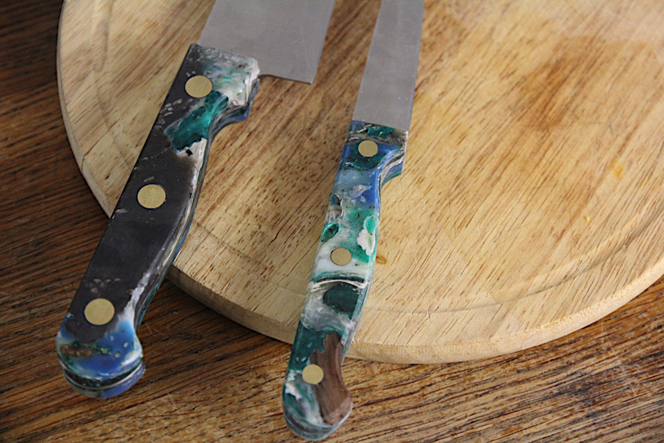
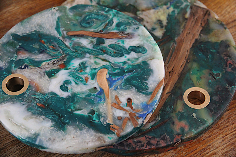
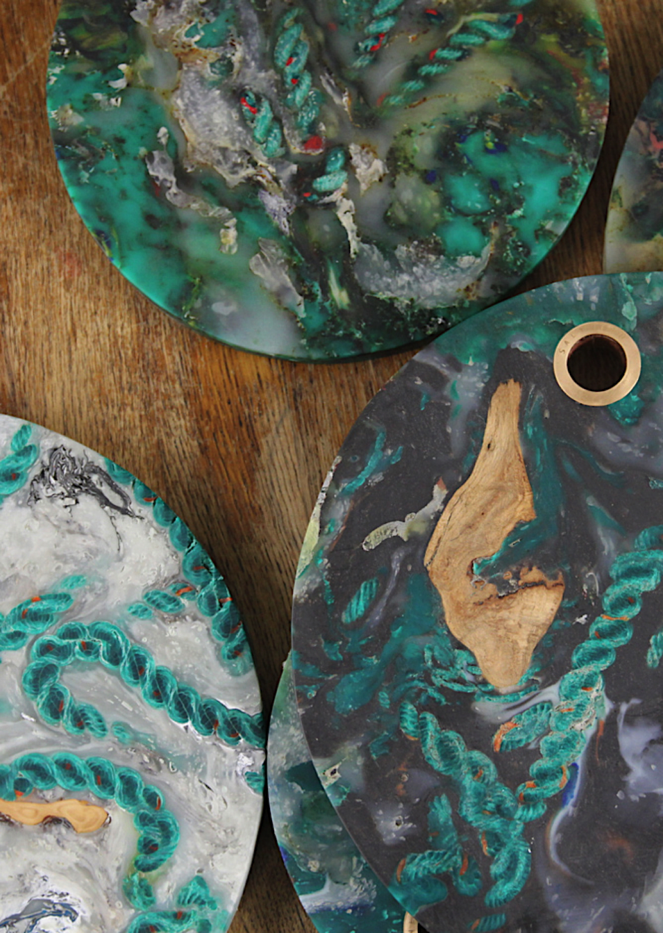
Antonia (Toni) Packham is just graduated from the University of Brighton in 3D Design. She explores the possibilities of waste materials found on beaches such as plastic fishing nets. By transforming waste into beauty, she questions our relation to waste and open a door on what could on new material. For you to get to know her better we asked her a few questions. What is the main inspiration for this project? The project was sparked by my research into plastiglomerate, a plastic stone that has been discovered on the shorelines of Hawaii. Natural materials such as wood, shells and sand are joined together with melted plastic to form a stone like material. I was motivated by the abundance of plastic waste along the East Sussex Coastline to create a material like plastiglomerate that would speculate how plastic might be found in the future. It’s a material that embodies the conflict and connection between the natural and man made environment. With the negative effects of plastic waste ever increasing, I hoped this project would address it in a positive and accessible way. Do you think plastic waste of could be used for mass-production objects in the near future? I think the potential is there. Within the design sphere there is ongoing research into addressing waste plastic but there needs to more commercial uptake with the right systems in place to collect it. Plastic waste has huge potential as there is so much of it available and it needs to be used productively. What fascinates you about designing new materials? It’s exciting to see waste which is deemed as worthless being made into something valuable. I like the narrative that these materials tell, when waste from a specific site can be re-processed and made into something for that local area, it is particularly interesting.
Can you tell me a little about the design process, how do you start your design and what’s your goal? As I’m very material driven, I often work backwards; starting with a material and its properties and then seeing how it can be applied to a product. The outcome often differs from the initial goal as the material dictates the direction of the project. How would you describe yourself as an awareness activist, as a designer? I wouldn’t particularly say that I am an awareness activist but I am very conscious of the negative impacts of plastic pollution on the environment. I enjoy working with waste materials and designing so on reflection I would say I am a designer. I think that designers have a responsibility and a role to play in ensuring that waste materials are used positively. Do you think the impact on society of a work is key? I think its important to consider the context of work, in this case plastic pollution is a huge problem and so when working with it, it was important for me to create something that was accessible to the public, that could be appreciated on its aesthetic merit and prompt discussion about plastic pollution. How do you see yourself in the coming years? I’d like to continue working with waste materials and see where it leads. Ultimately this could mean having my own established studio/workshop or working for an organization which shares my values. Interview by Cecile Poignant
`
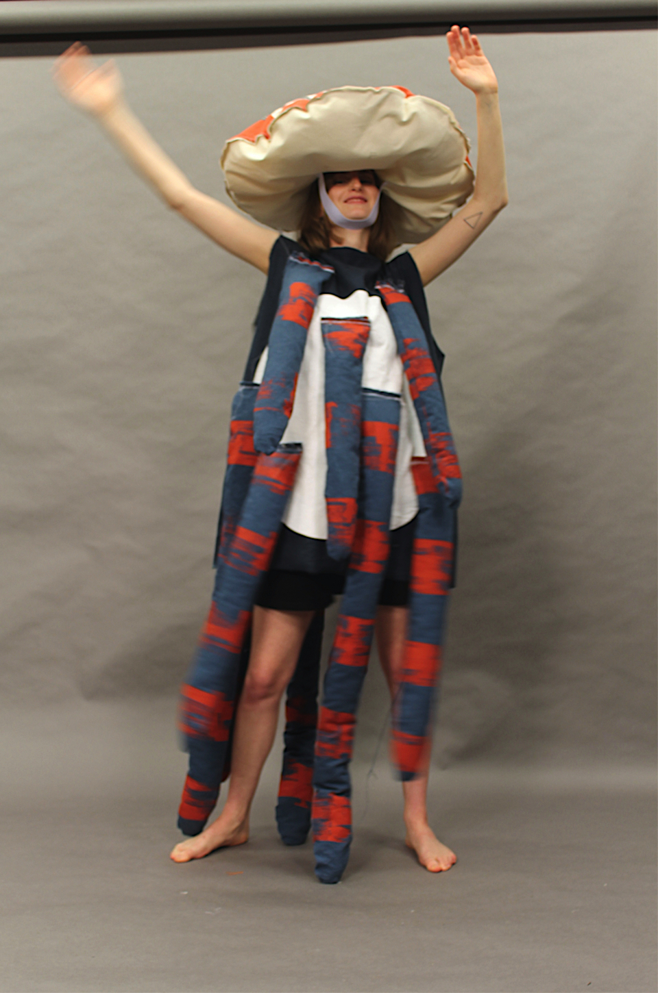
betty liu
The 21-year-old RMIT fashion student Betty Liu explores the multiple functions of clothes with particular interests paid to technology, sociology, identity, and nature. As a fashion practitioner, she is interested in exploring issues surrounding gender, post-colonial discourse, and consumption. Currently, she is in her last year of uni, working on her graduation series. Her last project ‘After Print’ is all about bee’s and we asked her some questions about the project. Can you tell me something about your After Print project? This series is a trilogy of works that explore nature from the sight perspective of bees as an effort to raise awareness to colony collapse disorder (CCD), a phenomenon that has drastically impacted the bee population in North America and Europe. What was your inspiration for this project? The television series Black Mirror actually informed me about this phenomenon and a Japanese manga: Meitantei Conan gave me the idea to look into the after image illusion and combine these two together. Can you explain your creative design process? I always start with asking myself what I want to portray with this work by writing down thoughts and linkages to different types of sewing techniques, garment archetypes or silhouettes. Then I explore various design techniques such as collage, draping, deconstruction to see if I can find any outlooks that will work with the concept. The process is repeated again and again until I am satisfied with the result and that’s when I start drafting and making. What is your goal with this project? On one hand, it’s to bring awareness to CCD and the decreasing bee population while also exploring how to execute these ideas in relation to color theory and sculptural forms. What are your plans for the future? I would like to continue working in the field of fashion after I graduate, ideally where I have my own practice; not sure whether I want my own label or not. Interview by Isabeau van Maastricht
hana fujimoto
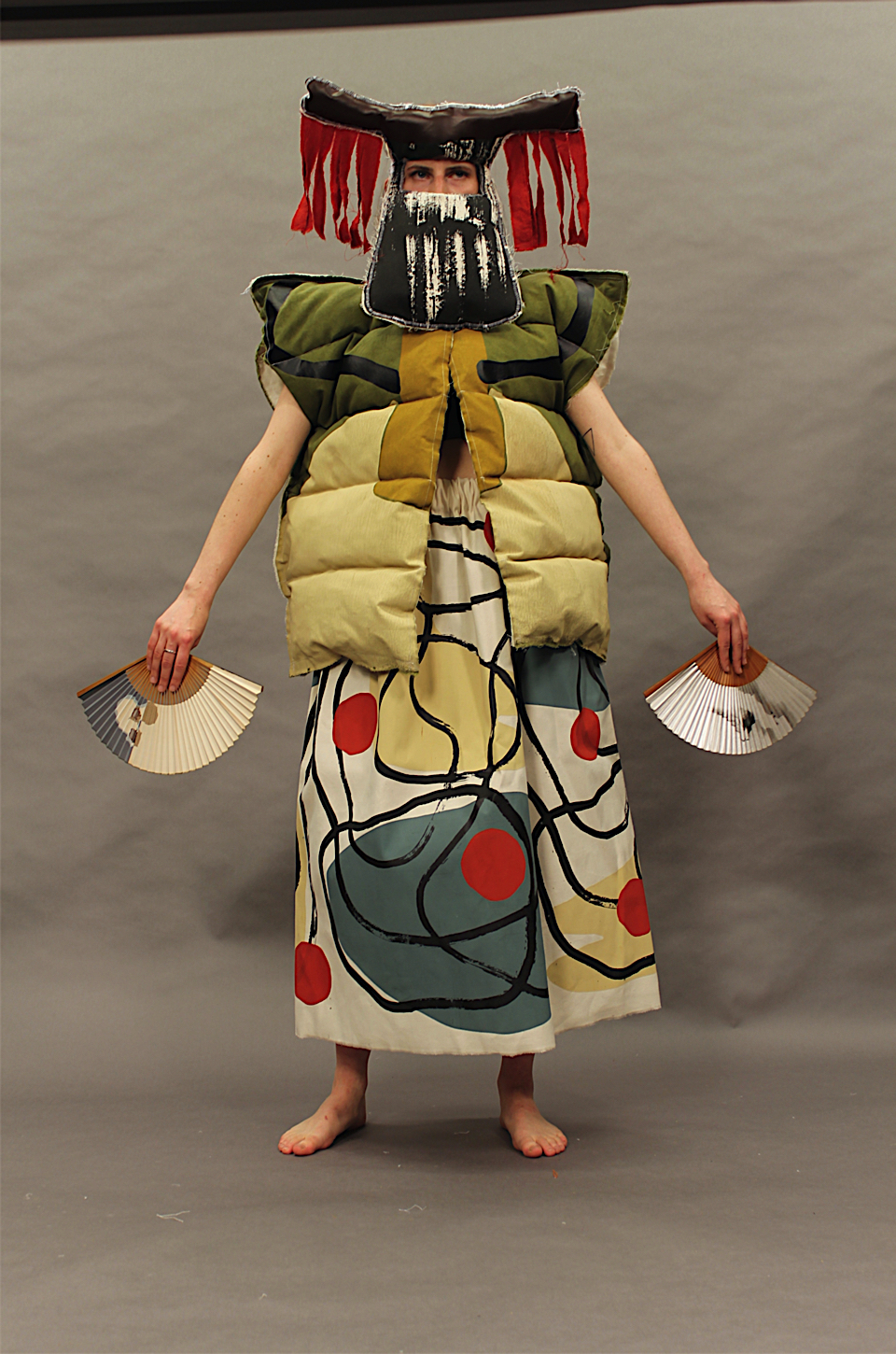
Hana Fujimoto is a London based artist and textile designer. She is half Japanese and this cultural heritage plays a strong role in her identity and the work she makes. Her work is multidisciplinary and seeks to portray a personal and emotive journey through daily practice and rigorous research. Abstraction and unexpected humour are key themes in her work. To get to know her, her work and her view better, we asked her some questions, What is your main inspiration and how do you translate it into fashion pieces? My main visual inspiration is always taken from the mundane everyday life. Walking is a crucial part of my visual research. I walk everywhere and collect found items, take photographs and take notes from my stream of consciousness. I then translate this information into abstract paintings and small sculptures, which then inform my design work. Abstraction and painting is always the key theme in my practice and my visual development holds the same importance as the final pieces. I previously come from a fine art painting background so I always see my work as art rather than fashion; hence my final project being a collection of costumes for performance art. Your designs are all very colourful. What is your relation to colour? For me, colour is mood and emotion. Colours seem to trigger an emotional response from people and that is always my objective: to provoke an emotional response. I create my colour palette through rigorous primary research then meticulously create my own colours from scratch by dying all my fabrics and making print pastes from pigments.
What do you want to say throughout your designs? What is your message? My designs are an expression of a personal and emotional journey. All I want my work to do is to convey some sort of emotion that people can connect to in their own interpretation. Although I take my practice very seriously, humour is always present in my work because I think art should be accessible to everyone and I want people to see that it’s not always so serious and makes the world a lighter place. What is your goal as an artist? I enjoy exploring my potential through various mediums whether it be painting, printing, sewing or something else. Making art and being creative for me is a compulsion and an on-going journey without an end destination. What does the future hold for you? The future is uncertain but for now, I am training to become an art teacher and I currently work in a special needs school. I am always continuing my practice and plan to create a new body of work soon for a group show. I have yet to spend my grant from winning the MullenLowe Nova Prize, so this will fund my next project. Interview by Isabeau van Maastricht
vanessa schindler
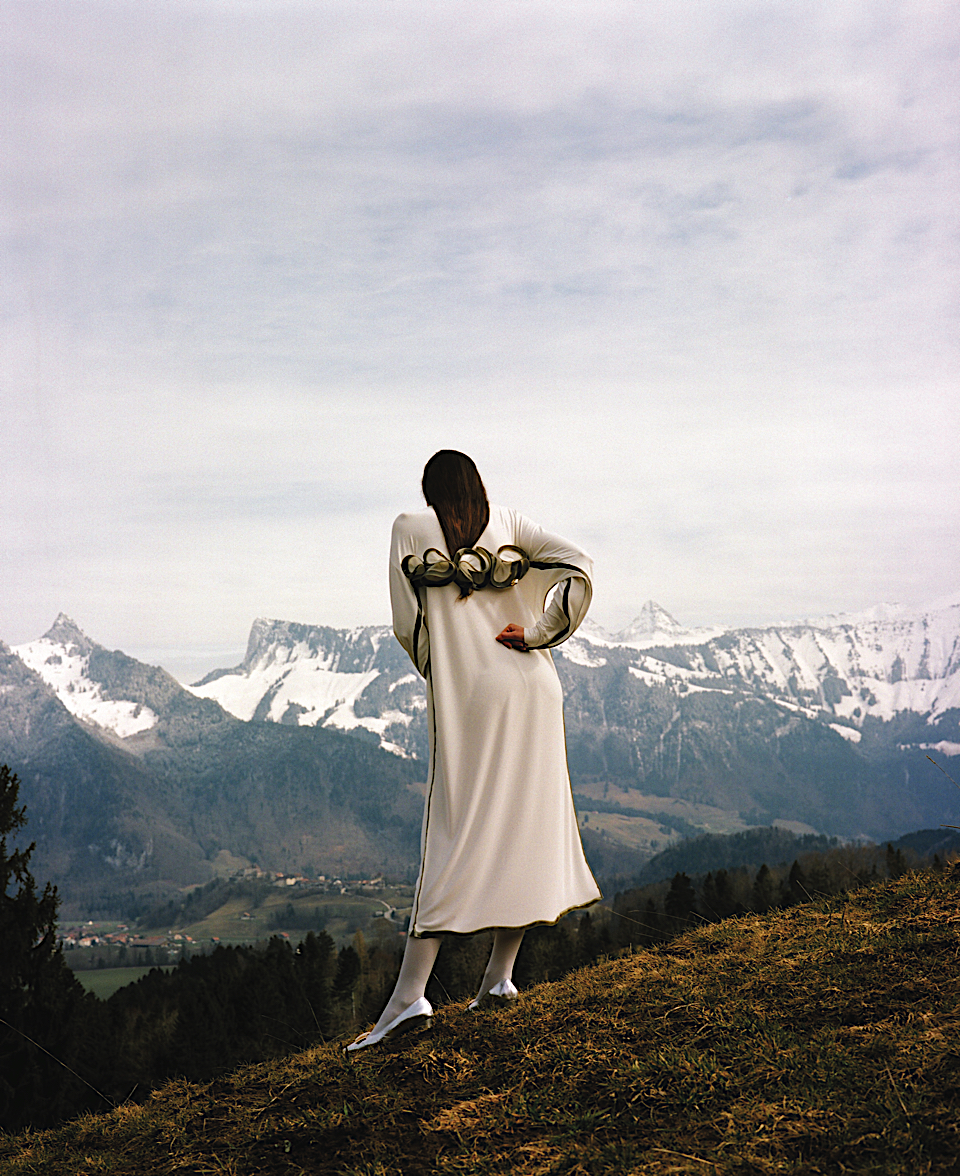
Vanessa Schindler, a fashion designer based in Switzerland has created a whole new way of sewing. Instead of sewing pieces of fabric with thread, she melds or glues her creations together with liquid urethane. We wanted to know more about this technique and her way of working and asked Vanessa some questions. How would you describe yourself as a designer? As a designer, I question the way how garments and accessories are made. It always starts with a technical aim that comes from a research on textiles and constructions. In my last projects, the idea was to find a solution to build a garment by hand in my studio. I wanted to invent a kind of new craft and to come back with a gesture of a hand. On what point you thought about another method than ‘normal’ sewing? At the very beginning of this research, I had the utopian idea to be able to mold fabrics. That is why I started to work with this polymer called urethane. I poured it on different kind of fabrics and made a few discoveries that really interested me. First of all, I realized that the material went into the fibers and froze it. It allowed me to think about a new way of finishing processes in my garments: a line of this urethane became ahem, a neckline or any kind of opening. Then I also discovered that I was able to join textiles with it. I put 2 layers of a thin fabric on top of each other and drew a line. The material went through the two layers and attached them. So this whole project was around the idea of a garment totally drawn by hand. How did you develop this innovative technique? What was your inspiration behind it? I worked step by step by testing a different kind of textiles with this material. I made a ranking of what worked and didn’t. I tried to invent different tools to be able to pour this liquid (mostly like honey) precisely on my pieces of fabrics. The main inspiration was this irregular and spontaneous gesture of my hand. The line is always a bit different and makes each piece unique. This line is a kind of frozen liquidity.
Can you tell me about the process of working with liquid urethane? I developed first of all so many samples of construction with different kind of fabrics and this material. Then these tests made me developed another way to pattern my garments. Since this material is liquid I have to work flat on tables. The pattern needs to be always flat as well. I use the textiles as huge pieces of paper where I draw the edges of the garments. I made some patterns out of plastic sheets and place it in between my two layers of fabrics. This technique allows me to guide my hand when I draw. Then it has to dry and finally, I can cut around the lines. This is mostly how I make my garments! What are your plans for the future? I will edit some pieces of my last collection I shown this year at Festival de Mode, Photographie et Accessories in Hyères in South of France. To me, it is so important to offer to my customers this gesture of a hand. So I make very limited editions. For now, I work in my studio in Lausanne in Switzerland. I am now editing some earrings. I will have a residency at la Cité des Arts in Paris in September and I will produce these pieces in my studio. I would also love to continue to research the construction of garments. This work with urethane is more a reflection, not a solution. I just want to believe that is is possible to question the production in the fashion field and I think there is a lot to do and think about! Interview by Isabeau van Maastricht
vanessa barragao
Vanessa Barragao is an all-ecological textile artist based in Portugal who after graduating from the Master Program at the Lisbon University in Fashion and Textile Design came to open her own design studio in 2014. Her inspirations of the ocean are depicted in many of her art works, which is deeply connected with her growing up and living in the seaside in the south of Portugal. The design studio is best known for their work with artisanal techniques and for using recycled materials such as wasted yarns from the industry to create organic textiles and products for interiors. By using wasted yarns she reduces the leftover and spill of the industry while creating something new. Vanessa’s artwork has a strong and clear ecological message for her audience that can be experienced through her different color shades and coral motifs. Vanessa carefully observes the effects that human kind has left on our planet and rejects the very polluting textile and fashion industry of today. Instead she is an artist with a cause and aims to bring back the importance of artisanal and traditional techniques that today unfortunately are fading out. For you to know the artist better, we asked her some questions. When did your passion for artisanal techniques first emerge and why? Since my childhood I was in contact with artisanal techniques, my grandmothers are knitters and do a lot of crochet and this influenced me so much. When I started the university in Fashion Design I decided to focus on handmade and artisanal techniques to produce and create my collections. After completing a Master Degree at the Lisbon University in Fashion and Textile Design what made you want to start your own textile studio? After I finished the Master Degree, I realized that fashion wasn’t really the path in which I wanted to focus my career. Being an artisan and craftsperson, I love to experiment and textiles were definitely the field I wished to develop. Why do you choose to work mainly with recycled materials? The textile industry is one of the most polluting in the world. In almost everything process, chemicals are used specially when it comes to the fibers treatment and dyeing. All the machinery used requires tons of energy while producing a lot of waste and disposable trash. It is extremely harmful for our world and it affects all of its different natural environments, particularly the ocean which absorbs 90% of the atmosphere pollution, warming up itself to the point that so many species get threatened, being the corals, who sustain so many other creatures, one of the most endangered ones
I truly believe in an up cycling effort towards the right way to try to fight this kind of negative mindset described above. All the materials used come from the deadstock of several local factories which are first cleaned and then selected to be reused in my projects. Where does your biggest source of inspiration come from? My biggest source of inspiration is the complex structure of coral reefs, which are truly cities of the bottom of the sea, which are the most impressive thing that I have ever seen. What is your favorite stage in the crafting process? For me every stage has its own importance and I enjoy each step of the crafting process mostly because there are always infinite possibilities to be discovered which at the end turn out to be a wondrous journey. Could you explain why some of your environmental works are crafted with very rich colors whilst some remain muted and restricted? While trying to replicate abstractly the coral reefs as they are in our present time, my goal is to give a chocking contrast between the colorful and the colorless because while the former means life, the latter is indeed the representation of the coral’s bleached effect and therefore its death. Being an all-ecological textile artist what is the main message that you want to portray to your audience? My ultimate goal with my artworks is to raise awareness of the dark consequences that our footprint is causing on Earth, particularly in the water habitats, and hopefully, this way, I can contribute on giving a more clear and bright perception towards a cleaner ecological path. Interview by Amanda Andersson

angele fourteau

Angèle Fourteau presented this diploma project in June 2017 for a Master Design for Luxury and Craftmanship at écal (École Cantonale d'Art de Lausanne), Lausanne, Switzerland. Her goal is to cross Science with Design.
Here is how Angèle is explaining her approach:
"Textures Cosmiques" is based on Nasa’s pictures of Mars and other planets of our solar system.
I first was interested by the textures of those planets, caused by impacts and traces of geological and meteorological effects, and the goal was to try to visually reproduce those textures and create a material to work with.
During the research process, my experiments with soils and resin were quickly linked to pedology (science of soils studies). This science field is using the same principle, but for a microscopic study's purpose. How it work ? A part of the soil is selected and extracted, then in a laboratory, a resin is poured on it to fix the soil block. Then, after few days of drying the block is cut into thin sections up to 30 micro millimeters.
Fascinated by the range of textures, and color possibilities depending on the typology of soils. I decided to work with this material as it reminds me the cosmic textures of the planet’s pictures. Thanks to a partnership with Folkert Van-Oort, (Artist and Pedologist) I was able to reuse his leftover of the resin blocs and recycle them.
I choose to value those materials by creating two collections of unique jewelries inspired by Nasa’s Mars cliches of dunes and comets impacts, the shapes are guided by the images.
angelefourteau.com


erika marthins

Erika is a 25 year old Swedish student in Media & Interaction Design at ECAL. After spending most of her life in her hometown Stockholm, she decided to take on the challenge of learning a new language and, therefore, she moved to Switzerland in 2012 to learn French. Erika have cultivated her passion for design and entrepreneurship since she was 16 years old that lead her to undertake a Bachelor program in Media & Interaction Design at ECAL in Lausanne, Switzerland. ECAL has boosted her ambition and creativity including her technical skills and given her a chance to develop her competitive edge. It is particularly the stimulative aspect of the "design world" that pushes her to constantly be creative and innovative in every aspect of her studies and daily life.
"Déguster l’augmenté" is an experimental project exploring the potential of integrating data information in food. The project answers theses questions: how could we consider food in a new way with the process of todays technology? What if we could augment our food? Would it be possible to extend some dishes to a new dimension? It’s a desire to enhance storytelling on food. A poetically extending proposition for three desserts.
"Déguster l’augmenté" includes three desserts, expanded with data in a poetic way each with a unique feature: animation, perception and sound.
Dessert à l'Air: animated desserts are created using edible robots, the sweets of the future.
Lumière Sucrée: a lollipop uses external lights to refract a hidden message contained inside.
Mange Disque: chocolate records allow us not only to hear, but to taste sound.
Cecile Poignant
Project by Erika Marthins in collaboration with Chef Fabien Pairon at Ecole hôtelière de Lausanne, Romain Testuz at Rayform (Rayform light shaping technology), Dr. Jun Shintake Laboratory of Intelligent Systems (École polytechnique fédérale de Lausanne). Special thanks to: Michel Ferla (EHL), Dario Floreano the Director of Laboratory of Intelligent Systems (EPFL).


Photo Younes Klouche


Photo Younes Klouche


Photo Younes Klouche
fransje gimbrere

photo by Angeline Swinkels
Fransje Gimbrère is a multidisciplinary designer, born and raised in Tilburg, graduated in 2017 from the Man & Identity department at the Design Academy in Eindhoven.
She observes and explores the world with profound critical thinking and an intuitive interest for the aesthetics of shape, color, image and material.
Her concepts and designs often contain contradictory elements and a new playful approach, that she uses to push boundaries, resulting in a little idiosyncrasy or raw edge in every one of them.
The desire to bring textile into the interior in a different way than we are used to, resulted in a technique that creates fragile looking skeletons, hat give the suggestion of a solid volume.
A lack of support and hollowness make them seem on the edge of breaking, though their structure is strong and sturdy.
Therefore, they can not only carry themselves, but also the human body.
The volumes are built up, thread by thread, on a custom-made weaving loom. 3D-woven configurations are experimentally discovered on the spot. An engaging play of repetition and overlapping lines create an interesting visual interference.
This method creates endless possibilities in color, shape, material and application, giving direction within the interior, without diminishing the sense of space.
For you to know her better our editor, Cecile Poignant asked her some questions.
What was your main inspiration for « Standing Textile(s)"?
‘Standing Textile(s)’ was born out of the fascination for textile crafts. Textile crafts enable a person to create something by hand relatively fast with relatively little means. Weaving, knitting, crocheting, knotting etcetera are all very approachable ways to create, but unfortunately are often seen as old fashioned. I wanted to shine a different light on textiles and textile crafts, by using textile in the interior in a different way than solely as upholstery. By 3D- weaving these textile sculptures I’m proposing the idea of textile as a beautiful new building material, with endless possibilities in application.
Do you think the textiles of this project could be used for mass-production in the near future?
At this moment I am still producing my textiles by hand, so mass-production in the very near future might be a little too ambitious. The technique needs more development, but I certainly believe that in the future we can have machines, that 3-dimensionally weave lightweight structures for us to use, live in and even drive in.
Therefore I am now seeking for the right party to help me further in the development of the technique and fine-tuning the material.
What fascinates you about designing materials?
Materials are intermediate products; they can still serve all sorts of applications and leave some room for imagination. Besides that, materials speak to all the senses; therefore designing materials is like designing an almost ritualistic experience for the body. Seeing, hearing and touching materials evokes thoughts and feelings.
It is like a poetic communication between the body and materials.
I’ve always been fascinated by the human body, how it functions, how it behaves, how we present it and how it relates to a space. Fashion and Interior are all about the interaction between the body and materials.
Can you explain more the idea of multidisciplinary that you use to describe your work?
My designs start in ideas or in concepts, not in end products. I start designing by experimenting, trying to push boundaries and show other sides of the things we seem to take for granted. Every concept or design is different and therefore requires a different medium or discipline. The mediums I choose to communicate my designs can range from film, to textiles, to interior products, to garments, to trend forecasts and more, but also combinations of these.
Can you tell me a little about the design process, how do you start your design?
A starting point for a design could be anything, from wanting to show the value of a certain technique, to the way we move in a space, to how we treat our bodies. Having a subject in mind, I start experimenting and sketching 3-dimensionally with materials, shapes and colours, creating an imaginary world or story, with its own atmosphere. From here I begin to work towards the application and purpose of the design, narrowing down by evaluating every creative step and outcome of experiments.
How much impact would you like your work to have on society?
In general, the messages that I want to bring in to the world are a little bit under the surface of my designs. I want to show people different sides and angles of the subjects that my projects are about, without serving the answer on a silver platter. I like to make people wonder and think, which I think is one of the best ways to stimulate viewers.
What are your plans for the future?
At this point I want to continue working on developing my existing projects, hopefully together with others. Collaborating and working in teams, is something that is very inspiring to me. I want to keep learning and can hopefully do so, by collaborating or being part of a bigger company, studio or even multiple collectives to keep sharing ideas and keep creativity flowing. Eventually I hope to make my own autonomous work next to commissioned projects and collaborations.
Cecile Poignant
www.fransjegimbrere.com

photo by Ronald Smits

photo by Ronald Smits

photo by Ronald Smits
sara regal

Sara Regal born on the seaside of Galicia, Spain, was deeply enriched from her native environment. After studying in Spain she moved to London, where she gained experiences working across diverse disciplines. Subsequently she mastered on Product Design at ECAL, in Switzerland, enabling her to explore and develop her own methodologies. Regal graduated in 2017.
Currently in Hong Kong, she is teaching product design at HKDI where she is discovering modern mass production and its correlation with traditional Chinese crafts.
For her diploma project she was inspired by recycled Pu foam: « I was captivated with its strong colorful patterns and rawness » She worked in collaboration with a Swiss recycling factory, she understood its potential as along life cycle product application.
FOAM-IT is 100% recycled and recyclable seating system for pop-up events made out of polyurethane foam scraps. There is a big necessity to create useful applications for the large amount of scraps produced instead of ending their cycle on landfills. Therefore, this recycling methodology is applied to a furniture system for events in a collaboration with a recycling factory based in Switzerland, considering the existing resources to keep the whole life-cycle on site. The component shapes are flexible enough to create infinite possibilities that can be assembled on site.
Regal elaborates an intuitive and experimental approach centered on material qualities and production, with a strong influence on color trends and art direction as we can see in her previous projects .
« Cuerdas », a quick production hand made sandals is made by a continuous rope, wrapping the foot’s anatomy like in the traditional espadrilles. The industrial material brings a new aesthetic to the craft sandal world alongside a long lasting product due to the strength properties of the rope. Each pair takes 10 minutes to be hand produced, speeding the craft labour.
« Garbo”is a flooring system which hides and leads the cables at the workspaces. The usual solution is to wrap them with metallic profiles or cable sleeves. The carpet is composed by a top felt layer and a bottom rubber grip. The rubber grip leads and keep sort the cables underneath, while keeping the carpet secure on place. The cables are imperceptible while walking on the top. Trough the rubber pattern on the top the user can pull out the cable at the desired point.
We will sure keep an eye on such a promising young designer!
Cecile Poignant


`

snap together for animals

Violette van den Berg is half French half Dutch, she is a student aspiring to become creative strategist and is currently studying Branding at the Amsterdam Fashion Institute. With Aron Meier who is also a 3rd year Branding student they are the winners of the 2017 ‘New Blood’ award at D&AD (Global Association for Creative Advertising & Design Awards) with a campaign for the NGO brand and anti- fur organization – ‘Respect for Animals’.
The team want change people minds by creating a contemporary campaign against the use of fur. “We choose this brief (out of 16 options) as it was the most linked to fashion – meaning we could have a relevant perspective in comparison to other candidates. As fashion has a long history with fur, we thought it would be interesting for us to tap into that subject and explore why people wear fur.” says Aron.
The choice for Snapchat as a communication tool seemed obvious, as Violette explains: “Generation-Z’s favorite app is Snapchat so we looked at the platform and we discovered the filters. A lot of them have fur animals. Users put dogs, foxes and rabbits on their faces but they never think about the fact that these animals are killed for fur.”
Snap Together for Animals is a campaign aiming to put fur back in the conversation by disrupting users' daily experience of social media (such as Snapchat and Wechat). Violette and Aron remove digital representations of animals, like the Snapchat lenses, to show the young generation that real animals are in urgent need of their help.


flaka jahaj x bonne reijn

The Fashion & Textile Industry is currently reinventing itself - going from out of fashion into fashion, trying to find ways to bring it into the 21st century.
Whether with recycling materials, sustainable textiles, handmade items, seasonless collections, genderless approaches - finding its way back to the root of analyzing the garment itself.
Iahai International x Bonne Life two experts in their own field, coming together to develop a future recipe.
Chloe Sos: You both seem to explore the “labour of love” within the garment. Flaka, you from the exploration of materials and handmade traditional crocheting, working with Ateliers in your home country where you employ Kosovar Women to preserve traditional knitting techniques and Bonne, you from the volume perspective of reimagining the workers suit and genderless shapes. Was this where this collaboration initially originated from?
Flaka: It started out when I discovered Bonne's suit and orderded one. I have 6 by now....
Already there I realized that Bonne was interested in much more than fashion. I saw he's doing art projects & music, fading the boundaries of singular disciplines, empowering the youth. I researched and read all his interviews. In one interview he mentioned Rick Owens and Issey Miyake to be his favorite designers, both brands I have worked for. I liked his approach of going back to uniform. I was at the same point in a different field but with the same mindset.
Last year I did a pop up shop in Zurich on the prestigious Bahnhofstrasse and invited Bonne to send me some suits to sell, he didn't only bring the suits but came along with Smib a punk/rap collective from Amsterdam and Bonne's inner friend circle/family.
We celebrated the opening together and decided in Zurich to do a collaboration.
Bonne: Yeah, so we try to do 4 drops of the normal suits but in different colours and 4 times a year a collaboration with an artist who uses my pattern but can do anything he or she wants. Flaka was the perfect fit and we've known each others since the brand started. Flaka's suits fit perfect with our collaborative philosophy and truly reimagines them in addition puts everything in an amazing new perspective.
The Knotty project by Pawel Lasota & Madga Mojsiejuk, one of our Talking Textiles Talents translates the knitting technique into the language and movement of a robot. Flaka, preserving traditional techniques is key today for any brand to survive but with new developments in the textile industry and the binary approaches of high-tech / low-tech, where do you see the traditional crocheting techniques influence the knowledge of potential machines? Would you ever consider exploring experimenting with it? If yes, how so if not why?
My favorite technique is crochet because until this day there is no machine able to recreate this textile or the possibilities of within this technique.
I'd love to sit together with a machine engineer and nerd around trying to figure out a way. But I think I prefer to preserve the artisanal handicraft rather than forcing it into technology.
Certain things can not be created by machines and shouldn't. I like the human error for example. I like perfection within finishing and details but I love when somewhere in between a tiny little error appears making it human.
Locally sourced materials and production is a treat with all the outsourcing surrounding the industry. You decided to build your atelier in Kosovo, to slow down fashion and preserve and readapt.
How does it work in terms of production? It of course allows you to provide jobs to a neglected atelier but also how to do you see the production developing over the next years and how will you adapt to the potential growth? What are the key struggles and how could we get more brands to produce in Kosovo?
Flaka: The structures of my atelier are quite loose. The women pick up the work and mostly work at home. Being able to take care of their children at the same time. They decide themselves how much work they want to pick up.
Artisanal Know-How is spread throughout the whole country because they value cultural traditions to this day. So I have no problem finding women who excell in handcraft.
The only problems I have for example are finding local organic yarns or having it shipped to Kosovo. Because of the war any infrastructure of the technological textile industry is shut down plus the know-how disappeared. The country is closed up from Europe and does not appear on the maps of UPS or DHL which is really annoying for the production to run smoothly.
For everything to work better everything is needed.
I guess I have an advantage to be able to live in Europe and proclaim the beautiful heritage and meticulous arts and crafts of my country of origin. So I see it as my responsibility to spotlight it.
Bonne,You focus more on the question of a 9am to 9pm uniform, providing a solution to the fast pace lifestyle we live today, for every individual. How are you rethinking the measurement process and the approach to a genderless brand? Why is it more important now than ever?
My whole approach with starting my own brand was that it should be for everyone. I wanted to start a new way of approaching a garment. I think a lot of the ways we've been perceiving fashion the last let's say 50 years, is overly complicated and laced with too many assumptions (or is it forced assumptions?) about what peopled want/need. To me clothing should be simple. Cheap, long lasting, and for everyone, so for me making a gender less brand feels like logic. I would never make a garment that's only for certain people let alone one gender. It not only messes with your money but it also makes other people feel left out. A product should be available for everyone.
Your suits are made to work and live in - following your previous collaborations they become a blank canvas for creatives to express themselves. It seems that you are testing the waters in the art world as well, which is crucial as the new fashion inspirations happen at art fairs and designers bringing art on the runway. Will you consider focusing on building a sub world of art where textile art could grow?
Bonne: For me it's already an art form. If you look at for example the starting of hip hop. It's all about expression really. I don't really know about the fashion inspiration at art fairs. I think it's pretentious. My opinion is that it should be done effortlessly. Not as a marketing tool but as a pure expression. With starting Bonne Suits I felt the need for it. It think expression is best when somebody truly feels the urge.
Having experienced the fashion industry first hand - collaborations and capsule collections are currently playing a big role in todays fashion world. Withal it creates a base where expertises come together to build a better product. Will you continue with collaborations and will you see it being part of the 21st century fashion industry?
Flaka:
I'm happy we reached a point where we won't compete with each other but unite what each can do best. I think this should happen all the time and much more.
It's a win-win really for all the collaborators in every aspect.
Bonne:
Collaboration for bonne suits is key. We need it to grow and see our product in a different light every time.
Last but not least Flaka x Bonne: What new developments are you looking into and why?
Flaka:
I'm moving cities from Zurich I'm relocating to Amsterdam. I got to experience this city while working on the collaboration with Bonne Suits and I love it. There I will be focusing more on little series of handmade items like a limited series of my pompscarfs and jumpers, little series of knitted jumpers and textiles rather than working on seasonal collections. I want to enlarge my field of work and horizon. I'm also working on a collection with my sister Bleta Jahaj, who's an artist and another collaboration with my best friend from high-school Nina Job who is also a fashion designer. I'm so exited.
Bonne:
We're doing a complete new suit. It's gonna be the same price but a bit more dressed up. Also we're doing a big collaboration with Irma Boom which is crazy for I've been her biggest fan for a long long time.


moisés hernández

Moisés is a Mexican born designer based in Mexico City. His hometown, being chaotic and over populated, as well as Mexican objects, traditions, textures, social contrast and chromatic diversity are elements influencing Moises’ work.
Moisés have always been atracted by simplicity and fresh ideas and that is why he decided to study at ECAL, in Lausanne Switzerland where in summer of 2013 he became the first Mexican to get a Master of Product design from this school obtaining special mention.
The concept of this vase collection is to have different cylindrical containers that are connected between them but with independence at the same time, each container have different diameters and heights, giving the feeling of rhythm and balance.
The vases are made of borosilicate glass, which allows a pure and geometric appearance, with clean and solid connections.
The cylinders heights incite to play with the flowers, giving individuality to the elements of this object and making the flowers and the water look like they are floating, generating a micro landscape feeling.


Quinten Mestdagh

Quinten Mestdagh from the Royal Academy Of Fine Arts Antwerp has a great talent, his garments are spectacular and complex. They reflect our modern obsession for messages and personality. This strong and colorful collection was inspired by ripped up publicity panels and a love for fashion photography and strong graphic identity.
For you to get to know him better we asked Mestgagh a few questions:
How did you start this project?
I wanted to work around the concept that showed the power and strength of fashion photography and fashion imagery.
I’ve always been attracted to highly stylized and iconic fashion images in magazines and advertisements and they were the main inspiration for starting the collection.
During a walk trough the Paris metro stations I came across an advertisement from the department store les Galleries Lafayette. On the advertisement there were two models shown who were wearing very skinny trousers.Right from the waist up the poster was ripped off and the silhouette of the long legs continued into the rips of the paper. It created a new and abstract kind of silhouette and it was the main inspiration for the shapes and the graphic identity of the collection.By seeing these ripped advertisements I started to get interested into how you can create, by an act of aggression on a beautiful picture, a kind of tension or disruption on an image.
I started with making collages and 3d paper compositions myself with Images found in the archive of the MOMU library in Antwerp. Glossy pictures of woman’s faces are disrupted by paper rips and shreds resembling the damaged advertisements creating a tension and roughness in contrast with the beauty showcased in fashion photography.
Afterwards I made blow-ups of these prints and started to think how I would translate them to into 3-Dimensional garments.
Can you tell us more about the shapes?
For the shapes of the clothing I looked to the clean and architectural volumes of midcentury couture gowns.
They had and elegance but also a kind of static and strong feeling that worked really well together with the impact of the prints.
I used trompe l’oeil effects by printing the paper collages on different fabrics and reinforcing them with stiff non woven and paper.So it has the effect and lightness of paper but the fabrics have enough stiffness and structure to hold the shapes.I also worked with pleating systems in full skirts where the two pictures are fused together to recreate the feeling of rotating billboards.
How would you describe yourself: as an artist / as a fashion designer / as a graphic designer …?
I tend to work almost always in a very graphical and visual way when I start designing.
I am really interested in the power of image and graphics and it is something that I always try to incorporate in my work.
It is really important to me that the core of my work always starts from a reference that is directly linked to fashion.
Working with contrasts and juxtapositions is a theme that always comes back in my work and I always try to find a way to visualize that.
What fascinates you so much about photography?
In fashion photography its always the direct impact and beauty of an image that strikes me the most.
Your work is very strong also by the way you use colour, what is your relation to colour ?
I really like to mix very bright and hard colors with other colors that are more soft or calm.
It’s always about finding a contrast between them to get that graphic feeling.
I like to work with colors on images that it looks like there has been a filter placed over them and everything gets saturated into one bright glow.
Is your design process always the same ?
It always starts with a lot of visual references who I then place next to each other to create a dialogue or a contradiction between them.
For me this process is a lot of fun because it’s really here where the collection starts to come together as a whole.
From here on I then start to think how these images can be translated into shapes and how they can become a three-dimensional fashion silhouette.
How do you see yourself in the future?
I Hope that one day I will end up in a place or a position where I can continue to work with fashion in the same way that I am doing it and how I am enjoying it now.
Cecile Poignant
Photography: Michael Smits
Make-up: Laura Noben and Cecile Paravina
Model: Luka Van der Veken
quinten mestdagh


teresa van dongen

Teresa van Dongen, AMBIO_photo by Hans Boddeke
Teresa van Dongen recently graduated the Design Academy - Netherland is exploring the boundaries and connection of design and biology. For you to get to know her better, we’ve ask her some questions about her work:
You graduated from the Design Academy in 2014, what did you do until now?
When I graduated my project ‘Ambio’ gave me a flying start: it was exhibited, awarded and published internationally. ‘Ambio’ is a lamp that works on bioluminescent bacteria from the skin of an octopus. The bacteria are inside a seawater liquid, when they are oxygenated by movement they emit a dim blue light. In 2015 I won a ‘Dutch Design Award’ and ‘the Eyes on Talents Award’. The last award allowed me to create a big installation at the Musée des Arts Décoratifs in Paris during D’Days 2015 called ‘One Luminous Dot’, a continuation of ‘Ambio’. Since then I continued to work with microorganisms. My latest project ‘Spark of Life’ is a lamp that works on electro active bacteria.
First you studied biology and after you applied at the Design Academy Eindhoven. What made you want to be a designer too?
Actually, I never wanted to become an artist like many of my friends did, but when I discovered that through design you could make so called "applied arts" I knew that that was what I wanted to do because I love to do or create something for others. The direction "Well Being" at the Design Academy fitted exactly what I wanted to do because it focuses on the well being of all living things and systems; people, nature, animals and the society as a whole.
What aspects of biology are fascinating to use for your designs?
During my study Biology, I noticed that interesting developments in the field of science often didn’t leave the confined space of the lab, or find an application in daily life. I see a great opportunity for designers to work together with scientists and use each other’s knowledge for co-creation.
Can you describe your creative process? How do you start your project, what is your goal and how do you know it’s finished?
To start with, I take a period to do research into scientific developments; I go to lectures, watch documentaries and I read about it. When I find something that takes my interest, I try to find if there is a scientific discipline related to the subject and to find someone working in that field. Often professors are quite willing to call or meet me in person, and at this point I already have some sketches of what I imagine could be a done with the technique I have in mind.
If the professor finds it interesting he/she puts me in contact with his or her (master) students, who are often happy doing something new and experimental. During ‘Ambio’, the students did sometimes even text me in the middle of the night after drinking in the pub, telling me that they would go to the laboratory to check if the bacteria were still emitting light. After I understand the science, technique and the essence of the technology to try to simplify it. Then I try to make the technology part of the design and when it’s working, I know it’s finished.
If I look at the projects you did, like ‘Spark of life’ and ‘Ambio’, almost everything has to do something with light. What makes you being fascinated with light?
I am mostly fascinated with alternative and natural forms of energy. Light is only one of the many "translations" of energy but it is almost a primal need for human beings. We are currently living in a time where energy is a concept that is and needs to rapidly change. I don’t think that the light of 'Ambio’ or 'Spark of Life’ will replace any regular lighting yet, but it surely is a great natural addition to the existing artificial lighting.
Do you think your work could be used for mass-production in the near future?
I think it is possible to produce some of my works in large numbers. At the moment I am investigating the options of making a consumer friendly version of ‘Spark of Life’. For the past few years I have been keeping bacteria samples alive for several weeks in a row during exhibitions. For Ambio that was quite time consuming, it needed daily care. My latest lamp ‘Spark of Life’ is already alive for about a year. This lamp only needs a bit of nourishment once a month. I personally believe that taking care of your lamp enhances the relationship between product and its user.
What are your plans for the future?
I think it is an important step to see if I can create a living lamp that is available on the market. I have noticed that there’s a great trend where designers create experimental and conceptual designs. It’s important to show people that also these experimental designs could become part of your daily life. Besides making prototypes, which I love doing the most, it’s important to take the experimental crossover of disciplines to a next level and make it available to anyone’s interest. My dream is that people have to ask their neighbours to feed their lamp whenever they go on a holiday.
Nine van der Wal

Teresa van Dongen, AMBIO2_photo by Hans Boddeke

Teresa van Dongen, AMBIO photo by Hans Boddeke

Teresa van dongen, Spark Of Life photo by Hans Boddeke

Teresa van dongen, Spark Of Life photo by Hans Boddeke

Teresa van dongen, OneLuminousDot photo by Hans Boddeke

Teresa van dongen, OneLuminousDot photo by Hans Boddeke

Teresa van dongen, OneLuminousDot photo by Hans Boddeke

Teresa van Dongen, LUMIST photo by Hans Boddeke

Teresa van Dongen, LUMIST photo by Hans Boddeke

Teresa van Dongen, LUMIST photo by Hans Boddeke

Teresa van Dongen, LUMIST photo by Hans Boddeke
cox janssens

Dutch designer Cox Janssens graduated last year from Design Academy Eindhoven. She has created things as long as she can remember: drawings, prints, comics, stories, poetry and songs.
Her project ‘Time Included Cloth’ is a series of textiles that embraces time and use. Instead of diminishing clothes, she turns their change into something positive. Textiles become more interesting through processes such as washing, surface friction and color change by sunlight. With this, the consumer is tempted to use them longer.
What was your main inspiration for this project?
The idea was born three years ago. I can feel very guilty and responsible towards things. The overall idea in society is that something looks best if it looks like new (with some exceptions of course). So mostly, traces make things less attractive. However, I realised that I could feel emotionally good if I saw traces of use on products, because it shows these weren’t made for nothing. That’s why I thought about creating good looking ‘traces’: so that we are actually rewarded by usage
What do you hope to achieve with ‘Time Included Cloth’?
To spread the idea that sustainability can be fun. As it’s the most important topic in design, it can feel heavy weighted and a lot of responsibility because we need to buy less and use things longer. This project can be an inspiration for both consumers and companies, to see that there are various nice notions of durability. It would be great to make this accessible for many people
Do you think the textiles of this project could be used for mass-production in the near future?
I would like to develop this project further, make it easier to produce and super sustainable. To achieve that I need investors and partners from the industry, so unfortunately this will not be in the near future but I am working on it. Besides that, ‘Time Included Cloth’ is also the opposite of what most industries want, because if people use things longer, you sell less. Nevertheless, I hope some will see change as a quality; to make people dare to use it with pleasure
.
How would you describe yourself as an artist?
As an artist I treasure diversity and my broad interest and need to be socially involved are bringing me that. Furthermore, I like to observe human behaviour, question norms and see paradoxes. In my work I use humour and make unexpected connections, to show different sides or positivity in something that is known for the opposite. I create better things through discussions with other people and highly believe in unusual collaborations between the creative industry and other industries.
Whose work do you admire and why?
David Bowie is a creative I admire because during a lot of experimentation he was still able to deliver qualitative, characteristic music. He was curious after other professions and unusual collaborations and used this for music videos and album covers. The inspiring thing to me is that you can be diverse yet ‘yourself’ and that you never achieve something alone.
Are you currently working on a new project?
At the moment I’m developing my graduation project, which is very different from ‘Time Included Cloth’. For this project I worked together with psychologists to create a set of cards that can be used as a conversation tool to talk about norms and desires around having children. I visualised about hundred motivations for having or not having children. The cards help to distinguish your own desires from those projected by outsiders.
What are your plans for the future?
I am now part of a starting up collective of designers and workspace for other creative people in Rotterdam: The Commune. It’s so interesting and exiting to see how collaborations evolve. I’m also curious to work with people from very different cultures. For me it’s important to keep on learning and that can happen everywhere.
Nine van der Wal


joanne tan

Joanne Tan
Joanne Tan is graduated last year from Central Saint Martins with her project ‘Not Your Average Beauty’. She questions and discusses the concept of beauty and today’s media beauty standards through jewellery. She’s interested in the interaction between humans and objects and human’s complexity.
How would you describe yourself as an artist?
Art and design are my way of going all out in self-expression. Thus, as an artist, I see myself as the one who creates conversation with or through jewellery; who gives new life towards jewellery and redefines what people would perceive as jewellery.
Why is your project about celebrating natural features through enhancement instead of plastic surgery?
Not Your Average Beauty collection is a project that I want to create conversation and discussion on the topic of beauty and plastic surgery. Through my design, I would like society to be exposed to an alternative form of beauty enhancement and rethink about what plastic surgery and what beauty is about.
What does beauty mean to you?
Beauty is a very dependent entity and heavily influenced by our surroundings. Human aren’t born with an innate knowledge of beauty. But, we acquire the knowledge of beauty through our cultures, societies and mass media.
How much impact does your work have on society?
I believe my work will kick start a paradigm shift on what society would perceive as jewellery and elegance. The reaction for Not Your Average Beauty collection is very subjective. People would either like it or not based on their personal perspectives.
Can you tell me a little about the design process, how do you start your design and what’s your goal?
My work is concept driven with topical approaches. Thus, I would first set a theme for the collection, followed by doing a wide range of research related to the theme in the idealization process. Ultimately, I want to create visual impacts, conversation and interaction through or with jewellery using minimal and subtle design.
In an interview, you said you’re interested in human identity. In what way is this related to jewellery?
Throughout history, jewellery has been worn not only to beautify our body, but also to communicate social status, identity and even to protect one from evil spirits and misfortune. When a piece of jewellery is worn, it visually communicates who we are, who we would like to be, what kind of social group we belong to and so on. It reveals information such as character, taste, cultural background, sexual preference, economic status and educational achievement. Above all these shape our identity.
What’s your dream?
People use technology and social media platforms as mediums of communication. My dream is for jewellery to be a means of communication, i.e. the interaction between object and individual when one wears it.
Besides the launch of your own brand ‘JOANNE . T’, what does the future hold for you professionally?
I believe life is limitless, as in my journey as an artist and designer. I hope through various forms of collaboration, we could work together to learn and explore the unlimited. I personally am very excited to see what’s awaiting ahead.
JOANNE.T
Nine van der Wal


Joanne Tan

Joanne Tan
wendy andreu

design wendy andreu - photo ronald smits
Wendy Andreu is a recent Design Academy graduate; she describes herself as a craft designer that communicates through the materials she is using. In her work she bridges matter, people and space and through her project ‘Regen’ she came up with a new and innovative way for producing water-proof garments without sewing or cutting patterns.
Can you tell us a bit about your graduation collection ‘Regen’?
‘Regen’ (‘rain’ in Dutch) was born two years ago when I was experimenting with rope and latex. I found out that the latex could get stuck into the cotton fibers and therefore « glue » them together. By analyzing the property of the material, I concluded that this new fabric was actually waterproof and I naturally directed the function of it towards rainproof accessories. From this first sample, I developed a production system and a finally a collection and brand. The whole making process works with molds: all products are already shaped in 3D, and there is no need of sewing machine to make them. Moreover, by coiling the rope around the mold in one go, there are no material leftovers.
How did your background in ‘metal craftmanship’ influence your project?
Before coming to Eindhoven, I studied metal craftsmanship at Ecole Boulle. This school teaches students the traditional French craft heritage. There, I learned to have a good vision in 3D, precise technical skills and an eye for quality. Some aspects of this education have remained strongly in my mind: as we were forging our own tools with a fire torch and a hammer, I designed my own tools -all laser cut in steel- to construct the ‘Regen’ garments and accessories. I also love all the little technical tricks that make crafts and techniques being so smart. And to conclude, I really enjoy the craftsman routine: spending time in an atelier, being physically active and focused, trying out different tools, making a mess, and having the greatest satisfactory feeling when all the products are finally done and the atelier is clean again.
What fascinates you about designing materials?
First of all I would say that I am a materialist and therefore, I like to touch and feel the matter. I like the weight, the texture and the smell of things. I feel connected to the materials because my senses can relate to them. I like the smell of Argon when I weld, the smell of sheep when I work with wool, the smell of latex when I work on ‘Regen’. All these details give an atmosphere to my days. Besides this, I am seeking unexpected outcomes from common materials. I enjoy playing with their limits, or combine them to extract possibilities they haven’t given yet. When I manage to get a surprising effect, then I feel that I have achieved my goal.
Can you describe your creative process?
I am working hands-on most of the time, materializing the ideas I have in my mind.
I barely draw on a piece of paper; I would rather sketch in 3 dimensions. I am experimenting a lot and try to be very open at the beginning of the process and then narrow my ideas in order to design towards a function or a purpose. Organization is something I find absolutely fantastic but I always keep a space for procrastination and spontaneity. An efficient process makes me have a strong satisfactory feeling. More than experimenting only with materials, I find value in designing processes.
Next to this, I feel that inspiration cannot be always found at the museum or into books but everywhere in life. I like to see beauty in the insignificant things as much as in the spectacular ones..
What is your inspiration for the project ‘Regen’?
From the material I designed and created a craft to be able to shape into garments and accessories. In this way, the material gains value and is suitable for a production in series. All the metal molds are sustainable and can be used endlessly. I drew all the parts of the molds on technical drawing software. From there, it was a puzzle of trying to translate the shapes of our body from 3D to 2D and try to combine them in the most ergonomically volumes. The cap and the raincoat for instance, are the two products I designed with the raw shapes. Because the bags are not following the silhouette of our bodies, I could develop more free shapes like the Spike bag for instance. Color wise, I kept it raw. The latex was dyed black to contrast strongly with the natural cotton color. To conclude, I didn’t have a very strong inspiration for this project. The aesthetic of it is purely a result of the technique I used to make it. Though, I had more creative freedom for the art direction of the look book. I worked together with a photographer and graphic designer. Our goal was to show the collection on greyish and cloudy backgrounds in order to suggest the function of ‘Regen’: being rainproof
How did your internship at Studio Toogood inspire you?
When I was a researcher at Toogood, I was assisting the fashion designers by developing new fabrics and textures for the 005 collection. I was producing lots of samples that were matching the mood board created by Faye. It was a really new experience to me: as I am educated as a metal craftswomen, I never expected to work for a fashion label. I am very thankful to Erica and Faye for letting me in their studio despite my funny background. They are really curious and open-minded designers. They are able to break the boundaries between the different fields and that makes their work look rich and beautiful. Toogood inspires me in many ways: their love for crafts, their sense of details and their trust in collaborations.
Are you currently working on a new project? Can we expect a continuation of your graduation project?
For DDW 2016, I am part of the design collective Dutch Invertuals. I created a new piece that consists of 8 stools made in bricks and concrete. Set up in half a circle, they create an installation where people can seat and gather around shared energy in the public space. Concerning ‘Regen’, my ultimate goal for beginning 2017 is to design a new collection. I want to imagine new colors, shapes and textures. To do so, I am keeping the production of the first collection going and at the same time, I am looking for shops that want to sell my products. Once I will be financially secure, I can start designing again. I am looking forward!
What does the future hold for you?
I am currently still living in Eindhoven and I might move to another city in the future.
On one hand, my dream would be to remain independent and collaborate with other design studios like Toogood, for instance, and manufacturers to be commissioned on projects. And on the other hand, I want to keep growing ‘Regen’ and let it expand all its possibilities. I am a curious person and I am willing to design any kind of objects, furnitures, spaces and fashion items.
Britt Berden
wendyandreu.com
Britt Berden is a Dutch future concept developer and material explorer living in London, currently studying MA Material Futures at Central Saint Martins. She works across various disciplines to create a single body of work in which she emphasizes that the assets of nature and being human are of intrinsic value, especially because we are heading towards a technological future. She derives from intuition and seeks new tools to stir the imagination to inspire a more valuable future.
www.brittberden.com

design wendy andreu - photo ronald smits

design wendy andreu - photo ronald smits

design wendy andreu - photo ronald smits

design wendy andreu - photo ronald smits
phoebe quare
 Phoebe Quare Islander Brendan Sullivan Mussel Farmer making Lights")
Phoebe Quare Islander Brendan Sullivan Mussel Farmer making Lights
Phoebe Quare is a MA Material Futures graduate who has always had a fascination with materials and transforming them in unrecognizable ways. In her project ‘Beyond the Mainland’ she is utilizing locally waste materials, such as mussel shells and sheep’s wool, to revive the economy of Bere Island.
Just off the coast of County Cork in Ireland, you can find Bere Island with currently around 165 residents; this population has largely decreased due to economic pressure, because at its peak there were over 2000 residents. This rapid depopulation has resulted in limited job opportunities and the work that is done on the island is often seasonal and unpredictable, which is the reason for many locals to leave the island and work on the mainland.
In her graduation project, Phoebe revives the variety of raw materials and reconsiders the resources of the island. She uses sheep’s wool and mussel shells that would otherwise have been discarded. Throughout her research she discovered a new material made of mussel shells. By applying heat to the mussels, they turned completely white and by grinding them and adding a natural binder she created a plaster-like material. From this material she created a collection of lights, inspired by the military heritage of the island.
By sharing her skills to the islanders Phoebe aims to economically help sustain the population of Bere Island so that they can carry on and take more ownership of the island’s future. She transforms the traditions of the island and embraces the unique lifestyle of the small community by uplifting locally sourced resources.
Britt Berden
Britt Berden is a Dutch future concept developer and material explorer living in London, currently studying MA Material Futures at Central Saint Martins. She works across various disciplines to create a single body of work in which she emphasizes that the assets of nature and being human are of intrinsic value, especially because we are heading towards a technological future. She derives from intuition and seeks new tools to stir the imagination to inspire a more valuable future.
 Phoebe Quare / Martello Lantern with Bere Islander")
 Phoebe Quare - Mussel Plaster")
Phoebe Quare - Mussel Plaster
 Phoebe Quare - Military Wool")
Phoebe Quare - Military Wool
pure human by tina gorjanc

photo by sanne visser
Tina Gorjanc just graduated from MA Material Futures and explores the intersection between biology and luxury with a proposed leather collection made of skin grown from Alexander McQueen.
In her project ‘Pure Human - Embodied Luxury’ she pushes the boundaries of the luxury industry and criticizes the current legislation that deals with biotechnology, a legislation that until now, only focuses on medical purposes. The project uses the process of tissue engineering, in which scientists grow human skin in a laboratory. Her project is based on recent developments that uses biotechnology and leather making; first the genetic material is extracted and implemented in a cell culture, than the cells are harvested into skin tissue that is later tanned and processed into leather.
Tina shows how genetic information can be redefined as a source of luxury but also how easily a person or corporation can claim ownership over biological material. The project shows the huge ability of biotechnology shifting in perception from luxury goods to implement in consumer material and leather, by highlighting this issue she shows her concern about the protection of biological information.
In her design proposal, Tina has designed a line of future commercial leather products cultivated from extracted biological material of Alexander McQueen. The designed products within the collection are manipulated into three modifications referring to the human skin; a tanned bag, a freckled backpack and a tattooed jacket.
Britt Berden
tina_gorjanc
Britt Berden is a Dutch future concept developer and material explorer living in London, currently studying MA Material Futures at Central Saint Martins. She works across various disciplines to create a single body of work in which she emphasizes that the assets of nature and being human are of intrinsic value, especially because we are heading towards a technological future. She derives from intuition and seeks new tools to stir the imagination to inspire a more valuable future.

photo by tom mannion


photo by tina gorjanc

photos by tina gorjanc

photo by tina gorjanc

photo by tina gorjanc
david lehmann
blank chair studiodavidlehmann ©
David Lehmann (*1985, Wuppertal) studied Industrial Design at the Academy of Fine Arts Stuttgart and worked throughout his studies as an assistant to the sculptor Tony Cragg in Wuppertal as well as for Marcel Wanders in Amsterdam, and Nendo in Tokyo.
In 2014 he founded his own studio in Munich where he lives and works. A key theme in his work is to “make the obvious unobvious by hiding it behind the obvious”, resulting in subtle outcomes that are nonetheless rich in detail and complexity.
Lehmann 's creation are particular : simple but not simplistic, refined and never weak, utilitarian with poetry. He managed to find a balance in each of his piece whether it's industrial or conceptual.
Here is how he describes "Vers A Tile" his interpretation of a contemporary table service:
"The classic table service essentially distinguishes itself through its multiple parts, the possibility of extending it through additional pieces, and its ability to take on many specific functions of our dining culture. Each dish or plate has a function that is specific to a given task. The pieces are identifiable according to essential characteristics that inform the user of the way in which they are to be used. The perception and experience of the service thereby corresponds to a stereotype.
My intention was not to work with the receptive experience of the user, so that he/she might recognize a cup as a cup, but rather leave it up to them, which piece they select to perform the function of ‚cup‘. The pieces should be distinct, prompting the user to instinctively select one or more pieces to meet their appropriate needs."
Another emblematic piece of Lehmann's work is "Ephemere" a conceptual and fragile creation.
"The soap bubble has existed for over 5,000 years. It has always been more than just a by-product of cleansing or something for children to play with, becoming a symbol for the ephemerality of beauty and of life itself. Blowing a bubble creates something both beautiful and delicate that you know will only last for a few brief moments. Ephemere is a soap bubble bowl from the split second series, comprising products which, once used, last only for a very short space of time. There exists a brief moment, so fleeting as to be imperceptible to the human eye, in which the bowl fulfills its function and is immediately destroyed through doing so."
blank series studiodavidlehmann ©

Left: Kumo series studiodavidlehmann © - Right : Steffens studiodavidlehmann ©

Ephemere studiodavidlehmann ©

Left :Eclipse vertical studiodavidlehmann © - Right : Sphere studiodavidlehmann ©

versatil porcelain tableware studiodavidlehmann ©
bonnie pierre-davis

photo by tom mannion
Material Futures is a two-year Masters course at Central Saint Martins College of Art & Design, dedicated to exploring how we will live in the future through trans-disciplinary practice and expert collaboration. Blurring the boundaries between craft, science and technology gives the possibility to look beyond existing disciplines to anticipate our future needs, desires and challenges for the 21st century.
Bonnie Pierre-Davis just graduated from MA Material Futures 15/16.
Bonnie Pierre-Davis encourages Afghan farmers to grow saffron as an alternative to opium.
Bonnie is a London based designer and she became highly fascinated and intrigued by the saffron spice after visiting Dubai while exploring Al Fahidi, a traditional Arabian market originated from the 1960s. She realized that saffron is the most expensive spice in the world and is even priced similarly to gold. It is used traditionally as a color dye for textiles and made from the saffron flower, Crocus Sativus L. Saffron.
While thoroughly researching the economics and politics about the saffron spice she stumbled upon the opium drug trade in Afghanistan and became engaged with the country. Through farming opium, Afghanistan creates a poor way of living with an increase percentage of addicts to this narcotic drug, producing 90% of the world’s supply of heroin. In her graduation project ‘What is Golden’ she aims to encourage Afghan farmers to grow an alternative crop, namely saffron.
Bonnie has a background in Menswear Print Design and in her graduation project she explores the possibilities of saffron as a raw material in which she uses traditional crafts while seeking for new design opportunities.
She explores the value of the material and transforms the matter to create new perceptions and contributions. She gives new life to old recipes using her traditional making skills such as embroidery, dying and hand weaving to create artefacts that celebrate this naturally occurring spice.
Bonnie has done this in order to highlight the culture of Afghanistan with its strong traditions and rich cultural heritage but also to encourage farmers to stop growing opium. She aims to help stabilize the economy of the country and creates an ethical contribution to Afghanistan.
Britt Berden
Britt Berden is a Dutch future concept developer and material explorer living in London, currently studying MA Material Futures at Central Saint Martins. She works across various disciplines to create a single body of work in which she emphasizes that the assets of nature and being human are of intrinsic value, especially because we are heading towards a technological future. She derives from intuition and seeks new tools to stir the imagination to inspire a more valuable future.

photo by bonnie pierre davis

photos by bonnie pierre davis

photo by bonnie pierre davis
marlies kolodziey

Photo -Left : Peter Cox - Right : Lisa Klappe
Marlies Kolodziey is a graduate from the Design Academy, Eindhoven. In her graduation project ‘Hidden Values’ she questions the status quo of the design system, speculating at how the value of objects will possibly change in a dematerializing future. How does this dematerializing world affect us and how do we approach this shift in design? Her work balances between the real and fictional in which the individual experience becomes the new standard and is key in defining functionality.
In her project Marlies wants to unlearn the learned to open up new perspectives in perceiving materiality and shape. ‘What if every object becomes what you see in it, rather than falling back into behavior patterns constructed by marketing and industry?’ Focusing on the imagination, exploration and appropriation of an individual. Because that is where the emphasis of our time is on according to Marlies. She thinks that ‘possession is essential in the way we define who we are, and personifying objects is another way of expressing oneself'.
She challenges and questions the existing norms of our modern world in which every object needs to have certain usability. Her project marks a form or action so the user can ‘design’ the functionality and purpose itself. She shows fresh alternatives that tap into shifting values creating designs that are accessible, triggering and intriguing finding a balance between the known and the unknown in which one would feel familiar but alienated at the same time. Creating flexible functions through a more natural and improvised interaction between human and object. Through this somehow unconscious behavior, deeper layers of interaction will be exposed.
During the process of the project but also during her exhibition at the Dutch Design Academy Graduation Show and Van Abbemuseum she tested people’s improvisation upon her abstract objects, to test if people were able to imagine the limitless functions of the objects that could become a material, object or product depending on the individual perception.
According to Marlies, during the Graduation Show, ‘people stopped because they did not know what it was, whereas usually things should communicate’ and apparently also many people passed by without noticing, as it was not a very promising Instagram shot. Also, people were refreshed in being challenged instead of being told what to do. ‘Finally it felt like people wanted to find the hidden value themselves and enjoyed to design a function without being the designer’.
Britt Berden
Britt Berden is a Dutch future concept developer and material explorer living in London, currently studying MA Material Futures at Central Saint Martins. She works across various disciplines to create a single body of work in which she emphasizes that the assets of nature and being human are of intrinsic value, especially because we are heading towards a technological future. She derives from intuition and seeks new tools to stir the imagination to inspire a more valuable future.

design & photo : Marlies Kolodziey

design & photo : Marlies Kolodziey

design & photo : Marlies Kolodziey

design & photo : Marlies Kolodziey

design & photo : Marlies Kolodziey
adam blencowe

Fuzzy Logic by Adam Blencowe is an innovative project introducing a method of creating textiles using felting and new digital technology. Blencowe, a Royal College of Art graduate currently working in East London, managed to construct a digitised mechanism that combines CNC (computer numerically controlled) technology and the traditional craft of felting. His geometric samples demonstrate the technique’s ability to bring « unprecedented precision » to woven textiles.
Felt, one of the oldest textile known today, is usually produced by matting, condensing and pressing fibres together. It can be made of either natural or synthetic fibres, and is used in industrial, technical and design contexts.
The common process of felting is generally done in two ways, wet or dry; the dry process, known as “needle felting”, is the one Blencowe chose to focus on for his Fuzzy Logic project.
Using a hacked Makita jigsaw, two textiles are bonded together through needle-punching, creating effects of colour-blending and gradations. The marks created by the process form rich textural surface patterns and simultaneously reveal the contrast between the different fibres. « The marks created in the process become patterns and pockets that enrich and decorate the surface of the fabric, but also present the opportunity to make the material three-dimensional, » explains Blencowe.
The textiles created by this unique technique could be applicable in various fields - from floor-covering to the production of fashion fabrics. With the control gained through the digitise process, Blencowe is now able to customise fabrics within short production runs. « Using needle punching as a starting point, I found there was a gap in the application of the technique, » told Blencowe in an interview to Dezeen. « It existed either as a labour-intensive hand-produced craft or within a mass manufacturing space to produce non-woven textiles for industry. »
Blencowe’s approach to design is centered around combining existing materials and systems in ways that produce unexpected results. He explores traditional techniques along with groundbreaking technology, interpreting the dichotomy between the two worlds in a contemporary way.
In previous works “Thaw” and “Thaw vases” , Blencowe challenged traditional casting techniques by working with unusual materials such as frozen water. Burring ice in plaster - the water from the melting ice hardens the plaster and creates a physical record of the transition process - produced unpredictable shapes and forms. As Blencowe managed to enhance the process, it resulted in a series of unique furnitures and vases.
www.adamguyblencowe.com
Lior Fisher Shiloni


birgit toke tauka frietman

Birgit Toke Tauka Frietman - Photo Theresa Marx
Birgit Toke Tauka Frietman is a hybrid designer working in the Netherlands and London. Her sculptural jewellery follows the complex shape of the human body and uses wood in an unconventional way to explore an uncommon material and shape.
Can you tell a bit about your collection?
I got inspired by nature in minimal art. Seen as in for example the impressionist painting ‘Study of Trees’ by Paul Cézanne, I found it incredibly interesting to see how a subject can be reduced to its essence and still keep all its strength and impact. This contrast of the minimal and the powerful interested me. I came across the work of Christo and Jeanne-Claude in which their wrappings of nature and architecture revealed strong and clean shapes by removing the detailed and the intricate. Their ‘Running Fence’ intrigued me most, bringing the complex and simple together. I aimed to represent the framing of nature in my graduate project as well. Creating jewellery for an organic and complex body, I wanted to design pieces that contrast with their use of straight lines and clean curves.
I started looking into all the possibilities for shaping wood around the body. The technique of steam bending, gave me the right method to manually manipulate solid sheets of European walnut. In the end, Wood and the use of felt, I believe created a collection that in shape and cut is minimal but leaves a strong impression since the framing emphasises both the body and the jewellery.
What fascinates you about the jewellery design?
Jewellery, to me, is incredibly unique in its intimacy. It is a medium that exists closely connected to (and is driven by) personal values instead of functionality. To me, jewellery can be defined as unnecessary. Unlike clothing, there is no need for a person to wear it. Therefore the wearer makes an absolute conscious decision when s/he puts on a certain piece of jewellery. The irrelevancy creates that jewellery can expose the personal and the intimate.
The work reminds of very sculptural garments and it looks like there is a link between jewellery and fashion design, can you explain this?
Yes, there is a very close link; they go hand in hand in my work. When I started studying Jewellery Design, I was amazed by the enormous freedom in material and technique; from traditional enamelling to the new technologies, such as 3D printing. However when it came to the actual designing, the medium of fine jewellery seemed very limiting to me in both size and placement. For me it should adorn the body and fashion design started to intrigue me because the whole body is being considered and addressed. When I started to understand those differences/qualities, I think I gradually combined them to find my own hybrid.
How do you choose the materials and silhouettes for your designs?
The decisions for both materials and silhouettes are very naturally made. I tend to experiment a lot which gives me the right aesthetic and function. I think for my graduate collection, I spent about a month trying different types of wood to see which one would bend best into the shape that I wanted for the shields. Silhouettes, on the other hand, come more from my drawing development transferring to the body. With the chosen material, I try to understand what quality needs to be altered for the model to work as a final design.
Are you currently working on a new project? Can we expect a continuation of your graduation project?
I am working on several projects. I am currently developing sculpture ideas for a new project but I am also continuing my graduation collection in collaboration with Azura Lovisa Wänmann, graduating this year, from the BA (honours) Womenswear Design course at Central Saint Martins. Other than that, I am currently collaborating with several artists and designers in both the Netherlands and England, which projects should all come out around this summer.
Britt Berden
Photos: Theresa Marx.
Make up artist: Grace Ellington.
Models: Flora Miles from D1Models & Natalia Munoz from Wilhelmina Models
birgittoketaukafrietman
Britt Berden is a Dutch future concept developer and material explorer living in London, currently studying MA Material Futures at Central Saint Martins. She works across various disciplines to create a single body of work in which she emphasizes that the assets of nature and being human are of intrinsic value, especially because we are heading towards a technological future. She derives from intuition and seeks new tools to stir the imagination to inspire a more valuable future.
www.brittberden.com

Birgit Toke Tauka Frietman - Photo Theresa Marx

Birgit Toke Tauka Frietman - Photo Theresa Marx

Birgit Toke Tauka Frietman - Photo Theresa Marx

Birgit Toke Tauka Frietman - Photo Theresa Marx

Birgit Toke Tauka Frietman - Photo Theresa Marx

Birgit Toke Tauka Frietman - Photo Theresa Marx
sebastien courty

« Angels and Demons” – perhaps an inelegant way of describing Sebastien Courty’s artwork but it works. And buying one of his canvases, much like most things in life, is all about the mood you find yourself in. His 2015 Non-Washable show at Bespoke Studio Gallery in New York was a textured introduction to the art scene of this adopted city; a young Frenchman originally from the City of Lights - Paris after all is also a place with an acquired taste for art.
Sebastien paints on three-dimensional surfaces while screen-printing on silk organza and other high-end fabrics. The result is an artistic mirage; layers of images that blend together, leaving one intrigued by the depth of the work’s character and the artist’s research. His inspiration in one piece is faces, and a lot of them: Renaissance, Beethoven, masks from the Mayan era, homeless people. He captures expressions that demonstrate his eye for the different strands of what could be deemed powerful. When he paints on silk, we find bright colours and bold lines that break from the darker, more mysterious faces that often scream back at you.
Sebastien was raised in Limoges in the west of central France, a city well known for its 19th century porcelain and oak barrels that make Cognac. At 5 years old his uncle taught him how to combine his vivid imagination with whatever he could find and that planted a creative seed. By 17 and against his parent’s wishes, he moved to Paris to attend the École nationale supérieure des Beaux-Arts where he found his artistic freedom.
As the artist puts it, “you could do whatever you wanted”, but by wanting to forge a more predictable career path, he shifted into fashion and textiles, yet while bringing his first love, painting, along for the journey. One that would lead him to New York’s renowned Fashion Institute of Technology and his second solo exhibition.
Textile allows Sebastian to work on a surface like a canvas but allows for great practical use of the work – so rather than just hang on a wall, he wants to see his creations in as many forms as textiles allow themselves to be transformed into. A nuanced sense of creativity… Sebastien has a unique ability for translating the ideas of ancient civilizations or the images of a ‘current living’ into ambidextrous fabrics that, depending on one’s mood, could work well as a stretched canvass on a wall or produce an interesting exchange about the couch one might be sitting on. Says C, “it’s important nowadays that an artist is able to propose their work on different surfaces.”
Sherwin Bryce Pease


tjalling quinten mulder

photo Tjalling Quinten Mulder
"Material utopian"
Artist Tjalling Quinten Mulder and Jules van den Langenberg meet in a house in the suburbs of Amsterdam to discuss life after graduating at the Sandberg Instituut.
Mulder graduated earlier this year at ‘Material Utopias’, a temporary masters program of two years taking place at the Amsterdam based Sandberg Instituut. Headed by Dutch editor, critic and curator Louise Schouwenberg, the course at the Gerrit Rietveld Academie’s postgraduate department is a materials-based Master program in which Tjalling enroled after graduating in Fine Arts at the ArtEZ Academy in Arnhem. ‘Material Utopias’ focuses on serendipity during the experimental processes of artists and designers. Tutors include a variety of artists, designers and architects amongst others Folkert de Jong, Lex Pott, Vincent de Rijk, Gijs Assmann and Karel Martens. An important element of the program was the collaboration with the Rietveld departments and workshops - Glass, Ceramics, Textile - and external workshops which enabled the students to extensively work with materials and discover its qualities and narratives. Throughout their studies, both the artists and the designers continue to let themselves be surprised by their material experiments and the consequences of those surprises. Tjalling deepened his relationship with clay and started clay turning, throughout his studies he remained an interest for ceramics but was uncertain of what exactly he was researching. As het got stuck in the process this internal conflict became the starting point of his graduation work. “I literally struggled free from plaster blocks that where poured on my hands and feet. These I later used to create new images of myself, showing the process of the conflict that we as human beings all encompass inside of us daily.”
Louise Schouwenberg, Head of Material Utopias department about Tjallings’ journey:
“In many ways Tjalling and his work coincide: his personal feelings, his passion, love, but also his fears, inspired his choice of subject and way of working. Viewed from the other way round his sculptures, installations and performances reflect how we have gotten to know him during his studies.
The intense interweaving of his personality and his work meant that Tjalling could never take a distance from his struggle with topics and materials. From the moment he ceded with that, which happened during his video performances for his graduation, all individual works obtained a big, almost universal intensity that can be understood by spectators.”
After graduating Tjalling is currently working on a competition and is about to embark on a new struggle with wood chipping as a material and technique to discover.
The young Material Utopian has found his role in reality: “An Artist Craftsman. In this order I see myself in the world of art. The projects that I do originate from the mental and physical processes that are involved in crafts. In my work I start as an amateur and stop when I feel I mastered a craft.”
Jules van den Langenberg
www.tqmulder.nl
Jules van den Langenberg (Boxtel, 1988) graduated at Design Academy Eindhoven and works within the fields of exhibition making and curation. His Willy Wonka like behaviour leads to a zapp culture of projects as initiator, creative director, editor, critic and entrepreneur in which the role of design is carefully programmed. Parallel to commissioned works and self initiated projects Van den Langenberg works as a curator/designer at Studio Makkink&Bey and guest tutor at the Academy of Architecture Amsterdam.

PhotosTjalling Quinten Mulder

Video still by Tjalling Quinten Mulder

PhotosTjalling Quinten Mulder

PhotoTjalling Quinten Mulder

Photo Tjalling Quinten Mulder - Portrait of Tjalling Quinten Mulder - photo Jules van den Langenberg
matilde boelhouwer

Matilde Boelhouwer Terrarium
Matilde Boelhouwer has been recently graduated from Artez Institute of the Arts in Arnhem. "Insectology Collection" is about upgrading insects as alternative material and food source. Considering food and environmental problems, she highlights this fact as a designer on different levels.
Our editor Cecile Poignant asked her some questions for you to get to know her better:
You have been doing recently 2 works with insects. Where does this interest come from?
The interest in insects is actually came from a deeply rooted interest in nature and animals. When I was seven I already began reading Charles Darwin and learning the scientific names of animals. This resulted in a choice between studying Biology or studying in the field of arts, which I also had a big interest in. I chose for the arts, but during my study I was developing a way to combine my two biggest interests, animals and arts. In this process I chose specifically for insects, because they are such an under appreciated group, super interesting as inspiration (because of shapes, sizes, colour, detail and everything else you can think of) and also, it’s a subject which hasn’t been used this much before in design. This insect-subject became so to say my specialty, because I learned so much about them in this project, I will definitely work with this for a long time. I would like to develop the sweets with chefs, maybe Sergio Herman, Jonnie Boer or Heston Blumenthal an take it to a higher plan.
For the other part of the collection, it would be great to work together with biologist in New Guinea (specifically there because they are specialized in insects for a long time now) or Japan, which is a country in which there is more interest in insects, they keep beetle as pets and they even have a fun-park entirely based around insects.
Do you eat insects yourself if not why?
At the moment, insects are not at my daily menu. The sweets are shaped and made this way because I actually didn’t like the idea of eating insects as they are (crunchy, tasting quite dark/earthly, looking at heads and six legs). The sweets are quite complicated to make, so I don’t do that on a daily even not a weekly bases.
I tasted everything though, making the sweets, this is a necessary thing of course. That’s the point where you get more used to the flavour, which is put into another form and structure and other flavours are added which are chosen together with the insect taste, so there becomes a good balance.
Do you imagine more personal works around insects in the future ?
My latest project is soon to be revealed at Glow in Eindhoven, it’s a project in which I developed a technique to be to print with butterfly wings.


Matilde Boelhouwer - Insectology Sweets

rodrigo ambrosio

«Engenho Chair» Design by Rodrigo Ambrosio
Rodrigo Ambrosio is a young designer living in the northeast of Brasil, Alagoas. He is part of « The Armorial Design Group » a collective of North-Eastern Brazilians together with Zanini de Zanine, Sérgio Matos and Rodrigo Almeida. They combine the traditional clothing, crafts and the Northeastern way of life, mixing public and private symbols.Rodrigo Ambrosio also realize projects by its own.
Ambrosio recently exposed a new work made for the design week in Sao Paulo : «Engenho Chair»
The concept is to transform the most powerful energetic food in a design piece. Ambrosio used « Rapadura » aka sugar cane.The sugarcane was processed as a juice, cooked until boiling and evaporating. Finally it gets to the correct point to become resistant. “Rapadura” is the name of the process used a lot in the past to keep and transport sugar.
People could eat a piece of the chair when passing by the exhibition.The idea was to rescue the history of the colonization of Brasil, with the interaction of flavors that feed us until today. The chair was made at the last remnant machine Engenho São Lourenço, in Água Branca, state of Alagoas.


contemporary primitives by jagoda fryca

‘Contemporary primitives’ is a graduation project of the alumna of the School of Forum in Poznan, Jagoda Fryca. It is worth mentioning that the mentor of the school and the author of the program is none other than Lidewij Edelkoort.
The footwear collection project is a result of a fascination with amateur handcrafting of everyday objects. It is impossible to avoid comparison with the famous Dashilar Flagship Store project by the Dutch designer Sander Wassink. However, the effect seems to be more commercial. Similarly to the Dutchman, Jagoda Fryca saw the mass product as a resource and resolved to play with ready-made elements, which give infinite possibilities. The designer created an ‘unfinished product economy’ instead of the one in which everything is ‘finished’ and designed to have a predetermined effect, which means that it is bound to become outdated quickly. The collection was made of readily available materials and techniques, and the author herself described the whole creative process as ‘modern primitivism.’ By sharing photos of the products on and a short description of the technique used to craft them on the Internet, the designer, in a way, encourages others to design objects for their own use. Reusing materials and resources is increasingly less innovative and more obvious among the young generation of designers.
What’s the idea behind the ‘Contemporary primitives’ project? What the term of ‘finished product’ means to you?
One moment I noticed that all manifestations of ‘spontaneous creativity’ were less and less visible around us. We are afraid of what could reveal our amateur clumsiness, we feel too incompetent even to decide about our closest surroundings. We prefer having ‘professionals’ manage this area of our life. The same happens with objects. We rarely treat them in an expressive way. The primitives were my personal experiment. I wanted to find out if the existence of something aesthetically far from perfection can still be justified.
And the distinction between finished and unfinished products depends only on our approach to them and on how much potential we are able to see in them.
In your work you give new life to ready-made elements. Do you think that’s a good answer to the modern overproduction of consumer goods problem?
I doubt if we can defeat overproduction in this way. Instead, I suggest that if we look at everything around us in a creative way, an abundance of opportunities will appear before us.
You called the process of creating shoes as a modern primitivism. What is your definition of that term?
When I was creating the collection, I used not only elements of mass products, but also other materials and techniques that are available to the contemporary human, and I called this very technique modern primitivism. I do not mean, however, the literal meaning of primitivism (relating to some techniques or materials taken from primeval cultures), but I understand it as an opportunity to obtain necessary things on your own, an opportunity to handcraft something, in opposition to mass culture. What is primitive today is hand-made, imperfect, and yet immersed in contemporary reality, created using currently available materials.
How did you develop the production technique? Can you briefly describe this process?
I can describe the production technique as spontaneous. Everything depended on the materials that I managed to find or received from my friends. Later, the time came for trials, experiments and extensive testing the product on myself - checking if the shoe holds together, if it is possible to survive a day in it.
You decided to use a very characteristic pop colour range. Why?
The colours I used are a consequence of available materials. For example, I was able to find only pink, black and white warm-setting adhesive. It determined the whole colour range.
You’ve made available online not only photos, but also instructions regarding manufacturing your own shoes. Do you reckon that sharing your know-how is an important element of the economy of exchange?
It was rather a description of materials utilised in a given pair of shoes than a detailed assembly instruction. That this lace was taken from cheap slippers and the other one was moulded from warm-setting adhesive. It gave me occasion to suggest a way of using what we can find around. And because everyone can find something else, detailed instructions would not work here. It is characteristic of scraps that they are often unique.
The ‘Contemporary primitives” project was selected for the finals of the make me! competition organized within the Łódź Design Festiwal 2015.
Agnieszka Polkowska
Contemporary Primitives
make me !
Trend watcher, lecturer, Head of Trends at Pop Up Grupa creative collective agency based in Warsaw. Author of first Polish blog dedicated to emerging trends in fashion and design. Agnieszka Polkowska is also a doctoral student of Academy of Fine Arts in Gdańsk in the domain of experimental design and trends.This is also the field to which she dedicates her scientific work. Since she’s both a recipient and designer, she feels that her experience makes her a right person to share reliable analyses with the world.
trendspot.pl


kaja solgaard dahl

Design Kaja Solgaard Dahl - Photo Magda Gyda Johansdottir
Kaja is a Norwegian designer from Oslo. She studied two years of fine arts in Oslo before moving to Stockholm where she pursued her bachelor in product design at Beckmans College of Design 2008-2011. She worked in Stockholm for two years after graduating, testing the waters on the design scene with exhibition collaborations with fellow graduates from Beckmans and a solo show of timepieces.
She was accepted at the Master in Contextual design at Design Academy Eindhoven in 2013. After two eventful and evolving trimesters the studies proved not suitable for Kaja’s design approach and she moved to Switzerland to attend ECAL. She graduated in 2015 June from the Master of advance studies in design for luxury and craftsmanship.
“Tapputi and the Sea” is Kaja's graduation project ECAL 2015 in Master in Design for luxury and craftsmanship. It is a tale of natural sea sponge, heat, skin, texture, fragrance and rituals. "This experimental perfume project about the meeting of fragrance and material, a design take on the luxury of cosmetics and natural materials role in our objects. In my casted solid perfume designs the sponge material properties enables the design and interaction.
You apply gently by rubbing the casted solid perfume onto your skin, the heat of your skin melts it just enough and fragrance transfers. Applying different notes of smell you can blend directly on your skin, creating a new scent.
The project is named after Tapputi, the first known chemist, she used the method of distilling essential oils, which is the origin of perfume creation."
www.kajasolgaard.com

Design Kaja Solgaard Dahl - Photo Magda Gyda Johansdottir

Design Kaja Solgaard Dahl - Photo Magda Gyda Johansdottir

Design Kaja Solgaard Dahl - Photo Magda Gyda Johansdottir
jorge penadés

Born in Málaga (Spain), Jorge Penadés studied Interior Design at Escola Superior de Disseny i d’Arts Plàstiques Llotja in Barcelona, before graduating in December 2014 from IED | Istituto Europeo di Design in Madrid with a Master´s degree in experimental design and conceptual thinking.
´Structural Skin´does not start from an interest in the advantages of a material, but from its disadvantages.For Penadés, «Leather is a beautiful material but very inefficient in terms of its manufacturing process due to its natural origins No matter which tanning process a hide went through, the quality of a piece of leather depends directly on the part of the animal that came from. The higher the movement, the lower the quality; some experts indicate that just the 13% of a hide is top quality and up to the 43% is considered good quality. This fact means that companies involved in the production of leather goods produce a large amount of discarded materials, leftovers and offcuts.»
As a thesis project, Penadés developed ´Structural Skin´, this new material made out of leftovers from leather factories. The self-produced material is 100% coming from animal resources, so any resin or chemical component has been used along the production.
The binder is fully biodegradable and this fact allows the process to be returnable. The outcome can be re-heated and re-shaped again which means that nothing is lost and therefore the whole material is re-usable.
The objective is to reintegrate the offcuts from the leather industry into their own companies by creating different objects that can be used for displaying their leather goods. Two furniture pieces has been designed to launch the project, a hanger and a side table; with the hanger 28kg of leather offcuts has been reintegrated and 12kg with the side table.
New furniture pieces will be developed with monochromes and also mixtures of different colors, further developing the aesthetic side of the material.


roos meerman

Aera Fabrica
“Innovation turned into a magic word, all things new are being embraced in an instant. As a designer I desire to discover if technical innovation alone is enough to succeed in practice or if other qualities are needed.”
Meet Roos Meerman, a 23-year-old designer from the Netherlands who studied product design at Artez academy for the Arts. She mainly focuses on techniques instead of products, as the process regarding innovation intrigues her more than the final outcome itself. “I want to create materials and techniques that appeal to people, that make them wonder what it is”.
Roos’ latest project is Area Fabrica, which arise from an online video about the inflation of marshmallows in a vacuum chamber. Roos was instantly intrigued and got the idea to insert this technique in different materials that would have the characteristics of staying inflated permanently. Area Fabrica is a combination of blow molding, glass blowing and 3D printing.
“With my project Area Fabrica I research other qualities of 3D printing, my drive is the fascination I have for this technique. The technique is still in development and currently quite inert, expensive and difficult to upscale. Moreover, outcomes of the 3D printer are mostly gadgets as people still consider this machine as a product producer instead of a material producer. My goal is to change this assumption and to discover new material characteristics through the 3D printer.”
She started with simply stretching plastic and after that moved forward with blowing the plastic up just like a balloon. When plastic is heated it turns into a flexible substance that can be transformed in to every possible shape, cooling it down solidifies this specific shape again. This technique mind remind one of glassblowing but with Area Fabrica the form is determined before the inflating process, which allows more influence on the final form.
Roos likes to see her project as a combination between Art & Science, an experiment to push boundaries regarding great objects. Area Fabrica is the perfect example of our current redefining trend as this project mainly focuses on discovering new ways of engaging with well-known materials. It creates awareness regarding the fact that we should be open to determine new paths, to define the old into the new. Area Fabrica teaches us to never stop redefining.
The project Aera Fabrica won the Hendrik Valk prize 2014, the New Material Fellow 2014 and the Design and Innovation award Gelderland. At the moment Roos is developing the process and researching the different possible applications.
Cecile Cremer
Extremely curious and always searching for little weak signals that tell us things are changing. Cecile is a trend researcher and creative concept developer with the wanderlust of a cosmopolitan.Her aim in life is to develop things that matter to others and to help others change their strategy to be ahead of the future. Because she believes “The future is ours”.

Aera Fabrica

Aera Fabrica

Aera Fabrica
linde freya

Carved fluolight design by Linde Freya
Linde Freya graduated Design Academy Eindhoven in last January. She just start her design studio - Destroyers/Builders Ontwerpstudio - where she gives a new view and re-intrepretation of material : "My fascination is in the thin border of being an object or being almost a material itself. I question the use of crafts, but translating into contemporary materials. I question the daily objects around us."
"Carved / Uncarved" is a series of objects based on the craft of carving wood, a traditional way of shaping. By searching for a way of shaping the wood, a human signature arises. The series is made as a reaction on our structured life.
For Freya: " the industry continues in making cold, featureless objects, where we are unable to find a signature of the maker. More than ever we live in contradictions, of overstimulation and under-stimulation of our senses."
Today is a particular time of fusion between industry and craft, between material and digital. Freya expresses that with a lot of talent in her recent works.
Cecile Poignant

Carved fluolight design by Linde Freya

Table Top design by Linde Freya

Trash Bin design by Linde Freya

Left:Table Top - Right: Carved Tapestry. Design by Linde Freya

Carved Tapestry design by Linde Freya

Side Table design by Linde Freya
kenny dunkan
Kenny Dunkan is a Guadeloupean Paris based artist that belongs to a category of transversal cultural dreamers. A recent graduate from the École Nationale des Arts Décoratifs in Paris, he breathes art and aestheticism, and this shows in both his physical appearance, environment, language and work. He documents his visions in a blog where he creates collages using his body as canvas.
One can immediately understand the artist’s vision by looking at his living space. An all white laboratory where minimal design objects interact with tropical plants and Guadeloupean inspired coloured decorations. With a similar approach to researchers, he observes and explores his surroundings to then “sample, analyse and transform” them into sculptural collages and objects.
In “Knife Just Do it” (2014) for example, he hijacked a Nike logo to transform it into a rustic knife, combining two of his passions: craftsmanship and fashion.The artist has what can be considered as a fetishist obsession with small manufactured objects, that he accumulates to create “organic textured furs”.
Combined with his childhood explorations in the Mardi Gras parades of Guadeloupe, his sculptures are filled with movement and eclectic colours.
In “Frustrations #1” (2013), hundreds of plastic purple flower petals were glued together into a base like circular shape that then evolve into a tube. The tube then leads to a plant like construction; compiled by clothes wrapped with electrical wire. Resembling a tropical plant of our time, he was able to ensemble together opposing objects and to capture the essence of stuff we often consider as trivial.
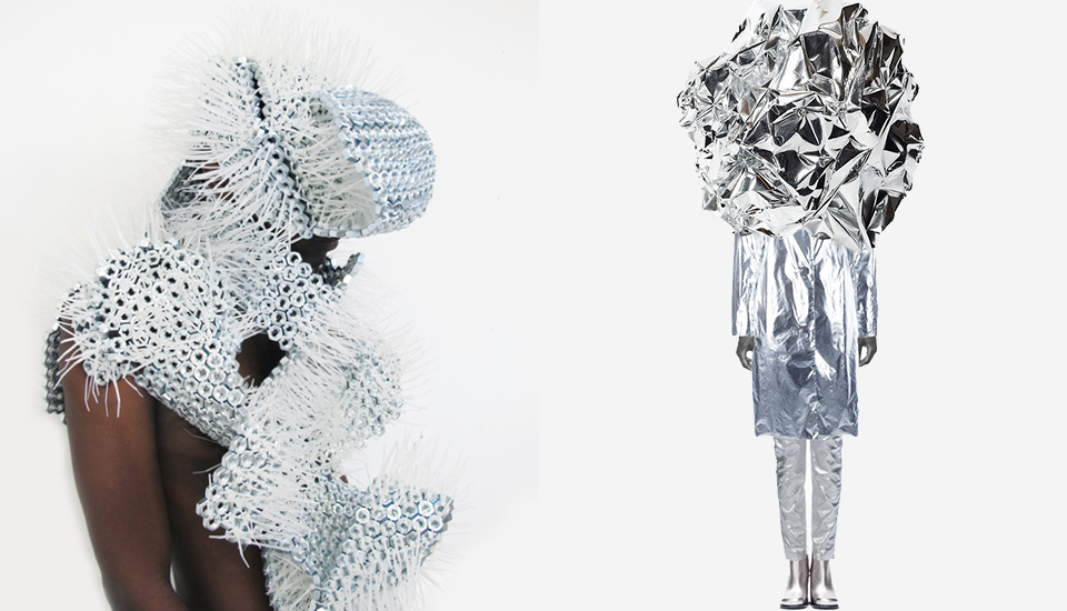
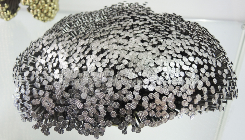
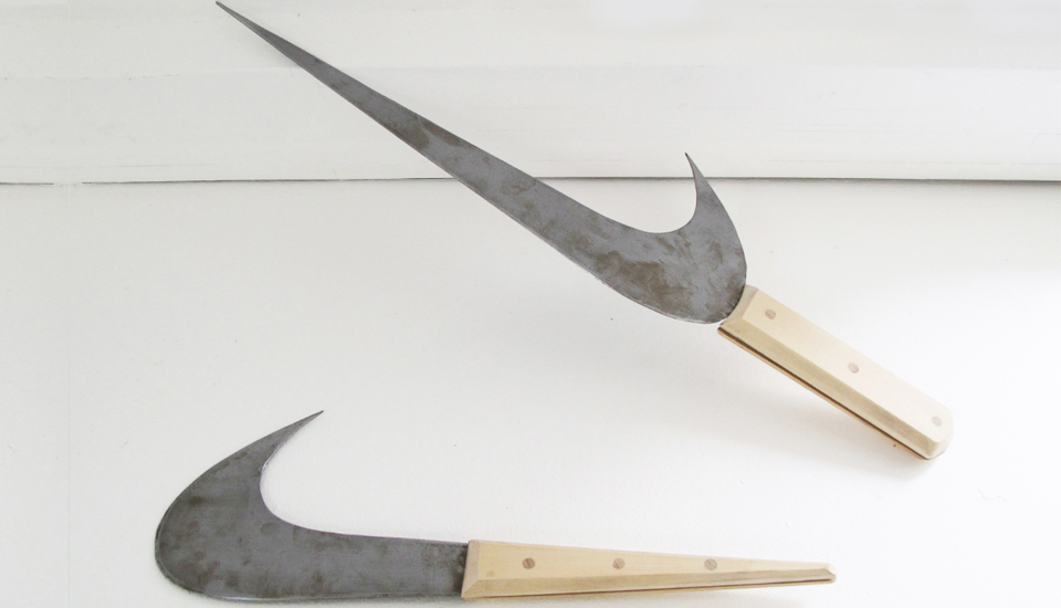
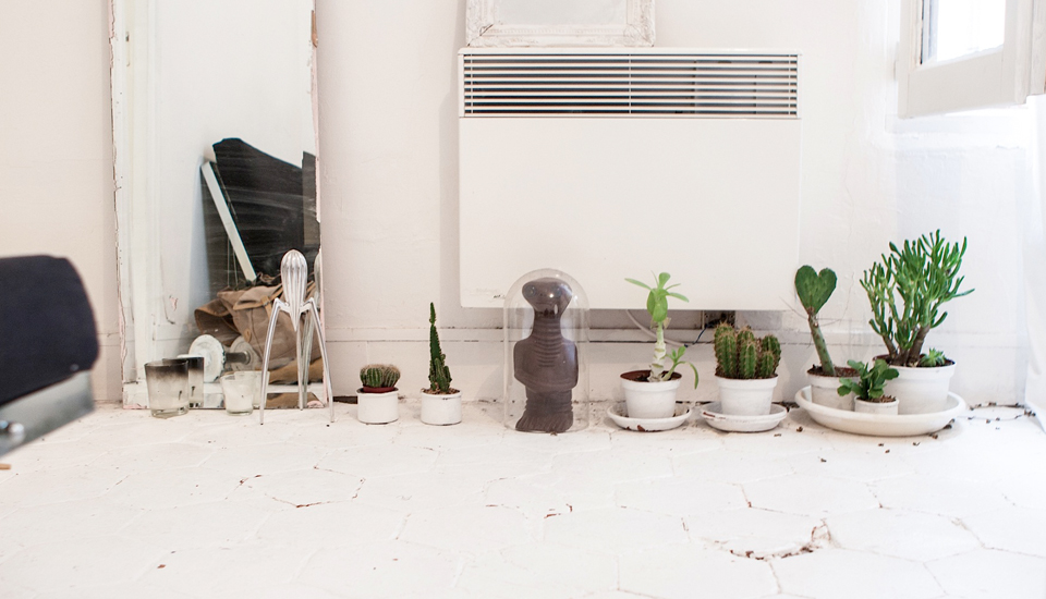
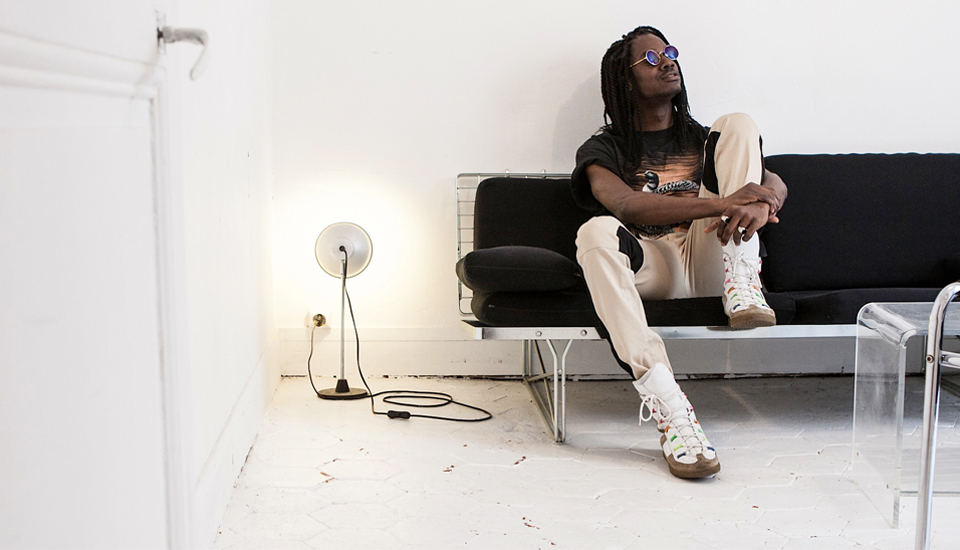
mickael wiesengrün

RÉVÉLATEUR / in collaboration with Sissel Tolaas
Smell to trigger emotions – Recent Design Academy Eindhoven graduate, designer Mickaël Wiesengrün uses intrinsically shaped smells as a way to seduce the audience and interact with his work. For his graduation project, he conceived an installation where visitors use their noses as reading tools. By capturing scent and converting it into fog, Wiesengrün managed to catch the historical atmosphere of the Witte Dame building, former Philips light bulb factory of Eindhoven.
With overpowering grease in the air and scents of musty metal created by the machines, the hard work back in the days gave rise to laborers sweat. He reproduced this ambiance by creating a highly visual structure where three glass tubes transported and diffused the specific smells of sweat, grease and metal. The smells were chosen and created in collaboration with the famous „scent provocateur“ Sissel Tolaas.
By interacting in a material and invisible way, the scents allowed history to come back to the space, through the material state of fog. The public, implicated in the process as receptors at the end of the tubes, could then imagine the hard work that shaped people‘s lives in the present space. The smells could be discovered separately or in union. The mix of them summed up what the designer called the “smell of the past” - an homage to a space of creation.
Good scents or bad ones didn’t matter anymore, the main purpose of Wiesengrün being to communicate information through smell. Thus, the designer considers smell as one of the most powerful generators of emotion and reaction within human beings. Endless possibilities open once we brake the barriers of what we consider a message.
Michèle Degen
http://www.wiesengrun.com
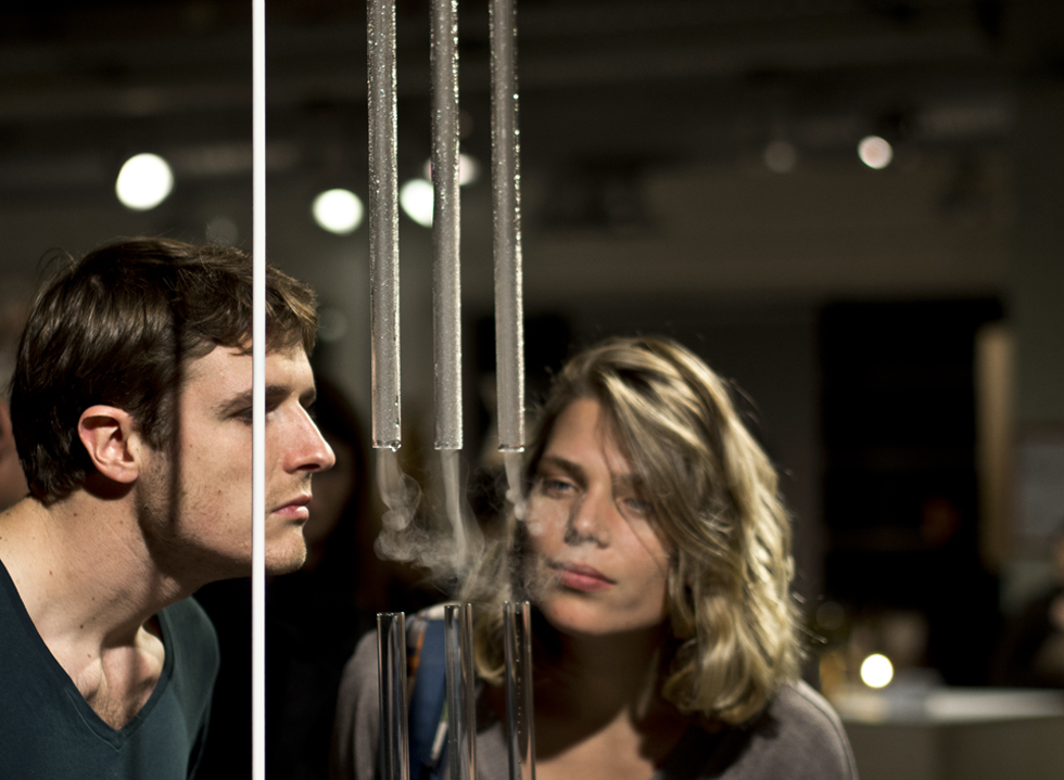
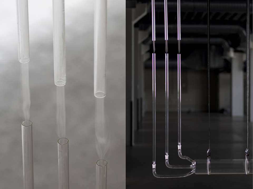

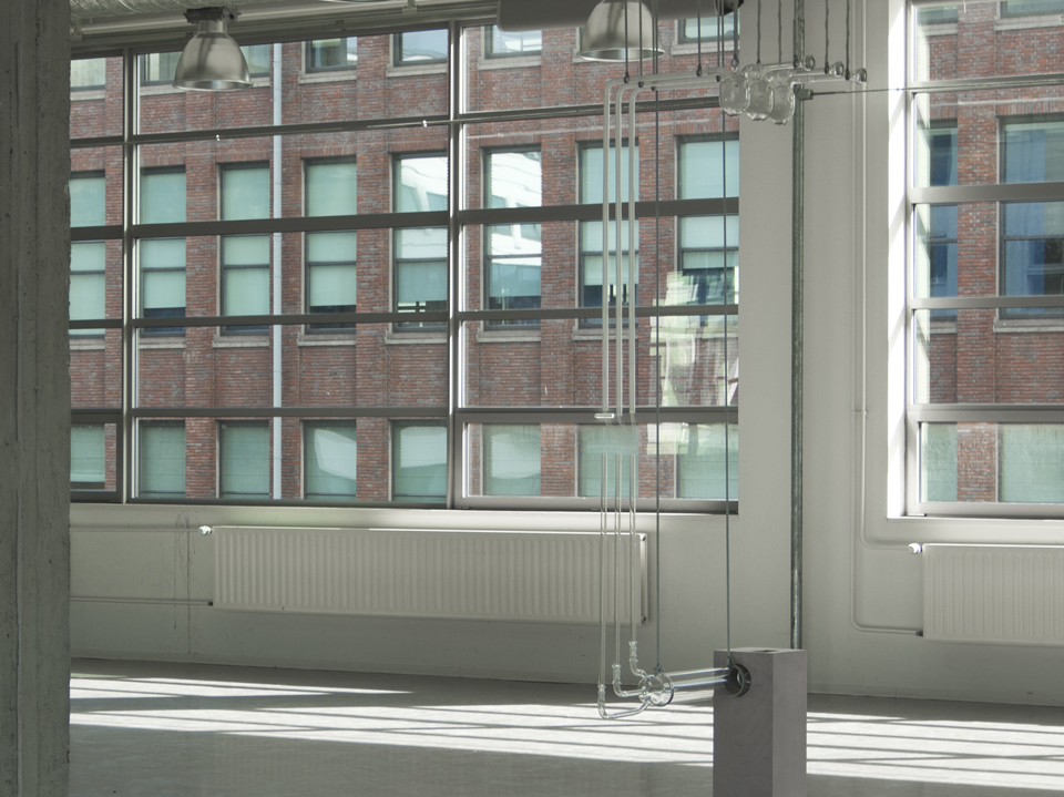
mateusz wiewiorowski

Working in a variety of crafts and visual interventions, Mateusz Wiewiorowski (1988) designs metaphoric furniture and graphic concepts – exploring the wonder around each creation. Studying at Design Academy Eindhoven, Chelsea University of Art/Design in London and taking entrepreneurship courses in New York.
His training started before school and continued after – from furniture management at Barcelona’s Design Center to learning from old craftsmen in Wroclaw and back to spatial adaptation in his hometown Stavanger.
Currently developing new project, he continues to bring visual poetry into different atmospheres – investigating the behavior of lively materials and their outcomes.
Here are his words to explain his quest :
"I set out to communicate sense through shape and explain insight through visual creation.
Feeling for the structure and transforming volume into surface, results in given space. My need to reshape reality is an on-going development that focuses on diverse activities within our visual world by which, senses attract and hypnotize.
I explore different planetary perspective reinterpret them into sculptural metaphoric objects."
Adrian Madlener
Stone Project image was shown as part of Nasza Polska – Paris Design Week 6 to 13 September 14 www.tlmagazine.com & www.promateria.be

Stoneproject : collaboration with TLmag / Pro Materia - Produced at Hostal productions, Wroclaw.

Stoneproject : collaboration with TLmag / Pro Materia - Produced at Hostal productions, Wroclaw.

ReshapingReality : produced at Hostal Wrocław / Poland 2012 - Scenario at lysefjord resturant Stavanger / Norway

ReshapingReality : produced at Hostal Wrocław / Poland 2012 - Scenario at lysefjord resturant Stavanger / Norway

ReshapingReality : produced at Hostal Wrocław / Poland 2012 - Scenario at lysefjord resturant Stavanger / Norway
shai langen

Shai Langen just graduated from the Hogeschool voor de Kunsten Utrecht, The Netherlands.
"Chimera is a project , depicting a contestable future where the human body is grown and cultivated. A material based entity whose boundaries continually undergo construction and reconstruction. Moving away from a solid to a liquid form.
Here it has become an amalgam of the synthetic and the organic. Its skin infested by fungi like textures, feeding of its host. Synthetic cellular structures constricting its carnality, growing in stasis, waiting to unveil its newly formed function.This new malleable body, has become a place where plastic parasitic substances emulate the immaterial, intuitively revealing its architect.
The collection consists of different pieces of liquid latex, that emerge through the emulsifying reaction of latex with calcium nitrate. Calcium nitrate is used in the balloon, latex gloves and condom industry to create a uniform film of latex around a mold. The molds are first dipped in a bath of water and calcium nitrate before being dipped into liquid latex. I’ve been experimenting with the shapes that form through dripping latex into the emulsion of water and calcium nitrate. By changing the viscosity of both the latex and the emulsion I was able to create different outcomes.
Each piece of the collection asks for a different thickness of the latex as well for a different technique of dripping. A lot of experimentation was needed to find the right method, since the material is very perceptible to numerous components, such as water surface tension, ratio calcium nitrate and water, drying process, etc.
With the different techniques I created a collection that resembles cellular structures, slime molds and fungi-like textures, that are created and formed like living and growing organisms. These textures are both organic and synthetic. Exploring the boundary between living matter and non living matter.
Chimera plays with the concept where the organic is overgrown with the synthetic. Where natural processes mutate the skin into fungi like textures. Like living organisms feeding off its host. And where the synthetic is governed by the organic. A place where plastic parasitic substances emulate and imitate the immaterial. Intuitively revealing its architect."


tom mckenzie

tom mckenzie
Tom Mckenzie is an australian, Denkmark based photographer whose work is distinguished, passionate and emotional. Growing up in a both musical and highly academic family allowed him to get inspired by a blend of various factors - Ancient Greek mythology, modern natural and biological phenomena, sexuality and mystical theory. With a strong fascination with new ways of interpreting reality and contemporary identity and how our generation, with our resources and complex technology, may discover a new language in which to describe our place in the ever-changing world, he invites you to explore a surreal world and creates a sentimental feeling in its beholder.
His project 'CHRYSALIS' (2012) was made in close collaboration with sound and set designer, Simon Holk Witzansky and was created as an editorial for The88.dk. Looking at the biological metamorphosis of snakes and moths, the geological processes of plate tectonics, rock and crystal formation, as well as incorporating classical and medieval depictions of warriors and heroes, they created a rich universe which gave new meaning to a mythological story of light and dark, confrontation and resolution.
tommckenzie.dk

tom mckenzie

tom mckenzie
anna badur

anna badur
Design Academy Eindhoven graduate Anna Badur is an independent Designer based in Berlin. Having studied Contextual Design she has created several industrial design projects that reflect her style, her ideas and her view on design. Her ability to create art and design from everyday simple materials makes her work unique and lets us see design from a new angle in an un-expecting way. All her projects so far belong to her master thesis, which was generally about the idea of using natural influences in design processes.
Her latest project „Drawn by Nature“, awarded with the iF concept design award 2013, is where natural forces meet because the environment in which it exists shapes everything in the natural world. Since natural forces and weather conditions form Landscapes, and organisms adapt to their natural habitats, she explored the northwestern Germany, her home turf. There, water and wind have a dominant effect both on the landscape and on the human condition. It has a melancholic beauty, which offers room for poetry and creation.
These most essential elements oft he region became Anna’s media and is a study of its aesthetic potential.
Her 100% cotton textiles (washable up to 40°C) are made of blue pigments that were blown over the wet fabric, by the wind making it result into unique patterns and an end result is directly determined by the process.
She exhibited during last Dutch Design Week in Eindhoven a collection of all kind of experiments to give the viewer an inside look into the processes.
“I’m interested in how design can take advantage of integrating natural forces in the process of creation”.

anna badur

anna badur

anna badur
katherine mavridis

A ribbon or a rope can create endless possibilities. They are symbols of connecting or binding things together, which therefore represents relationships, bonds, safety or communication. But yet they can evoke a feeling of being constricted or restrained. A simple rope serves on it’s own as a linear object with no limitations.
A challenge of exploring the ways of transforming a linear material into three-dimensional objects has been executed from folk basketry up to fashion. Researching the spatial possibilities of the coiling method that are influenced by masonry construction.
Australian knitwear designer Katherine Mavridis, is most interested in exploring the textural qualities of clothing. These ideas then transform within her knits from a 'rhythmic' perspective, creating dynamic textural and sculptural structures which 'pulsate' around the body. Her Mokuba collection was sponsored by luxury Japanese trim and ribbon company, Mokuba.
“Initially inspired by one of their amazing ribbon samples I received from their New York store. This led me to explore traditional rustic techniques of coiled basket making and sculpting. My research led me to explore more modern examples of basket making as I looked to other inspiration sources such as Brooklyn based designer Doug Johnston who constructs amazing coiled bags, purses and baskets out of rope. I went on to develop a way of shaping the pieces around the contours of the body, eventuating in fully-fashioned pieces. “
Her collection relies on a new technique, creating clothing with only utilizing-coiled rope, a new technique to be explored in fashion.
Chloe Sos
katherinemavridis.com

photos by Banjo McLachlan

photos by Banjo McLachlan

photos by Banjo McLachlan

photos by Banjo McLachlan

photo by Banjo McLachlan
moriel dezaldeti

Design by Moriel Dezaldeti- photo by Lior
Moriel Dezaldeti is a graduate of the Textile Design Department at the Shenkar College of Engineering and Design - Israël. During her studies, Dezaldeti found a refuge in knitting as an intimate and meditative act which provided her a quiet place and a form of expression. Dezaldeti believes that through knitting she can express her vision to the world; she examines body movement compared to textile and produces images of the inward body through search and great curiosity of the human body.
Through the transition between the two dimensional and three dimensional,Dezaldeti explores the material, listen to it and let's it be what it is and so breathes life into it. As a designer, she puts emphasizes on handmade works and mainly works with a manual knitting machine. With the same machine she has developed a technique that combines textile knitting and weaving elements, this is how she manages to embrace a variety of colorful and unique textures.

Design Moriel Dezaldeti - Photo Leonid Padrul, © Eretz Israel Museum, Tel Aviv

Design Moriel Dezaldeti

Design Moriel Dezaldeti- Photo Leonid Padrul

Design Moriel Dezaldeti

Design Moriel Dezaldeti

Design Moriel Dezaldeti

Design Moriel Dezaldeti

Design Moriel Dezaldeti - Photo by Lior
lev khesin

Khesin’s unique technique of multiple layers of silicone, colored differently, and to be placed one above the other after a long process is an intriguing process of art. His will to obtainable form is accompanied by his humility in virtue of natural processes. Evidently Lev Khesin compares painting to the art of archery and other Zen rituals: When applying each new layer, he focuses exclusively on this one action, thus making them an exercise in controlled presence of mind. The image is the evidence for an accomplished meditation.
The light penetrates the transparent material: colored layers shine through, shimmer and shine.
They mix and oscillate in its various shades depending on the position of the viewer and depending on the time of day. A single beam of light can bring a deeper color to glow, let it glow mysteriously diffuse or disperse. The boundaries between the individual color fields are never clearly perceived, since there are no faces, but only depths from which ascends a color.
The secret lies in the artist’s technique managing to give the color and the material a twist. The original substance manifests itself in the pictures, but the man who has left his trace here .
www.levkhesin.de


christa van der meer

by christa van der meer
Christa van der Meer is a Dutch fashion designer and graduated from the Royal Academy of Art in The Hague. Experiencing with different mediums she now works on projects to find ways to connect her portrait drawings to her fashion designs. Her graduation collection she portraits the fact that drawing is essential for designing. The drawings form the base of her fashion collections and is an instrument to create a new perspective both visually and emotionally.
Since faces define the identity of a person, Christa uses this intriguing factor as inspiration.
After an intense research into the relation between her love and fascination for portraits and passion for designing fashion stands a collection which merges the two. In addition her studies are intriguing collages which tell a story. Her approach to her silhouettes, using them as portraits and her materials as a frame to the face she lets us see a new world.
The combination of the exotic prints make her collections a piece of art. Wrapping her silhouettes in different cultures allows a new global silhouette to be born and gives us new ideas how to incorporate new fabrics in various prints.
A new urban nomad.

by christa van der meer
agustina bottoni

photo by Roberto Niño Betancourt
Agustina Bottoni is an Argentinian product designer. After graduating at the University of Buenos Aires and working as a fashion designer, she moved to Italy to pursuit a master’s degree in product design at the Nuova Accademia di Belle Arti (NABA) in Milan. Her main goal is to develop skills to become an integral designer.Currently she is an exchange student at Willem the Kooning Academy in Rotterdam, The Netherlands.
"Glow Set" is a luminous tea brewing. The aim of the project is to maximize the luminance and heat potential of a small candle. The tea set celebrates the process of slow tea making while showing it through a light effect, becoming a decorative object that brings a pleasant moment of contemplation.
The spherical shape of the glass bottle acts as a lens, magnifying the light of the candle, and showing the beauty of the tea.
Tea can be brewed slowly in 3 to 4 hours or can be used to maintain the infusion hot. The flask rotates in every direction for serving the tea. The strainer fits the cup, which has a cork sleeve as thermal insulation.
This set is carefully handcrafted in turned wood, cork and borosilicate glass.

photo by Roberto Niño Betancourt

photo by Roberto Niño Betancourt
philipp weber

Philipp Weber was born in Munster, Westphalia in 1987. During his studies at the Design Academy Eindhoven in the Netherlands he explored various media and materials, always fascinated by language, music and craftsmanship.
In 'Creation of a strange Symphony' Weber portrays the performance of a glassblower using a new and unusual tool.
Pivotal to this work was Webers desire to discover the world of a glassblower. In Belgium he was able to watch glassblower Christophe Genard working with the hot material. The designer questioned himself, ‘How can I inspire his interest to work with me?'. Genards most important tool, the blowing pipe, caught Webers attention. In the past 2000 years only minor alterations have been made to the 1.5m long steel pipe, with no effect to the material. ‘What would happen to the glass, if the function of this tool radically changed? How would Christophe adapt to a new pipe?’.
And so, by manipulating the pipe, he took influence on the inner shaping of the glass.
Simultaneously to this process, Weber also sensed a strong rhythm and musicality in the way Genard was working on the glass.
The pipe as a tool for glass production, appeared to be like a musical instrument to him. He could not resist the idea to translate the mechanism of a trumpet into an application for blowing glass. Together with an engineer and the knowledge from preceding experiments for a new tool, he worked on an ‘instrument’– an allegoric bond of craft and music–, inspiring Genard to ‘improvise’ the glass, to start a dialogue with the material. Playing the valves, Genard would shape the glass from inside, activating different air streams.
The transformation of the pipe into an instrument provoked a performance of glass making. A short-movie, several glass objects and the instrument itself communicate this dance with the fire.
The musical rhythm of the glass workmanship emerges and unveils a new facet. An old craft can be experienced with a new sensibility and poses the question how design can change well-known patterns and processes without destroying the essence of the craft.With A Strange Symphony, he received the DMY Berlin New Talent Award 2013.


qiyun deng

Image ECAL/Qiyun Deng
Agrarian consciousness – how food is grown and harvested, and where it comes from – has been rising steadily for the last decade. Sustained interest in sustainable agriculture, energy and consumer products has also garnered a great deal of time and attention from top designers and innovators.
Product designer, Qiyun Deng has interpreted these matrices of agriculture, design and ecology in the form of biodegradable tableware for his diploma project at ECAL, in Switzerland. Made of bioplastic PLA, Deng's project, Graft is a testament to the inherent artistry of nature's colors and textures. Merging form and function, Deng modeled his bio-untensils after common fruits and vegetables. His project honors beautiful design and the moral imperative to live consciously and sustainably.
The briefing for this project was to uplift disposable products by introducing a "haptic" quality, such as texture or color. Deng noticed that the texture and shape of fruits and vegetables could be applied to everyday artifacts: for example, a celery stem made sense for a handle; a petal of artichoke was perfect for the bowl of a spoon; and one half of a honey melon would make a bowl fit for the human palm.
Textures were copied by various techniques including 3D printing; and then parts were joined together by a grafting technique that is also commonly used in horticulture. The final prototypes were finished at the school workshop by using two parts of polyurethane resin with different colors.
Qiyun Deng leaves his audience with one final thought: "Will you throw them away easily?"
Beth Lauk
Beth Lauck contributes bi-monthly posts about emerging and disruptive design and communications trends, and helps forecast why and how these changes will affect market intelligence. She also maintains a blog devoted to the intersections between fashion, future studies and trend science. She completed an internship with Trend Union in 2012 as the Assistant Editor and Community Manager of Trend Tablet, and considers her experiences with the Trend Union team an invaluable addition to her work as a trend forecaster and fashion theorist.

Images ECAL/Qiyun Deng

Image ECAL/Qiyun Deng

Images ECAL/Qiyun Deng

Image ECAL/Qiyun Deng

Image ECAL/Qiyun Deng
stéphanie baechler

photos stéphanie baechler
Stéphanie Baechler is a trained textile and fashion designer who graduated from the College of Art and Design in Lucerne, Switzerland. She was nominated in 2009 for her thesis for the Design Prize Switzerland and has already won various other design awards in her young career. Curious, imaginative and courageous, she incorporates art and contemporary topics in her designs, forging intuitive understanding with conceptual imagination. She not only works by hand but also uses the computer, to follow a playful process of deconstruction and reassembly to derive at fresh perspectives on seemingly familiar themes and forms. The transition to a three-dimensional approach required in fashion design set off a chain of developments in her thinking which started off as an exploration of the mineral world, her graduation collection eventually researched elegance in relationship to the space we occupy in the world, both in a physical sense and psychologically, socially and politically.
Her surreal world is a manipulation of textiles and invites us to see textile from a complete different angle. Her main inspiration originates from minerals. Dug up from the earth and grounds to glaze components and pigments, in her vision they mysteriously regain their solid state on the surface of the fired pieces, adding durability, colour and brilliance to the work. With a main focus on rocks, gems and ores, studying their varying substance densities she creates wearable minerals.
" In negotiating this disparity, transition and transformation are essential: stone becomes fabric, modelled to follow the body while it is moving and to turn the figure into sculpture as soon as it comes to rest – suggesting an effortless, casual flow from fashion to art and back again. Several elements taken from the mineral world return into the design. "


photos stéphanie baechler
crossover collective

photo by Louise te Poele
Floor Nijdeken recently graduated at Artez institute of Arts Arnhem, The Netherlands in Product Design. His latest project is called Crossover Collective and we just love it.
Floor explains us his project : "The Crossover Collective intends to redress social relationships. My main focus lies in activating and mobilizing people. I designed the conditions in which social structures can grow and bloom, and the initiative of users is stimulated. With myself as an intermediary and my table as a medium, I let participants find out that working together stimulates mutual trust, understanding and positive energy.
In today's society there is a lot of knowledge (created), but how is this knowledge passed on? Young people get their knowledge from books and the Internet, while the elderly and their heritage disappear. Society is changing and people are suspicious of spontaneity and communication with each other. People increasingly withdraw into their own privacy ‘bubble' while society, perhaps more than ever, actually is in need of real social exchange.
Collect moments, not things.
My social machine focuses on an ancient form of communication and social activity: collective embroidery. With my machine the viewer is an active part of the installation, where transfer of ‘heritage’ (a collection of behavior, knowledge, expertise, skills, memories, core values and sentiment) that you leave in your environment is the central theme. The embroidered carpet is the silent witness of the numerous short encounters, and the visitor created a positive memory to cherish."

photo by Louise te Poele

photos by Louise te Poele

photos by Louise te Poele

photo by Louise te Poele
alexa lixfeld

Alexa Lixfeld photos by Dietlind Wolf
Alexa Lixfeld is a design studio, consultancy and production company, based in Hamburg, Germany. Set up in 2008, its portfolio ranges over a great variety of projects, from tableware and cashmere products to children’s dolls and a fragrance. What these projects have in common is that they reach far beyond the strictly commercial: the limited series and one-offs that result from Lixfeld‘s interventions are first and foremost meant to be statements, processes and experiments where interaction is central, where new relationships are woven, and where the improbable is more than possible.
The present series of glass pieces, GlassWood, which was premiere in Milan in April 2013, perfectly fits Lixfeld‘s approach. The glass elements were handmade and mouth-blown in a workshop in Novy Bor, a small town in the Czech Republic, between the Lusatian Mountains and Central Bohemia, famous for its history of glass production. The glass tradition still survives in hundreds of small factories in the surrounding villages. When confronted with their techniques, Lixfeld decided to celebrate them by combining the glass with the wooden molds that lend it their form in the blowing process.
“I was struck by the relationship that grows during production between these beautiful oak molds and the hot glass, each leaving its mark on the other,“ says Lixfeld. “Upcycling and working with existing forms has always been a point of interest to me. These molds, just fuel for the kilns after they were discarded, had a beauty of their own, which is never seen. Keeping the glass pieces and their molds together once the production was over offered me an opportunity to put that beauty on display. It also provided a much greater tension to the glass, because of the contrast in texture between its shiny and colorful skin and the worn out appearance of the mold. It equally gave me the opportunity to show the process that led to the finalized product.
Our production has always been non-industrial, away from the standard and norm. GlassWood is no exception: each duo comes a perfect couple, with a unique identity. I re-use an old mold to serve as a base for one glass object. It creates a unique mold-glass combination, and you cannot have the same coupling twice.”
Lixfeld sees her work as an open process, a collaborative action that allows for coincidence and surprises, incidents and accidents. In the GlassWood project she had her project guided by objets trouvés – the molds that she found and used untouched- and the craftsmanship of the artisans by whom the glass objects were blown.
“I chose the color of the glass, and decided where and how to cut it, but after that the project became an interaction with the surroundings, finding potential in what was given, working hands-on with the artisans. My work is essentially about bringing together what is already there, but which remained disconnected. A great number of designers start from scratch, and then define the product in every detail. If you take that as a norm, I’m less a product designer than a process designer, a curator and facilitator, someone who makes things possible.”
Max Borka

Alexa Lixfeld photos by Dietlind Wolf

Alexa Lixfeld photos by Dietlind Wolf

Alexa Lixfeld photos by Dietlind Wolf
arturo erbsman

Arturo Erbsman, freshly graduated from ENSAD- Ecole des Arts Déco- lives and works in Paris, France. Water, fire, wind, light, gravity, temperature, are his working tools. Erbsman works with natural phenomenons and try to create links between manufactured objects and the four elements of Nature.
Polar Light is a project realized in Lapland in Winter 2012 and presented at Salone Satellite - Milan 2013.It is a poetic ice chandelier, result of human conception and nature’s intervention.Designed to be hung from a branch of a tree in winters, it is composed of a metal structure covered with soft white woven fishnet that catches water in all its forms.
At dawn, when the morning dew deposits micro droplets on the surface it gradually freezes and turn into stalactites. Over course of the day, the structure stiffens coated with ice. At nightfall, it glows as rays pass through the ice, thus highlighting the beauty and delicacy of crystallization of water.
This ephemeral work of nature exudes a timeless boreal light.This faraway, atmospheric light reinterprets a crystal baroque chandelier. It sees water, frost and ice as functional materials, and enhances each of their aesthetic, ecological and structural qualities. This project considers factors of climate as potential drivers that can interact with manmade objects.
It is the first result of an ongoing experimental research on relationship between manufactured objects and the four elements of nature.


maximilian löw

Maximilian Löw is a young designer from Weißenburg, Germany, studying Integrated Design at the University of the Arts in Bremen. His work focuses on objects for everyday life, with a playful handling of materials and design in different fields.
One project, titled Edged—Cutlery, combines the elegant soft curves of classic cutlery with sharp, rigorous edges. Cast in bronze, the set is designed to achieve a balance of ergonomics and aesthetics.
On his process, Maximilian states that “It is my impulse to question the essence of objects and to try to get to the bottom of them. Therefore it is really important to experiment and work practically.”
The designer’s work also includes Edged—Lamp, a one meter long pendant lamp made from a single sheet of stainless steel. The design process involved the creation of a paper model before the final result was achieved.
Another inventive and playful project is Cake Server, in which the handles for the cake plate are removable and become serving utensils. The sleek design is accentuated by an elegantly curved handle.
Maximilian will be graduating from his program this summer. We hope to see more from this talented young designer.


julian vassallo

photo by julian vassallo
Camilla Bo’ is an Italian freelance journalist and stylist. After two years of study in Paris she returned to her native Rome to study architecture. The art of critique proved more fruitful for Camilla and she began to write for the Association of Art and Critic about art and design and on her personal blog Choufouchouf. Focusing on the relation and communication between fashion and art, she decided to follow her creative nature not only giving a voice to the library she has on her laptop but also as inspiration for editorials. She’s now based in London, attending the course of «Art Direction for Fashion» at the Central Saint Martins College of Art.
It has been just one year since this young architect started to devote himself to photography.
He spent his childhood behind science books and numbers, then later joined an architecture course where he was also introduced to the camera for the first time.
Architecture has taught him so much about balance, form, colour and so many other skills which he now apply to his photography, creating his own personal language.
The photographers whose work he admires most are Kris Micallef, the surreal works of Alex Stottard and Brooke Shaden and the poetic scenario of Sarah Ann Loreth. But his stronger influence comes from fantasy movies set in fantasy worlds.
I asked him about the picture with the men’s head covered by flowers. I think this picture is so powerful thanks to the contrast between the male subject and the grace of pink flowers. I was wondering how the concept was born and if it is part of a project…
“I remember watching fencing on the television and thinking to myself that the masks the Olympians wear were so cool and mysterious. I usually always try to find some connection between the relationship that us humans have with nature, so I thought I would try replicate the fencing mask with beautiful, graceful flowers. It is definitely part of an ongoing project that I wish to continue once I graduate from university!”
Fascinated by eclectic references, this young architect is able to filter out unnecessary excess and contrived structures through his camera lens, and communicate only the grace and lightness that he experiences in his inner world.

photo by julian vassallo

photo by julian vassallo

photo by julian vassallo

photo by julian vassallo
sabatina leccia

sabatina leccia "eat the world up"- "Haemorrhage"
Sabatina Leccia is a 28 years old independent eco-designer based in Paris. "Eat Up The World" her master project at Saint Martins is a visual metaphor aiming to communicate that we are consuming too much too fast.
Through the invention and reinterpretation of existing objects, two collections of products were created: Haemorrhage and Fragile Breath. Each project is designed to visualise a specific set of data or specific material scenario. Through exploring methods of ‘designed destruction’ and removing calculated portions of material, Sabatina aims also to question if we can design in a more material-efficient way.
In a time of unparalleled material scarcity and increasing population she hopes to use design as a communicative vehicle to visualise the urgent need to reconsider the patterns and speed of our consumption, and bringing these broader global issues closer to home.
“Eat The World Up” is located within the table landscape, aiming to underline the notion we are ‘eating’ our planet’s resources.

sabatina leccia "eat the world up"- "Haemorrhage"

sabatina leccia "eat the world up"- "Haemorrhage"

sabatina leccia "eat the world up"-"Fragile Breath"

sabatina leccia "eat the world up"-"Fragile Breath"

sabatina leccia "eat the world up"-"Fragile Breath"
dienke dekker

photo by dienke dekker
My name is Dienke Dekker and I am a 4th year student at the Design Academy Eindhoven in Holland.
I think that different properties of materials offer a great opportunity to express ambience, tactility and feel of objects. In my work I love to experiment with these properties and to create objects with a strong emphasis on craftsmanship and detail.
The basket weaving craft has been the inspiration for this project about imitation and reinterpretation of crafts.
From imitation of bamboo structure, the step was made to silkscreen printing on silk and other textiles with custom paint stamps, resulting in a series of archetypical objects.

photos dienke dekker

photos dienke dekker

photos dienke dekker

photos dienke dekker

photos dienke dekker

photos dienke dekker
yuval atzili

photo yuval atzili
Yuval Atzili is 26 years old , he lives in Israel and just graduated Academy of Art and Design Bezalel, photography department.
"The majority of nature's creations where created in couples – as many of the human organs, so can a fetus be created in couples, transforming from semen and ovum to cells sorting process. I have a twin brother. To be a part of a couple and experience everything together is a big advantage in life, the bond, created in the womb, I cannot explain but it has affected me tremendously in consolidating my personality and my self-esteem. Growing with a twin brother can sometimes lead to loss of identity, loss of the individual's oneself, starting from identical clothing, celebrating birthdays together until getting the first summons for the army.
Our names – Yuval and Gal always called together, so are the wings, dependent on each other in order to fly. Chicken wings symbolize purity, sanctity and immature manhood. By using wings in different forms I am trying to express the sacrifice, sacrificing and death, sometimes, African cultural symbols. Working with wings as a material, intrigues me, it is a live-dead material.
Wings allow me to show the clean outline, saint as angel wings. However, the use of wings in my photographs does not wishes to express the above-mentioned. Moreover, the wings in my photographs always wishes to symbol the rooster's slaughter as part of the food industry – an unseen stage.
Photographing control and loss of control interest me; expressed as human control of animals for instance, such as training or butchery. In the still nature photograph with the bed, I have built a construction out of 250 chicken wings, which comes out as a peacock's tail. The magnificent peacock tail has survived through evolution and has preserved, even though it lessens the peacock survival abilities and according to evolutionary history should have not survived. What allowed it to stay was mating issue; tail is presented to females at the reproduction period and the most beautiful, impressive male gets to have offsprings. The impressive tail symbolizes manhood, power and control, however, It also symbolize vulnerability, femininity and care."

photo yuval atzili

photo yuval atzili

photo yuval atzili

photo yuval atzili
- photo yuval azili
ingrid hulskamp

photo by arnout hulskamp
27-year-old Dutch designer Ingrid Hulskamp describes herself as a 'design poet'. "My aim is to enchant people with the use of poetic, playful and sophisticated design."
Here are her words to describe her Toys for contemplation :"To pursue time for daily contemplation in an intuitive way, I have developed a series of contemplative toys for adults. The luxurious objects, made from hand-blown glass, remind us of the candid fun we had as a child, when we were able to fully get caught up in the moment.
In order for the toys to catch our attention and create a poetic moment in time, I have created three different sensory experiences: a tactile experience using hand-blown glass, wood, brass plated gold and textiles; a visual experience using coloured pigments that transform when you start playing with the object; a sonic experience through the movement of water and glass balls."

photo by arnout hulskamp

photo by arnout hulskamp
elisa strozyk

photo courtesy of elisa strozyk
When you think about designed object, lot of super famous designers and object came into your mind, but the essence of design is more about innovation of shapes and matters, then it can become part of our culture.
That's exactly what Elisa Strozyk is making, turning wood into flexible textile : surprising and playful way to use this material ! The outcome is really fantastic, and shows us that innovation is still part of the game, using traditional material to create new forms, reconnecting us to real feelings and a new tactile experience.
As she explained the world around us is becoming immaterial, with all the way we have to communicate with people, by mail, messages, calls, using internet to live, buy, get informations of the world : a society of pictures and waves. The place for printed and matters is becoming tiny, but making it luxury and precious.
And that's what she want : "Giving importance to surfaces that are desirable to touch can reconnect us with the material world and enhance the emotional value of an object."
There is also a part of earth care in her work process, as she said "Another way to save resources is working with reused or recycled objects and material waste. Also it is crucial to aim for a closer relationship between subject and object.This can be achieved through more flexibility and changeability, the possibility of growth or surprising elements. In the future we will have to deal with more waste and less resources. Therefore it is fundamental to be aware about life cycles of objects. That means to use material that is able to grow old beautifully. "
Born in Berlin, Strozyk studied at prominent arts colleges at a young age, ENSAD (Ecole Nationale Supérieure des Arts Décoratifs) in Paris and KHB (Kunsthochschule Berlin-Weissensee) in Berlin, before she received her masters in Future Textile Design from Londons Central Saint Martins in 2009.
There is no doubt the young woman is particularly well-qualified when it comes to design pedigree, but it is the artistry, originality and use of symbolism, in which her works and approach display a depth and maturity beyond her years, considering she is only 28 years old, and is already capturing hearts and minds the world over.
Caroline Aufort

photo courtesy of elisa strozyk

photo courtesy of elisa strozyk

photo courtesy of elisa strozyk

photo courtesy of elisa strozyk

photo courtesy of elisa strozyk

photo courtesy of elisa strozyk

photo courtesy of elisa strozyk

photo courtesy of elisa strozyk

photo courtesy of elisa strozyk
elisa van joolen

design by elisa van joolen
Sample (SS 2012, produced 07/21/2011), donated, sent from Beaverton to Brooklyn
1/1 must Showroom Sample (date unknown, most likely SS 2012), donated, Midtown NYC
Garment (date unknown, most likely SS 2011), acquired at a Warehouse sale, Chelsea NYC
Elisa Van Joolen is a recent graduate of the newly initiated MFA Fashion Design and Society program at Parsons The New School for Design. Her graduate work 11” X 17”, was an installation that specifically challenged the confines of conventional fashion collections.
Elisa embarked on a collaborative project whereby she requested and acquired sample garments from industry giants, (Nike, Banana Republic and Calvin Klein, to name a few), as well as sourcing from local stores and independents. She longed to create a collection with multiple entities and brands, like a wardrobe.
Through the process of cutting into these pieces, Elisa created several new assemblages lending itself to a collection in sum.
As a result of this process, garments that had already been deemed complete were given new life and each purposeful cut gave way to an array of beautiful abstractions.
Elisa will be showing at New York Fashion week in September 2012 which will provide a new perspective on her work 11” X 17” as it translates from an exhibition context to runway.
Madeleine Harman

design by elisa van joolen
Garment (date unknown), acquired at Salvation Army, Brooklyn
Limited Edition Piece (SS 2012), acquired at high-end store, Soho NYC
valeriya olkhova

photos by alina berezenko
"My aesthetic evolves around fusion; contrast of techniques, materials and inspiration. I concentrate on combining traditional, hand and innovative approach to knit, such as using horse hair, untreated alpaca, berries home made dyes. I am fundamentally inspired by non physical subjects; psychology & sociology, however, natures ' multi dimensional elements: such as evolution, preservation, decay.
Texture, remains a source of fascination and often a backbone of visual and textural moodboards.
Currently I am living in Kiev & preparing for a summer internship in Copenhagen."

photos by alina berezenko

photos by alina berezenko

photos by alina berezenko
daniel costa

photo by daniel costa
Daniel Costa is a design poet who hails from the Tyrol. Like a breath of fresh mountain air, his endearing personal style and enchanting optimism mix freely with his creative skills and mature sense of beauty.
After studying at the Design Academy Eindhoven, Daniel completed an internship at Studio Edelkoort in Paris, where he immersed himself in the city to redefine his work and expand his identity. In Self-reference, Daniel has responded to the organic grains of a found piece of wood before taking it on a journey of transformation to create a series of contemporary fossils.
The contextual designer explains:
"I found a tree trunk in the forest, which was cut every 50cm. A very pragmatic human interaction with the tree as a movement in time and space. I take this found piece and give it a more sensitive shape. Following the grain, the structure, the architecture of the tree. I cast the new shape in ceramic to observe the qualities of this shape in a different material.
The shape is still human – I start to burn and brush it. The grain comes out and the smooth shape starts to have a structure that is logic towards the shape. Again I cast the new shape in ceramic. I burn the shape even more. Deformation. Cast in ceramic. I sand the grain structure away to observe the deformation – anew burning the shape and casting. Anew sanding and observing the deformation...
Autonomous shapes arise that refer to themselves and their origin; shapes and surfaces that need contexts in our world. They show us potentials and new design qualities but also a strong relation to our body. It is a research that evokes an archaic quality that seems to harmoniously combine the contradictions of us humans in our troubled world with the roots of our existence. An alchemistic approach to design and our contradicting lifestyle. My longing for tactility and structure. My wish to appreciate the complex beauty of the most elementary things."

photo by daniel costa

photo by daniel costa

photo by daniel costa

photo by daniel costa

photo by daniel costa

photo by daniel costa

photo by daniel costa

photo by daniel costa
lee schein

photos courtesy of lee schein
Lee Schein is recently graduated in visual communications and illustration from the Wizo Academy of Design, Israel.
Her final project called "Wild Realms" is an anthropology work about fictional civilization of warriors. Her world is inhabited by strange creatures, well-dressed and accessorized.They look perfect, between Tim Burton and African Art.
Even more impressive in real, her silk-screen printed figures are 2 meters high! "Wild Realms" was showed with a wall of miscellaneous "remains": dental clay models, handmade felt pieces and few pairs of feet made from a mixture of sawdust and mud. Schein's major interests are illustration and wearable art.
Caroline Aufort

photos courtesy of lee schein

photos courtesy of lee schein

photos courtesy of lee schein

photos courtesy of lee schein

photos courtesy of lee schein
jungeun lee

Photo by b. lee
Jungeun Lee has been experimenting and researching unconventional methods of garment construction. She is a recent graduate of London’s Royal College of Art (2011) with an M.A. in Mixed Media/Textiles.
Her process eliminates the need for sewing, cutting or weaving. She wraps synthetic fibers around a desired form, and then uses a heating process that transforms the fiber into a three dimensional molded garment. This technique renders both expected and unexpected silhouettes.
Her zero-waste garments are a significant contribution to the fashion industry. Although her materials are petroleum-based, her process is noteworthy nonetheless. By designing in free form without the vast amounts of waste that traditional methods entail, she is paving the way for future eco-friendly praxes. Text by Beth Lauck.

Photo by b. lee
fiona krüger

photo by Damien Ropero/ ECAL
Fiona Krüger is a recent graduate from ECAL/University of Arts and Design. Earning her Master’s in Luxury Industry and Design, she presents her final project, Memento Mori. Drawing inspiration from the 17th century skull watch of Mary Queen of Scotts as well as the artwork of Dia de Los Muertos, Krüger worked with key suppliers from the swiss watch industry to have the pieces made and with a watch maker to do the assembly.
The pieces of the dial were layered to mimic the shape of a skull, mirroring the layers that facilitate the movement of a mechanical watch. A devotion to detail and a dedication to the art of craft make this watch a spectacle for the eyes as well as a tribute to luxury horologists of the past, present and future.


photo by Damien Ropero/ ECAL
claire-anne o’brien

Claire-anne O’Brien — a young, Irish-born, London based-designer and last year’s RCA graduate (MA Textiles) — takes a sculptural approach to textiles. O’Brien is forging a new relationship between textile design and landscape interiors.
Her meticulous praxis uses a combination of hand- and machine-knit stitches.
Without losing our connection to technology, O’Brien’s craft offers a renewed appreciation for artisanal intelligence.


elsa lambinet
-
 photo by ludic owczarz & elsa lambinet
Elsa Lambinet is born in 1987 in Nimes, France. After graduating from Design school in France, she decided to live in Australia for a year in order to perfect her english and build upon her professional experience. She sent her application to the ECAL/University of Art and Design from Melbourne and was accepted 2 months later in MAS Luxe.
She was part, as a student, of the Baccarat/Milan Design Week 2011 as well as Christofle/Designer Days 2011."Don't play with food" is her diploma project : "A new kind of chocolate which can be created according to your taste, thanks to three elements."
meriç canatan

self portrait
"My name is Meriç Canatan. I was born in 1988 in Turkey. I studied painting in high school.And now ı'm studying fashion and textile design in mimar sinan fine arts university in istanbul. I do love to create-draw-illustrate my world and transform to design-print-cloth.
I always feel close to speechless and undisputed free side of life such as art,design and music. This is what ı do and will be doing in the future."


masha reva

"I`m 23, I live and work in Kiev. Past summer I finished MA course Fashion design in Kiev National University of Technology and Design, then I got a couple of internships in studios of Thakoon and Walter Van Beirendonck. I`m really enjoying to experiment with everything that I could create or change, and a big part of me - is my love to draw and make sketches.
I hope to make an experimental studio to work on different things as illustration, garments and print design and even maybe something else."


jannis huelsen

photos by Jannis Huelsen
Jannis Huelsen is a young german industrial designer graduated in 2011 from HbK Braunschweig.
Xylinum is a research project that poses the question: what could future materials and production processes be like? The title Xylinum is the name of the bacterium which produces an artificial cellulose material. This bacterium consumes sugar and builds a cellulose fibre structure around any given form. Since the process takes place in a nutrition liquid, the wet material can be dried later on, resulting in a durable and 100 % biodegradable material.
The properties of this material can be adjusted by changing the genetic code of the organisms. In collaboration with the company Jenpolymers, a technique was developed to create a »skin« around a wooden stool frame, forming the coating and seating surface.

photo by Jannis Huelsen
thos

"THOS claims that it is possible to capture the essence of luck into garment. Its underlying thoughts are meant to provoke a discussion and pose an alternative to the current trend logic. In Mongolia, my native country, we believe in an ancient myth that you can charge your spirit and fortune by standing in the dust of our famous horse races. As I explored deeper, the question branched out into: What is luck? What is luxury?And ultimately how are these things connected to humans desire for spirituality?
Due to its nature, part of this project involved a journey to Mongolia where I explored the other, the eastern side. In Mongolia, the project not only got its essence but also got shaped by all the other occurring experiences and influences. The next evolutionary step of luxury in the west will be intangible."
A graduation project by Tschagsalmaa Borchuu

sarah mesritz

The designer behind SMJD is Sarah Mesritz, she graduated in 2008 from the Academy of Fine Arts in Maastricht. After several projects and internships in Amsterdam and New York, Sarah started her own jewellery label in the fall of 2010. The collection is made of 100% cotton rope, knotted and crocheted in different patterns.
During Milan 2011 SMJD presented, 25 meters of jewellery. Create your own design with jewellery per meter and combine different elements of knotted or crochet rope.

2011-07-08 07:16:47
2011-06-22 06:34:40
christian sarragúa
"My name is Christian Sarragúa. I'm an illustrator, graphic designer and toymaker based in Montevideo in Uruguay."
The Amigurumi is a Japanese technique that allows modeling small sculptures by crochet wool.This technique creates textures and unique volumes for natural and organic pieces.
http://facebook.com/chitysoyyo

photo by raquel kelmanzon

photo by raquel kelmanzon
2011-04-02 00:37:47
borre akkersdijk
25 years old, he studied at design academy eindhoven (the netherlands)& FIT N.Y.C.
He is working on his new collection and as a freelance designer in paris.

photos by marie taillefer

photos by marie taillefer
2011-03-29 12:11:58
anna october
Anna October is 20 years old, she is a designer based inUkraine.
Creation and harmony, utility and functionality are main words for understanding Anna's clothing.

photo by Alina Berezenko style by Dasha Lagenberg

photo by Alina Berezenko style by Dasha Lagenberg

photo by Alina Berezenko style by Dasha Lagenberg
2011-05-20 10:36:00