TREND WORDS
a sudden start
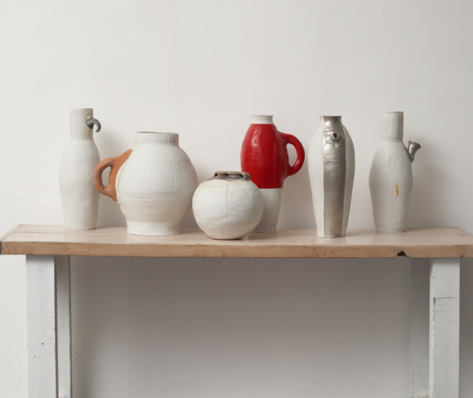
photo by Thomas Straub
The day in 1998 that Hella Jongerius pushed her thumb into a small rectangle of still damp clay to leave her unique imprint on a series of pots was a historical landmark moment in the recent history of Dutch craft and design. Single-handedly or rather, with a single thumb, she pushed open the door to a new era of creation that has truly changed our perception of giving form to matter and to the important changes in the design discipline at hand.
As an early introduction to the turn of the century with a body of work capable of prefiguring the next currents of creation, with 7 Pots / 3 Centuries / 2 Materials Hella decided to take fragments of archaeological shards of pottery and reformulate around them; the body of the past rendered in contemporary clay and finished with futuristic high tech paint. This collection of containers is surprising even today; their robust presence conveys a sense of serenity and exudes a peaceful feeling. Strength and fragility are combined to create this fusion bridging the past and the future.
Hella’s vessels can be seen as a work of autonomous design that has been precisely forecasting the future in all its aspects. A host of products and projects are until this day playing with ideas of national and regional history, to be rekindled as future international and global icons.
Thus, Jurgen Bey has given new skin to old furniture, new function to old crates, new volumes to old chairs and new and tender décor to antique ceramics. Much in the same way and at the same moment, Piet Hein Eek has set out to make used wooden planks his idiom formulating brand new, yet rustic and sturdy Scrapwood furniture. A generation of individuals embracing the regional and the historical, creating the global and the contemporary, was born.
A decade later, it is Studio Job that is incorporating proven vintage materials like ceramic and bronze and eternal shapes like candles or jugs to design ultimate prototypal form, such as the Sword of Damocles, made from crisp and sharp biscuit (a sword that in fact would break upon dealing a deadly blow…), and the spade and hayfork from the Farm collection, made out of highly polished hammered bronze. Modest things constructed from strong and attractive materials with masterful finishes is this dynamic design duo’s way to express monumental form by putting it on a pedestal. They espouse the ethnicity of our culture to decrypt the anthropology of tomorrow.
More recently, it is Joris Laarman who is brave enough to challenge the ‘less is more’ modernist idea, deciding that his Heatwave Electric Radiator’s function needs to have a lot of radiating space, and therefore rococo form is the most fundamental; not only blending past and future, but also bridging the enormous divide between fantasy and function.
Another defining recent moment of collage can be seen in the fantastic, seductively curvaceous form of the wooden Cinderella table by Jeroen Verhoeven. The morphing of 17th and 18th century form in fusion with 21st century technology does look amazingly foreign and familiar at the same time. As if one is stumbling upon an organic find, a beautiful shell, a delicate coral, an intriguing bit of bone like an antique piece of curiosa – or a brand new and futuristic work of sculptural form crafted by computer.
In a vein similar to the curiosity cabinet, the ceramic animal skull which is also a teapot by Wieki Sommers is arresting and also, unbelievably, highly commercially successful; apparently the public identifies with autonomous design very easily.
Since then, a worldwide movement citing former centuries in miscellaneous order (from Viking to Victorian and from Cleopatra to Metropolis) has conquered creation on a global scale; with Jaime Hayon in Barcelona, Marcel Wanders in Amsterdam, Tord Boontje in Lyon, the 5.5 group in Paris, Paola Navone in Milan, Front in Stockholm and Boym Design in Manhattan, to name but a few.
It suddenly makes total sense that towers of recycled ceramics, black lacquered bathroom pieces, gold-plated domestic animals and multiple variations of chandeliers are the result. Royal Tichelaar Makkum, a company which can trace its clay roots back to the late 1500’s, has harnessed this movement by collaborating with contemporary architects and designers wishing to forge the future through tradition, innovation and savoir faire; ensuring the survival of a brand that has become synonymous with the Dutch design movement as much at home as abroad.
The turn of the two centuries has been marked by a second coming of the arts and crafts movement in direct response to the virtual age instead of the industrial age, and in turn feeding a design-educated generation of consumers interested in shopping with their fingers and savouring the unique and the handmade. By giving fantasy to form, in Makkum’s case through hand-painted décor and illustrative shapes set in Frysian clay, a period where telling stories reflected a narrative moment that hedonistically challenged the dry humour of the droog design purists. Jewellery boxes with gold-plated bows, serial irregular cups and bowls, chaotic collages of plates and Delft blue pieces of ceramic bijoux, all bear witness to the exuberance of a small regional and historical company.
In the year 2000, the year of change and transition, Maarten Baas decided to burn the past by setting fire to antique furniture, halting the process before it fell to ashes and stabilizing it with resin; he acknowledged once more the link between past and future, paving the way to a huge current in furniture and curiosa design baptised as new antiques, dark age, post punk and neo gothic by the media. It felt as if Smoke anticipated the big bang of our young century and its terrifying repercussions; the arrival of fear as the most important driving factor in our culture and politics.
Over the last ten years, not only did we live in fear of viruses and poisonous substances, in fear of the economy and the endangered ecology of our planet, in fear of further virtualisation and robotisation, and in fear of fierce competition in the job market, we also encountered the real and global fear of terrorist attacks and therefore the fear of the other, the neighbour, and even the friend.
With the recent economic crash providing the final and devastating blow, we are at ground zero and it is little wonder that people around the planet feel lost. Trust in people was given up with multiple corruption scandals and the irrational killings of students, artists, politicians and people in the street. Like rats living in a place too small, people started actually killing each other. Control and rules are the result.
This immense and imminent sense of fear has largely influenced the creation in the beginning of this century and has dominated the first decade of the 21st century, with an enormous influence on design and art. Immediately, design and architecture started to measure up to hide and protect, sooth and embrace. Thus avant garde architecture is hiding behind constructed veils just like stylish women will want to do, and design is hiding behind a mask, creating secret hiding places and enchanted fairytales in which to disappear, like going through the looking glass of Alice – a very smart Alice indeed. Choosing a life of virtual fantasy, the public will therefore wish to veil, mask and armour buildings as well as interiors and to transform industrial design into magic matter.
The boudoir is back in interiors to accommodate the private sphere of a woman, just as a fashionable woman’s car is refined and confined to let her live out her private hours and fantasies.
Men are hiding behind wrap around sunglasses and branded merchandise. This sense of privacy and protection has resulted in the need for protective skin on our buildings and has brought to Makkum a new domain which lay dormant for a century; the use of ceramic tiling on and in architecture with collaborations with major architects like Ettore Sottsass, Allied Works Architecture, MVRDV, Arcadis Achitecten, Kohn Pederson Fox Architects and Buro Lakenvelder. These made to order skins of buildings are creating a unique character to compete in the ever more cut-throat arena of international icon architecture.
A new and more decorative and colourful cityscape is therefore to be expected. A trend which will grow in the future to give identity to a building, to update an old structure or to personalize a high rise apartment; used as much as a functional devise for finish, absorption and protection as it is for fantasy, colour and creativity. Another domain which is bridging and fusing, between protection and expression and from the individual to the universal.
If expression is in the zeitgeist of design, with a period of eccentric design knocking on our doorstep, the autonomous design market has exploded over the last few years to define a new notion in form: that of a purely aesthetic function. Though design has always incorporated the importance of beauty in its being, the post-Bauhaus world we lived in still placed function at the forefront and encouraged us to feel a pleasurable guilt when considering a piece of design furniture which had much more visual punch and a minimum sense of utility.
From Miami to Basel to Tokyo, the world is currently obsessed with design and the discipline is gaining importance every day; every hour, almost. The auction houses of the world make the prices of autonomous pieces escalate and the one-of-a-kind or vintage industrial is the new object of desire for collectors and landing in the collections of prestigious brands. Hotels, restaurants, clubs and offices are given form by designers with a new vision of public life and atmosphere, introducing brand new visions of things to come. Designing ceramics to fit into this picture.
Design takes its rightful place next to art and is fast becoming the discipline of this century.
Therefore the consumer will access design in a new way and acknowledge not only function but more so emotional and investment value. Recognising the soul in a product. Even the volume business is using design as a vehicle to upgrade its classics, as in Hella’s PS Jonsberg vases for IKEA; similar to fashion’s merging of high and low, leaving the middle market to become a dead-end alley.
With this growing enthusiasm for form, people will therefore conceive their houses and studios in an artistic way with connoisseur connotations. Their home becomes an atelier, a gallery or even a private archive. The consumer will become the curator of his own life, creating a museum house and living a cultural lifestyle.
Lucid and brave, Jan Tichelaar has been there right from the start with legendary timidity and proven tenacity, still re-editing historic porcelain while commissioning contemporary curiosities and functional tabletop for our homes. Working with designers since the mid 1990’s, Jan reached a pinnacle when asking Hella, Jurgen, Studio Job and Alexandre van Slobbe to make an installation of flower pyramids, following a restoration project of an authentic 17th century tulip pyramid at Amsterdam’s Rijksmuseum. These contemporary interpretations piled up high everything which is Dutch design’s strength and tradition: an eye on the past and cultural identity, while turning function on its head with innovative prowess as if already preparing the country’s design heritage of the future.
Faience building blocks for a young century in which architecture will mimic fashion and art will give way to design. A jump start to a time where the theoretic rethoric of last century is less relevant and where endless bounds of fantasy, creativity and aesthetics will surely reign over fear.
Bridging earth and fire under the cool Dutch sky.
Lidewij Edelkoort
To download a printable PDF version of this essay click here
crafts, a matter of scale and pace
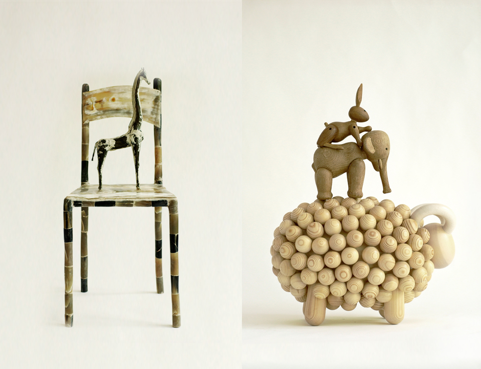
photos Sabine Pigalle- Left CSAO Paris : horn chair & giraffe statue / Senegal - Right : Kay Bojesen and Aarikka
"Crafts: A matter of scale and pace" is an analysis of the future of hand-made design and sustainability, first published in the Prince Claus Fund Journal, "The Future is Handmade", The Hague (2003). Lidewij Edelkoort is one of the founding members of Heartwear, a non-for-profit organisation based in Paris and working principally in Benin, Morocco and India. She helped start a Humanitarianism Design masters programme while directing the Design Academy Eindhoven and has received a Lifetime Achievement award from Aid to Artisans.
Some years ago while strolling through the Luxembourg Gardens in Paris in April, I discovered a unique nest in a tree, crafted by an avant-garde bird; its outer layers were made from twigs, while the inner side was woven from plastic McDonald’s coffee sticks… a perfect blend of the old and the new, the organic and the technical, the natural and the man-made, bridging the past with the future!
This metaphor has inspired me ever since and has taught me to understand the future of arts and crafts, its possibilities and its requirements.
Ethnologic museums such as the striking National Ethnological Museum in Osaka or the endearing Indonesian National Museum in Jakarta, show us in often touching ways how mankind has crafted its way from prehistoric to post-modern times, creating culture and forging tradition; how in each instance and on every island, the local population has realised hunting weapons and fishing tools, cooking vessels and utensils, patterned bark and dyed textiles, braided baskets and woven carpets for humble but perfectly-designed abodes in local matter and ingenious indigenous techniques. Each tribe benefiting from other grasses, other earths, other minerals and metals, other beliefs and ceremonies. Craft has been born from human life and needs, and therefore will possibly sustain itself into the far future so long as our species survives.
These archaic examples of arts and crafts still inspire us today to re-design and re-craft. Through time, however, other techniques and materials have been introduced to enable the creative spirits to develop and broaden their horizons, borrowing ideas from other groups, regions and beliefs. Early on, craft started to travel, became a trading device, a business model, a cultural icon and a messenger. Cross-fertilisation started to influence local colour and regional pattern and the trading path influenced its design.
The use of skin, feathers, beads and blankets can be traced back to tribes in the extreme north and the extreme south of our planet, from africans to native americans, from eskimos to shamans. The famous Silk Road opened Asia up to Middle Eastern splendour while installing buddist rigor in muslim expressions, indian blockprints became the trademark of french provinces, while exotic cashmere patterns became a staple of tradition, still today a landmark of european bourgeoisie. In telepathic empathy, several regions of the world developed similar techniques in textiles like dying indigo or weaving intricate ikat weaves, an early and spontaneous form of globalisation. Therefore, we can observe that craft has the power to express a local as well as a universal identity. This double layer identity is typical of arts and crafts and indeed a guarantee of its survival.
Crafts developed through the ages, inventing new techniques at each step, and tackling new matter; metal, glass, and even plastics, and lending its endless variations to the expression of the individual artist within this common experience.
By and large, applied and artistic crafts developed and thrived translating social, political and economic currents and illustrating the shifting in world powers from Istanbul to Saint Petersburg, from Vienna to Paris, from Lisbon to Goa, from Udaipur to Ispahan and from Kyoto to Como. The rigorous is alternated by the superfluous, the bold by the refined and the sombre by the splendid. Today’s world of antiques is witness to this everlasting change.
But man invented the wheel and started to rationalise the production of craft, still using his hands but with a little help from the machine. The machine was in turn made high-performance and self-sufficient so that our minds had to preview production beforehand, giving birth to the concept of design.
Design is a young discipline. A process engineered at the beginning of the industrial age that first and foremost developed function and derived beauty from it. Up until today, function is the trademark of industrial and serial design, reluctantly giving in to the emotional and the ephemeral. But man started to tire of function alone and evolved to decor, surface effects and inlay techniques, blending industry, art and design; a movement which is making a revival at this current time. Then came a moment of great innovation, aerodynamic design and streamlined form. What followed was a time of space-age shapes and science-fiction volumes: our fascination with form for form’s sake was born. As time passed, shape changed shape, and decor followed decor as Wallpaper reintroduced wallpaper.
Function became remote and voice-controlled and morphed into virtuality, giving function an ungraspable quality. Thus arrived matter and the development of our fingertips as important consumer tools. Material development became a major focus of the art and design worlds, the concept of second skin was born, forecasting a future of genetic engineering and human cloning. The more virtual life became the more tactile we wished to become. Matter called for colour to make up its mind and express its mood, ultimately making colour the overruling reason to select an outstanding work of design.
When design had acquired a sense of function, decor, shape, matter and colour, the insatiable and by now global market, requested more. It needed a code, or a name, or a logo, or all of those, so it invented and perfected the brand: passport to international shopping pleasure. With this last step, the world could sit back, relax and contemplate a century of learning, accumulating in a completed and perfected design process…
However, the demand for design had been explosive over the last decade, stretching our imaginations thin, and had engendered an insatiable appetite for new experiences which created a world full of stuff; a globe drowning in design, a situation ready to explode. Today, we experience a need for reflection and we feel a need to rethink the (non)sense of design.
To answer the growing global resistance to constant renewal and limitless expansion, humanity and integrity are requested for the years to come. It is time to empower goods with a new dimension; their own character, an invisible energy locked into the design process.
I believe that we will be able to make the object (concept or service) come alive to be our partner, pet or friend, and to relate to us on a direct and day-to-day level. Only when design will be empowered with emotion will we be able to create a new generation of things that will promote and sell themselves; they will have acquired an aura able to seduce even the most hardened consumers on their own terms. Only then will design have acquired soul.
With a consumer ready to embrace the rare, the unravelled and the irregular in this quest for soul in a product, the arts and crafts movement is back at the forefront of fashion and interior styles. The ritualistic qualities inherent in the making of the craft object or the symbolic quality in the concept of a human service will gradually become more important; in a quest for experience, consumers will want to embrace their inner-selves and choose merchandise to appease this need.
In an ever-more complex and information-riddled society, it will be important to touch base and to feel real matter, as if literally getting in touch with society. This is why the human-to-human revival of craft will flourish, lending well-being to uprooted westerners longing to get in touch with their original selves. Well-being industries and eco-tourism will rely heavily on human skills for preparing oils, herbal medicines, massage and pampering, as well as food preparation. The immaterial approach to craft will request far-fetching conceptual design and strategy to ward-off the ever more invading branded superpowers.
The question is now, what does this all mean for emerging economies and markets and what influence will this longing for human design, local craft and the uniquely man-made, have on local artistic developments and the global commercial markets?
Before we can develop and sustain the craft movement in our world, we will have to design new strategies of retail and new categories of merchandise, new ways of sharing profits, and fresh ideas of showcasing and promoting these goods.
Based on 15 years of experience in a humanitarian trade adventure from Paris called Heartwear – a collective of design friends developing crafts from different countries, such as pottery from Morocco, khadi from India and indigo from Africa – and armoured by past observations within the Design Academy Eindhoven’s masters course for humanitarian design and sustainable style, I have developed the following observations:
• Crafts run on local time, a rhythm which is considerably slower than the hectic pace of the international markets. This is why the public, especially western audiences, easily embrace and discard items and trends; leaving entire regions without markets by the sheer strength of changing fashions. Therefore we have to develop strategies that play on a once-in-a-while rhythm, exposing and withholding these works of craft so as not to allow the public to get jaded.
• Based on better and equal opportunities, we will have to build up new networks of distribution; playing with exhibition-style events, elevated garage sales or highbrow home-selling parties developed to encounter clients directly, intimately and... sporadically. The retail space takes on the appearance of a gallery and its workings.
• Without doubt, we will have to settle for small quantities and higher pricing; after all, these goods are made by hand and created by man, one by one. Large companies should therefore refrain from delving into craft ideas, exposing them for one season only to discard them the next. Global markets ruin the sustainable perspective of local arts and crafts; they devour their ideas, modify their production rhythm, demand much in little time to only then demand little for a long period. The fatigued fashion cycles of style turn the wheel evermore quickly to ultimately feel unsatisfied about everything. Distribution will become the mechanism of editing the pace.
• Based on the power of slow change, we will have to stimulate the creation of better goods with higher creative content and a stronger emphasis on quality, discarding the nostalgic western notion of the primitive and the exotic. Might some technology or some new material not exist in a certain region, I see no further reason to withhold the artists and artisans from its use. I believe that people’s creativity is apt to filter through new opportunities and options to create their own opinions and their own new dialect of design. Popular culture, outsider design and Sunday artists imbed contemporary images, technologies and sounds in their work, just like the Parisian bird making its wonderful nest. The embracing of the new will guarantee the survival of the origins of craft; a coming of age of craft.
• I believe that we will have to further teach art, craft and design in the emerging economies (as well as in our computer-driven art schools), through craft and design institutes, museum-quality craft centres and artist-in-resident initiatives in the third world. Education certainly is a key.
• On the horizon, another social factor is emerging, creating new possibilities for the craft and cottage industries; the birth of the creative consumer. Educated by retail and press, informed by new media, trained by television, and gifted with a broad schooling, we see the birth of a brand new consumer group yearning to be involved in the creative process. Far-reaching studies are currently underway at economic and technical universities in conjunction with large companies such as Audi and Adidas, to figure out how the industrial process can be modified so as to let the consumer in as a partner. Obviously, here is a challenge for the arts and craft movement; one-on-one and one-of-a-kind, its structure is able to embrace the creative consumer at once, as it still exists today in societies from India and Africa, for example. Workshops in city centres could facilitate this encounter of talents…
• Arts and crafts can only develop in a new economic landscape built on the sustainability of style and in a networking economy. I believe that local markets are to be developed and will take on an important role; the people-to-people service industries emerging all over the world will furnish local, embellish local and serve local, thus enabling small cottage industries to emerge.
At the Design Academy Eindhoven I have seen glimpses of this immaterial world to come, as translated by students from their IM Masters course. The mostly foreign students come to the Netherlands to train in the conceptual side of design, a discipline they haven’t yet mastered in their previous education. Their keen interest in the conceptual and the immaterial gives us food for thought and hope for a distinct and other future.
Working with the elderly was a goal of Thai student Ann Praoranuj; therefore, she scouted a group of elderly persons from Eindhoven and art directed them into a total concept, running a slow restaurant with slow service and slow food, completed by a slow chamber music ensemble for the opening of the event.
Banning the idea of personal rejection, the student San Hoon Lee from Korea had a hair-loss problem in his youth which he wanted to eradicate, and therefore he proceeded to create a brand called “I’M-PERFECT”, collecting and editing the rejects of our industrial process. To general amazement, these rejects echoed the unique and lively quality of the handmade, the crafted... This concept made us understand much of our motivations to cherish, to hold and to buy. It also made me understand that the industrialised will ultimately be able to obtain a craft quality.
Today we see that borders blur between disciplines and therefore art is using fashion, fashion is using craft, craft is using industry, industry is transforming design, design is getting close to art... All of a sudden the traditional feud between industrial versus artisan, and craft versus art, gradually loses its interest. Who cares? is often the answer of a new generation of all-encompassing creators.
Therefore, I believe that we will see the day that the industrial will carry the soul of the crafted, while arts and crafts will certainly sustain through the discovery and acceptance, or even inclusion of new and who knows virtual technologies. There will come a day when the two fields will merge and become an indiscernible whole. This is when humans will have come of age and become wise and will have decided to opt for the sustainable quality and style in design, intimately blending all which is believed to be contrasted today; young and old, old and new, healthy and naughty, nihilistic and decorative, male and female, first and third world, ethno and techno...You may think I’m a dreamer, but I’m not the only one!
Lidewij Edelkoort
Download a printable PDF version of this essay
a dialect in design
"A Dialect in Design", Lidewij Edelkoort discusses the essential creative language of Japanese art director and designer, Kenya Hara. The text was a preface to his 2007 book "Designing Design". Over the years, Hara's work has explored tactility and shape in ways that can take your breath away, always embodying the unique spirit of his native country.
He is a person of character.
He is a tall man made of rigor and severe good taste. He has no age.
He acts as an agent of tranquillity and is dressed like a priest in dark apparently simple yet superbly cut clothes, or on weekends, like a monk in hooded sweatshirts over soft drawstring pyjama pants. He is an arresting person with piercing all-seeing bird-like eyes that observe the world from behind intellectual round-rimmed spectacles.
For an instant, one could be mistaken and think him to be a swiss modernist designer of the last century; all red and white and angular.
Yet he is all the contrary, all white and red with a softer edge.
Precise and rigorous, he discusses design like a philosophy of life while continually shifting his awareness of the process, always with a work in progress somewhere, challenging and changing his own wisdom. He can be considered as much the timely delivery-boy of communication as the inventor of exformation, struggling and toying with acquiring knowledge and deleting excess in both disciplines.
He is a truly japanese creator grown from shadows and darkness, his soul bleeding from the scars of recent history, concerned with the roots of his culture and the DNA of its design discipline, and promoting its existence in the face of the other emerging asian countries. Therefore he focuses on the island’s own special values and strives for the survival of paper, print and recently also that of textiles; infusing tradition with contemporary content.
He is inventing a dialect in design, blending global ideas with local and regional colour and taste.
He is an idealist about the identity of nippon culture.
He becomes a samurai in his pursuit of nothingness, an acupuncturist to cure visual excess. He preaches contentment with emptiness and simplicity and sees Japan as an extreme hybrid that absorbs all other influences, neutralising all chaos, hovering alone on the edge of Asia.
Being an utopian he believes in a future without artifice, imagining a Japan that liberates itself from the bond of the american and now asian dream, coming to terms with a new economic and aesthetic maturity. Like kindled spirits, we both believe in a better world with spiritual and humanistic values.
He is literally in touch.
He is a teacher of texture, a leader in the field of tactile experiences, inspiring colleges and disciples to invent new textures and to employ surprising matter, a feast for the fingers as much as for the eyes. Soft-fingered yet strong-willed he has trained himself and a generation of designers in sensory perception putting Japan at the forefront of the design of new matter with new touch.
He is a colour escapist because he knows that by avoiding colour tactility can and will speak up. He designs in white to say snow, space, float, trust and rest, to whisper. As if white has become the skeleton of his body of work.
Again and again, he will express and explore the joy of humble design into the life of the everyday. As a sculptor of basic things, he uses in his major design projects materials such as paper, cardboard and textile to convey honesty and reliability. He designs paper to feel like snow and embosses it to look like ice, he dresses sign systems in freshly laundered cotton and continues to use whites for wrapping, storage, ceramics and architecture imprinted with the impact of red; red flame, red seal, red type, red sign, red heart, red dot...
This is the design of dignity; a whispered value system penetrating the human mind through all the senses. Emotion is tossed into the process by connecting the dots, by assembling the figurines, by connecting the past with the future and by fusing high-and low technology, as in embroidering paper to create new posters. The abstraction of paper and its timeless tranquillity make him believe in a future when books will carry information with the appreciation and added value of touch, weight, smell and memory. For him, paper is food, white is a concept, print is a process and design is oxygen.
As an architect of brand strategy in a truly contemporary and collaborative way, he teaches his clients to reconsider and redirect in a softer and almost more natural mode, more fluid also, with the whole process running like a river, shifting in perception silently; without any apparent effort. He pushes his partners to work with excellence and introduces them to the best thinkers, photographers and designers; he is a networker avant la lettre, stimulating his peers to ever-newer explorations in the field of the design of emotion.
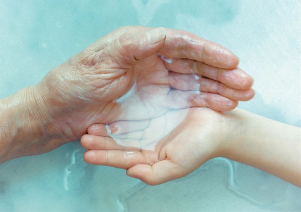
As a prophet in the wisdom of nature, he resorts to small ideas and examples to let nature speak. He will transform the contemplation of a vast and empty horizon to invite us to experience freedom of choice and liberation from the bondage of consumerism and he will imagine our own human hands as a vessel to drink water, as if being the first and most perfect example of the discipline of design. He is in fact a perfectionist with an eye for the imperfect and the decayed, the depleted nature of things, the random beauty of the changing seasons also.
Although he believes that forecasting the future (which is my profession!) is a futile occupation, he has in my eyes a natural talent for it; he becomes a prophet when he speaks of our life in the 21st century and the task he lays in front of us is vast and all encompassing.
He sees the japanese aesthetic and way of life as a role model for the western world with its modesty, symbolism, tradition and darkness, discarding over-consumption to experience another joy, the joy of being a spiritual individual at one with the sun and the moon, the river and the city, the forest and the animals, including ourselves. The emergence of the growing well-being industry can be seen as an early sign of this philosophy.
As an artist while drawing hieroglyphics, characters, scribbles or letters, his typography looks like raindrops, rice grains, snowflakes and butterflies… conveying the poetry in nature by a delicate rhythm alone. Therefore he also seems to have a particular liking for dots, which is no surprise to me. Only recently I discovered why the dot is so powerful and prominent at this point in time; I found out that the dot is narrative when it represents apple, wheel, balloon and moon, as well as it is abstract when saying stain, drop, pebble and moon, and therefore has become symbolic of the major movement of the future which will merge everything contrasted today: young and old, minimal and decorative, healthy and naughty, ecology and technology, craft and industry, natural and synthetic, abstraction and narration. The dot hereby perfectly embodies the idea of the hybrid and is almost symbolic of his body of work.
I can therefore only think of him in his own terms; his terms of archaic form, heightened touch and escapist colour; seeing a snow white, absorbent, slightly irregular, soothing and immaculate blank piece of paper punctuated with a burning and passionate red heart in the form of a perfect circle; his national identity is embedded in his body and rooted in his soul.
Lidewij Edelkoort
Paris, January 2007
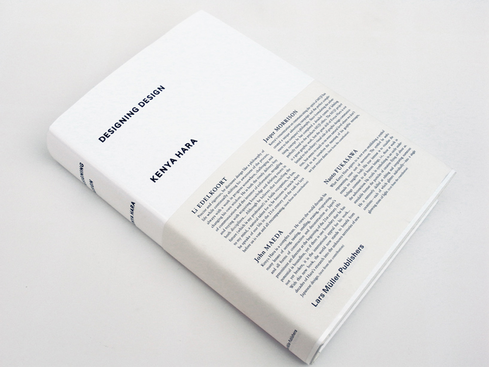
Designing Design by Kenya Hara- Lars Muller Publisher
21st Century Color
By using paint right out of the tin or spray straight from the can, the artists of the 60’s and early 70’s managed to give up a personal opinion when it came to color, expressing a need for interpreting quality renderings and transforming color into an emotional vehicle. With the arrival of acrylic fast-drying paint, automotive chromatic paint, flat and often synthetic surfaces and the popular image as inspiration, readymade color was meant to be a symbol of reality and therefore had to resemble the colors of packaging, billboards, magazines and comic strips. The two-dimensional artist prints realized with screen-printing (instead of more refined lithography) only emboldened this movement of pure color, so directly that brushstrokes were expressively amplified by Roy Lichtenstein and paintbrushes even stuck directly onto the canvases of Jim Dine.
This was a period when interiors were to come alive with bold blocks of upholstered chairs made of synthetic molded materials as seen in the designs of Joe Colombo and Pierre Paulin. The world was optimistic and playful, with designers and artists kneading matter like a child uses play dough and coloring in surfaces with flat, fast and fashionable markers such as in the Do It Yourself works of Andy Warhol. Out of the paint box, out of the can.
Nowadays, the public at large has learnt to discern color perfectly. As the curator of their own museum houses, they have learnt how to handle color choices and will reinterpret their individual cultures through color. They know that green can be pistachio, avocado, spinach or wasabi, that red might be coral, that pink could be flamingo, that brown will be chocolate and that skin no longer means a weird shade of salmon, but that it can be anything from the palest porcelain to a dark shade of ebony. When fine-tuned by sophisticated color and textile designers, these nuances make our times specific in their own right.
Today color never comes on its own. When we discuss color we speak of volume and we describe matter. The fusion of material and color has given our surfaces new interpretations; from matte rubber to high-gloss lacquer, from speckled mica to iridescent and pearlized effects, from lightweight transparencies to multiple layers and from brushed titanium to polished bronze. These new developments that embed color in materials have deeply changed the way we see and actually feel color. Our fingers seem to see the shade of things to come. The next step will be to push color to be fragrant and audible; a crispy salad green, a heady mildew mauve, a crunchy Japanese apple…
With a surge of brights currently parading the catwalk and clashing with the red carpet, and with lively lacquered surfaces in interiors and architecture changing color like structural chameleons, it is easy to mistake this colorful movement as a revival. Most fashion magazines have already labeled the color comeback as a return to the 60’s and early 70’s and seen it as a rekindling of the Pop movement. Yet a closer analysis of contemporary color codes teaches us the contrary.
Although brilliantly and blatantly colorful these newer shades are carriers of emotion and finesse and tend to be complex and researched. These tones are influenced by a digital timeframe where the color of light, video and the Net affect our perception and require today’s hues to be translucent and mutant since there are derived from pixels, recomposed and flexible.
The contemporary yellow is acidic and reflective and doesn’t resemble the egg yolk yellows of Andy Warhol or Ellsworth Kelly.
The current craze for green is as inspired by nature as was the vivid green of the Fauvist period; an interpretation of nature rather than a one-on-one Pantone match taken from the grass. These greens are the edible and drinkable greens of an organic movement with absinthe being the newest and hottest hue.
Our blue is not from either of the Yves (the intense blue of Klein or the navy of Saint Laurent) but a blue that resembles the Cerulean Ocean with the transparent quality of perfectly-rendered water.
Our oranges no longer resemble a Fanta bottle or an Orangina poster; they are based on exotic fruits like kumquats, mangoes and lush papayas. For autumn they may resemble pumpkin and fashionably introduce the shades of a prolonged Indian Summer, perhaps a symbolic anticipation of further global warming.
Our reds are possibly the only color that can still match the references of the 60’s and early 70’s, mainly because bright red has the strongest communication capacity amongst all the colors. Red is a color that is liberated from political possession and without an ideological identity; since the end of the Cold War red has been redefined by Coca-Cola, the Pope, Nancy Reagan, and most recently by the omnipresent red carpet.
Our pink (now in its tenth anniversary as a fashion favorite!) has been defined by roses, ribbons and more recently, macaroons, making these shades the darlings of us all. Even men have given in to a sweeter tooth and in recent summers hot Bombay pink has become a bestseller amongst polo shirt companies worldwide.
In a way the colorcard of the 21st Century very much resembles the Book of Genesis with its beginning of light, the water and earth dividing, the arrival of green – strangely enough before the moon, stars and sun – the colors of fish and birds (the best brights yet to be studied), the endless neutral shades of animal fur and last but not least, the color of man, our very own skins derived like a fashion colorcard.
So we live in our own century with our own brilliant shades of brights illustrating life from within and not just on the surface. But do they really play such an overarching role?
The bestselling RAL color in history is reference #7035, a boring middle grey tone. Grey is the perfect fusion of black and white, the color of nuance and dialogue, and a metaphor for a mature and truly democratic lifestyle. The family of greys permits all other colors to lean against them, to underline or overshadow them. Grey is patient and flexible and an appeasing tone in times of change and financial crisis. And with the recent success of Ratatouille, mouse grey paint everywhere may be the next small thing.
Lidewij Edelkoort
Download a printable PDF version of this essay
Commissioned by T Magazine, "21st Century Color" was also published by the New York Times on March 16, 2008 under the title "Paint by Numbers". The essay was written to celebrate "Color Chart: Reinventing Color, 1950 to Today", an exhibition at the Museum of Modern Art, New York (2008).

photos by Vanessa Batut

photos by Vanessa Batut

photos by Vanessa Batut
barns of the future
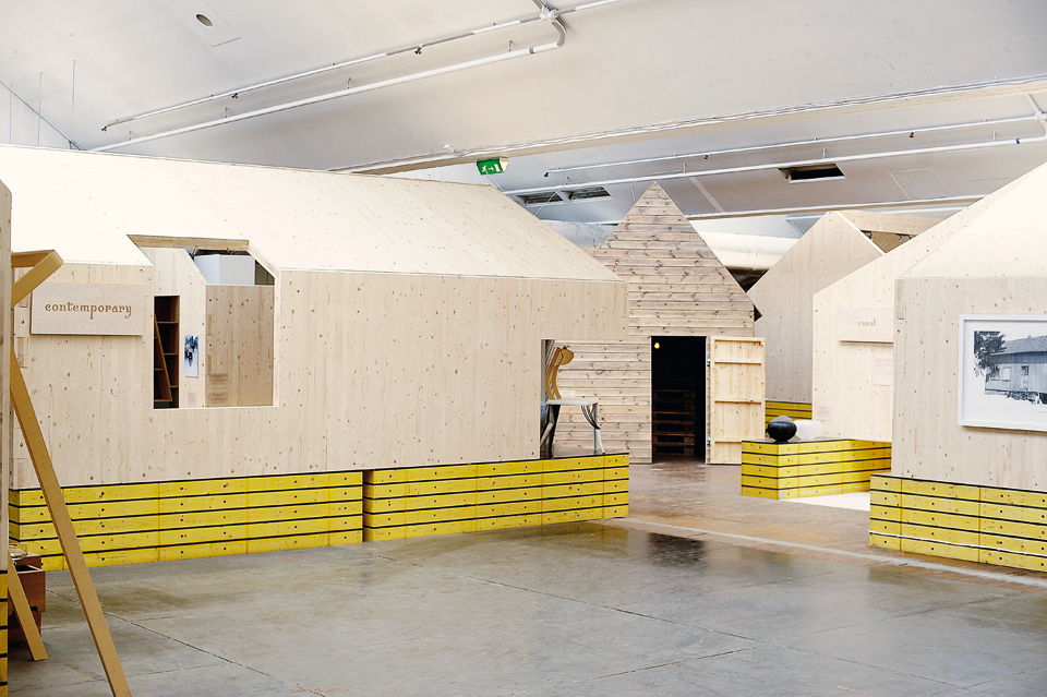
A Word of Folk, Sadnes, 2008, architecture by Helen & Hard Architects
"Barns of the Future" was written as part of "A World of Folk", the design and craft exhibition that Edelkoort curated for Stavanger2008, as part of that city's festivities as European Capital of Culture (2008). The exhibition featured both international and Scandinavian designers and took place in a small village of pre-fabricated barns created by the Norwegian architects Helen & Hard.
As we abandon long-established notions of the past and truly embrace this young century, the agricultural community will become the planet’s new elite, dominating our essential needs and inspiring years of farmer styles. After all, the farmers of the future will clothe us, house us, feed us, fuel us and hopefully even heal us. Ultimately they will be able to engineer design and grow furniture in a symbiosis of technology and biology, and therefore rural and urban lifestyles will merge and become one; resulting in an inversed social landscape with a greener city and a more contemporary countryside.
We will see vertical farming in the inner cities and the return of smaller luxury farms in the countryside to handle the market for fresh niche products, while arid areas of the globe will be used to power solar plants and farm new kinds of bio fuels. The farm will even become a destination for beauty and learning as well as a cradle for new retail strategies and marketplaces for the future.
This rural revival will sustain far into the future, influencing our habitations and interiors. The sparse architecture of the barn is to become a contemporary space using at once recycled and new materials, blending natural elements with industrial aspects; as adopted recently with innovative flair by Helen & Hard Architects, to define a unique contemporary village that houses the craft and design objects in Stavanger2008’s A World of Folk. Based on the traditional tun habitations of Norway, these open-ended structures absorb natural light and make use of laser-cut pre-fabricated woods that are cost-effective, easily assembled panels; a new way of building summer houses and semi-permanent housing.
Located in a small clearing within this landscape is a striking sinking silhouette, surrounded by peacefully-grazing sheep that have travelled far from their South African beginnings. The barn is entitled Hide, a recent graduation project by Design Academy Eindhoven communications student Laurens Manders. While his girlfriend austerely turns the pages of a narrative pop-up book illustrating their demise, this rural romantic sits playing a folk song on an acoustic guitar, drowning his sorrows away following his lover’s unfaithful ways. Live and unplugged, folkloric and poetic.
Outside the exhibition’s entrance, two more barns stand divided by a hundred years of time, but linked by their contemporary spirit. The Gann-Graveren Stockhouse is a 1911 structure originally used for drying clay bricks and once destined to be placed in storage as a heritage listed building, only to be resurrected by Helen & Hard who replaced its dated corrugated iron roof with a PVC veil that accentuates the linear skeleton of its expansive and aesthetic wooden beam rooftop. The refreshed version of this barn hosts A World of Folk’s opening ceremonies and other events related to the exhibition such as the New & Norwegian markets selling design, craft and international food in collaboration with local community groups and taking place on weekends during the exhibition dates. Once again engaged with its public, it seems evident that this building translates into any cultural space, whether it be to house a new ceramic gallery, an organic food hall, a rural lifestyle general store, or a day lit working studio for Sunday artists.
Just opposite, the Farm Project is the acclaimed touring installation commissioned by the kitchen and bathroom accessories producer Dornbracht, and intended to educate the public about the provenance of everyday food. Art director Mike Meiré designed the project as the stage for life: the lively mix of ingredients and spices, of cutlery, dishes, pots and pans evoke a place of tolerance where food and drink, kitchen utensils and recipes from all over the world coexist.
The Farm Project is not defined by technical touches or formal perfection. Instead, the visitor is a guest in a kitchen that quotes simple, down-to-earth life: in a barn-like room he or she encounters live pigs, birds, fish and straw, hay forks and simple galvanized buckets, gathered in an emotive collage of industrial stainless steel, traditional cast iron, newly designed furniture, and locally-sourced groceries and packaging. On the outside, panels in various materials (copper sheet, insulating panels, plastics) envelop the spatial object and become a symbolic, provisional and constantly changing patchwork; their great diversity also representative of our delicate civilisation.
Going back to nature but in a contemporary way, low-tech living will be optimized by advanced technology, as fast and slow are woven into a seamless whole. All of these simple, direct and modest elements will create very modern environments, or barngalows (bungalow-barns) as we may call them, be they in urbanized rural landscapes or countrified city centres.
Lidewij Edelkoort
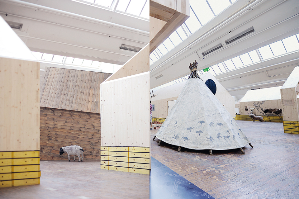
A Word of Folk, Sadnes, 2008, architecture by Helen & Hard Architects
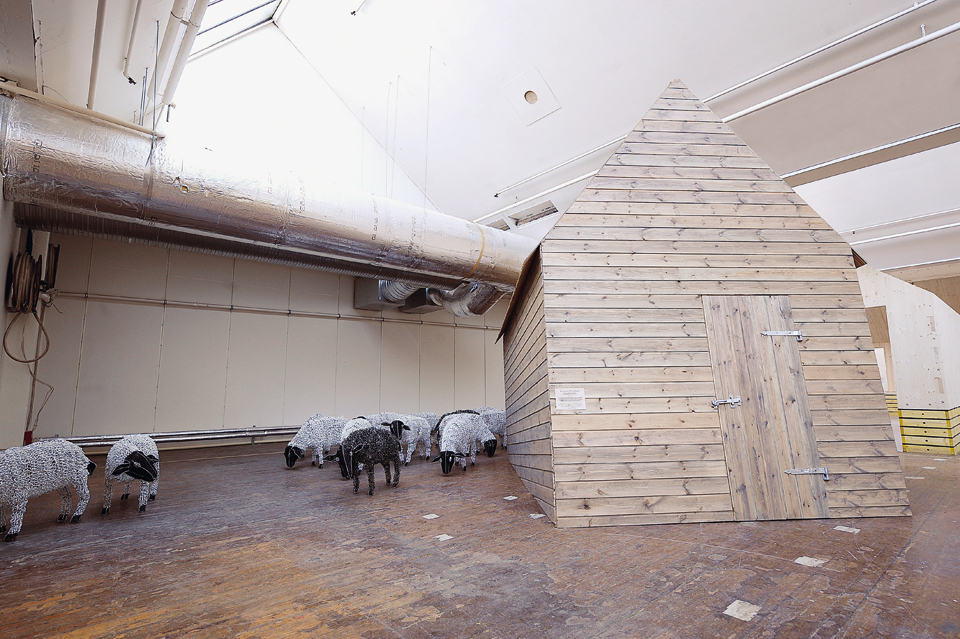
A Word of Folk, 2008, Hide by Laurens Manders
bold beginnings
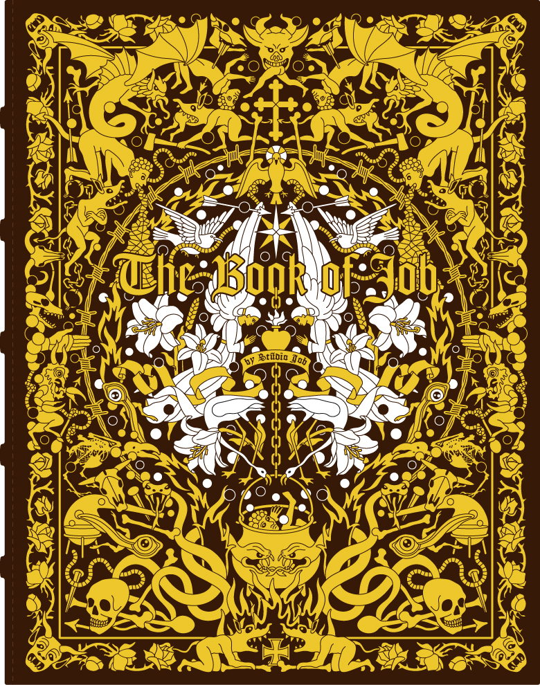
"BOLD BEGINNINGS" is an essay celebrating the work of Studio Job, whose career Lidewij Edelkoort has followed since the duo's early days at the Design Academy Eindhoven. In 2007, Edelkoort was proud to present a survey of their work at the Designhuis' inaugural exhibition in Eindhoven as well as an installation called "Safe House" in her studio in Paris. This text was published by Rizzoli in the landmark publication "The Book of Job" (2010), beautifully conceived and designed by Studio Job.
They are bold and happen to be beautiful also.
They are bold and make giant leaps creating the market of autonomous design.
They are bold in designing perfectly researched and precisely executed archetypical forms, interpreting furniture and artefacts found in historic palaces and rural areas and magnifying them to unusual proportions to make us aware of the beauty of the ordinary products in our kitchens and the value of the exotic finds in our curiosity cabinets.
Bold beauty is in the eye of the beholder.
Bold charms embrace universal symbols of romance, religion, royalty and region, chained together in heavy pieces of oversized jewellery.
They are bold characters, outspoken and confident in their creations, comfortable in their own skin and enjoying every minute of their hectic existence, although suffering will always be around the corner.
Such maniacal creative energy comes with a price.
Bold in public yet timid in private, the couple safeguards their secret garden of creation. They perfectly manage and boldly direct their public image but will never diffuse the style they live in; only their cats are at times allowed to penetrate the limelight, as only cats can do.
Whether playfully carousing with a football as pouf or symmetrically book-ending their impeccable pure white composition, they carefully art direct their projected images of self. Their bold behaviour in view of their promotional activities establishes the idea of the ideal couple, the picture-perfect partners, a crisp image of youthful energy.
They draw bold objects into perfect, almost aseptic, and often spherical forms, as if to encapsulate the soul of a crafted utensil for eternity, a contemporary vision of anthropological quality. They place everyday life on a pedestal. They live amongst vanities and curiosities, skeletons, insects, bronzes and jewellery; all given form anew by Studio Job; no nostalgic clutter in their environment.
They have developed a bold sense of tactility with irregular paper, facetted bronzes, jacquard metal-weaves and bas-relief in steel. They have collaborated with excessive clients like Swarovski and Bisazza, using shine and opulence in ever bigger and bolder scenarios. Yet they have also designed self-adhesive images people use to decorate their minimalist walls. High and low are their respiration and their influence, as children of their time, they manipulate volume distribution and unique pieces with ease and irreverence.
They even managed to produce a series of ceramics for the volume market before upgrading it step by step with hand-painted embellishments for the middle market, then adding gold-plated surfaces until it became a unique piece for top-end collectors.
In the meantime, the price has gone up 100%!
Their story started early. They both graduated from the Design Academy Eindhoven with rather bold concepts; she designed a copious alphabet made of fat 3-dimensional chunks, he gave form to a series of sorbet coloured oval forms looking like furniture yet expressly without function; the debate started then and there.
Early on, their creative destinies were forged by the powerful weight of a troubled timeframe. Or as Job likes to say, the end of the industrial period and the new experience of a post-craft culture. A time of merging disciplines as expressed by Job and Nynke as intimate architects, poets of mood and illustrators of dreams (or insect nightmares), with heraldic elements of form continually coming up. Undone from function, these arms are artistic references simply there to visualise the times we live in, they become pictograms of an era plagued by fear. Although heavy, dark and dangerous, their weapons do not kill, their brittle ceramic swords do not cut and their trophies do not celebrate. These epic memorabilia are part of a fairy tale creating their own imaginative castle, a second life in physical form.
Their bold sense of humour upsets some while delighting others; are they taking us for a ride, or do we agree that life is a carousel? Choosing well-known symbolic forms they confront their audiences with their past, their memories and social status, ensnaring forgotten memories and delving them into a wealth of experiences.
Their graphic work has made them famous in the world of illustrators and they often lecture on the subject. They have even acquired a cult following in Asia amongst the manga generations. The way they move from 2-D to 3-D is effortless. Like pop-up pictures, their world flips from flat to volume in one movement, effortless. Living in their own world of fantasy they don't even seem to notice.
The dapper duo takes on diverse markets and collectors at the same time, feeding frenzied American millionaires with robber-baron legends cast in extremely elaborate and detailed bronzes, while at the same time purifying final sketches for an installation of agricultural artefacts for a rural museum in the Netherlands. In one continent dancing around the golden calf with Design Miami collectors, while at the same time researching their fundamental regional roots. This keen understanding of markets and cultures shows a bold talent for strategic questions. In the footsteps of other entrepreneurial creators like Koons, Haring, Wanders and Warhol, they embrace the zeitgeist of a new century with dedication, insight and management skills.
Studio Job has no contemporary competitors; their only challengers come from the past. Their curved chair wants to realise Rietveld’s dream, their unique pieces are in awe of the Wiener Workstation and Memphis, their bold furniture will question Artschwager, their intricate patterns are challenging Fornasetti, their textiles become household partners like the Ploeg used to provide, and their narrative inlaid woods remember Bugatti. Indeed, their way of merging work and play could be compared to Charles and Ray...
Lidewij Edelkoort
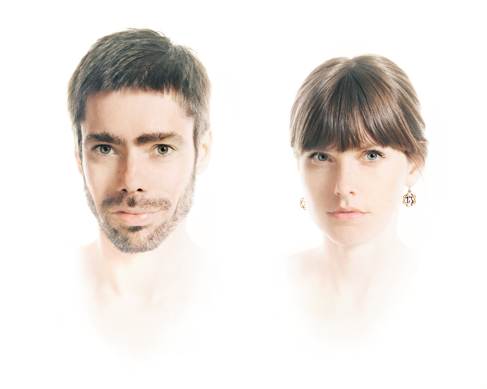
Studio Job's portrait
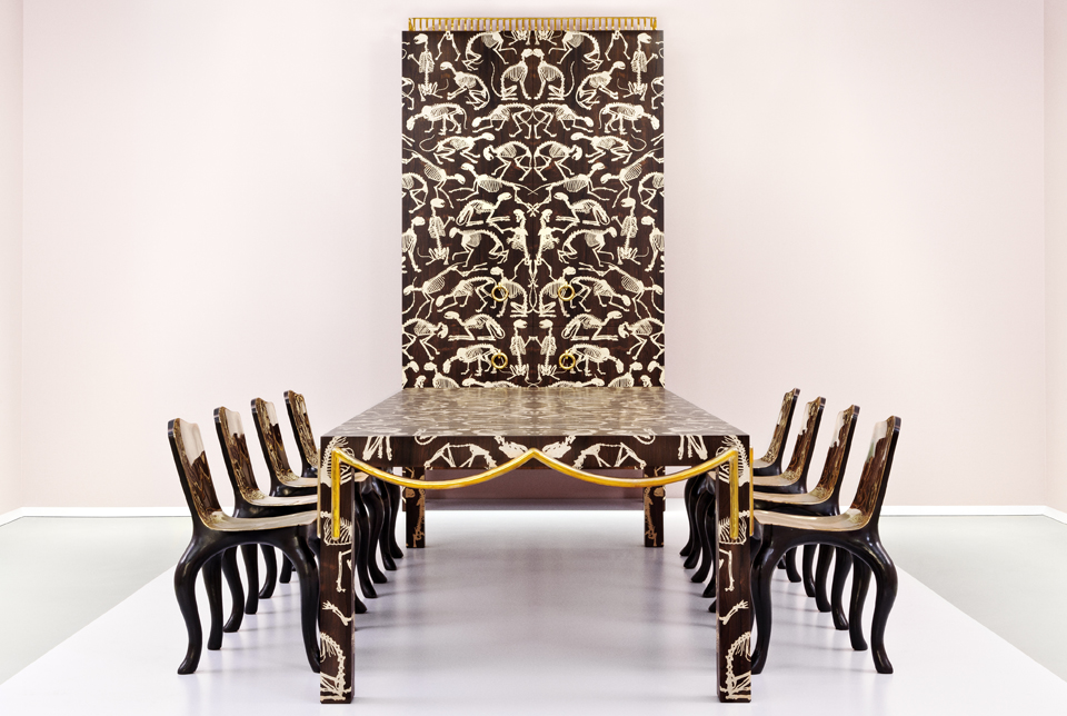
photo by R. Kot
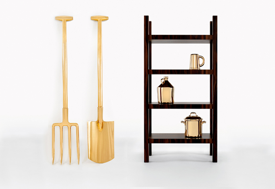
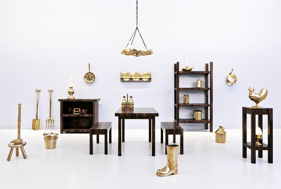
photo by R. Kot
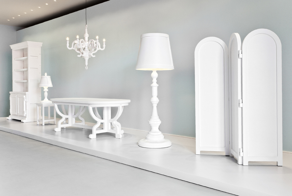
photo by R. Kot

