NØRDIC NEWS
monochrome states of mind
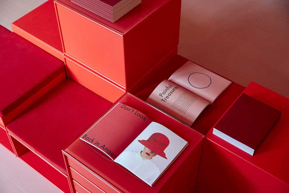
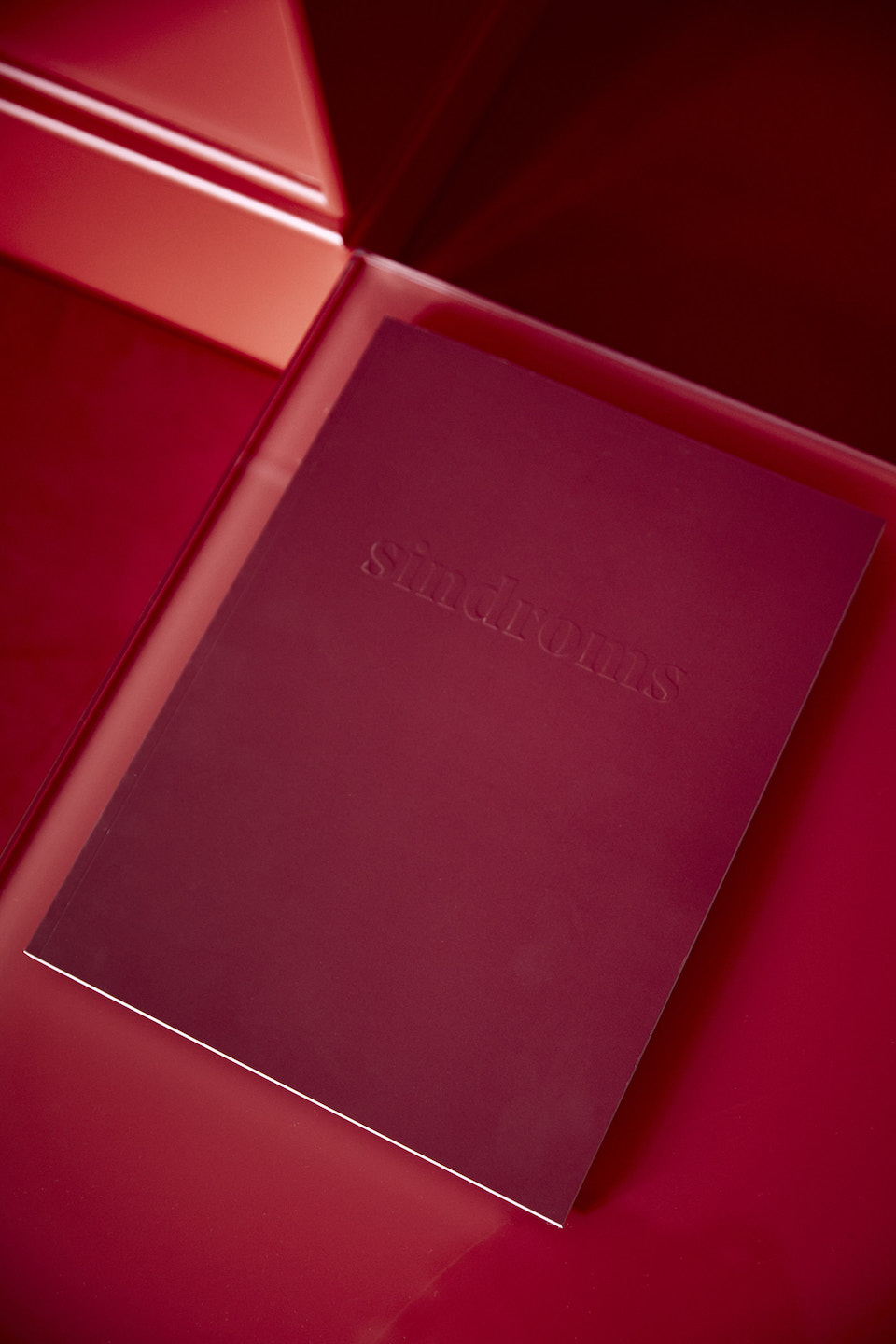
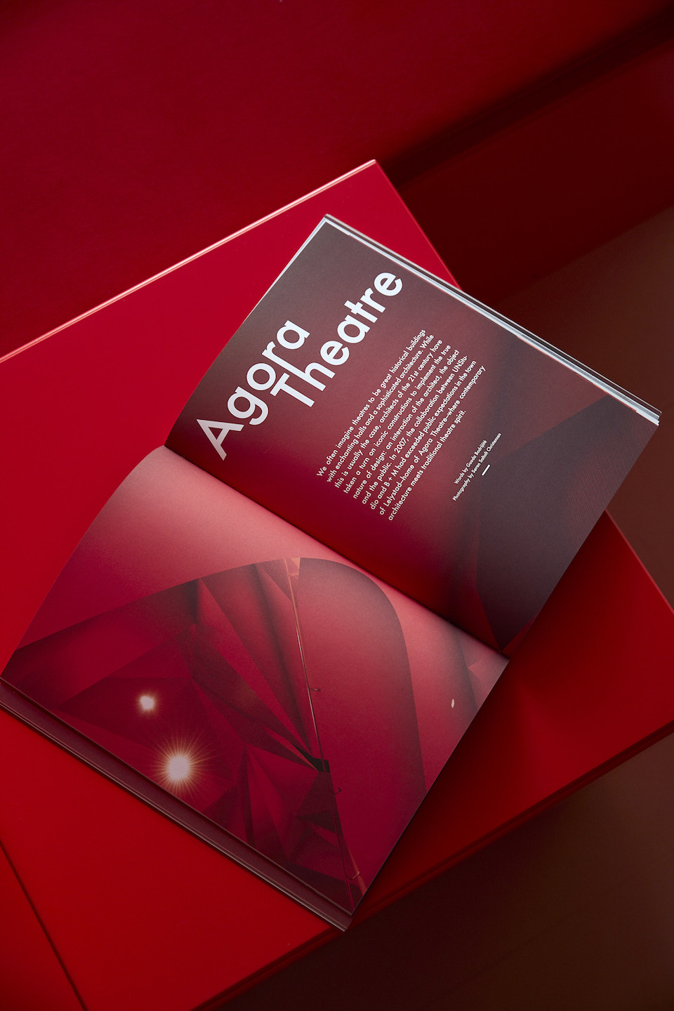
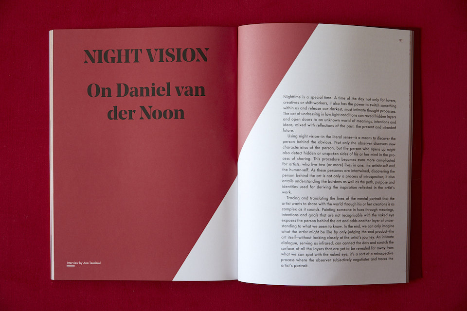
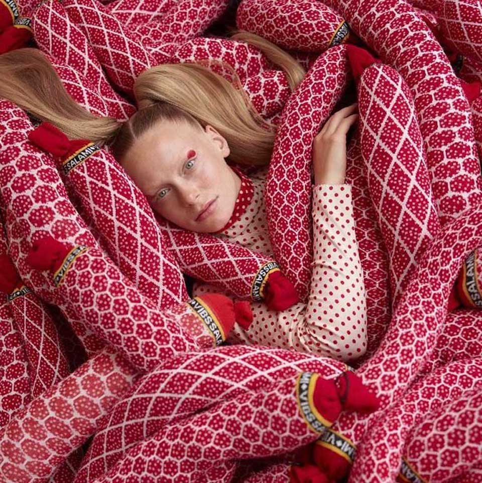
Sindroms is a journal of monochrome states of mind. The print magazine published biannually is curating its content based on specific colors, investigating them across culture and immersing its readers in the feelings and moods evoked by each color.
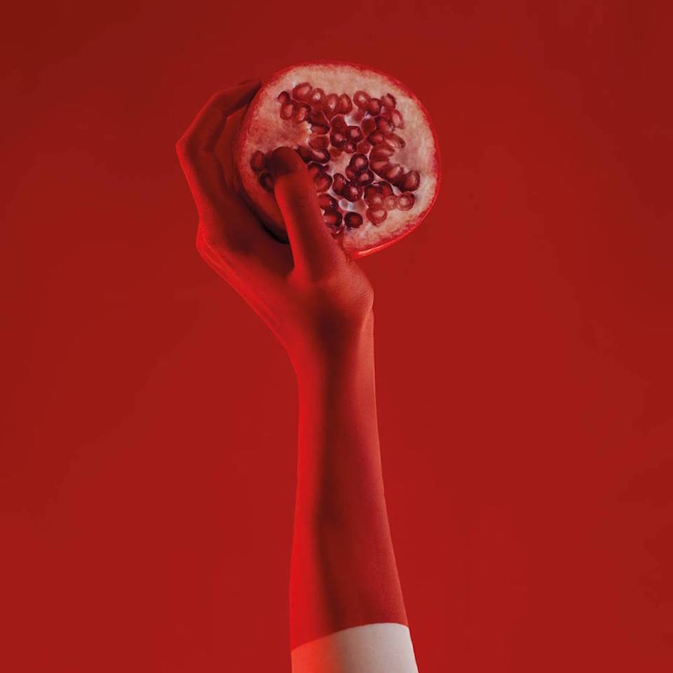
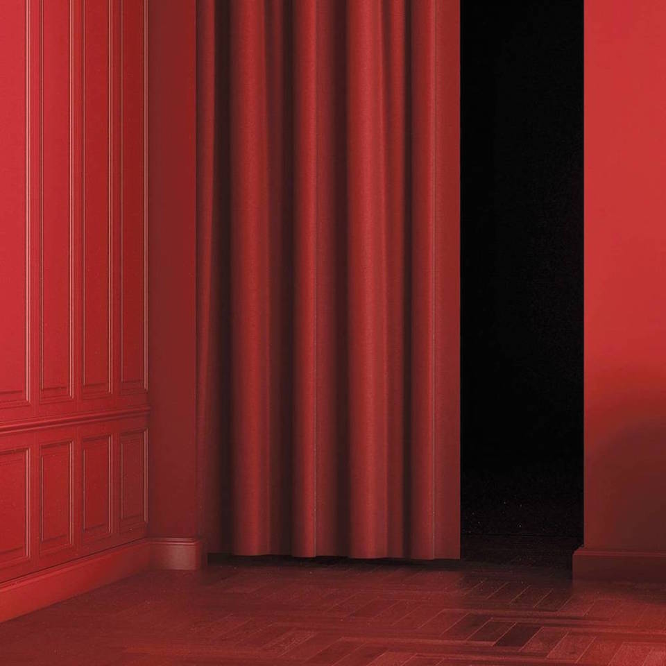
The first and recently published issue channels the states of mind that the color red can provoke. To explore this color, they look at everything around them, letting their readers experience the feelings it evokes. Though the magazine is highly conceptual the content manages to flow between heaviness and lightness, pleasure and pain, appreciation and criticism of red – and always with a simple, witty, and casual tone.
The team consists of four women all living and working in Copenhagen: Miruna (Creative Director), Ana (Business Development), Monique (Editor-in-Chief), and Kotryna (Communications). To dig deeper into a monochrome states of mind we have been in a dialogue with the two founders, Miruna and Ana.
Four women, each with their own professional background, team up and choose to collaborate together on creating a unique, independent and hyperly-curated lifestyle magazine. How and why did Sindroms Magazine originate?
Miruna: It started more than a year ago, with Kotryna and I deciding to start our own magazine. We loved the independent publishing scene and what so many great indie magazines were doing in print, and since we had a quite multidisciplinary background, making a magazine seemed like the perfect chance to combine everything we loved doing. We also knew we had to bring something novel to the market, something that was missing. I was working a lot with color at the time, and I just thought, why not make a magazine that focuses on a single color at a time? We just instantly felt like this is it! There was nothing close to it on the market, and people seemed to be really into the concept. But it only started to come to life as we found the key people to do it with: Ana, our business development responsible, Monique, our Editor in Chief, and Ausra, who was among the first photographers we worked with.
Why is it important to you to investigate and explore a certain color? Do you experience any limitations from the concept of working with just one color?
Ana: When you look at our first issue and its overall concept, you instantly get a clear idea – it’s monochrome. When we started to work on the first issue, it was a bit of a challenge to understand what should go in and what would be a bit random. Personally red was my least favorite color, so I wanted to explore it, and I wanted to understand what it can bring when used in small but also large quantities, placed in the spotlight or emerging from the details. There are so many use cases when you look at design, architecture, or lifestyle, and so many ways you can use color to build but also hide certain elements/experiences/messages. The limitation might initially be perceived as the concept of focusing on one color per issue – and that is what we wanted to reach with the feeling of obsessing over one color – but then the stories we tell within each color open up doors to new perspectives and are aimed at creating room for further discussion.
Miruna: I’ve personally always found pleasure in monochrome aesthetics, and in sorting things by color – it’s something that can please the eye for sure. So that played a role in deciding to curate each issue by investigating a single color, but it was also about the opportunity of going really in-depth by taking each one at a time, and dedicating an entire issue to it. This gives us the chance to really obsess over each color and study it, analyze it, find interesting stories and new angles around it. And we don’t really see it as a limitation – it’s more like having a specific filter and then exploring all the possibilities related to this color – and there are so many!
To me, Sindroms is a very conscious and emotional word. What’s the actual meaning behind it?
Miruna: Organizing things by color can often be something obsessive-compulsive, and working with only one color at a time (for us) – and then reading a magazine that is completely monochrome (for our readers) – can be overwhelming and feel a bit obsessive. We wanted a name that would transmit this obsession somehow.
Ana: The reasoning I mainly think of here is found in the game between the infinite themes to approach within one color and the color itself. The feeling of being trapped in a monochrome state of mind and then observing the endless possibilities of knowingly using a color. It should feel a bit like a challenge to break the patterns of a color while staying within its universe. So Sindroms should mirror this gameplay and the obsessive world we focus each issue on.
The first issue has several articles exploring and investigating red, with an introverted and psychological approach. Will this be a general approach in the forthcoming issues, or was it specific for the “Red Sindrom”?
Miruna: Yes, it definitely will. It’s also why we call Sindroms a journal of ‘monochrome states of mind’ rather than a magazine about colors – because color has such a big emotional and psychological influence on us, and is capable of altering our moods and triggering different feelings in us, so we really wanted to use the colors to evoke different states of mind within our readers. It’s also why in each issue, besides our ‘regular’ content verticals (such as design, lifestyle, art, etc.) we also focus on investigating the feelings associated with each color.
Ana: The concept we are approaching through a magazine focusing on colors is by its nature an approach which requires an in-depth analysis of each subject. Working with colors together with the team helped in making it obvious that the way we perceive colors is different, it is something completely subjective. The approach we took for the overall concept was defined by looking into the different angles with which color are used in different areas, whether that’s architecture, food, lifestyle or fashion. So what the philosophical approach brings is a new viewpoint for the reader to interpret surroundings in regards to colors and their daily or strategic use, while leaving enough space for their own interpretation.
You all have full-time jobs, have both families, friends and interests to take care of, but there are still only 24 hours in a day. How do you manage your private and professional life?
Ana: Well, we don’t – haha. I think we are all so into the subject we are working with, and the product that we bring out there, that it just became part of our daily lives. And we’re so interested by the themes we choose that we managed to create a high interest among our close ones as well. So this helps – we get further inspiration by discussing and playing with our imagination among the team, as well as among our friends and family, and it makes Sindroms feel like something natural. Sometimes we can also get a bit geeky about it, so it is also easy for this to feel like a second job, but then we always use different motivations to get us back on the floating line. Yes, we enjoy it, and we managed to find a natural way to integrate it into our daily lives, but we’re also good at working together and giving each other the necessary space to keep the good vibes floating in. So in the end it just feels like a normal 24h day, only one in which you have a continuous engine of inspiration.
Miruna: Yes, and if you think about it – it is very much a second job, it’s the after hours job. So there are obviously moments where it can get quite stressful and we feel like there aren’t enough hours in the day, especially in the busy periods. But it’s also exciting because we are passionate about it, and happy to spend our free time doing it – so it’s crucial that we love what we’re doing and we keep doing it our way. I think that is also why we are very picky with all the stories that go into the magazine, all the people and brands we partner with, etc. We really need to be proud and excited about all these choices.
What are the most essential components to running a biannual magazine?
Ana: We decided to be biannual as each issue in itself is quite complex. It requires time to digest each story, and to give your own interpretation between a written theme and the role of color in regard to it. Each issue is also a complex approach on an individual color – we wanted our readers to explore and feel engaged in the red states of mind for a while, almost like exploring a new world. We also need the time to investigate and put together something that does justice to the color. What I see as the challenge with biannual magazines is keeping the interest around the concept alive. Having a solid story around each issue with a clearly defined concept, and already creating interest for the next ones is what I see as the golden key here.
Why is it important for you to make it in a printed format?
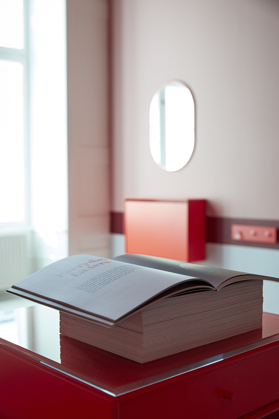
Miruna: It’s a good question, because from the beginning we knew we wanted to make a print publication. We love print, and I think everybody is at least a bit fond of it – there’s something about holding something physical in your hand and turning a page. And what is happening in print in the independent publishing industry is just fascinating – indie magazines are reinventing print, breaking all the rules, and creating beautiful objects, not just magazines. Some people buy these magazines just to display them in their home. It’s definitely exciting to try to create something like that – yes, it’s a magazine, but we want to make something that people love to read and look through, display it, and collect it.
Ana: The independent magazine industry offers so many different approaches to so many interesting subjects. Every print publication plays the role of someone’s craft, and it feels a bit closer to the raw format of a product, which makes the reader feel closer to the subject of joice. Print format contributes to this as it offers a gameplay of textures, sizes and colors which I think is one of the most interesting parts in regards to the physical attributes of a magazine. The different paper textures, the feeling of delving deep into a physical object and being far away from the distractions the digital world offers. It creates a more personal invitation for the reader to get immersed in the world one aims to create.
You are all based in Copenhagen. How does the city influence your work?
Ana: It might sound like a bit of a cliché, but what I see as a main influencing element is the Danish hygge culture. I think this played a role in us becoming even more receptive to textures, to colors and to the whole print feeling. It’s a city in which there is so much space for new initiatives and people around are really open to helping out and contributing, there really is this feeling of a big city in a small place. But then we have the muted colors theme around the city, so it inspired us on a detail level, but it also challenged us to bring in a new concept.
Miruna: Exactly, that’s probably something that influenced this concept coming to life – the lack of focus on color, and this muted, calm tones palette that is at play in Copenhagen. A lot of publications also focus on this lifestyle and aesthetic, and that played a part in us wanting to create something different. But you can of course see the influence in our aesthetics, even if we are so colorful, we do promote a quite clean and simple style, with a focus on conceptuality.
How is your creative process in order to decide which color will be next? Where and how do you find inspiration? Is it entirely based on common intuition and dialogue ?
Miruna: It’s a mix. There was a lot of thought into choosing the first color, it felt really important to go with the ‘right’ one. In the end it was a combination of color psychology, as our research indicated red is the most attention-grabbing color, and we wanted something unignorable, and also our personal intuition that sort of ‘validated’ this choice. We felt really good about going with red. For the second issue, on which we are working on now, it was a slightly bit different. This time, we also investigated trend forecasting. We were really lucky with the red issue, since red really had its moment this past year. So we made some research, to know what’s happening, and then again, our intuition played a big part – we all kind of knew we wanted to take on this color next.
Ana: Miruna kind of covered it, yet another element is revolving around the discussion of the overall mood or emotion predominant in a color, which is only what the initial perception might be. This plays a definitive role as well as it’s the first perception on each issue. We always try to go back and see what are our natural curiosities sparkling up from the process of creating an issue and its stories. So we wouldn’t do black and then grey as they might initially seem as if they are limited within the area of the same states of mind or emotions. We always also keep in mind bringing in a refresh through every issue and the 5-6 states of mind we explore as part of its angles.
What are your favorite colors?
Miruna: It’s funny, but making Sindroms is completely changing my perspective of colors. I used to really dislike red before starting to work with it, and I really started loving it more and more. That’s ironic, because we all expected to hate it after obsessively working with it for more than a year, but it’s been quite the opposite – it’s one of my favorite colors now. And I can already see it happening with the color of the second issue, so it might be that my answer will become whatever color we’re working on. And pink!
Ana: I couldn’t choose one as my one and only favorite one, but I do have something for black, and that’s mostly a fashion choice – only because I see it as a blank, but elegant canvas for playing with textures and unique details that define my style. I like to keep it clean and a bit mysterious. But in general, I can’t point to a favorite. What made everything so unique for us with Sindroms was the fact that the more we found out about a color, the more we got to understand its meanings, how to use it consciously, and how it plays a role unconsciously as well – a lot of psychology there, but as a process it’s really cooler than I can describe it. Think of it as Eiffel 65’s song, Blue. You might think they’re talking about a blue little guy and his blue Corvette, when actually creating a mainstream pattern breaking dance track was not their only purpose. They actually used a color reference to send out a higher message and give meaning to the song. Sindroms is our pattern breaker, but maybe we just went a bit deeper than Da Ba Dee, Da Ba Die.
Magnus Høst
Magnus Høst is a freelance creative consultant and editor based in Copenhagen, Denmark. Magnus helps brands connect (or re-connect) with consumers through visual storytelling. His consultancy and multidisciplinary approach is based on trend forecasting, an understanding of contemporary culture and lifestyle.
