
NØRDIC NEWS
floating public spaces
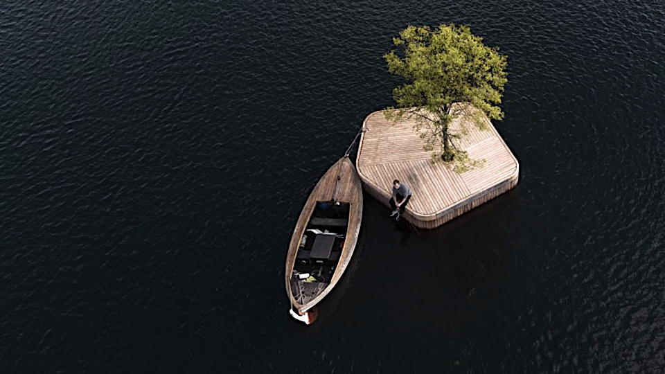
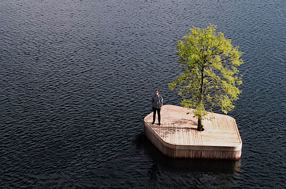
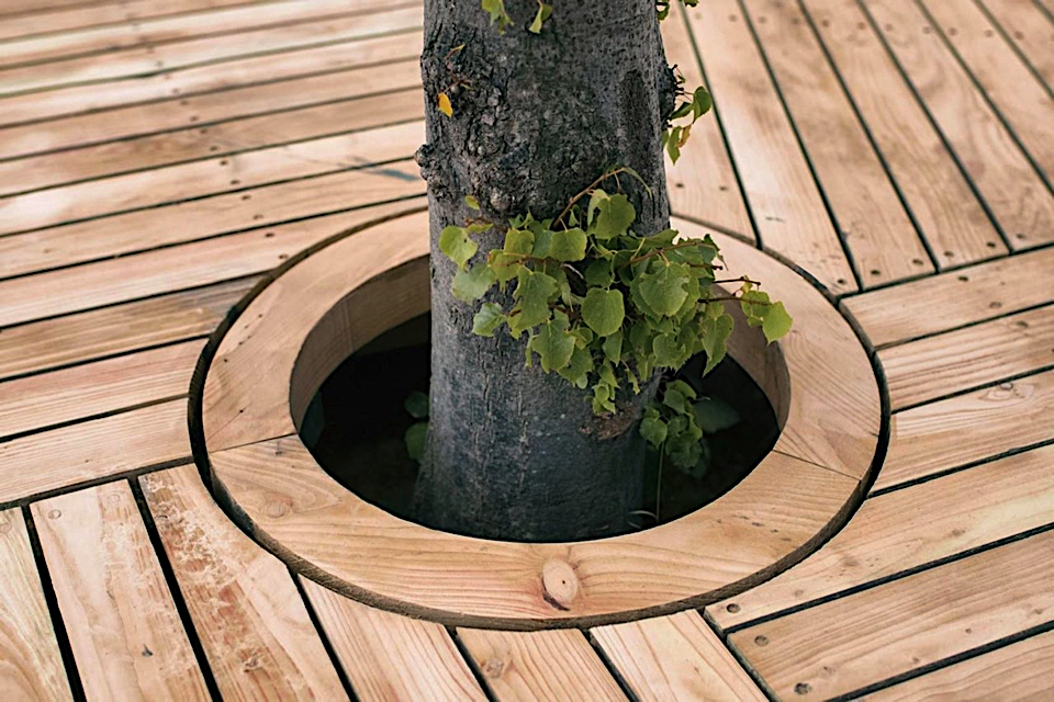
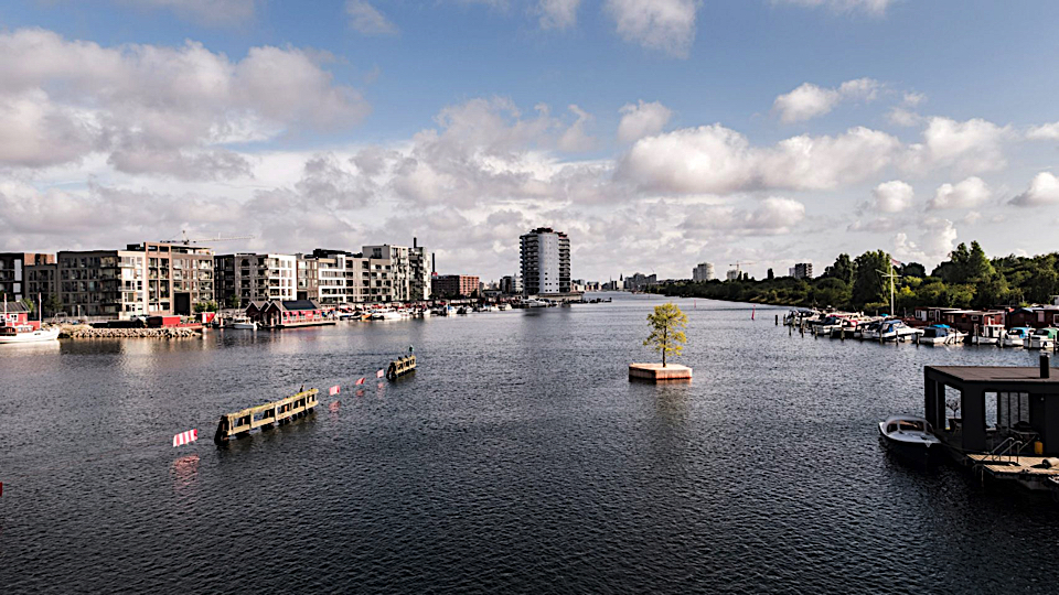
The world’s population is becoming increasingly urban. 2007 is usually reckoned to be the turning point when city dwellers formed the majority of the global population for the first time in history. Today, the trend toward urbanization continues, and it is estimated that more than 55% of the world’s population lives in cities – and it’s expected to reach 66% by 2050. This rapid increase in urban population creates a massive density pressure on larger cities, which require well-planned urbanization, creative housing solutions, building innovation, and green mobility solutions. In Copenhagen, the capital of Denmark, around 4.000 people are estimated to settle down every single month. Australian architect Marshall Blecher and Magnus Maarbjerg, who are the founding partners behind the creative and multidisciplinary studio Fokstrot, have creatively addressed this issue with their new concept called ”The Copenhagen Islands”.
This is the first in a series of new experimental floating public spaces in Copenhagen. Defined as a “Parkipelago” it focuses on the place and function of public spaces in the city – both in a local context where rapid urban development along the harbour side threatens the recreational spaces, but also in a global context where rising sea levels creates new challenges for urban environments.
The islands will be dispatched on suitable locations around the inner harbour, but will also find their way to more forgotten and underused corners a long the waterfront, catalyzing life and activity. Ultimatelively giving back a little bit of space for whimsey and wonder to old industrial harbour sides, and help democratizing the area.
They will include some simple swimming platforms, but also a floating sauna island, floating gardens, floating mussel farms and a floating sail-in café, all free to be explored by the increasing number of kayakers, sailors and fishermen using the harbour. During Winter and for special events or festivals, the islands can be brought together, creating a cluster more easily accessed from the harbour side.
The first stage of the project was funded by the Danish arts fund (Statenskunstfond) and Havnekulturpuljen, an organisation that promotes and cultural activities within the harbour. Blecher and Maarbjerg are working with the Danish arts fund and other not-for profit groups to fund the next stage of development.
Magnus Høst
Photo by Christian Emdal. Drone photo by Airflix.
Magnus Høst is a freelance creative consultant and editor based in Copenhagen, Denmark. Magnus helps brands connect (or re-connect) with consumers through visual storytelling. His consultancy and multidisciplinary approach is based on trend forecasting, an understanding of contemporary culture and lifestyle.
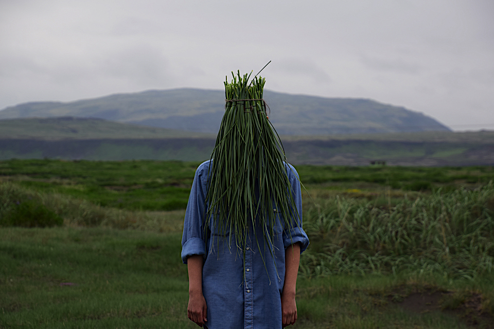
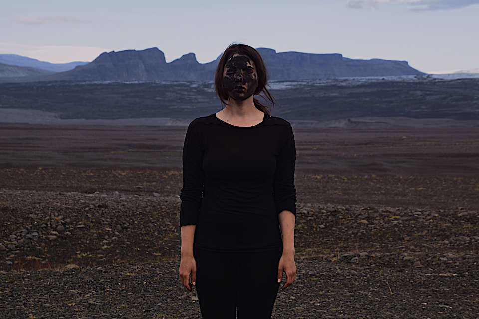
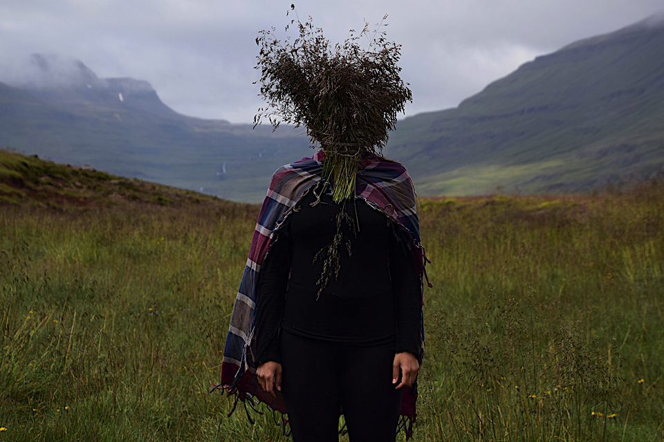
landface

Anastasia Savinova is a visual and performance artist, born in USSR and currently living and working in the north of Sweden
“Landface” is an ongoing series of self/land-portraits, an exploration of an intimacy with the landscape, wild grass, sand, ice, rock, mountain. Anastasia travels, hikes, climb the mountains to reach the open horizon, to see an endless land, breathe in the dizzying wild air, drink the powerful energies. She walk slowly in the landscape, listening. Does it speak like father, a sister, a lover, or all of the above and more?
When humans see the reflection in a mirror, an image of their face takes a central position and the nature becomes a mere backdrop. In this series, on the opposite, a human face is a reflection of the landscape. Human body's presence, dignified yet silent and humble, is merging with the landscape splendor.
The face and sight are covered by a mask, made from plants or other matters, abundant in the portrayed landscape. Through the mask ritual the body becomes a listening body; through the physical blindness all other senses grow acute. A trusting, intuitive body enters the mystery of the landscape, breathing in unison, inheriting the wisdom of the land's body.


monochrome states of mind

Sindroms is a journal of monochrome states of mind. The print magazine published biannually is curating its content based on specific colors, investigating them across culture and immersing its readers in the feelings and moods evoked by each color.
The first and recently published issue channels the states of mind that the color red can provoke. To explore this color, they look at everything around them, letting their readers experience the feelings it evokes. Though the magazine is highly conceptual the content manages to flow between heaviness and lightness, pleasure and pain, appreciation and criticism of red – and always with a simple, witty, and casual tone.
The team consists of four women all living and working in Copenhagen: Miruna (Creative Director), Ana (Business Development), Monique (Editor-in-Chief), and Kotryna (Communications). To dig deeper into a monochrome states of mind we have been in a dialogue with the two founders, Miruna and Ana.
Four women, each with their own professional background, team up and choose to collaborate together on creating a unique, independent and hyperly-curated lifestyle magazine. How and why did Sindroms Magazine originate?
Miruna: It started more than a year ago, with Kotryna and I deciding to start our own magazine. We loved the independent publishing scene and what so many great indie magazines were doing in print, and since we had a quite multidisciplinary background, making a magazine seemed like the perfect chance to combine everything we loved doing. We also knew we had to bring something novel to the market, something that was missing. I was working a lot with color at the time, and I just thought, why not make a magazine that focuses on a single color at a time? We just instantly felt like this is it! There was nothing close to it on the market, and people seemed to be really into the concept. But it only started to come to life as we found the key people to do it with: Ana, our business development responsible, Monique, our Editor in Chief, and Ausra, who was among the first photographers we worked with.
Why is it important to you to investigate and explore a certain color? Do you experience any limitations from the concept of working with just one color?
Ana: When you look at our first issue and its overall concept, you instantly get a clear idea - it’s monochrome. When we started to work on the first issue, it was a bit of a challenge to understand what should go in and what would be a bit random. Personally red was my least favorite color, so I wanted to explore it, and I wanted to understand what it can bring when used in small but also large quantities, placed in the spotlight or emerging from the details. There are so many use cases when you look at design, architecture, or lifestyle, and so many ways you can use color to build but also hide certain elements/experiences/messages. The limitation might initially be perceived as the concept of focusing on one color per issue - and that is what we wanted to reach with the feeling of obsessing over one color - but then the stories we tell within each color open up doors to new perspectives and are aimed at creating room for further discussion.
Miruna: I’ve personally always found pleasure in monochrome aesthetics, and in sorting things by color - it’s something that can please the eye for sure. So that played a role in deciding to curate each issue by investigating a single color, but it was also about the opportunity of going really in-depth by taking each one at a time, and dedicating an entire issue to it. This gives us the chance to really obsess over each color and study it, analyze it, find interesting stories and new angles around it. And we don’t really see it as a limitation - it’s more like having a specific filter and then exploring all the possibilities related to this color - and there are so many!
To me, Sindroms is a very conscious and emotional word. What’s the actual meaning behind it?
Miruna: Organizing things by color can often be something obsessive-compulsive, and working with only one color at a time (for us) - and then reading a magazine that is completely monochrome (for our readers) - can be overwhelming and feel a bit obsessive. We wanted a name that would transmit this obsession somehow.
Ana: The reasoning I mainly think of here is found in the game between the infinite themes to approach within one color and the color itself. The feeling of being trapped in a monochrome state of mind and then observing the endless possibilities of knowingly using a color. It should feel a bit like a challenge to break the patterns of a color while staying within its universe. So Sindroms should mirror this gameplay and the obsessive world we focus each issue on.
The first issue has several articles exploring and investigating red, with an introverted and psychological approach. Will this be a general approach in the forthcoming issues, or was it specific for the “Red Sindrom”?
Miruna: Yes, it definitely will. It’s also why we call Sindroms a journal of ‘monochrome states of mind’ rather than a magazine about colors - because color has such a big emotional and psychological influence on us, and is capable of altering our moods and triggering different feelings in us, so we really wanted to use the colors to evoke different states of mind within our readers. It’s also why in each issue, besides our ‘regular’ content verticals (such as design, lifestyle, art, etc.) we also focus on investigating the feelings associated with each color.
Ana: The concept we are approaching through a magazine focusing on colors is by its nature an approach which requires an in-depth analysis of each subject. Working with colors together with the team helped in making it obvious that the way we perceive colors is different, it is something completely subjective. The approach we took for the overall concept was defined by looking into the different angles with which color are used in different areas, whether that’s architecture, food, lifestyle or fashion. So what the philosophical approach brings is a new viewpoint for the reader to interpret surroundings in regards to colors and their daily or strategic use, while leaving enough space for their own interpretation.
You all have full-time jobs, have both families, friends and interests to take care of, but there are still only 24 hours in a day. How do you manage your private and professional life?
Ana: Well, we don’t - haha. I think we are all so into the subject we are working with, and the product that we bring out there, that it just became part of our daily lives. And we’re so interested by the themes we choose that we managed to create a high interest among our close ones as well. So this helps - we get further inspiration by discussing and playing with our imagination among the team, as well as among our friends and family, and it makes Sindroms feel like something natural. Sometimes we can also get a bit geeky about it, so it is also easy for this to feel like a second job, but then we always use different motivations to get us back on the floating line. Yes, we enjoy it, and we managed to find a natural way to integrate it into our daily lives, but we’re also good at working together and giving each other the necessary space to keep the good vibes floating in. So in the end it just feels like a normal 24h day, only one in which you have a continuous engine of inspiration.
Miruna: Yes, and if you think about it - it is very much a second job, it’s the after hours job. So there are obviously moments where it can get quite stressful and we feel like there aren’t enough hours in the day, especially in the busy periods. But it’s also exciting because we are passionate about it, and happy to spend our free time doing it - so it’s crucial that we love what we’re doing and we keep doing it our way. I think that is also why we are very picky with all the stories that go into the magazine, all the people and brands we partner with, etc. We really need to be proud and excited about all these choices.
What are the most essential components to running a biannual magazine?
Ana: We decided to be biannual as each issue in itself is quite complex. It requires time to digest each story, and to give your own interpretation between a written theme and the role of color in regard to it. Each issue is also a complex approach on an individual color - we wanted our readers to explore and feel engaged in the red states of mind for a while, almost like exploring a new world. We also need the time to investigate and put together something that does justice to the color. What I see as the challenge with biannual magazines is keeping the interest around the concept alive. Having a solid story around each issue with a clearly defined concept, and already creating interest for the next ones is what I see as the golden key here.
Why is it important for you to make it in a printed format?
Miruna: It’s a good question, because from the beginning we knew we wanted to make a print publication. We love print, and I think everybody is at least a bit fond of it - there’s something about holding something physical in your hand and turning a page. And what is happening in print in the independent publishing industry is just fascinating - indie magazines are reinventing print, breaking all the rules, and creating beautiful objects, not just magazines. Some people buy these magazines just to display them in their home. It’s definitely exciting to try to create something like that - yes, it’s a magazine, but we want to make something that people love to read and look through, display it, and collect it.
Ana: The independent magazine industry offers so many different approaches to so many interesting subjects. Every print publication plays the role of someone’s craft, and it feels a bit closer to the raw format of a product, which makes the reader feel closer to the subject of joice. Print format contributes to this as it offers a gameplay of textures, sizes and colors which I think is one of the most interesting parts in regards to the physical attributes of a magazine. The different paper textures, the feeling of delving deep into a physical object and being far away from the distractions the digital world offers. It creates a more personal invitation for the reader to get immersed in the world one aims to create.
You are all based in Copenhagen. How does the city influence your work?
Ana: It might sound like a bit of a cliché, but what I see as a main influencing element is the Danish hygge culture. I think this played a role in us becoming even more receptive to textures, to colors and to the whole print feeling. It’s a city in which there is so much space for new initiatives and people around are really open to helping out and contributing, there really is this feeling of a big city in a small place. But then we have the muted colors theme around the city, so it inspired us on a detail level, but it also challenged us to bring in a new concept.
Miruna: Exactly, that’s probably something that influenced this concept coming to life - the lack of focus on color, and this muted, calm tones palette that is at play in Copenhagen. A lot of publications also focus on this lifestyle and aesthetic, and that played a part in us wanting to create something different. But you can of course see the influence in our aesthetics, even if we are so colorful, we do promote a quite clean and simple style, with a focus on conceptuality.
How is your creative process in order to decide which color will be next? Where and how do you find inspiration? Is it entirely based on common intuition and dialogue ?
Miruna: It’s a mix. There was a lot of thought into choosing the first color, it felt really important to go with the ‘right’ one. In the end it was a combination of color psychology, as our research indicated red is the most attention-grabbing color, and we wanted something unignorable, and also our personal intuition that sort of ‘validated’ this choice. We felt really good about going with red. For the second issue, on which we are working on now, it was a slightly bit different. This time, we also investigated trend forecasting. We were really lucky with the red issue, since red really had its moment this past year. So we made some research, to know what’s happening, and then again, our intuition played a big part - we all kind of knew we wanted to take on this color next.
Ana: Miruna kind of covered it, yet another element is revolving around the discussion of the overall mood or emotion predominant in a color, which is only what the initial perception might be. This plays a definitive role as well as it’s the first perception on each issue. We always try to go back and see what are our natural curiosities sparkling up from the process of creating an issue and its stories. So we wouldn’t do black and then grey as they might initially seem as if they are limited within the area of the same states of mind or emotions. We always also keep in mind bringing in a refresh through every issue and the 5-6 states of mind we explore as part of its angles.
What are your favorite colors?
Miruna: It’s funny, but making Sindroms is completely changing my perspective of colors. I used to really dislike red before starting to work with it, and I really started loving it more and more. That’s ironic, because we all expected to hate it after obsessively working with it for more than a year, but it’s been quite the opposite - it’s one of my favorite colors now. And I can already see it happening with the color of the second issue, so it might be that my answer will become whatever color we’re working on. And pink!
Ana: I couldn’t choose one as my one and only favorite one, but I do have something for black, and that’s mostly a fashion choice - only because I see it as a blank, but elegant canvas for playing with textures and unique details that define my style. I like to keep it clean and a bit mysterious. But in general, I can’t point to a favorite. What made everything so unique for us with Sindroms was the fact that the more we found out about a color, the more we got to understand its meanings, how to use it consciously, and how it plays a role unconsciously as well - a lot of psychology there, but as a process it’s really cooler than I can describe it. Think of it as Eiffel 65’s song, Blue. You might think they’re talking about a blue little guy and his blue Corvette, when actually creating a mainstream pattern breaking dance track was not their only purpose. They actually used a color reference to send out a higher message and give meaning to the song. Sindroms is our pattern breaker, but maybe we just went a bit deeper than Da Ba Dee, Da Ba Die.
Magnus Høst
Magnus Høst is a freelance creative consultant and editor based in Copenhagen, Denmark. Magnus helps brands connect (or re-connect) with consumers through visual storytelling. His consultancy and multidisciplinary approach is based on trend forecasting, an understanding of contemporary culture and lifestyle.


the algae dome

SPACE10, a highly active and progressive future-living laboratory and exhibition space located in the heart of Copenhagen, investigate innovative solutions to the future challenges of urban living. Through their work, they explore the sociological impact of future issues, alongside the artistic practice involved in resolving them, by creating sustainable systems that work on a global scale.
SPACE10 have previously been recognised by Trend Tablet for The Growroom - a forward thinking green multi-tiered spherical garden designed to sustainably grow enough food for an entire neighborhood. This concept and idea provided the backdrop for their latest and most innovative idea, The Algae Dome.
The Algae Dome is defined as as a “food-producing architecture pavilion” – a closed system containing a species of micro-algae, which runs through the 320 meters of tubing entwined around the pavilion. This bioreactor is at the heart of the of the Algae Dome’s pioneering design, which offers a sophisticated yet simple formula to combat malnutrition, greenhouse gas pollution, and end deforestation. In order to further explore the potential that this bioreactor model has in contributing to a sustainable food and agricultural industry sustainability, for their latest project SPACE10 have teamed up with bioengineer Keenan Pinto, and three architects, Aleksander Wadas, Rafal Wroblewski, and Anna Stempniewicz. The four-meter-high, open structure of The Algae Dome is capable of growing what could be the super-crop of the future, and was exhibited during the CHART Art Fair in Copenhagen. The closed system enables high productivity of micro-algae, microscopic algae that are typically found in freshwater and marine systems. Over the couse of a three day display at CHART, The Algae Dome was able to produce more than 450 litres of algae, illuminating it’s exciting potential.
According to SPACE10, the benefits of the so-called superfood are manifold. Not only is algae rich in nutrients, containing twice as much protein as meat- it is also packed with vitamins, minerals and essential amino acids, and it contains 50 times more iron than spinach. In addition, it can also reduce carbon dioxide and other greenhouse gases in the atmosphere, improving air quality during the process. Moreover, algae is the fastest growing plant organism, and can grow just about anywhere – even in polluted water.
The team behind the Algae Dome propose that in the future, different species of micro-algae could be harvested to supply the demand of our ever-growing population, such as a nutrient-rich replacement for soy protein in animal feed, in the development of biofuels, as well as as a method of treating industrial wastewater.
In creating the Algae Dome, SPACE10 hopes to provide a prototype for the development of food-producing architecture, and to trigger new conversation: how we can grow large amounts of nutritious food within our cities, while reducing our impact on the planet. Hopefully it is only a matter of time before they can follow the success of The Growroom’s model, and release the pavilion as an open source, in order for us to see it’s potential in our reality.
Magnus Høst
Photos by Niklas Adrian
Magnus Høst is a freelance creative consultant and editor based in Copenhagen, Denmark. Magnus helps brands connect (or re-connect) with consumers through visual storytelling. His consultancy and multidisciplinary approach is based on trend forecasting, an understanding of contemporary culture and lifestyle.


translucent leather
![]()
Today’s textile industry sees a very progressive and innovative moment, with smart textiles paving the way for change and new possibilities for designers around the world. Now, clothing is not just about providing for coverage; conveying our sense of style and protecting us from the environmental elements. Designers are updating unlikely textiles to add intrigue to their collection. With smart textiles taking center stage, we can now see fabrics that have been developed with new technologies that provide added value to the wearer. Added functionality including the ability to communicate, transform, conduct energy and even grow, has made these smart textiles stand out from their more conventional predecessors.
World renowned and innovative Danish shoemaker Ecco have extensive experience when it comes to constantly improving and researching new techniques and fabrics. Ecco Leather - an innovation and research lab located in The Netherlands - develops highly progressive leather qualities for some of the industry’s most iconic contemporary designers and brands.
Their latest innovation is in close collaboration with the Jerusalem-born designer and artist Sruli Recht, who is noted for his innovative and sometimes controversial use of materials. Together they have invented a transparent form of leather both supple and pliable. A small team of innovators within Ecco Leather worked for 3 years studying old Egyptian and Greek tanning techniques. Translucent leather in itself isn’t necessarily a new thing. In the past, both goats and sheep hides have been used to create a translucent effect, but they had a hard, parchment like finish to them. Sruli Recht however, managed to create a pliable version that was also large enough for clothing applications. After studying what other designers had done to achieve translucent leathers over recent years, Sruli Recht began to apply up-to-date manufacturing methods to solve practical issues.
By combining these with modern industrial applications they reached a breakthrough; with their innovative, transparent cow-skin leather being not only soft but pliable, strong and easily workable with added water protection. This futuristic material, named Apparition for its spectral qualities and almost ghostlike appearance, still maintain the properties of a traditional leather, and are available in a range of rich and controlled colours. The garments and shoes, specially designed by Sruli Recht, are based on natural amber, transparent green, black, brown-orange, bone and blood red, but any colour is theoretically possible.
The textile industry is set to go through an exciting time in fabric reinvention with new creative offerings, seeing designers experimenting with both new and old textiles to create innovative new possibilities and fresh ideas.
Magnus Høst
Magnus Høst is a freelance creative consultant and editor based in Copenhagen, Denmark. Magnus helps brands connect (or re-connect) with consumers through visual storytelling. His consultancy and multidisciplinary approach is based on trend forecasting, an understanding of contemporary culture and lifestyle.

![]()

![]()

the search for icelandic porcelain

photo by Axel Sigurdsson
The Search for Icelandic Porcelain is an insightful research project – between a designer, a ceramist and a geologist – where the journey is more important than the destination. In this incredible journey, Brynhildur Pálsdóttir (designer), Ólöf Erla Bjarnadóttir (ceramist) and Snæbjörn Guðmundsson (geologist) look for Icelandic minerals and rocks from all over the country which can be used to make porcelain. The trio recently spoke at Reykjavik’s design festival DesignMarch’s main event DesignTalks, and exhibited at Reykjavik Art Museum’s Case Studies: Product Design into the 21st Century.
They take samples of suitable local minerals and rocks (which they later experiment, study and map out) from their expeditions to Iceland’s rugged landscapes – far-flung locations they heard of mostly by word of mouth or from history books and old journals. As alkali feldspar – one of the three minerals usually needed to make porcelain, the other two being kaolinite and quartz – is nowhere to be found pure in the country, one of the main goals of the project is to search for other local minerals which could replace it, and thus, create “true” Icelandic porcelain.
“People in general do not think about Icelandic nature as being ‘geologically fit’ to produce minerals usable for ceramics and we wanted to challenge that idea. And at the same time, we wanted to continue the very short-lived search for porcelain in Iceland that was started in the late eighteenth century,” Brynhildur and Snæbjörn shares their motivation. They were very much inspired by the history of porcelain, and how it travelled from China to Europe during this mythical search for “white gold.” “At the dawn of the eighteenth century, it reached Icelandic shores for a very short period of time. Although most cultures have known ceramics for thousands of years, Iceland's ties with it have been very short, the first Icelandic potter only started working here less than a century ago.”
It can be said that the team aims to continue this narrative, while sharing their efforts with others. Their research is accessible for others to use; documentation is a big part of the project, with information available at their website for anybody interested in Icelandic minerals. While they would like to produce ceramics in the future, it is not the focus of project at the moment. “As with all research-based projects, it's hard to tell what exactly comes out of it. At the moment we are not focused on any end-product, we'll just see where the material takes us.” This pioneering spirit pays homage to the very first researchers of Icelandic ceramics and their curious story. Indeed, Iceland – being a young nation geologically and historically – still has a lot of secrets to be uncovered, and wondrous stories to be told.
Angel Trinidad
www.porcelain.is
designmarch.is
artmuseum.is
Angel Trinidad is the founder of Keen on Walls, a website featuring inspiring interiors, design and spaces. She is also the author of 'Scandinavia Dreaming: Nordic Homes, Interiors and Design', and co-author of 'Night Fever 5: Hospitality Design'. Based in Amsterdam, she works as a freelance editor, writer and creative strategist and have worked for clients such as Gestalten, FRAME Publishers, Victionary, Holland Herald KLM and Holland.com, among many others.
www.keenonwalls.com


photo by Axel Sigurdsson

photo by Axel Sigurdsson

photo by Axel Sigurdsson

photo by Axel Sigurdsson

photo by Axel Sigurdsson

photo by Axel Sigurdsson
an upcycling mindset

For many years, brands and companies in the lifestyle industries have been focusing on reclaiming, recycling and renewing. Lately, several have been attempting to further the discussion by investigating how they can help the environment while working in an industry that revolves around constantly making more stuff. Designers, brands and manufacturers are beginning to realize the importance of their direct involvement in the sustainability movement as a catalyst for change.
A significant concept which is a direct result of this trend is the latest initiative from the renowned Danish manufacturer of design textiles, Kvadrat. As Europe’s leading textile manufacturer creating high quality contemporary textiles and textile-related products for both private and public spaces, they certainly have the ability to make sustainability their highest priority thereby setting a new industry standard. They are known for their ambitious push of the aesthetic, technological and artistic boundaries within their field – always characterized by its Nordic simplicity, unique colour variation and choice of spaces. In order to stay creative and innovative, they frequently collaborate with leading designers, architects and artists such as Peter Saville, Olafur Eliasson and David Adjave.
The major trends during Salone del Mobile 2017 were mainly driven by politics, technology and the environment, forcing the designers to work with recycled materials, ancient crafts and new processes. Kvadrat brought their newly acquired sustainability start-up, Really, to the Milan design fair, initiated as a response to the urgent global issue of waste. Here they debuted the company’s Solid Textile Board - a high-density and progressive material made from textiles discarded by the fashion industry, households and Kvadrat itself - in order to create a series of benches designed by the British material enthusiast Max Lamb.
The collection consist of 12 benches made of upcycled end-of-life textiles such as cotton and wool which were turned into solid textile boards. These thoughtfully designed pieces both feel and function like wood, and can be used in architecture and furniture design. Without using any additional chemicals, the patented process that creates solid textile boards allows the boards to be regranulated and formed into new material. The focus has been on making a composite that, through its properties, can replace or even bring additions to existing material offerings and thereby offer a true alternative to materials such as conventional wood, metal and plastic.
With this innovative upcycling concept, Kvadrat is contributing to a new industry standard, challenging designers and architects to rethink the global use of resources.
Magnus Høst
reallycph.dk
Magnus Høst is a freelance creative consultant and editor based in Copenhagen, Denmark. Magnus helps brands connect (or re-connect) with consumers through visual storytelling. His consultancy and multidisciplinary approach is based on trend forecasting, an understanding of contemporary culture and lifestyle.


the growroom

Around the world, food is now being cultivated in dense urban areas. Urban gardening and farms are transforming inner city spaces such as rooftops, streetscapes, and building skins into generative ecologies that support and cultivate sustainability and wellbeing for people and pollinators alike.
An excellent example of such as initiative is SPACE10, a future-living lab and exhibition space in the heart of Copenhagen. Launched in late November 2015 in close collaboration with IKEA, SPACE10 investigates the future of urban living by detecting major challenges that will impact people on a global scale, exploring possible solutions. It is a hub for visionary designers, artists, technologists, makers and creatives from around the world, working to create opportunities for a better and more sustainable way of living in the future.
In the Summer of 2016, SPACE10 teamed up with the two Danish architects Sine Lindholm and Mads-Ulrik Husum to create The Growroom - a multi-tiered spherical garden designed to sustainably grow enough food for an entire neighborhood. This green sphere empowers people to grow their own food much more locally. Filled with herbs, veggies, and edible plants from floor to ceiling, The Growroom is an artistic exploration of the incredible potential of urban farming. To grow food locally reduces both food miles and pressure on the environment, while having to potential to educate children about where food comes from. The Growroom was first exhibited at the CHART ART FAIR and later at Vice's Munchies Festival in Copenhagen's meatpacking district during late Summer 2016. People from Taipei to Helsinki expressed interest in the original version of The Growroom and requested to either buy or exhibit it.
Based on the high demand, SPACE10 has now decided to release open source plans, as the creatives behind this project did not want to create a new way of cultivating local food simply to manufacture and ship the green pod across entire oceans.
Digital fabrication has made state-of-the-art factory tools accessible to the general public. A new generation of technologies such as 3D additive, subtractive manufacturing and laser cutting is available to the public in fablabs and makerspaces in most major cities. This means that most people, in theory, could produce almost anything themselves. In the future, local and on-demand, customised production could become the norm, and with The Growroom as an open source and produced from only one material, it is accessible and affordable for most communities. The 17-step process only requires plywood, rubber hammers, metal screws and some patience.
Magnus Høst
SPACE 10
Magnus Høst is a freelance creative consultant and editor based in Copenhagen, Denmark. Magnus helps brands connect (or re-connect) with consumers through visual storytelling. His consultancy and multidisciplinary approach is based on trend forecasting, an understanding of contemporary culture and lifestyle.


blurring physical & virtual

The digitalization is changing the future of physical identity and presence, while also shaping the way we live our lives and experience our surroundings. Furthermore, this rapid development in digital technology has also been greatly influencing contemporary art, expanding horizons of creativity and opening new artistic frontiers. A great example of a digital creative born out of this movement is the emerging Swedish artist and spatial designer Anny Wang (b. 1990) who splits her time between Copenhagen, Denmark and Malmö, Sweden. She graduated with a Bachelor in Fine Arts and Design from HDK – School of Design and Crafts in Gothenburg, Sweden in 2014. Her vibrant, surreal, and playful work is characterized by blurring the lines between two realities - the physical and the virtual.
Having studied interior architecture and design, Anny Wang’s influences often come from architecture and architectural details. She uses mainly still life, and is clearly influenced by distorted and imperfect objects, giving her visual expression a dreamy and conceptual approach. Her art is an exploration and experimentation with the third dimension both in spatial objects and illustration, where she manages to mix in both techniques and materials. The color palette is generally defined by iridescent hues and electric and vibrant colors reminiscent of the world-renowned James Turrell, who is known for his big-scale, colorful spatial artworks.
In her latest artwork she has joined forces with longtime collaborator Tim Söderström to create Physlab - a series of hypnotic, graphic and hyperreal environments and animations. This is an ongoing exploration of implementing physical forces from the real world into their quite surreal platforms.
These animations are a visual technique - a form of ”surreality” – that reconcile the duality we experience within our highly digitalized daily life. The creative duo’s magical creations contain animated spheres fluid in movement which feature heavily patterned surfaces that become increasingly mesmerizing to watch with every ripple and bulge.
This futuristic and hyperreal world of pastels and hypnotic animations is a new type of visual and tactile fetishism emerging in visual communication. It creates a more emotive, sensory, and authentic form of communication. It is a visual stimuli used to evoke a pleasurable sensation, enabling the viewer to have a real-life experience in a digital setting.
Magnus Høst
annywang.se
Magnus Høst is a freelance creative consultant and editor based in Copenhagen, Denmark. Magnus helps brands connect (or re-connect) with consumers through visual storytelling. His consultancy and multidisciplinary approach is based on trend forecasting, an understanding of contemporary culture and lifestyle.


urban rigger

Increasing density and rising rental prices in major cities around the world are phenomena that are not expected to change anytime soon. With that in mind, and the number of single-person households also on the rise, significant urban challenges can be expected to arise in the near future. These challenges will be exacerbated by the fact that in many cities, such as Copenhagen, the housing demand is not being met. This provokes architects to address such issues with innovation and revolutionary ideas. Today, many new units being built are becoming increasingly smaller, which is redefining the traditional household through a much more contemporary and sustainable approach.
The world renowned Danish architect Bjarke Ingels, founder of BIG, in collaboration with Kim Loudrup, the founder of Urban Rigger, seeks to offer a solution to the growing demand of affordable student housing with his design of upcycled shipping containers – the latest addition to a string of proposals using shipping containers as a model for affordable housing.
The project named Urban Rigger is a floating and carbon neutral property. It comprises of nine shipping containers stacked and arranged on a floating base, creating 15 living spaces articulated around a common green courtyard. There is a total of 680 m2 of floorspace split between housing, the courtyard, kayak landing point, barbecue area and bathing platform. In addition, the student housing includes a communal roof terrace and a basement level with 12 storage rooms, laundry room, and a technical room. Aside from the exterior, the rooms of Urban Rigger are really attractive and spacious. The large floor-to-ceiling windows create a light-filled interior with simple furnishings and unfinished wood to complement its raw exterior.
To address the concern of insulation, BIG has lined the containers with a highly-insulating aerogel developed by NASA. The environmental benefit of upcycling shipping containers is one thing, but the project’s sustainable approach are affected in other ways, too. Electricity is produced by a roof-based solar array, while a heat exchanger system uses the seawater it floats on to efficiently heat and cool the interiors.
Kim Loudrup’s idea was to develop an innovative floating dwelling system that would have a positive impact on the student housing situation, while creating an attractive and unique setting. With the combination of Copenhagen being one of the ten costliest cities in the world to live in and its kilometers of unused harbor, Urban Riggers, this fleet of mobile, sustainable dwellings, seems to be the obvious solution for students and others in urgent need of affordable housing.
Magnus Høst
Magnus Høst is a freelance creative consultant and editor based in Copenhagen, Denmark. Magnus helps brands connect (or re-connect) with consumers through visual storytelling. His consultancy and multidisciplinary approach is based on trend forecasting, an understanding of contemporary culture and lifestyle.


history meets contemporary design

New is not always better. The Copenhagen based design company Frama is looking into history and the archives to bring forgotten concepts forward. The new circular economy will have to make us consider to produce long lasting products and renew the old. The past is powerful and provides us with new design aesthetics and inspiration for the simple and hand made. It’s time to slow down the future and way of living. Simplicity has finally gained new value for how we live, dress, eat and drink. It’s considered essential in all aspects of a persons life and Frama’s new Studio Store in Copenhagen is a magnificent example of history meets the future.
The newly re-opened Frama Studio Store is located at St. Pauls Apotek in central Copenhagen. The store still has the original woodwork and architectural elements from when it used to be a pharmacy in the 1800’s The kitchen space and different rooms in Frama Studio Store is characterized as “work in progress” and serves as a retail space and a platform for creative freedom, bearing the stamp of Frama's aesthetic principles. The space features as a place where people can come together and relations are built by the many gatherings and events that Frama organize from vegetarian dinner gatherings to book and magazine openings.
The walls are painted in light grey lime paint, which give the space a structure and feeling of tactility in combination with the original woodwork. All walls are blank and treated as a canvas that allows the mind to fill the gaps. Simple structural alterations have been done to open up the rooms bringing lightness to the store. The space becomes almost like a physical manifestation of the brand's values and aesthetics with simple contemporary furniture and interior in contrast to the historic room.
The newest addition to the brand the St. Paul's Apothecary Collection consist of hand wash and hand lotion in pure form shape bottles of Italian glass all handmade in Copenhagen. The label is inspired by a MoMA poster from the 1920’s and creates beauty through its simplicity. By blending old and new contexts and influences, the collection reflects the brand's simple aesthetics, lasting quality and the history of the old Apothecary. While wondering around in the contemporary historic Frama Studio Store enjoy a slowly made drip coffee in a hand made ceramic cup while time slowly passes by.
Sara Ingemann
www.framacph.com
Sara Ingemann gives us chosen fresh news from Scandinavia. Sara is a very sensitive person, in love with trends and style, she is also a talented writer and one of the brain behind ateliercph.dk
ateliercph.dk


reform

RE F O R M opening
Reform is about transforming and reforming an object, story or idea to create new forms, function, processes, and techniques, as well as impressions and expressions. Furniture is – quite possibly even more than other kinds of objects – open to human interpretation. This means that it is in fact quite easy to apprehend a piece of furniture as a reflection of the body’s proportions. RE F O R M intend to challenge the common understanding of furniture and strives to expand the definition of function. The limbo of creativity, where allowing the maker to fail before creating something new is part of the final result. The process of reforming is important and therefore it is essential to do something illogical to create something logical.
“Any given object with a story can be reformed, and any given time needs reforms. It is important to question the things that surround us and ask ourselves, if we can do different and better”, Textile Designer Margrethe Odgaard, the creator of ‘Rite’.
RE F O R M Design Biennale was founded in 2014 by Furniture Designer Maria Bruun, Graphic Designer Jens Dan Johansen and Furniture Artist Rasmus Bækkel Fex, and is a biannual exhibition space that aspires to challenge the way people looks at furniture and functionality. By questioning the barriers between art, function and design, RE F O R M works as a creative playground and a movement, where the makers are free to explore and experiment with new functions, expressions, ideas, processes, craft and technologies, in a more slow and conscious way. Due to its openness to interpretation, it challenges the traditional way of thought, giving rise to new ideas, shapes and expressions that normally would not have appeared.
The result is an exhibition consisting of a variety of installations and works, created by 15 different designers, architects and artists, all established in Europe. The Design Biennale 2016 was exhibited in the Kinfolk Gallery, designed by Norm Architects, and showcased the 15 design pieces questioning new forms to RE F O R M.
The founders hope to achieve a long-time effect of the concept RE F O R M, by investigating and breaking with traditions though use of materials and techniques in new and surprising ways, without having to compromise with the tradition of good craftsmanship. Leaving space for change, innovation and experiments.
Sara Ingemann
www.re-form.dk
Photo: Emil Monty Freddie
Styling: Atelier CPH
Jury: Mette Barfod, Karen Grøn, Jonas Krüger
Location: Kinfolk Gallery
Walls: KABE
Sara Ingemann gives us chosen fresh news from Scandinavia. Sara is a very sensitive person, in love with trends and style, she is also a talented writer and one of the brain behind ateliercph.dk
ateliercph.dk

Left -Andreas&Andreas - Right - Astrid Tolnov - Photos Emil Monty Freddie

Krøyer Left Sætter-Lassen - Right - Rasmus Warberg - Photos Emil Monty Freddie

Left - Cille Vengberg - Right Kevin Hviid - Photos Emil Monty Freddie

RE F O R M opening

RE F O R M opening

Left - Johansen Faurschou - Right - Mathias Weber - Photos Emil Monty Freddie.

RE F O R M opening
fika: sweden’s gift to the world

IKEA fika - Credit Forsman & Bodenfors
Fika is probably any Swede’s favourite word (or time of day). This much-revered social and culinary institution is a cornerstone of Swedish culture. Essentially a coffee break combined with pastries or small open-faced sandwiches, fika can be had with colleagues, family or friends. It can be in the office, at home, or in a cafe. It can be a very welcome break from the work day, or a leisurely coffee date on the weekend. You can fika twice or more a day, or as often as you like. What makes it special, and slightly different from a regular coffee break, is that Swedes see it as an almost-sacred time to relax, to take a break, and to share this particular moment with someone. It’s the cosy factor that sets it apart.
The rest of the world is catching on with this cosy and, apparently highly productive Swedish tradition. From Dutch articles on fika as a Swedish cure to work stress and Italian articles claiming fika as the secret to work happiness, to fika travel guides on The Guardian, the fika revolution is surely gaining a lot of attention. Fika is regarded as one of the main reasons for the Swedes’ high productivity and creativity levels. It is so effective that the Swedish government made it mandatory. These frequent and constant breaks make employees more efficient, increase productivity, and create space for the best ideas and decisions to happen.
There are also plenty of Swedish-themed cafes popping up all over the world, serving popular fika treats such as the all-time favourite kannelbulle (cinnamon bun), semla (seasonal cardamom bun with whipped cream) and other sweet delicacies. The literal FIKA cafe is a now a successful chain in New York offering delicious coffee, pastries and chocolate. Scandinavian Embassy in Amsterdam is a minimalist coffee bar with a Swedish champion brewer at its helm, serving coffee from micro-breweries from Scandinavia (including the award-winning, Stockholm-based Drop Coffee) and the most delicious homemade cinnamon buns. Singapore’s Fika Swedish Cafe & Bistro offers authentic homemade Swedish cuisine, as well as assortment of traditional Swedish soft drinks like Trocadero and Champis.
If there’s no IKEA (which has delightful fika options, and the most beautifully designed fika cookbook ever) or Swedish cafes near you, don’t fret. You can fika anytime and anywhere in the world you find yourself in. It’s the spirit of fika that counts - grab a coffee and a piece of cake, and make sure to enjoy them. Savour this sweet moment and make the most out of it. Ska vi fika?
Angel Trinidad
Angel Trinidad is an editor, writer and creative strategist based in Amsterdam. Born in Manila with a Scandinavian heart, she has lived in Germany, Spain and Sweden. She writes for several magazines and online publications specialising on arts and design, Dutch and Swedish culture, music, travel and lifestyle. Previously the editor of KLM’s Holland Herald magazine and Arts Holland, she has also written for A-Mag Amsterdam Magazine, Happinez, Holland.com, The Green Gallery and CITIx60 city guides, among many others. She keeps an online diary and newsletter of her sparkling adventures at www.angel-magazine.com

IKEA fika - Credit Forsman & Bodenfors

IKEA fika - Credit Forsman & Bodenfors

IKEA fika - Credit Forsman & Bodenfors


Credit Susanne Walström -imagebank.sweden.se

Credit 2 Susanne Walström - imagebank.sweden.se
a slower living

A recent collaboration between the Scandinavian brand Iittala and Issey Miyake Design Studio produces a collection of ceramics, glass and home textiles inspired by a shared vision of harmony.
The collection revolves around subtle domestic rituals that symbolizes the transformation from the hectic outside world into the individual space, based on values such as timeless design, minimalism and continuity.The collection consists of 30 items, including cups, plates, vases, napkins, table runner and an elegant version of the popular tote bag. All objects are in black, white, green and light pink - a color scheme which corresponds with the traditional Japanese representation of spring and blossom.
Perhaps the most interesting are the textiles used in the collection. They are based on Miyake’s unique craftsmanship abilities of folding and pleating, which are associated with his design aesthetic since the late 1980’s. Each one of the textiles incorporated in the collection is differentiated by its own texture, adding a tactile element to flat objects by creating an illusion of volume.
The pentagon shape, which has a symbolic meaning in different cultures, is delicately repeated among the glass, ceramic and textile objects. “The pentagon suggests a non-daily element”, says Midori Kitamura, President of Miyake Design Studio. She describes its function in the collection as an element that could lead to a special moment - an invitation to touch and feel the materials.
Iittala, which started as a glass factory established in 1881, is a Finland based company that specializes in design of essential everyday objects. The company’s transition from decorative dinner sets to functional, aesthetically pleasing objects occurred during the 1930’s and 1940’s, in the years of modernism and functionalism. Today, Iittala’s core idea is to design long lasting products that are well thought of in terms of form, function, quality and inspiration.
The successful collaboration between the two brands is mainly based on their similar design philosophy, explains Harri Koskinen, Design Director of Iittala. He further states that they ”value tradition, functionality, and the use of innovative materials and methodologies in their design work”.
The shared minimalistic design language of both Japan and Finland enabled the concept and design teams to develop a collection which greatly relies on simplicity and harmonious aesthetic, aiming to bring to each and every home a peaceful, calm sensation.
Lior Fisher Shiloni


the nature escape

Is digital detox, simple living and primal needs enough theses days? Or do we need to anti-consume, living more with less in a sense that suffocation is a vital manifesto to change? The last couple of years we’ve seen a tendency to live a happier and healthier life with less products around us. The nature escape has been commercialized and in Scandinavia we see different examples of the merge of inside and outside.
A shelter in the Swedish wilderness.
In its original sense the shelter has connotations of basic living and a purpose of attending to our primal needs of having a roof over our head. The Danish brand Vipp has taken this a step further with their brand expansion of an exclusive shelter in the Swedish wilderness. The vision has been to create a mobile home concept based on the mind-set of going back to basics with a nature that is omnipresent. The landscape is purposely framed, turning the nature into a predominant element of the interior space. All interior is made in dominant dark tones and selected in order to keep focus on the surrounding nature. Blurring the distinction of the indoor and outdoor space is an extension of the whole feeling of a nature getaway.
The philosophy of creating small shelters or wooden houses that integrate nature in our escape from over-consumption, has also been manifested by the Danish and Swedish corporation Add A Room. The modules are simple in its design. Only one room, but the black modules can be linked together in different ways to create a variety of designs that meets different needs. The materials are sustainable and all from Scandinavia.
The concept of the small housing and shelters (DIY style or design-luxury) all refers to the idea of flexibility and buying little at the time. But even a simple life can cost a lot, if it needs design implementation inside out, urban life or nature getaway.
The nature escape is a clear example of the transformation of what we value. It is all about shared experiences, being social and finding a lifestyle with a home and products that are both flexible and moveable so it suits our metamodern needs. With complete solution as the Scandinavian examples, we are pushing the definition of what a home is and how a life can be lived.
Sara Ingemann Holm-Nielsen
www.addaroom.dk
www.vipp.com
Sara Ingemann Holm-Nielsen gives us on a regular basis, chosen fresh news from Scandinavia. Sara is a very sensitive person, in love with trends and style, she is also a talented writer and one of the brain behind ateliercph.dk


touch that taste
photo by Andreas Omvik
It is all about investigating, experimenting and combining when the next generation of designers want to design objects for the future.The graduation project TOUCH THAT TASTE by the polish textile designer Martyna Barbara Golik, from The Royal Danish Academy of Fine Arts in Copenhagen, combines her fascination of two worlds: textile and food.
In this case the project is based on data, where a study group has undergone a synesthesia-inspired experiment, where each person had to eat and smell representatives of five tastes and translate the experience into vision and touch. The outcome of the data was used for experimenting with materials and techniques to create various textile samples for the final collection.
The TOUCH THAT TASTE collection is based on the main tastes of food: umami, sweet, salty, bitter and sour. All five tastes are translated into an experimental collection combining different materials and techniques. The collection consists of:
UMAMI carpet - Exploration of the different structures and textures with bare feet. Combining the technical felt, tufted woolen yarn and rubber parts.
SWEET pouf - The feeling of slowly sinking in while being seated. Made of memory foam and upholstery technique invented by the designer.
SALTY space divider - Inviting the user to interact with the space divider by changing/adding/removing its layers. The room divider marks changeability and adaptability to different spaces. The piece is made by a combination of wool and polyester fabrics.
SOUR blanket - Encourages the viewer to interact with the blanket and comes to live with movement. The piece is made by woolen fabric and liquid rubber.
BITTER slippers - Is both soft and heavy at the same time, which makes it hard to walk. Each of the shoe weighs 2 kg. The slippers are made of foam and felt.
The impressions from the food investigation is translated into design objects in this collection, which makes the experience last longer. The hybrid of combining fields of science, food-synthesis, material research and pioneering design challenge the way we look at products for the future.
The experimental series of food and textile was exhibited in Milan at the Ventura Lambrate 2015 edition.
Sara Ingemann Holm-Nielsen
Sara Ingemann Holm-Nielsen gives us on a regular basis, chosen fresh news from Scandinavia. Sara is a very sensitive person , in love with trends and style, she is also a talented writer and one of the brain behind ateliercph.dk

photo by Andreas Omvik

photo by Andreas Omvik

photo by Andreas Omvik

photo by Andreas Omvik

photo by Andreas Omvik

photo by Andreas Omvik
copenhagen street food
-ALASTAIR-PHILIP-WIPER-6")
Street food culture is booming all over the world. Small food trucks serve coffee and soup on street corners in Tokyo, New York, London & Sao Paulo and now it manifested itself in a new way on Papirøen - the paper island in Copenhagen.
A new part of Copenhagen is beginning to take shape. The concept is to create a space where both food, design & social gatherings can take place. One of the first to open on the Paper Island earlier this year, was Copenhagen Street Food.
In the authentic open space warehouse, food trucks are serving fast but well cooked food with taste from many different kitchens. The visitors can get a small piece of for example Mexico in Copenhagen, truly feeling like a world citizen. Also the interior has a modern feeling to it with old containers and other reused materials working as a rustic setting with tables and benches. Since the owners of the space only have a contract to 2017, everything has to be mobile and can be pulled out and relive in a new space. A tendency that fits very well to the lifestyle of being free to roam and wander - a constant mobility.
The concept behind Copenhagen Street Food is to make a more available food market for everyone with a contemporary fusion of food styles. It is also compulsory to change the way Danish people are thinking about food and make a new approach to the New Nordic way that has gained so much reputation world wide. It all started of with an idea for a food truck festival, but with the trucks successfully parked inside the warehouse, they might wait 3 years before they hit the road.
On the same small island, fashion and food is merging. After the Danish designer Henrik Vibskov moved his studio to Papirøen, it was obvious to open a cafe, Den plettede gris - the spotted pig, as an extension of his brand. The space is made to create the feeling of being inside a piano, interpreted by the designer with colorful walls and black elastic bands. It is conceptual, creative and a place for connecting work and play while drinking a great cup of coffee. The time is now for bringing talents to the table, gather humans and celebrate the possibility that lay in front of us.
When food or coffee is served - what is then not to like? The new innovative spaces on the Paper Island in Copenhagen is symbolizing change and new possibilities. It is all about mobility, creative talent and fusion of styles. A New Nordic way is born.
Sara Ingemann Holm-Nielsen
Sara Ingemann Holm-Nielsen gives us on a regular basis, chosen fresh news from Scandinavia. Sara is a very sensitive person , in love with trends and style, she is also a talented writer and the brain behind "Quote The Future"
-ALASTAIR-PHILIP-WIPER-2")
-ALASTAIR-PHILIP-WIPER-4")


the longest art gallery in the world

photo Angel Trinidad
The Stockholm Metro is home to the world’s longest art gallery. Stockholm’s *tunnelbana* system spans 105.7 kilometres and has 100 metro stations, of which 90 have artworks on display, the oldest coming from the 1950’s. There is no other place where such a long tradition of art or such a huge amount of artworks can be found in a public space. Commuters and visitors are thus able to “go places in the past” and enjoy visually-stimulating contemporary and historical art for free or the price of a metro ticket.
The Stockholm metro was opened in 1950, but it was only in 1957 when art in the metro appeared for the first time. A big competition was announced wherein 12 out of 150 entries were selected for T-Centralen station. These artworks can still be seen today.
The most striking stations of the Stockholm metro line are the “grotto” stations - cavernous stations left with the bedrock exposed. In the 1960s, the builders decided to spray the blasted rock with a 7-8 cm layer of rendering concrete instead of coating it, resulting in a cave-like ambience. These stations are located in the Blue Line, where the deepest stations can be found almost four stories down.
The decorations are very calming in the deepest station in T-Centralen’s Blue Line: giant blue vines stretch across the rocks, a painting by Per Olof Ultvedt - 1975- to help soothe passengers transferring to different trains. Ultvedt also painted light blue silhouettes of men working on the walls as a salute to the many workers who built the station. Each drawing is of an equivalent of a specific engineer, welder, miner or carpenter who helped build T-Centralen.
In Kungsträdgården station, the cave-like effect could be felt in its most awe-inspiring glory. It is as if one is transported back in time: the walls are painted in Baroque-abstract style by Swedish artist Ulrik Samuelson - 1977 - and an archeological dig is on display with real artefacts from Sweden’s National Art Museum’s collective. On permanent display here are gas lamps that used to stand on Torsgatan street and marble columns and stone sculptures from the 17th-century Makalös Palace which was stood directly above the station. In addition, one can see and touch natural water from the rocks trickling down on the station’s crude walls, as if inside a cave.
Going forward in time, contemporary art installations dot the Green Line’s underground and aboveground stations. Most notable is Hötorget station which is also known as the “bathroom station” with its teal-coloured tiles and vintage signs. Artist Gun Gordillo added winding neon lights on the ceilings, making for a retro 90s feel. While at Stadion station, a giant rainbow is painted on the blue bedrock, as a commemoration for the 1912 Stockholm Olympics which took place at the nearby Stockholm Stadium.
The Stockholm Public Transport is committed to an active working relationship with contemporary artists, even if no new stations are being built. The program “Art in transition” ensures that the inner city stations are still continuing to develop by encouraging temporary exhibitions. The Odenplan station presents works by recent graduates of the Swedish art and design colleges every year, while the Skanstull station screens art films by both Swedish and international artists.
Guided art tours, again for free, are available for visitors who would like to know the stories behind the artworks in the metro. This summer from 3 June to 30 August, English tours are available every Tuesdays, Thursdays and Saturdays at 15:00 beginning at the SL ticket office at T-Centralen station.
Take a day trip, ride the trains and discover the most stunning works of art at the Stockholm metro.
Angel Trinidad
Angel Trinidad is a writer, editor and ambassador of Dutch and Scandinavian cultures. Born in Manila (1985) with a Scandinavian heart, she has lived in Sweden, Germany, Spain and currently Holland. She specializes on nation branding and the promotion of arts and culture as a way to see the world. Angel has worked as a web editor for Arts Holland and has finished her MA in Euroculture (Georg-August University, Deusto University) with her final thesis on Swedish Indie music and the nation branding of Sweden. She loves listening to music, taking in contemporary art and design, hanging out in cafes and discovering new cities.

photo Angel Trinidad

photo Angel Trinidad

photo Angel Trinidad

photo Angel Trinidad

photo Angel Trinidad

photo Angel Trinidad
future objects of the season

KVADRAT X RAF SIMONS
There is a growing interest in desirable objects, innovative materials and sophisticated colours this season. The Raf Simons x Kvadrat collaboration is the merge of fashion, fabrics and furniture. The Belgian designer and creative director for Dior woman and the Danish textile company Kvadrat have with the new textile collection created a modern approach to design - rich on colour and texture.
The collection is made on the mutual respect of good craftsmanship, based on the well-known innovative approach of Kvadrat and the refined and sophisticated feel of Raf Simons colour palette. The outcome of the collaboration is 11 new fabrics that can be turned into pillows, armrests on chairs & couches. A sneak peak of the fabric collection was shown on the runway at Raf Simon’s “Sterling Ruby” A/W14 men’s wear collection in Paris earlier this year. Some of the coats in the collection were created of more than 75 different patches of fabrics from the Kvadrat collection, launched later this year.
With Kvadrat’s history as the leading manufacturer of furnishing fabrics, since 1968, the company has a long side shown the ability to embrace innovation and pushing the aesthetics, technological and artistic boundaries in both fabrics, colours and the design direction. This innovative design dedication combined with Raf Simon’s background in both industrial and fashion design, gives the collection an aesthetic sensibility and tactility, which adds a touch of newness to the interior scene where furniture meets fashion.
The result is simply – future objects for the coming season!
Sara Ingemann Holm-Nielsen
Sara Ingemann Holm-Nielsen gives us on a regular basis, chosen fresh news from Scandinavia. Sara is a very sensitive person , in love with trends and style, she is also a talented writer and the brain behind "Quote The Future"

KVADRAT X RAF SIMONS

KVADRAT X RAF SIMONS
a single room hotel

In the unique one-room hotel in central Copenhagen you’ll experience a moment of local roots, digital detox and at the same time be at the inner skirts of the city itself. It is all about: Authenticity! Handcraft! & Re-connection!
The Central Hotel & Café is located in one of Copenhagen’s most charming streets in Vesterbro. The owner Leif Thingtved has created a unique one-room hotel on the top of a small café. In the room you will find a unique interior design that will make even the pickiest hotel aficionados feel right at home. There is no doubt a special atmosphere at the old shoemaker’s home, which has now been turned into the smallest hotel in the world.
From the first sight it is clear that there has been giving some serious thought and curation into the interior and concept of this classic-style hotel. Everything in the one-room hotel is custom made and the furniture is handcrafted and hand picked. It is local, authentic and unique. A tendency that many urban citizens have been longing for in their everyday lives and still are. It is simple living, but with a very personal touch.
When you have slept in the Royal Eden double bed with Geismar linen it is time for a slow coffee and croissant in the café downstairs alongside with all the locals also getting their morning coffee before jumping on their bike to work. There is a very special community-feeling in the tiny café and it is surely a neighbourhood favourite. A feeling that you can only find certain places in a pulsing city. If you want to restore and re-connect book a single room – it is a simple feeling.
Sara Ingemann Holm-Nielsen
Sara Ingemann Holm-Nielsen gives us on a regular basis, chosen fresh news from Scandinavia. Sara is a very sensitive person , in love with trends and style, she is also a talented writer and the brain behind "Quote The Future"


couture & craftsmanship

design by Mette Julie Bundgaard-Nielsen
A tendency among younger talented designers is to see the development of making one of a kind creations, where pleat, fold, textural, tactile and the merge of materials from high-tech combined with the natural, reshapes the language of fashion that we know of today.
The Scandinavian approach to this merge of couture & craft is seen in the handmade couture pieces made by the Danish designer Mette Julie Bundgaard-Nielsen. The look and feel of the hard and robust butt leather material stands in bright contrast to the very light and sensitive pyramid-shaped bobbin lace, which when combined creates the three-dimensional jacket Reduce. The light colours represent the natural and sustainable materials as an interpretation of the simple and natural style of Scandinavian design, and the traditional craftsmanship in lacemaking.
It is the matter of how simple, and yet how complex a design can be that drives Mette Julie Bundgaard-Nielsen in her work. The inspiration draws on neo-modernism and simplicity, as she believes people are yearning for simplicity as the world becomes more complex. In the making of Reduce she challenges both the composition of fibre and weight in materials, as well as the traditional lacemaking methods by using the triangle as a focus point. The unusual geometric shape adds a good proportion of simplicity to the design, though when sewn together with the 200 individual triangles of lace modules, they compose a very complex honeycomb system, which creates the volume of the three-dimensional effect. In order to preserve the voluminous effect, the lace can be detached from the leather shoulders and folded as a sextant.
The vision behind Reduce is grounded in Mette Julie Bundgaard-Nielsen’s passion for the traditional crafts and craftsmanship. In a time when technology has a lot to offer to the plate, a hunger for the traditional values creates an opportunity for a combination of technology and tradition. By working with the threads of old discarded jeans and anti-bacterial fibres for the production of the lace, a connection is made between the old and the new, and in this sense technology and tradition are merged into an innovative and tactile feel and style.
With an on-going interest for the coming together of the high-tech and the natural, Reduce brings with its made-by-hand aesthetics and different levels of techniques a very subtle entrance in Scandinavian couture and craftsmanship. We welcome the development of simple and yet voluminous couture pieces by a true talented artistic designer.
Sara Ingemann
Sara Ingemann gives us on a regular basis, chosen fresh news from Scandinavia. Sara is a very sensitive person , in love with trends and style, she is also a talented writer and the brain behind "Quote A Gentleman"

design by Mette Julie Bundgaard-Nielsen

design by Mette Julie Bundgaard-Nielsen
nomad by Åke Axelsson

Photos by Gustav Thörnqvist and Lennart Durehed
With simple wooden posts and traditionally bent frames, with rounded rods and canvas, without screws, nails or glue, Åke Axelsson, born in 1932, designer and co-owner of Gärsnäs, summarizes 60 years as a professional in his own furniture collection 'Nomad'.
Åke Axelsson’s furniture collection Nomad for the home is characterized by simplicity; everything from the construction and packaging to the distribution. The furniture is aimed at a design conscious, nomadic audience living in a small space, but is at the same time indicating the type of Swedish peasant traditional ideal that is close to the heart of Åke Axelsson. The collection is defined by traditional shapes, high functionality, great comfort, local production and longevity. "Nomad is a type of anti-design, where I have tried to push the simplicity to extremes. It is a highly personal collection, a kind of testament and the result of my 60 years as a designer and interior designer. I lack a statement in the design industry today, and feel that there is some sort of flashiness, partly instigated by the media. My collection is against all that." says Åke Axelsson.
The growing ecological awareness in the furniture industry involves new challenges which correspond with the smallholder’s upbringing of Åke Axelsson in Småland, southeastern Sweden. In Nomad he has placed great emphasis on minimizing resources, as well as sustainability. The design is minimalistic, the shapes reduced to an absolute minimum, and production takes place with sensible use of materials with as little spillage as possible and good storage, at the same time as Swedish craftsmanship and industrial knowledge are preserved. Nomad is designed with the aim of an internet based distribution with direct channels between customer and producer. The furniture comes disassembled and the customer puts them together without tools, glue or screws.
As Åke Axelsson explains it: "The collection has been created from the idea of being so simple that it can be made by a small workshop. The pieces are simple and easy to produce, rather labour-intensive than technology-intensive and made in smaller series. A wider audience should also find it easy to get hold of the furniture and the internet makes the collection available to all. I feel it is important to show that it is worth producing and selling furniture even in a smaller scale."

Photo by Gustav Thörnqvist and Lennart Durehed

Photo by Gustav Thörnqvist and Lennart Durehed

Photos by Gustav Thörnqvist and Lennart Durehed
the apartment

Sara Ingemann Holm-Nielsen gives us on a regular basis, chosen fresh news from Scandinavia. Sara is a very sensitive person , in love with trends and style, she is also a talented writer and the brain behind "Quote a Gentleman".
There is a special eclectic feeling and international rather than Nordic approach to The Apartment when entering the gallery, housed in a 18th century apartment in Christianshavn - the heart of Copenhagen. The concept and idea behind The Apartment is to create a space, where 20th century vintage furniture and contemporary art and design can be displayed in the inspiring settings of a private home.
When wandering from the entrée to the living room, guest chamber and further to the dining room, dressing room, kitchen and bathroom you get the vibe of being in a unique and iconic universe. The interior changes on a regular basis to enable the vision of a modern home. It’s clear that true craftsmanship and boldness of spirit are some of the keywords for the handpicked interior and contemporary art and design pieces.
The founder of The Apartment Tina Seidenfaden Busck is driven by strong aesthetics, quality and a story behind each design. Since the opening of the showroom in 2011 the founder has been implementing a bold mix of colours and eras with designs ranging from rare vintage pieces from the 1930’s–1960’s to selected objects by contemporary designers such as Michael Anastassiades, McCollin Bryan and Ilse Crawford.
Also to be found in The Apartment is a various selection of colourful aesthetics of Italian avant-garde design, Swedish 50’s designs, Moroccan Boucherouite rag rugs and hand painted wallpaper. Simply a strong mix that will inspire the visitor to embrace colours and textiles.
The smooth, monochrome and minimalistic Nordic look that has been prevalent through the 00’s, is seriously giving way to a warmer and more personal arty expression. The Apartment shows in an exclusive way that our home again will reflect its residents in the form of art, few but well picked objects with history and furniture made with the skill of hands. The vision behind The Apartment is also to find art and design pieces that will maintain and increase in value over time. If you don’t have the time to visit the unique private home in Copenhagen, Tina Seidenfaden Busck can be hired for personal consultations and the website just opened for international buyers. The new (inter)national is to be found by the small channels in Christianshavn, Copenhagen.
Sara Ingemann Holm-Nielsen


the art of knitting

Sara Ingemann Holm-Nielsen gives us on a regular basis, chosen fresh news from Scandinavia. Sara is a very sensitive person , in love with trends and style, she is also a talented writer and the brain behind "Quote a Gentleman".
A home with a big green tree surrounded by white walls, a mint green “falling” person on a chair, a “closet knitter” and a “womanschair” are all objects made in yarn. The playful knit sculptures and installations relate to everyday objects by exploring the fine line between firm and fluid. By adding an unexpected twist to the work, the artist challenges the preconceptions of what constitutes the purpose of an object, also mirrored in the wordplay of the titles. On the one hand, the art pieces are tangible, because all viewers are familiar to the material wool and the art of knitting, but on the other hand, the objects are an image, a symbol, a comment to our perception of the reality we live in. A new reality focusing on the sense of playing and introducing the new human transition period being a kidult!
The art pieces are made by the Danish artist Isabel Berglund who skillfully knits her objects and installations. What starts off as an ordinary piece of knitting, takes on a new direction and transforms into unexpected forms, balancing between function and abstraction, hard and soft, the familiar and the unexpected. In the “Floating Pearls”, a knitted collage hangs from the ceiling and spreads out on the floor – as a piece of knitted garment, apparently left behind by coincidence. One feels as if the garment was worn by someone with the pearls around her neck. The person has now dissolved and, in color and all, become one with the very objects that fashioned her or his appearance: the pearls and the knit garment. While one still has an idea of the initial function of the object, it soon becomes obvious that a transformation is taking place, and that we are witnessing an object in the state of transition.
The overwhelming knitted proportions, the borderline between playfulness and the ordinary, the exploration of the unknown dimensions of knitted yarn objects all creates a new and contemporary take on the traditional skills of hands. The artist thereby transforms the life we live through a world of wool. With a childlike curiosity Isabel Berglund creates artwork where the visual sense-experience is essential and underneath the surface, more is at play.
Isabel Berglund’s knitted art installations made from one single yarn will spread as a spider web this coming year. The talented artist will display her art pieces at the Nordic House in the Faroe Islands in April 2013, at the “Wool Modern” exhibition at the Seoul Arts Center in Korea in October 2013, followed by an exhibition in Kobe, Japan and latest the exhibition Asia Europe II in the textile museum in Krefeld, Germany and Jean Lurcat & Tapestry Museum in France both in 2014.
Sara Ingemann Holm-Nielsen


Sourdough Hotel

photo by Urban Orzolek
Sara Ingemann Holm-Nielsen gives us on a regular basis, chosen fresh news from Scandinavia. Sara is a very sensitive person , in love with trends and style, she is also a talented writer and the brain behind "Quote a Gentleman".
We can’t get enough of our breads in the Nordic countries. Rye bread, whole wheat, multi grain, crisp bread, gluten-free, organic, vegan, yeast-free etc. - a field that continue its growth. Even the traditional sourdough bread has felt the power of a trend from eco-lovers to locavores. There are sourdough blogs, sourdough bakeries and now the first ever sourdough hotel in Stockholm, Sweden. Despite the eco-friendliness and the healthy lifestyle choices there is also an invaluable social aspect of the spread of home-made bread. It gives an opportunity for homemade food lovers to create networks for passing on knowledge, sharing experiences and exchanging ideas.
The sourdough hotel, that’s part of Urban Deli in the hip Sofo district of Stockholm started almost 2 years ago and has been on everyone’s lips ever since. The whole new concept developed in collaboration with the local artist, Josefin Vargö, for her Living Culture project, and the bakery agreed on housing the collection of sourdough samples. The project became sort of an ‘intangible’ and immeasurable resource of sociological knowledge about how people around Sweden use sourdough. The most interesting findings regarding the project was; that there is something more about home-baked bread than people’s willingness for sustainable and healthy lifestyle.
Baking your own bread may be a metaphor for giving the best to those who we care about. In this sense, besides nourishing the body, home-made bread is also a key piece for people bonding with each other. Making, sharing and celebrating it can simply give a feeling of social belonging on every day basis.
What started out as an art project with jars of sourdough, is today part of Urban Deli’s bakery. The sourdough hotel is made for the Stockholmers who goes travelling and need their sourdough to be looked after – a nursery home to keep the sourdough thriving. The local bakers will look after the jars with sourdough and periodically add water and flour depending on the pre-ferment or to increase the volume of the starter. But the sourdough hotel also plays a more important role in the home bread-making culture. Sourdough baking is popular among the socially conscious and eco-worried opposing excessive food import. Other groups that find the concept deeply relevant are the stay-at-home-dads and young parents who are concerned with providing their offspring with commercially produced food. These groups have been a huge driving force in the Swedish sourdough trend.
The success of the sourdough hotel proves that the home production of bread or food in general might be more than a fad expected to pass quickly. It goes hand in hand with the local organic produced food, roof top gardening in the big cities, community gardens, co-operative society gardens, farm shops ect. At the moment the making of sourdough bread is the talk around the Nordic towns, and this momentum will definitely continue for the bread loving people of Scandinavia. Swedes will always be baking their crisp bread, Danes their rye bread, Norwegians their flatbread and so on. The taste, smell, feeling and touch of home-made bread is simply better than other breads and last longer.
Sara Ingemann Holm-Nielsen

photo by Urban Orzolek

photo by Urban Orzolek

photo by Urban Orzolek

photos by Urban Orzolek

photo by Urban Orzolek

photo by Urban Orzolek
touching nature

Untitled. Two projections. By Ayan Farah
Sara Ingemann Holm-Nielsen gives us on a regular basis, chosen fresh news from Scandinavia. Sara is a very sensitive person , in love with trends and style, she is also a talented writer and the brain behind "Quote a Gentleman".
It is almost like a feeling – a touch of something we are about to destroy. The Somalia born, Stockholm raised and London graduated artist Ayan Farah obtains the physical and tactile records of natural phenomena as a part of her artistic practice. The artist travels to carefully selected locations scattered in the North European countries and bring the imprints of long-lasting nature processes into existence of her site-specific masterpieces.
In fact, the art pieces are influenced by natural phenomenon to such an extent that they become almost an integral part of the place of their conception. The trademark of her practice is to make use of unconventional technology and natural resources while creating sun-bleached canvases, UV-light processed paintings or solar photographs on silk and cotton. An almost sustainable artistic practice where the canvases and objects deliberately put in different locations become “stained” by the time.
As a result, wind, sunlight, rain and snow penetrate the material so immensely that their traces become fully integrated in the work. This reduces the physicality of the object and makes it part of the physical architectural space it occupies, and also connects it to the non-material lucidity of moving image and sound.
Farah execute in whatever medium is relevant for the specific piece varying from placed canvas on a house roof in Nuuk, Greenland to the lining of a sleeping bag dug down by the foot of the Eldfell volcano in Iceland. After several months the physical fabric has undergone a transformation and the result is mostly unpredictable and allow changes to happen. The state of the material shifts as the light changes throughout the day, revealing folds, layers, lucidity and opaqueness. In her own words this is how Farah explain her artistic practice. “It’s about how the work occupies space and co-exits with it, it’s about weight and weightlessness, the making or the unmaking of the work and its nature, it’s cause and creation.”
Characteristic about Farah’s work is the boarder of the deliberate and the provisional. It is form-full and at the same time formless, finished and unfinished, reflective, translucent, static but with an element that echoes time based media. There is a feeling of being inside and outside, on the other side and behind the side first expected. Sometimes humanity forget what is given by nature itself, but hopefully this talented artist will bring back a touch of a natural phenomena.
Sara Ingemann Holm-Nielsen

Blushes of Aurora Installation by Ayan Farah

North Facing Installation - Air Architecture Installation- by Ayan Farah

Air Architecture - Sway - by Ayan Farah
 - by Ayan Farah")
North facing (8pm sunset) - by Ayan Farah
light house on a common ground

Eldin Oscarsson photo by Magda di Siena
Magda di Siena is an architect, an interior stylist and an art consultant. Her work is focused on projecting and setting exhibitions, fair stands, paper advertisements. She visited the Venice Architecture Biennale and shares with us the Nordic Pavilion.
One of the most interesting pavilions at the 13th Venice Architecture Biennale is undoubtedly the Nordic pavilion (representing Norway, Finland and Sweden), built in a 1962 design by Sverre Fehn, which celebrates its 50th birthday this year. To mark the occasion the curator, Peter MacKeith, has commissioned 32 architects, all born after 1962, to present their concepts of architecture as common ground.
In this pavilion, whose interior includes a number of trees integral to Fehn's design, the concept of an open dialogue with nature is already clearly expressed, and it seems that the new generations have taken the idea to heart. After meetings, workshops and discussions between the participants, the structure of the exhibition was mapped out clearly and effectively: the decision was to exhibit, in the form of installations (the supports for which were designed by Professor Juhani Pallasma, a colleague and friend of Fehn), conceptual elements that would lead the visitor to an immediate reflection on perceptions of space, materials to be used in construction and attention to the surrounding landscape: considerations which were for too long labelled 'utopian', but are now seen again as essential elements in any sustainable project of high aesthetic and functional quality.
Light house: on the Nordic common ground is the title chosen for the Scandinavian contribution to the Venetian exhibition. If architecture is once again a space for dialogue, what should it bring with it for this resumed journey? This is the question posed by the Biennale's curator, David Chipperfield. The Scandinavian reply is the contents of Light house, which in a broad sense can also be taken as just (just?!) a collection of good ideas, good intentions, 'cells' from which new spatial and material conceptions can grow alongside a better constructional awareness.
The visitor's attention is seized at once by Adaptation, a work by the Haugen Zohar Arkitekter: a leveret covering its eyes with its forepaws in front of three pine cones painted white. Halfway between tragic and comic, this installation brings the observer face to face with an important question: is what we produce always pleasing or right for the user?
The territory we live in is, furthermore, shared with other species; they take part instinctively in a dialogue about building and we should pay attention to them before intervening on the territory. Another visually striking installation is the cube created by Marge Arkitekter out of rings cut from plastic bottles. This installation clearly defines the potentialities of materials designated as rubbish, which can and should be thought of as materials to be re-used in new processes with surprising new possibilities and new aesthetic qualities. Similar thoughts arise from the Hollmenn Reuter Sandman team's structure of irregular branches bent into the shape of a cube.
The imperfect has within it the potential to reveal new poetic forms, a tree can be transformed into something else without losing its identity. Likewise cardboard packaging can be transformed (by Verstas Architects) into an interesting model for the study of a living space. The idea of an architecture that refuses to impose itself forcefully, but almost camouflages itself in the territory of its insertion is well expressed by Tham & Videgards through a piece of stylised woodland in which a small house is placed almost as if it were its fruit. Manthey Kula also proposes a reflection on the re-utilisation of materials through a design for a seat created from scrap timber and a vertical element in grey felt, communicating a desire for non-formalisation, while managing to describe atmospheres and sensations even with poor materials.
Closing this short tour, we might look at the installation by TYIN tegnesteu: a tool-box containing a collection of thoughts and maxims for working well and feeling good in the company of others. Among other 'tools' is a dictionary of beautiful mistakes, including this quotation: ‘Don’t worry too much about language difficulties. Use the universal language of the drawing and be aware of your collaborators' body language’. A handy message to carry about in an ever more globalised world, where people of diverse languages and traditions are continually meeting on common ground.
Magda Di Siena

Marge Arkitecter photo by Magda di Viena

Left : detail of the pavilion - Right : Tham & Videgard - Photos by Magda di Viena

Manthey Kula photo by Magda di Siena

Left : Haugen Zohar Arkitekter - Right : Hollmen Reuter Sandman Architects _photos Magda di Siena

TYIN tegnestue photo Magda di Siena

TYIN tegnestue photo Magda di Siena

Verstas Architects photo Magda di Siena
country clash

Jensen & Skodvin Architects : Juvet Hotel- Norway- 2007 Photo Jensen & Skodvin Architects
The Nordic revolution is presented both in classic Scandinavian furniture design, Nordic craftsmanship, the world famous restaurant Noma, the local produced new Nordic Cuisine and also various architecture. But is there a Nordic identity and does the Nordic way exist?
The Louisiana Museum of Modern Art is currently showcasing the exhibition New Nordic – Architecture & Identity, where some of these questions are in the spotlight. Despite the tendency of globalization where national and cultural differences are erased, it is important to notice if we still understand identity as something that is associated with particular places. If that is the case, how has the Nordic identity developed from the rest of the world?
The New Nordic exhibition explores how the five Nordic countries have experienced the latest development and how it’s taking form by asking what is the new Nordic and what is a rediscovery of the tradition? The Nordic is perhaps mainly evident in the clash between architects cultural roots and professional tradition on one hand, and on the other the fact that the global perspective is an inevitable condition for humanity today.
The exhibition focus on three main themes – reassessing the site-specific, reinteroritating community and reclaiming public space - areas where Nordic architecture has made its trademark in this first decade of the new millennium.Innovative buildings and original urban spaces shows the rebirth and interest of local and regional roots. But also welfare ideals are manifested in present day architecture – a welfare system that is often associated with the Nordic countries.
One of the great new tendencies within the Nordic societies is the Nordic sense of community. New institutions are build these years where many functions that used to be separate is now seen in new constructions. Hospitals become more-home-like atmosphere, library becomes concert halls and culture houses and citizens service centres are suddenly all in one.
The Nordic architecture is closely linked to landscapes and latitudes - from green beech forrest to ice-covered mountain caps, which is all closely associated with the quality sense amd choice of materials, proud building traditions and simplicity at its finest. When today’s new Nordic wave both attract international attention and have impact on a globalized world, it is definitely in association with the Nordic values and visions.
New Nordic is both a rich narrative and a modern look on how we currently build in the Nordic region and express and organize ourselves and our community.
The exhibition continues until the 21st of October 2012.
Sara Ingemann Holm-Nielsen

Left: photo L.Hirvilammi / Architects Louisiana Pavilion - Right: photo diephotodesigner.R.Ramstad Architects/National Tourist Route/Norway.

Snøhetta The Opreahouse / Oslo-Norway 2008-Photo Christopher Hagelundbirdseyepix.
a fresh design
photo courtesy of muuto
We are happy to introduce you to Sara Ingemann Holm-Nielsen who will give us on a regular base, chosen frech news from Scandinavia. Sara is a very sensitive person , in love with trends and style, she is also a talented writer and the brain behind "Quote a Gentleman".
Scandinavian furniture design is known for its golden era in the 1950s and 1960s, characterized by simplicity, minimalism, functionality and democratic in the sense that everyday objects should be affordable for not only the wealthy, but for all.
The democratic Scandinavian design ideals have survived and a new movement is positioned with the creative Nordic platform Muuto. The name Muuto is inspired by the Finnish word “muutos”, which means change or new perspective. The name itself is a new wave of Scandinavian design success where the best handpicked design talents and leading contemporary designers from Sweden, Norway, Denmark and Finland are given the freedom to express their individual story through everyday objects.
This new movement and chapter to the Scandinavian design tradition begin with the Muuto New Nordic collection consisting of furniture, lightning and accessories. The collection vary from the Wood Lamp by the Stockholm based design studio TAF Architects, that provides a low-tech counterweight desk lamp with a iconic and modern expression to the Raw Side Table by the Swedish designer Jens Fager.
The Raw collection consisting of handmade table, chair and candlestick is based on rough and intuitive interpretations of iconic everyday objects with a modern Nordic colour palette.
The Crushed Bowl by the Copenhagen based JDS Architects manifests big-scale architecture to small-scale objects. The geometric principals are still very strong, but the pure lines of the classics have now been combined with something more fluid. Another everyday object that captures the New Nordic wave is Under the Bell lamp by the Iskos-Berlin. The recyclable plastic, which the lamp is made of, absorbs sound and improves the acoustics in the room. It almost creates a space within the space. Last but not least the Visu chair by the Finnish designer Mika Tolvanen combines the old Scandinavian furniture traditions with a fresh feeling of lightness and modernity.
A hallmark of Scandinavian design is the respect for simple materials such as wood, steel, canvas, glass and cork combined with the Nordic natural light, traditional craftsmanship, classic lines and forms from the Scandinavian furniture masters from the 1950s and 1960s.
photo courtesy of muuto
photo courtesy of muuto
photo courtesy of muuto
photo courtesy of muuto