COLOUR CODES
a manifesto for colours
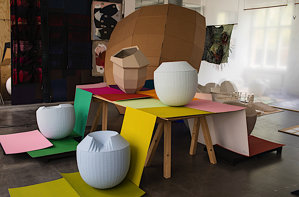
At the Studio : photo by Roel van Tour
The Dutch designer, Hella Jongerius, discusses how her latest exhibition “Breathing Colour” at London’s Design Museum is a manifesto for colour.
What is ‘Breathing Colour’ about?
Breathing Colour is an installation-based show that takes a deeper look at the way colour behaves, exploring shapes, materials, shadows and reflections. Through a series of studies and unique experiences the exhibition will make us question: How does the light during the day influence the colours and materials?
What is the relationship between form and colour? When does a colour lift up a shape and give it a new dimension? What is the role of shadow? All elemental aspects of design. The ultimate aim is to pit the power of colour against the power of form.
Can you explain your aim to ‘pit the power of colour against the power of form’?
In my work I think about how coloured objects affect other objects and how all the objects behave in a certain setting. How important is size or volume for a colour and how do coloured objects influence one another? The different materials have an impact on each other and certain colours can accentuate horizontal shapes, while others are better for vertical forms. And then the lighting conditions or colour temperature also changes a space. There are many facets that require research beyond these questions, because the relationship between colour and shape is a puzzle with many solutions. There’s no truth, it’s subjective, but I try to understand the matter.
What makes a colour beautiful?
Colour touches on so many different aspects of design: words, shapes, materials, physics, space, light. Experiencing colour is completely dependent on its physical, visual, artistic and cultural context.
Beautiful colours for me are made with high-end pigments, which result in colours that breathe with light – taking on new hues under different lighting conditions.
What do you miss in industrial colours?
I miss the dash of red in most industrial recipes for green that gives the colour its intensity, I miss a true black in plastic granulates. I miss colours that breathe with the changing light. I miss the changeability, the options, that will allow us to read and re-read an industrially produced colour, like we do with works of art. ‘Breathing Colour’ is a call for colours that respond, and that will allow being influenced by the nature of the light hitting them.
The most important aspect in the quality of a colour is its pigments – this is the recipe that lies behind the colour. Perfectly arranged, immaculate industrial colour systems don’t offer us the full potential of colour. With this exhibition, I hope to build an archive and create a tool for interpreting colour. I want to show a broader perspective than the industrial palet and demonstrate how powerful colour can be in transforming shapes and objects.
Breathing Colour is a manifesto for colours.
I rebel against the flatness of the conventional colour industry.
There are many colour systems with thousands of hues. Why isn’t this rich enough in your opinion?
The all-encompassing RAL, Pantone and NCS colour systems offer millions of colours, categorised, structured and sorted for us. We can choose from a large amount of varying hues. As a tool, this can be helpful for designers and interior architects. But how can we ever intimately relate to colour and its subjective effect in this scenario? The largest part of the effect of a colour is made up of its quality. The perfectly sorted colour systems with their immaculacy seem to neglect this aspect.
You’ve done a lot of research, working like a designer, an artist but also like a scientist. Is there a specific topic you’ve stumbled upon in your physico-chemical research that visitors of the exhibition will also learn about?
I will share one example: metamerism is a phenomenon in colorimetry that makes two colours appear to match even though they might not actually do so. This can happen especially when viewed in different lighting conditions. I think everyone once bought a piece of furniture or clothing in a certain colour, and experienced a shock, when unpacking it at home. A colour might look great under the fluorescent lighting in a shop but it might look very different in plain daylight. Some colours look dull in the morning but come to life at dusk.
How important are shadows?
The shadow is the ultimate fluid area of an object. We talk about light shadow, dark shadow, hard shadow, as substances, but also atmospheres. Where does a shadow stop and the original colour begin? A shadow in music is an echo, an after sound. Without shadow, an object will fly, so without light the object has no colour. We can feel a shadow (as coldness on a hot day), we can see it, but it does not have any substance. Yet, it has a colour. Different objects blend together in the projections of their shadows.
Why do you research?
As a designer, I feel a responsibility to act like a filter between industry and consumers. That’s why it is important for me to investigate the contemporary potential of textiles. I observe what could be produced by the industry, which products are missing and which new functions are needed in our society.
Working as a textile designer for 17 years, I base my work on acquired knowledge and existing archives. But only through experimenting do I achieve the results I’m looking for. My research always aims at ultimately producing industrial products. Experimenting in my studio, searching in a hands-on design approach, I try to come up with new ideas that could be translated for the industry. I aim to create unexpected yarns and fibres that will bring new functions and tactile experiences, to offer new perspectives on textiles and build a bridge between traditions and industrial processes.
The result is not just an autonomous project, but will result in a colour and structure library that can inspire industrial and future textile work.
Why are textiles and materials important?
We live in a digital world, where touch is essential. The surface and colour of an object defines how we interact with it, how we use it at first and over time. A sense of touch and feeling things strongly influence the relationship between object and user.
Can you explain your fascination with the phenomenon of colour?
Our intake of colours begins at the eye. Our eyes follow the reflections that objects emit. At a certain moment, under certain conditions, a colour acquires another tint because of the surrounding colours, because of the colours that you previously saw, because of the light intensity. The same colour exists under different conditions. Our brain works as a mechanism of correction or distortion. Is the ‘pure’ colour the sum of all changes that it makes in a day?
Through my work, I try to offer a perspective on colours that has been long forgotten. Experiencing the changeability and splendour of colours can be stimulating to the human mind in many ways. Just think of how we feel when we see a Vermeer painting, rays of light touching the wet morning grass, or blossoms in spring. The objects that surround us in daily life deserve to evoke a similar sensation!
After all these years of experimenting and researching: would you call yourself a colour expert?
I feel like an absolute beginner when it comes to colour. Even though I have learned a great deal about colours, I still can’t really get my head around the subject. Colour is one of those truly wonderful subjects that will always keep you feeling like a beginner. It is this quality that makes colour so worth it – just like life itself.
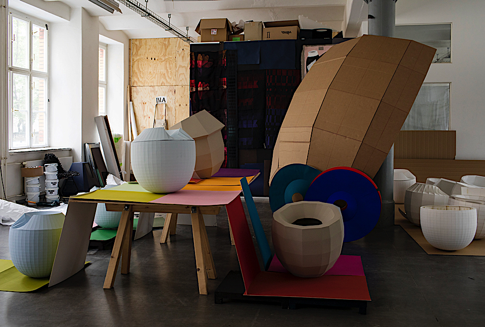
At the Studio : photo by Roel van Tour
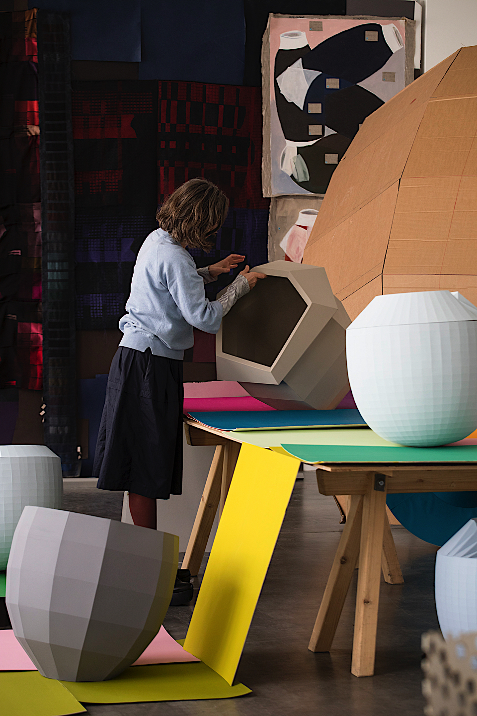
At the Studio : photo by Roel van Tour
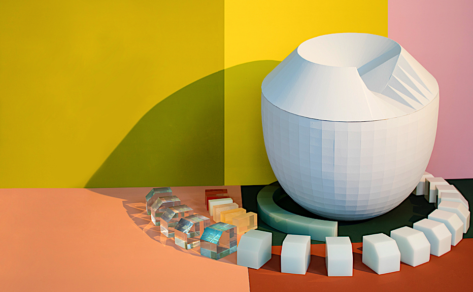
At the Studio : photo by Roel van Tour
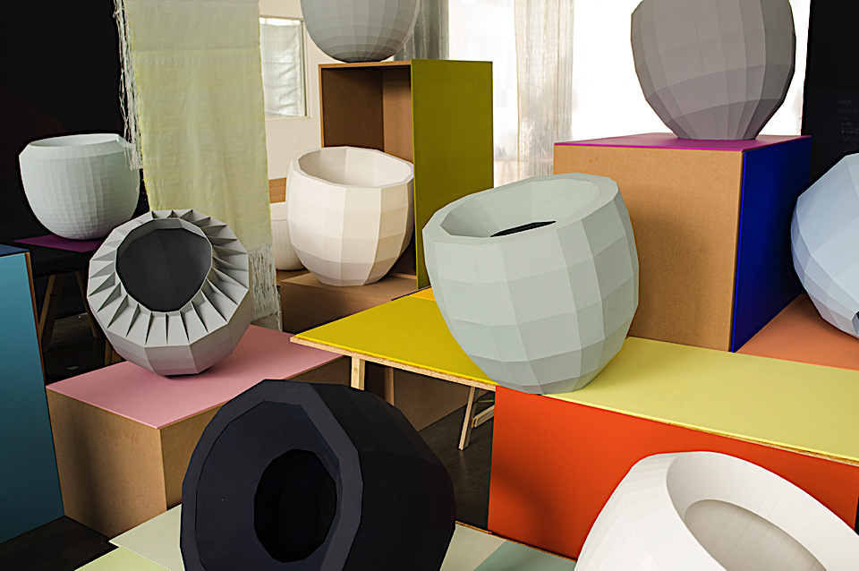
At the Studio : photo by Roel van Tour
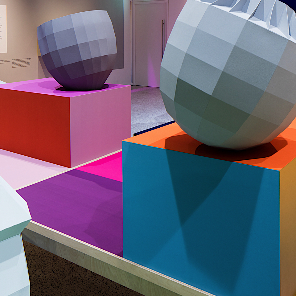
"Breathing Colour" photo by Luke Haye
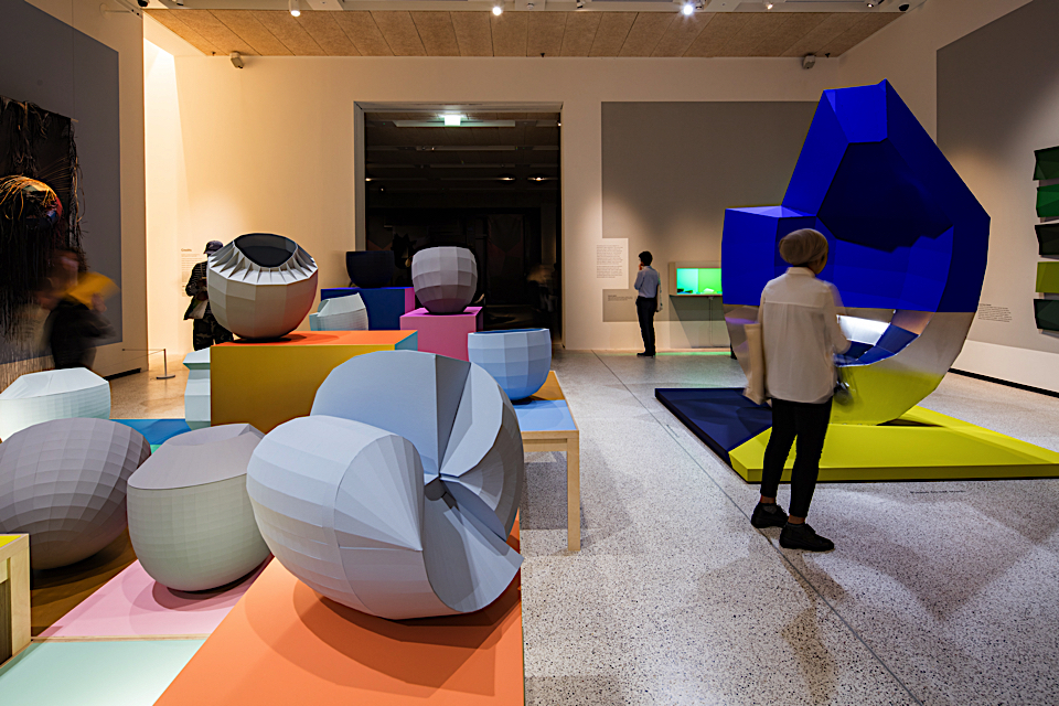
"Breathing Colour" photo by Luke Haye
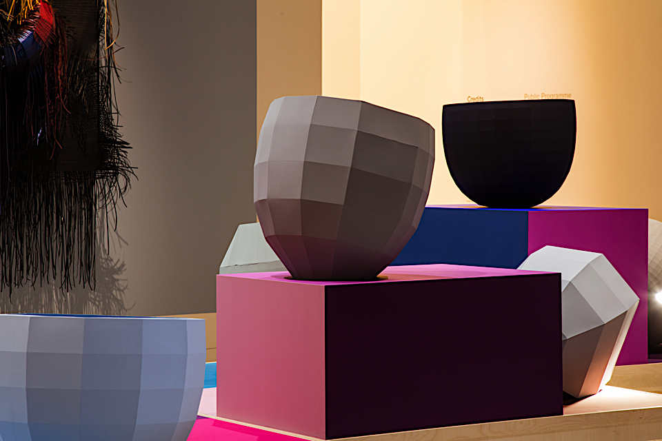
"Breathing Colour" photo by Luke Haye
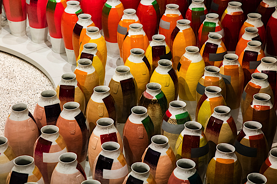
"Breathing Colour" photo by Luke Haye
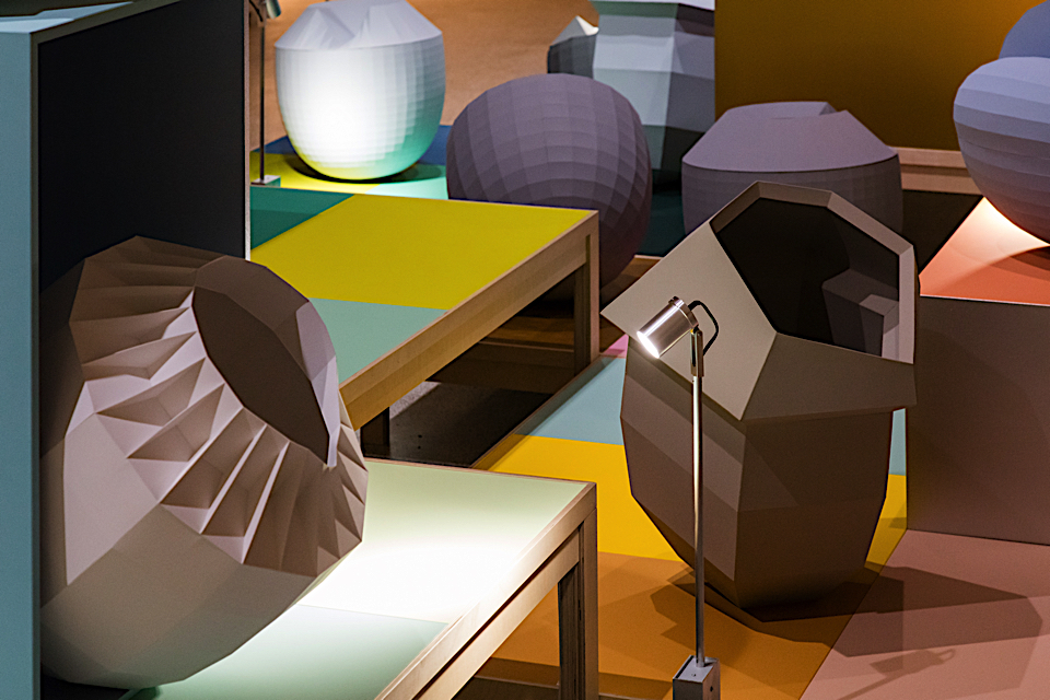
"Breathing Colour" photo by Luke Haye
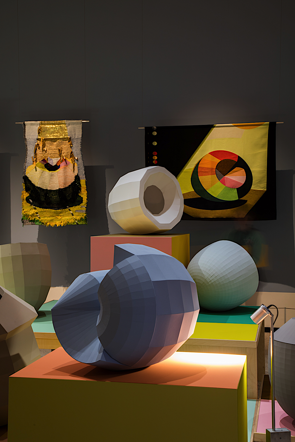
"Breathing Colour" photo by Luke Haye

