
COLOUR CODES
the workers
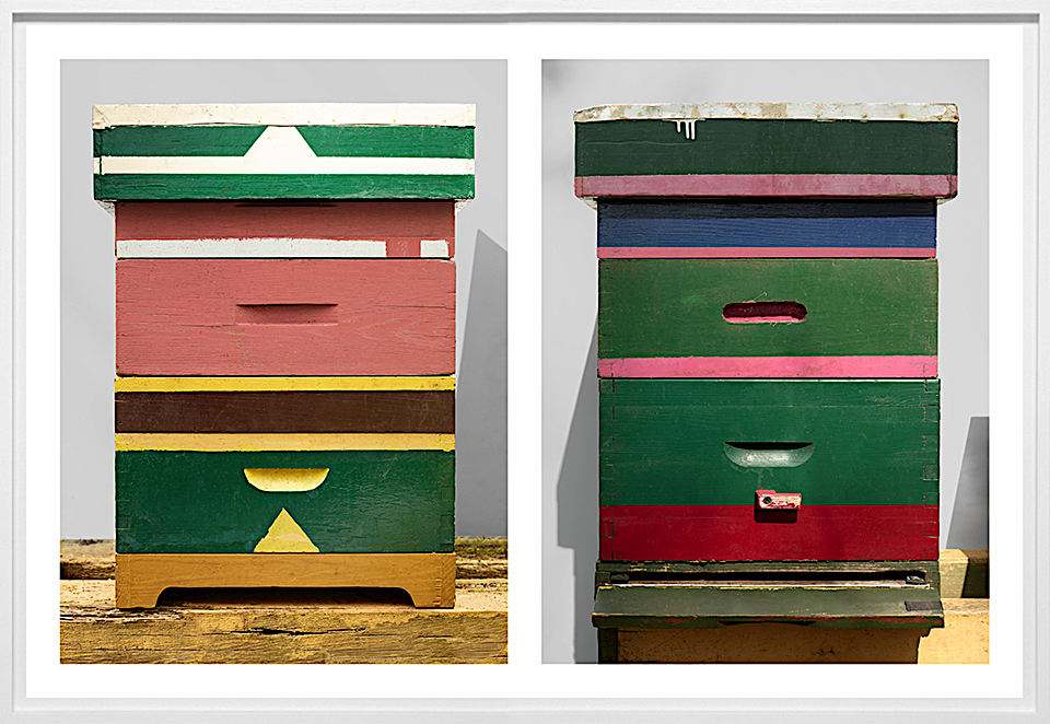
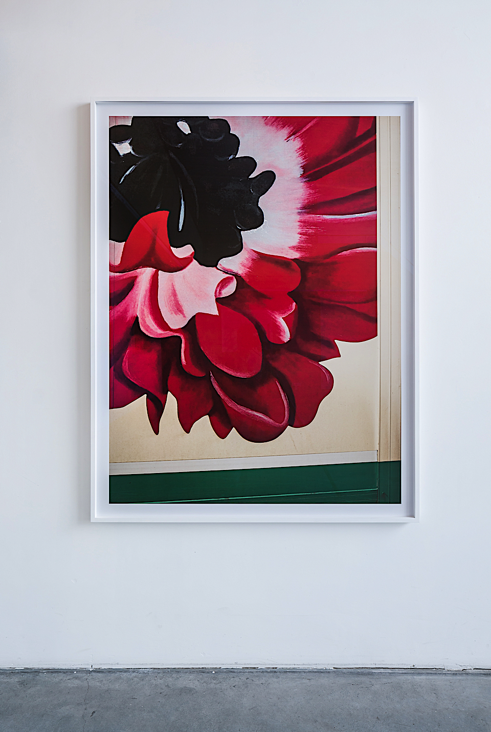
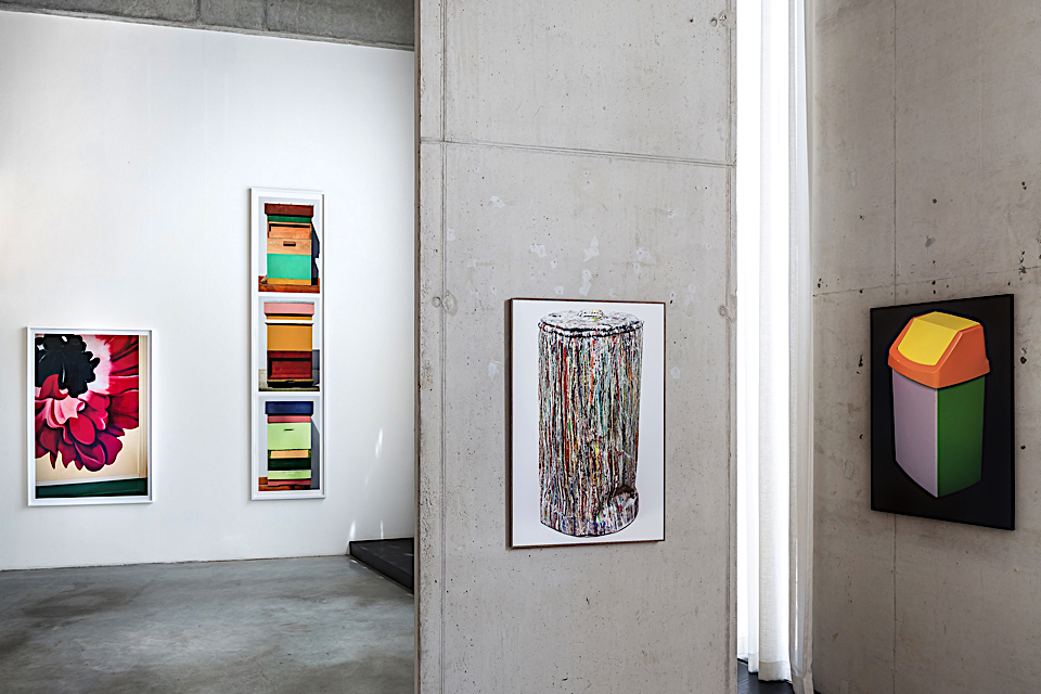
Scheltens & Abbenes are the sum total of a still-life photographer and the creative craftsmanship of an artist. They experiment with converting spatial dimensions into flat surfaces and explore intensively photography’s potential for creating illusion. Colours has a special importance in their work.‘The Workers’ is their last exhibition on show at the Ravestijn Gallery in Amsterdam. A bright statement !
It consists not only of still lives of painted flowers - printed large scale as to make the texture and every trace of use on the vans discernible - but also shows very mundane objects: different tools for gardening, beehives in various colours, a garbage can with layers of chemical paint spilled over its edges. On the photographs, however, the objects are transformed into highly stylised and aesthetic compositions, drawing attention to the colours and shapes, up to the point the viewer would almost forget their original context, as the play of textures and layers is endlessly fascinating.
What is not shown in these images are the humans hands that use the tools for gardening, to grow and cut the flowers the vans transport, that built and painted the beehives and tended to the bees. The images the viewers are left with are third hand, so to say. There are no flowers, nor bees, only man-made objects, all painted over, then taken up by the artists to be extracted from their context and to be made into an image.
The artists have added an extra layer, as it were, over these objects, and elevated them to aesthetic and abstract images - though still very recognizable, especially in their relation to each other. This layer serves as an extra remove but to remind the viewer of the original context of these objects and the processes of human intervention: to render objects useful, or, once assembled by the artists, to make appealing yet not obvious new compositions, images within the realm of art.
It is up to the viewer then, to imagine the possible narratives that these images allude to, the relation between man and nature, and between nature and aesthetics. This inevitably also leads to considerations as to the perilous position bees are now in due to pesticides and the impact their demise has on our ecosystem. Nature provides us generously with amazing beauty, but we can either admire it from a distance, or, as the viewer realises looking at these images, contemplate the deeper connections.
Until July 21st ‘The Workers’ is shown at the Ravestijn Gallery in Amsterdam
nuances in black

Courtesy of moowon.com / Photo by Mona Kim
Cristóbal Balenciaga's (1895-1972) legacy transcends the notion of "fashion". Known as the couturier of couturiers, his deep cultural connection to Spain is manifested in a body of work that often recalls mourning dresses, bullfighter costumes, and monastic robes.
On another dimension, Black was his muse. Through his mastery of this non-color color, Balenciaga has opened up an entire realm of intricacies, complexities, enchantment, and glory. Every angle of his pieces is a work of art. And the virtuoso's orchestration of light, shadow, form, and texture continues to awaken memories and emotions linked history, symbols, culture, and nature.
In this sense, his work makes us comprehend that dressmaking in its highest form, is an artisanal process, and an artistic process.
Yet what was equally compelling was Palais Galliera's curatorial decision to stage this body of work in Musée Bourdelle which was formerly the studio of sculptor Antoine Bourdelle.
Balenciaga's pieces were physically in dialogue with the equally-dramatic and non-tonal sculptures of Bourdelle, and co-habiting the space of art. This reminds us that art and artisanship are synonymous.
This is a story of Black. And the countless ways we can experience it through the couturier's masterpieces.
Mona Kim
Explore full story on
www.moowon.com
MOOWON is an online magazine unearthing beauty and the human spirit through the art of storytelling. Its stories connect readers to the world’s unique and extraordinary people, places, and practices: masters who revive vanishing arts, ideas and endeavors that embody noble values and authenticity. The following is an excerpt from its visual essay on Balenciaga’s work, documented at Musée Bourdelle and Palais Galliera’s exhibition “Balenciaga, l'oeuvre au noir".

Courtesy of moowon.com / Photo by Mona Kim

Courtesy of moowon.com / Photo by Mona Kim

Courtesy of moowon.com / Photo by Mona Kim

Courtesy of moowon.com / Photo by Mona Kim

Courtesy of moowon.com / Photo by Mona Kim

Courtesy of moowon.com / Photo by Mona Kim

Courtesy of moowon.com / Photo by Mona Kim

Courtesy of moowon.com / Photo by Mona Kim

Courtesy of moowon.com / Photo by Mona Kim

Courtesy of moowon.com / Photo by Mona Kim
a manifesto for colours

At the Studio : photo by Roel van Tour
The Dutch designer, Hella Jongerius, discusses how her latest exhibition "Breathing Colour" at London’s Design Museum is a manifesto for colour.
What is ‘Breathing Colour’ about?
Breathing Colour is an installation-based show that takes a deeper look at the way colour behaves, exploring shapes, materials, shadows and reflections. Through a series of studies and unique experiences the exhibition will make us question: How does the light during the day influence the colours and materials?
What is the relationship between form and colour? When does a colour lift up a shape and give it a new dimension? What is the role of shadow? All elemental aspects of design. The ultimate aim is to pit the power of colour against the power of form.
Can you explain your aim to ‘pit the power of colour against the power of form’?
In my work I think about how coloured objects affect other objects and how all the objects behave in a certain setting. How important is size or volume for a colour and how do coloured objects influence one another? The different materials have an impact on each other and certain colours can accentuate horizontal shapes, while others are better for vertical forms. And then the lighting conditions or colour temperature also changes a space. There are many facets that require research beyond these questions, because the relationship between colour and shape is a puzzle with many solutions. There’s no truth, it's subjective, but I try to understand the matter.
What makes a colour beautiful?
Colour touches on so many different aspects of design: words, shapes, materials, physics, space, light. Experiencing colour is completely dependent on its physical, visual, artistic and cultural context.
Beautiful colours for me are made with high-end pigments, which result in colours that breathe with light – taking on new hues under different lighting conditions.
What do you miss in industrial colours?
I miss the dash of red in most industrial recipes for green that gives the colour its intensity, I miss a true black in plastic granulates. I miss colours that breathe with the changing light. I miss the changeability, the options, that will allow us to read and re-read an industrially produced colour, like we do with works of art. ‘Breathing Colour’ is a call for colours that respond, and that will allow being influenced by the nature of the light hitting them.
The most important aspect in the quality of a colour is its pigments – this is the recipe that lies behind the colour. Perfectly arranged, immaculate industrial colour systems don’t offer us the full potential of colour. With this exhibition, I hope to build an archive and create a tool for interpreting colour. I want to show a broader perspective than the industrial palet and demonstrate how powerful colour can be in transforming shapes and objects.
Breathing Colour is a manifesto for colours.
I rebel against the flatness of the conventional colour industry.
There are many colour systems with thousands of hues. Why isn’t this rich enough in your opinion?
The all-encompassing RAL, Pantone and NCS colour systems offer millions of colours, categorised, structured and sorted for us. We can choose from a large amount of varying hues. As a tool, this can be helpful for designers and interior architects. But how can we ever intimately relate to colour and its subjective effect in this scenario? The largest part of the effect of a colour is made up of its quality. The perfectly sorted colour systems with their immaculacy seem to neglect this aspect.
You’ve done a lot of research, working like a designer, an artist but also like a scientist. Is there a specific topic you’ve stumbled upon in your physico-chemical research that visitors of the exhibition will also learn about?
I will share one example: metamerism is a phenomenon in colorimetry that makes two colours appear to match even though they might not actually do so. This can happen especially when viewed in different lighting conditions. I think everyone once bought a piece of furniture or clothing in a certain colour, and experienced a shock, when unpacking it at home. A colour might look great under the fluorescent lighting in a shop but it might look very different in plain daylight. Some colours look dull in the morning but come to life at dusk.
How important are shadows?
The shadow is the ultimate fluid area of an object. We talk about light shadow, dark shadow, hard shadow, as substances, but also atmospheres. Where does a shadow stop and the original colour begin? A shadow in music is an echo, an after sound. Without shadow, an object will fly, so without light the object has no colour. We can feel a shadow (as coldness on a hot day), we can see it, but it does not have any substance. Yet, it has a colour. Different objects blend together in the projections of their shadows.
Why do you research?
As a designer, I feel a responsibility to act like a filter between industry and consumers. That's why it is important for me to investigate the contemporary potential of textiles. I observe what could be produced by the industry, which products are missing and which new functions are needed in our society.
Working as a textile designer for 17 years, I base my work on acquired knowledge and existing archives. But only through experimenting do I achieve the results I’m looking for. My research always aims at ultimately producing industrial products. Experimenting in my studio, searching in a hands-on design approach, I try to come up with new ideas that could be translated for the industry. I aim to create unexpected yarns and fibres that will bring new functions and tactile experiences, to offer new perspectives on textiles and build a bridge between traditions and industrial processes.
The result is not just an autonomous project, but will result in a colour and structure library that can inspire industrial and future textile work.
Why are textiles and materials important?
We live in a digital world, where touch is essential. The surface and colour of an object defines how we interact with it, how we use it at first and over time. A sense of touch and feeling things strongly influence the relationship between object and user.
Can you explain your fascination with the phenomenon of colour?
Our intake of colours begins at the eye. Our eyes follow the reflections that objects emit. At a certain moment, under certain conditions, a colour acquires another tint because of the surrounding colours, because of the colours that you previously saw, because of the light intensity. The same colour exists under different conditions. Our brain works as a mechanism of correction or distortion. Is the ‘pure’ colour the sum of all changes that it makes in a day?
Through my work, I try to offer a perspective on colours that has been long forgotten. Experiencing the changeability and splendour of colours can be stimulating to the human mind in many ways. Just think of how we feel when we see a Vermeer painting, rays of light touching the wet morning grass, or blossoms in spring. The objects that surround us in daily life deserve to evoke a similar sensation!
After all these years of experimenting and researching: would you call yourself a colour expert?
I feel like an absolute beginner when it comes to colour. Even though I have learned a great deal about colours, I still can’t really get my head around the subject. Colour is one of those truly wonderful subjects that will always keep you feeling like a beginner. It is this quality that makes colour so worth it – just like life itself.

At the Studio : photo by Roel van Tour

At the Studio : photo by Roel van Tour

At the Studio : photo by Roel van Tour

At the Studio : photo by Roel van Tour

"Breathing Colour" photo by Luke Haye

"Breathing Colour" photo by Luke Haye

"Breathing Colour" photo by Luke Haye

"Breathing Colour" photo by Luke Haye

"Breathing Colour" photo by Luke Haye

"Breathing Colour" photo by Luke Haye
anaïs guery

"a.guery" photos by Stéphane Ruchaud
After working for Christian Dior and Balenciaga in Paris Anaïs Guery moved to London and New York. This young French designer then returned to Paris for Cacharel and in 2014 created her own maison to combine heritage of Couture and crafts.
Indigo blue is her signature colour. To discover why Guery is so fascinated by Indigo, our editor, Cecile Poignant met her in her atelier in Paris.
How would you describe yourself as an artist/a fashion designer/an artisan …?
I would say I am dedicated to textile experimentation.
Shape-wise, I identify myself as a couturier who is evolving between craftsmanship and design, what is to say between tradition and creation.
Surface-wise, I have developed my Indigo dyeing process almost as a painter who would research on emotions provoked by color, shades and textures, a result that would speak to our inner feeling of beauty..
Finally , I often consider myself as a decorator willing to create a whole atmosphere by my design practice.
How did your background in fashion design influenced you for this adventure ?
My first approach of fashion was through art and traditional garments and crafts. I spent a lot of time in libraries to gather ideas of details, shapes, fabrics, colors.
I have always been considering fashion as an intangible core around what different mediums are gravitating to build an idea, an impression.
As far as I remember, I have always thought of garments in a very abstract and poetic way, not really link to a present or a future, but much more to an immutable patrimony.
Couture speaks to my rational quest for epure.
For me Fashion is the art of combining textile with body structure and very soul : proportions, lines and movement become a dancing and incarnated composition.
What fascinates you about indigo?
Indigo is a pigment born from a vegetal process : both nature and humanity are involved in its essence. It is said that you can get up to 40 something different shades, so the color becomes alive, bringing light or darkness, faded or bright. With the same gestures, the same vat, and the same textile, you will never get the same blue..
Back to my studies, Photography was fascinating to me. The power of time and light and the alchemy of print was a kind of ceremony.
Younger I had also been taught raku ceramic, where fire, water and wood were key variables.
Designing hand in hand with the elements and accepting to partly loose control is what drives me to experiment with the indigo dye which is so much linked to the atmosphere - air, water, temperature, humidity are calling the tune.
Do you associate any symbol with blue?
Blue is a kind of base to me.
In my designs, even before starting working with natural indigo,I have always used blue in many shades.. It has always been evocative of origins to me.
Between sky and sea, air and water, linked to vital elements again and so probably a symbol of pure and absolute beauty.
Is the impact of your work on society something you are concerned about?
I started working on my own project because I was not feeling concerned about the way classical fashion system works.
Creating something new that kind of erases what you just achieved before
is not stimulating to me. What I am moved by is much more time proof and universal.
Things that last longer takes longer to create and produce, so you have to get yourself into a new logic.
My inspirations are also kind of immutable.
They evolve quietly, in the details.
Can you tell a little about the design process, how do you start your design ?
I always start with an archetype I want to work with, most of the time a special type of jacket : kimono, perfecto, duffle coat, suit jacket, etc. I often have in mind a special detail (the zip cuff of a biker jacket, the asymmetric opening of a blazer, etc..)
To this shapes, I associate, like an exquisite corpse, images of art pieces, interior design, places I visited, in which I find an atmosphere and inspiring techniques.
So i would say I work by collage, creating a perpetual mix between my very first loves in terms of shapes and my very present appetite for textiles and surfaces all around me. It comes from out of the fashion sphere.
You started to do workshops in your atelier in Paris, in Marseille to introduce Indigo .. can you explain me more why you started this?
Working with this technique since a few years now, I have been getting more and more precise about the process. Explaining again and again the origins of my blue, I noticed how curious people were. I day, I realized this moment of sharing could be deeper, and I wanted to offer a kind of immersion to people..
One thing I wanted for the workshop is to offer a high-level of explanation and experimentation, so to have time and space to really feel the process in its diversity. After workshops, I always ask for feedbacks : what comes out first is the magic people felt from playing around with this ancient technique and the feeling of spending time together as a real gift.
Recently, you did many collab with Meghan Shimek or l'Atelier Singulier is it something you want to pursue?
Collaboration with Meghan was a very unique moment as we had a one-week residency in my atelier as Meghan arrived from Oakland and we had a very short time to create something out of our two practices : weaving and indigo dyeing.
It has been such a immersion and exchange moment, very rich and friendly.
Recently, I worked for Romain Cole, a portrait photographer who wanted a special background for a nomad photo shoot at Festival de Cannes. The results were beyond my expectations !
Finally, last year residency at Living Blue cooperative in Bangladesh, working with quilting masters and indigo dyers led me to understand new possibilities on how renewing traditions in endless possibilities.
These kind of four-handed works are pure energy and a way to explore new territories. I do believe it gives new inputs to both parties.
How do you see yourself and your creation in the future?
I wish to keep on developing a.guery’ wardrobe to build a true vocabulary of shapes. Settling my own « classics » and continuing to experiment more an more with fabric manipulations for creating one of a kind pieces.
I would love the studio to keep in mind its origin, to be part of a new generation, thinking about fashion differently: the clothes are made to last for years and to be a personal daily luxury, objects of respect and pleasure for both the consumers and the makers.
Cecile Poignant
www.aguery.com

"a.guery" photos by Stéphane Ruchaud

"a.guery" photos by Stéphane Ruchaud

"a.guery" photos by Stéphane Ruchaud

"a.guery" photo by Anaïs Guery

"a.guery" photo by Anaïs Guery

"a.guery" photo by Anaïs Guery

"a.guery" photo by Anaïs Guery

"a.guery" photo by Anaïs Guery

"a.guery" photos by Stéphane Ruchaud
where colours bloom in faith

After completing a masters in fashion trend forecasting from Polimoda - Italy , I moved back to South Africa, and decided to begin developing a deep appreciation for colour, which has the capacity to speak to people, to spaces, to environments. Colour has a profound power and I wanted a much deeper understanding from a resonating place, so I travelled to North East India, where religion and colour work symbiotically with mother nature and human nature. A place which is pure in its own way of life, a part of the world where gentrification is nonexistent.
In this region; religion, humanity and joy are the pigments that frame the exploration and devotion to colour. There is a river; Kameng, that runs through both the Assam and Arunachal Pradesh, only later did I realised the river is a metaphor for the foundations of religion and humanity; the elixir of life is our faith, religion, our spirituality. That which blooms along the banks are the colours that are born from the faithful nurture of the water. And us as humans, head towards the waters, to consume colour and in turn we are nurtured.
Ziro Village is one of the most unspoiled places in India, where Apatani locals live closely as their forefathers did, in bamboo houses, besides bamboo forests, and amongst respected Shamans. The village is also one of the last places where a number of villagers and locals believe, still, in one of the oldest religions according to anthropologists, dating back 16 000 BCE; the Donyi-Polo religion, translated as Sun and Moon.
Buddhism is seen all through N.E.I, prayer flags dance in the wind along winding old roads traversed through upon entering Arunachal Pradesh. Sitting atop secluded mountain and hill tops, majestic Gompas are not only sights of devotion and faith, but also sights of historic artefacts, and structures of buddhist artwork that call out at mantras of astounding hues.
Hinduism also spreads throughout N.E.I., with a strong influence in the Assam region, such as Guwahati. A religion known for vibrant colour expression that lives through the locals, their dress, and even the simplicity of nature. What stood out was; I could see Hindu influence in natural moments, where space, religion as well as colour are in symbiosis.
One can’t separate faith from colour, or colour from faith, and this would mean that one can not separate man from colour, it is the science of nature. As the importance of the influence of faith arises, the importance of colour arises. Where to experience is closely linked with truth, sensitivity, devotion, depth, and all these will exist alongside faithful colour.
Text and photos : Nicole Samuels


espanyolet

During a sabbatical year in 2014, Melissa Rosenbauer & Thomas Bossert, who met while working in New York City, spent time in Bali where they learned about textile dying and printing techniques, and “rediscovered the joys of working with our hands,” as their website states. Full of inspiration from their travels and encounters, they decided to settle in Mallorca in 2015 to launch their slow batch, hand-dyed textile and handmade ceramics business. When it came to deciding on a name for the business, their first instinct was to call it Cloth and Clay after the two materials that drive their passion and creativity. But as they looked out at the view around them, with the fading Majorcan light reflecting off of the glowing terracotta buildings, lush vegetation and blue sky, it seemed fitting to call it espanoylet, after their new neighborhood which was providing so much of their color palette inspiration. Goldenrod, almond blossom pink, sea wash greens and deep charcoals, all pay homage to the beauty and richness of the Majorcan landscape
For the range of bed covers, pillows, and blankets, espanoylet sources only quality vintage linen fabrics from across Europe, such as Spain, France, and Romania, each of which has its own weight, weave pattern, texture, and natural color, so the dyes and process are adapted to fit each style. For example, Melissa says, “the vintage French linen is very fine and with an “optic white” color so it lends itself to our lighter, finer & more delicate colors like almond blossom pink. On the other hand, some of the vintage Spanish linens are highly textured, rustic, and irregular so we can play a bit more with stronger color.” Once the hue is determined, the dye is mixed with algae giving it a gel-like effect that allows them to paint directly onto the fabric with brushes rather then dipping, creating their signature painterly style that offers more interesting gradations, tones, and textures. One favorite color palette of the designers is Marsala.
Originally they were looking to capture that vibrant pink of bougainvillea which surrounds not only their studio, but much of Mallorca. What happened was that during the curing process which is done outside, the sun faded the color, creating a more eroded, muted effect that they ended up loving even more because it worked better with the fabrics. From here they began adding other colors to the batch like chocolate brown, grey or yellow, creating a range of pinks from a deep coral pink to light peach, and which has become one of their most popular colors.
The ceramics were added soon after the fabrics. Thomas hand forms each of the unique boards which are perfect for serving cheese and ham for an aperitif, as well as just looking gorgeous while sitting on the the table. There are two lines in the ceramic collection so far: Agua which borrows from the vintage lined texture of the textile line and is painted with turquoises, blues, and greens, and the Tierra line, which is black-volcanic ash-like clay that evokes the rocky soil of the island.
Blaire Dessent
Blaire Dessent is an art, design and lifestyle writer and the founder of The Vitrine, a project based business with a focus on producing pop up shops, events and editions with contemporary artists and designers. www.blairedessent.com and www.thevitrine.com.


tenerife greens

Tenerife has stolen our hearts, the volcanic island has everything you need to recharge yourself.
Wind caves, dragon trees, lunar landscapes, shores full of banana tree plantations and bushes with bird of paradise flowers.
Everywhere you look there are shades of green.
My favorite color has many faces; emerald green water and almost black green mossy volcanic rock in the Natural Park of El Teide create a color palette that will remain fascinating.
Nature on Tenerife is stunningly beautiful, literal highlights are the rugged cliffs of Los Gigantes, situated on the west coast of Tenerife.
These high cliffs fall almost straight into the sea as the locals call the walls of hell.
Together with son Raf we photographed all the beautiful greens on the island, images that we now use in new mood boards for 2017-2018 at Studio Aandacht.
Text : Tatjana Quax - Photos by Raf Lambers + Tatjana Quax
studioaandacht.nl


the world’s rarest colors

Mummies, Brazilwood and crushed beetles are the origins of some of the world’s most unusual colors. The Forbes Pigment Collection, located in the library of Harvard Art Museum, contains almost every pigment you could think of, including the rarest materials.
More than 2,500 different specimens collected from all across the world, each with its own backstory, origin, production and uses, are part of Edward Forbes’ life project. Forbes, an historian and director of Fogg Art Museum at Harvard University from 1910-44 is considered the father of art conservation in the US. It was widely through his extensive study of pigments that Forbes was able to determine the authenticity of paintings, knowing that centuries ago, finding one specific color meant trekking to a single mineral deposit in remote area in Afghanistan - the only place where it could be found.
Today, the collection is used mostly for scientific analysis – providing standard pigments to compare to unknowns. For the last 10 years, Narayan Khandekar, director of the Straus Center for Conservation and Technical Studies at the Harvard Art Museum, is rebuilding the collection. Describing his research as the “work of a detective”, he adds to the collection modern pigments to better analyze 20th century and contemporary art pieces.
“Every pigment has its own story”, explains Khandekar the purpose of exploring key compounds of materials and mapping out precise chemical composition of pigment.
Apart from its scientific justification and its contribution to the study of art works, the pigment library is an intriguing place; Floor-to-ceiling walls of color, glass jars in rainbow colors sourced uniquely from the most unusual places; “Mummy Brown” extracted from Egyptian mummies, “Cochineal Red” made of beetles or “Cadmium Yellow”, bright and highly toxic.
Lior Fisher Shiloni


stories of light

cmyk
Studio Dennis Parren, known for it’s CMYK Lamp, that projects coloured shadows, is a multidisciplinary design studio that focuses on using natural and artificial light as a design material. With a team of three designers and a network of experts, partners and freelancers they create their work.
They design from the idea that light is everything. Without light there is no colour, and no life. « We use light as a material to progress and innovate the way in which we experience, think about, and look at light. We use the mystery of colour and light to create new concepts, and use cases for light to innovate, educate, inspire and amaze." says Dennis Parren.
‘Gradient’ challenges you to stop and think about what you are actually looking at, as the eyes and mind try to make sense of what you are seeing.
Like the sun, white light consists of Red, Green & Blue light (RGB) and by carefully placing white expanded polystyrene shapes in a pattern under the RGB lights, they controlled how much light each shape reflects and which colours blend, resulting in a magical field of different coloured gradients.
By rotating the position of the red, green and blue light, different gradients became visible before making a dramatic pause to white light showing that this is no trick, just the simple blending of colours on white shaped material.
With ‘Reflections’ Studio Dennis Parren wanted to show how light reflects by trapping it inside different shapes. Catching the light and forcing it into a shape amplifies the reflection as it has nowhere to go. Dennis: « This results in a magical spectacle of bright colourful, almost fluorescent, light. »
LED technology has been a revolution for the light industry. A very popular, mass produced and cheap product is the LED strip, most often seen hidden away behind panels or underneath surfaces. Studio Dennis Parren wanted to do something new showing that there are other ways to use such a great product.
The Dotted Lamp uses the LED strip to show that it can be transformed into a delightful, simple and elegant lamp. In this case the design was inspired by the colourful an freely floating, dreamy jellyfish, a marvel of nature.
Light can be controlled by design to create beautiful patterns that tell us stories of colours, shadows and reflections.
www.dennisparren.com


reflections

gradients


dotted lamp
katharina grosse

We are living in a world full of boundaries, Berlin-based artist Katharina Grosse is trying to take these boundaries away with her art. Colour is the main feature in her work and an element to push boundaries and the imagination. She explores the impact of colour on regular materials, surfaces and architecture. Grosse: “colour has the potential to make us think.”
Easily recognizable, Grosse’s trademark are bright, fresh colours sprayed onto physical surfaces including wood, walls, plants and piles of dirt, creating an imaginary world within an actual human space. Turning these everyday objects into bright coloured installations, Grosse is creating a new reality.
Working with industrial spray guns expands her body’s reach and makes it very easy to move on rough surfaces or paint under difficult circumstances. This way of working makes it possible for her to create art on an impressive scale, think of architectural installations or even whole landscapes.
Bamboo van Kampen
www.katharinagrosse.com
Bamboo van Kampen, 26, is an all-round creative specializing in visuals and colors; she forms half of the Berlin-based duo Arturo Bamboo.


blue on blue

photos by Tokyo Cervigni
When I bought my plane ticket to Fez, pushed by a friend who showed me a photo of a pictoresque blue street, I was sure I was going by the sea. Sometimes it’ s extcing to leave without knowing exactly where the destination is. and what will happen.
The swimsuits I put in my suitcase were not to be useful since Chefchaouen is located in the middle of the Marocain mountain chaine of the Rif, surrounded by kif fields and hills full of horned goats (the translation of Chaouen is long horns).
Even if the town was opened to foreigners in the fifties and was nominated Heritage of Humanity by Unesco, Chaouen (the way locals call the citadel) exit the classic touristic routes of Morocco as Marrachech, Essaouira or Rabat. Visiting this place in low season, you can feel to be the only foreigner. The reason being its distance from the country’s main airports. From Fez, it takes 3 hours to arrive with a taxi, but it’s surely worth it.
The reality feels better than what a photo could picture. Leaving the cars and mess behind, I felt astonished by the peaceful beauty of the old Town, the Medina , of Chaouen. A labyrinth of blue streets, stairs, doors and windows, an unreal scenario, a blue picture that I will keep with me for ever.
Different stories surround Chaouen and the reason why the medina is fully painted of an intense pale blue. From Jewish to Berber, from Spanish to Andaluse, every people has contributed to build this place, to change it into an incredible meltin’ pot of cultures, creating its magic.
Slowness is mandatory here, the main occupations could be wandering through the streets, sneaking around the souks, talking with locals, visiting the river side full of nice bar where you can sit enjoying an avocado milk shake or a mint tea.
I couldn’t help taking millions of pictures of every lazy cat staring at the sun, of every blue door and window. of every tone of blue, of the hundred medina’s streets, of the artisan fabrics small shops or the amazing view upon the town from Casa Perleta’s terrace.
The photos can well reproduce the incredible beauty of ChefChaouen, but only getting lost in there can let you feel like being under the sea, or in an upside down world, in which the sky continues over the horizon , painting every wall and thought.
Chiara Apperti
EAT
SLEEP
Fashion Designer and trend researcher, Chiara lives trying to catch every kind of inspiration. Based in Milan, four years ago she founded a lifestyle magazine with her best friends.

photos by Tokyo Cervigni

photo by Tokyo Cervigni

photos by Tokyo Cervigni

photo by Tokyo Cervigni

photo by Tokyo Cervigni
océan rouge
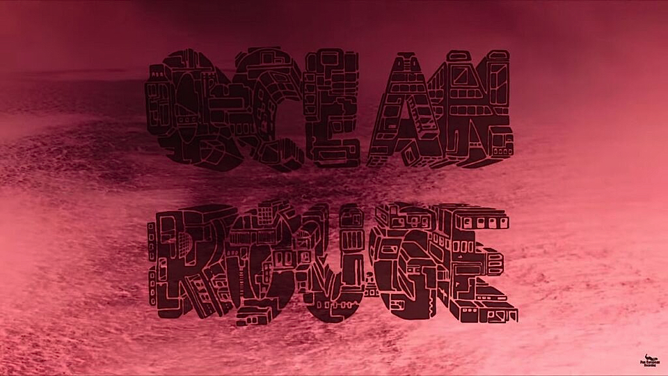
Man may not have walked on the moon in almost half a century, but increasingly our collective gaze is turned towards space. Since Felix Baumgartner’s jump from the stratosphere, our imagination has been captured by missions like Mars One, which has chosen 100 men and women out of 200 000 hopefuls to (perhaps) settle on Mars within the next two decades, and the Dawn spacecraft releasing photos of mysterious lights on Ceres, a planet far, far away.
If that boundless fascination with space had a soundtrack, it would certainly be Flavien Berger’s dreamy sounds, and in particular Océan Rouge, a song which he released last June and which was masterfully put into images by fellow collectif_sin member Robin Lachenal. From the road-trip which gets you out of the city and begins your journey to a manmade seaside resort on Mars, to the bizarre creatures and awesome waves which make up your long summer days, and finally the road back home with your head filled with beautiful memories, the 14-minute short takes you on a ten day holiday that is as strange as it feels familiar. In the lyrics, the extraordinary context is juxtaposed with mundane stories of summer romance and seaside descriptions, and out-of-this-world landscapes as those imagined by Ray Bradbury’s in his Martian Chronicles, which Berger names as one of his influences.
Talking about his newest album, which came out with Pan European Recording in April 2015, Berger explains that “I think that one hour of music is like a trip, temporal as well as spatial. What I would like to do is to offer this album, like someone would offer an amusement park attraction, or a film.” Painted with carefully chosen vocabulary and enhanced by floating synthesizer themes, Berger’s lost worlds are vividly visual, they’re a musical science-fiction tainted with nostalgia. Still, the dreaminess in Berger’s songs is counterbalanced by a strong bass which keeps driving them endlessly forward. Part of a growing French electro scene which embraces its mother tongue, Berger is one musician that’s worth to keep one eye out for, as much for his poesy as for his talent for artistic collaborations.
Mathilde Leblond
Mathilde Leblond is a trendwatcher based in Buenos Aires with a passion for creativity, beauty and the future. For Trend Tablet she contributes posts about some of the most arresting artists and creators which she scours the internet to find out about.


experimenting synesthesia

To balance our digital life we are looking for more and more sensual experiences, this explains why there is a trend for multi-sensory experiences. The goal is to heighten our awareness of the links between the 5 senses and makes us feel super-alive.
The Waldorf Project is one of those innovative projects: it is an immersive experience on a grand stage, in which art is taken in through all of the senses. It is a fusion of theatrical performance, choreography, visual arts and sound, together with the finest in food design and wine.
We were happy to feature the first chapter in Trendtablet two years ago. We are excited to share the teasing of Chapter Two. Once the event is on stage we will provide you with inspirational photos and a detailed report.
Chapter Two will delve into colour creating monochromatic environments in which the atmosphere, emotions and sheer power of colour saturation will be explored. The guests will experience what it feels like to eat, smell, hear and touch colour. At its zenith a new taste will be realized.
Seven pioneering practitioners in the worlds of visual art, choreography, theatre, design, electronic music and gastronomy unite to add their skills and imaginative minds. One can imagine the synergy between a food designer, a choreographer, a production designer, a product designer, a sommelier, and a sound designer, all directed by artist Sean Rogg.
The project will run in London over a number of installments for seven nights -Thursday 5 -Wednesday 11 February 2015 - with only 48 guests per night.
Cecile Poignant
ryan roche

photo courtesy of ryan roche
One of the most refreshing new talents in the world of knitwear and womenswear design is Ryan Roche, an avid pink devotee, upstate New Yorker and mother of three. Roche begun her creative journey with her conscientious children's wear label Mor Mor Rita, established ten years ago in Williamsburg.
Shortly after its launch, requests from brand enthusiast mothers for larger, women’s sizes, were too hard to ignore and Roche launched her namesake brand in 2011. It was a natural transition between the two, thanks to her prior following and since then the brand has gone from strength to strength. Currently waiting to hear results of the CFDA/Vogue Fashion Fund in early November, where Roche is one of the finalists.
Her use of the colour pink is one of the brands most discerning factors; the colour features in every collection predominately and ranges from nudes and peaches, to neons, and back again. But rather than the age old stigmatism surrounding the ‘pink is for little girls’ idea, the palette is subtle and becoming, even tough at times. Quoted saying that, “no better colour exists in so many lovely shades”; within Roche’s world, pink is for women, and all their variations.
From time to time though, this intriguing use of specific colour overshadows the brilliance within the rest of the work. Beautiful hand crocheted pieces adorn nearly every season, as well as luxurious cashmere, knitted by a women’s cooperative in Nepal that Roche has been working with since 2004.
Not only that; the garments themselves are all relevant and contemporary - not that brazen transience found on the innumerable mass consumption catwalks - but a different fad free sense of style, shape and modernity.
The new Spring 2015 collection is a beautiful melange of quintessential wool knit, cashmere and silk, but with beautiful interjections of indigo denim pieces that bring a beautiful depth of contrast to the pastel hues.
Roche’s designs reflect our resurrected societal need to revive artisan labour, this ‘know-how’ is critical to ‘the future of our planet’ says Lidewij Edelkoort; “society at large is weaving new alliances and spinning different connections”. The fluid, earthy hand made aesthetic appeals to our need to once again reconnect with human values and ground ourselves, understand our clothing and salvage its perceived value. Ryan Roche is at the forefront of this movement, allowing her customers to connect with their clothing, tell their own personal story through her crafting capabilities.
Saskia Hadley
ryan-roche.com

photos courtesy of ryan roche

photos courtesy of ryan roche

photos courtesy of ryan roche
colour provenance

photo Laura Daza
The different shades, colours and hues have the power to overwhelm, but it seems that the origins and journeys of these pigments are obscure and forgotten. Today, colour is a commodity mechanically made and claimed for mass consumption, once colour had a unique aura, power and magic that brought stories alive.
Colour Provenance is a visual investigation and interpretation into the ancient world of colour. Through developing a thorough understanding and knowledge of how colour was sourced, crafted and utilized in the past, Laura Daza hopes to both celebrate the ancient rituals and alchemic techniques that were once used but also make people re-appreciate colour through the process of experimenting and re-manufacturing authentic ancient pigments that are increasingly being lost. It seems that today we have lost touch with the origins of colour, as we move away from natural materials and traditional methods.
Colour making was a laborious process. For instance, Medieval and Renaissance masters would have apprentices to grind the pigments for them and source the most precious and difficult to find ingredients to produce colours.
In this project, Daza tells the story of 8 colours, Whiteshell, Saffron, Ochre, Verdigris, Malachite, Azurite, Mummy Brown and Lamp Black by reviving its history, origins, secrets and authentic methods for producing them. Inspired in the purity of the ancient Egyptian colour palette and the materials used to manufacture them, she reinterprets these colours and recipes by resourcing raw materials.
For instance, recreating green from malachite, considered to be the first green ever used by humanity. Her journey has taken her to many places and experiment with a range of different materials such as bones, eggs, mummies, minerals and shells as a modern alchemist. Mummy brown, one of her colours, has an interesting story, which its true to its origins, mummies were grinded to make pigment.
Laura Daza designed a ‘DIY Colour Recipe Book’, a useful handbook for people to make and experiment with colour, which highlights these ancient colours giving back its value and meaning. It shows key tools, secrets and her experience recreating them. The revival of historical recipes for making colour such as Cennino Cennini’s ‘Il libro dell’ Arte’ and ancient Egyptian manuscripts, were part of her process. Laura hopes to take you through a fascinating journey into the past to help us understand and appreciate colour in a different way.
Laura also designed a collection of bespoke vessels that display, highlight and contain colour pigment. Each vessel represents different colours from the Colour Provenance palette. Each piece is handcrafted as a precious jewel using the same materials used for manufacturing colour pigments; she used uncommon materials that in old times were precious and today usually we discard them very easily. These vessels remind us about the importance of colour and how it has played an important role in humanity.
www.lauradaza.com

photo Laura Daza

Left grinding white shell - Right : saffon strands - KKGas Photography

Left: ochre raw material - Right : malachite ingredients - KKGas Photography

Ochre - KKGas Photography

Left : aceticacid - Right verdigris pigment - KKGas Photography

Photography Laura Daza - Colour Provenance project
the coloured constructivists

Clean graphics are fencing off bright and bold colour blocks on casualwear inspired creations. The constructive designs by the sisters Tina and Nikita play with minimalistic silhouettes on one side and the explicit use of colours and patterns on the other. Inspired by pop art, the colours are almost reinterpretations of the post-modernistic Memphis designs. For their latest collection, the colours and graphics on detergent packaging inspired Tina and Nikita to extract their colour card by scanning a box of Daz detergent.
Daring colour tones are standing out of the crowd and emphasize a playful character with a grown-up and mature twist. Outspoken geometrical surfaces are disorderly tessellated into a mosaic grid, in a way that all together the pieces orderly belong together, as an inseparable family.
Their fresh and almost rebellious approach made them selected as one of the semi-finalists for the LVMH prize, an initiative to encourage and help young designer to establish themselves in the market.
The India-based Tina and Nikita (MIUNIKU) have both studied at the London College of Fashion and were selected by eight creative directors from its houses. Together with twenty-nine other semi-finalists they presented part of their collection to forty professionals in Paris during the fall/winter 2014-15 ready to wear fashion week.
Willem Schenk


telling colours
-
 carmen kemmink
 - carmen kemmink
The colours of today never come on their own. Colour has become a discussion of volume and a description of matter. Different colours evoke different feelings therefore we feel colour. The Holland-based fashion photographer Carmen Kemmink has been capturing her ideals of fashion for the past fifteen years. Graduated as a fashion designer from the Royal College of Arts in Arnhem and the Royal College of Arts in The Hague, she developed a great sense for clothes, fabrics, colors and shape which come to live in her work. In her art she researches the notions of perception and alienation and often involves a combination of different arts such as video and photography. A crossroad between beauty and eclectism. The pictures are delicate and yet strong, demonstrating her fantasy world.
Carmen’s photography has been published in national and international magazines and she also works for catalogues and advertising. Not forgetting her art roots, she has been selected for the Fashion & Foam exhibition in MOAM, which presented young talented photographers reinterpret works from three iconic photographers. There is always a twist to her images, which make them unique.
Photography: Carmen Kemmink@houseoforange.com
Styling: Roel Schagen@ericelenbaas
Make-up: Lisselotte Saarloos@ericelenbaas
Hair: Daan Kneppers@NCL
Model: Fleur@paparazzimodels
-
 carmen kemmink
 - carmen kemmink
-
 carmen kemmink
 - carmen kemmink
white white (color) white

Mona Kim is a Korean-American creative director based in Paris after having lived/worked in Milan, New York, and Barcelona. She’s involved in projects that range from fashion advertising to experiential spaces for brands, and cultural institutions.
sky,
white,
sun,
white,
ancient white,
sleepy white,
greek white,
BLUE.
chalk white,
cavernous white,
sedimenting white,
peeling white,
RED.
lit white,
planar white,
FLOWER.
wrinkled white,
flowing white,
airy white,
CACTUS.
fluid white,
protruding white,
punctured white,
painterly white,
GREEN.
crumbling white,
crimpled white,
crocheted white,
OLIVE TREE.
Ostuni, Known as “The White City”. Puglia, Italy.
Text & Photos by Mona Kim


underworld, otherworld

photo by mona kim
Mona Kim is a Korean-American creative director based in Paris after having lived/worked in Milan, New York, and Barcelona. She’s involved in projects that range from fashion advertising to experiential spaces for brands, and cultural institutions. She shares with us "underworld, otherworld" Enjoy!
Iridescent - Fractal - Futuristic - Irreal - Dreamlike
The strange forms, textures, colors…of underwater organisms. It is awe-strucking.
A sublime source of influence and inspiration for: Fabric, Objects, Architecture, Materials, Fashion, Computer Animations, Light Installations, Scenography …even an App.
There is a connection between the underwater to the outer space.
A possibility to emulate the beauty down below to the overland in which we inhabit.
There is silence down there... Yet there is sound, expressed through electric colors, and the furtive movements of preys and predators that dance in continual struggle to maintain balance.
I hope we will take care to preserve these magnificent artworks of nature.
Mona Kim

photo by mona kim


photo by mona kim

photo by mona kim

photo by mona kim

photo by mona kim

photo by mona kim

photo by mona kim
still life

design & photo by raw color
The work of Raw Color reflects a sophisticated treatment of material and colour by mixing the fields of graphic design and photography.This is embodied through research and experiments, building their visual language.
Daniera ter Haar & Christoph Brach work on self initiated and commissioned projects in their Eindhoven based studio. With the series of still life's, they try to capture the characteristics and associations of certain color shades. For example, reddish is represented as tensed, explosive and dynamic, skin shades are shown by softness and purity.
The used objects are part of their inspiration archive that is permanently growing through the years. Raw Color created the images for the New York based online design magazine 'Sight Unseen'.
After a studio visit and a long chat they decided to make a photoseries that visualises their approach and fascination about colours, materials and their character.
Sofie Broden

design & photo by raw color

design & photo by raw color

design & photo by raw color