
GALLERY
black representation through lego
by Daily VICE
Ghanian-Canadian artist Ekow Nimako has been inspired by Lego bricks for decades, developing his artistry through Lego bricks. Lego is his way to speak out on how it is to be black in a world were most toys, but also media is focused on white people and their representation.
Ekow Nimako: “If you think about lego, you think of a playful color explosion. The most common question about my work is: ‘Is this... No, this is not Lego, is it?’ Yes, this ís lego I then say. They are always surprised and kind of in a shock. I think such a response is quite funny because it actually gives a very good representation of how culturally polarized Lego is. Because how universal and widespread Lego may be, you would not associate it with the black culture.The black diaspora and culture are constantly changing and growing, just like my work. It is also just a way for me to express myself and my black identity. Lego may not be the most accessible way to do that, but the simple form of the Lego ensures that the message gets through, and I appreciate that.”
by Daily VICE
by Daily VICE
by Daily VICE
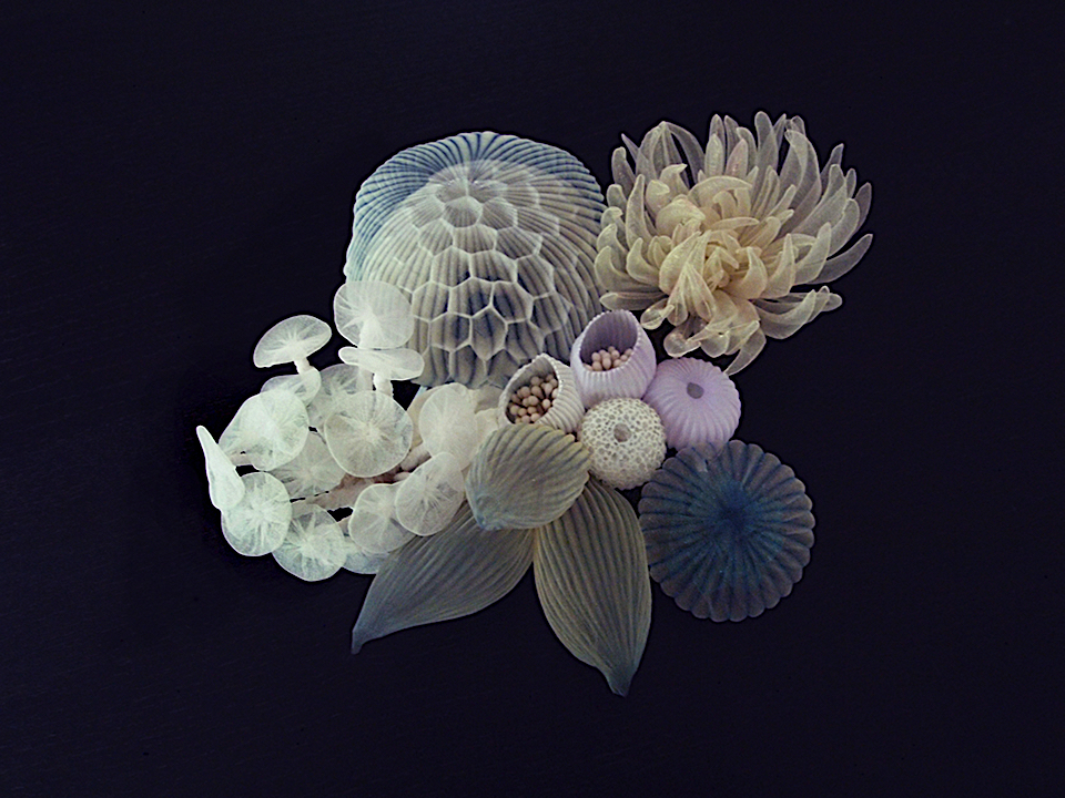
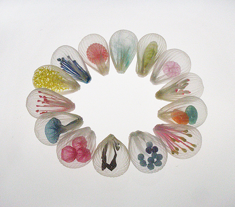
mariko kusumoto
The Japanese artist Mariko Kusumoto focuses on the beauty of materials such as fibers, metals, and resin. Her work is included in permanent collections of the Boston Museum of Fine Arts, Japanese Gardens Flordia, the Kock Collection at the Swiss National Museum, Murikami Museum and the Racine Art Museum. In all of her work, there is always the insistence on skill and craftsmanship.To get to know her and especially her fiber collection better, we asked her some question: How would you describe yourself as an artist? Growing up in Japan and living in the USA for nearly 30 years has exposed me to both Western and Japanese aesthetics which, enhanced by my intense curiosity, has broadened my view. I am able to appreciate all art forms, and I regard them all as one. To me, there is no boundary between different categories. My mind is very flexible, and my creativity is not restricted by any rules. What is your main inspiration behind your fiber work and can you tell me about the design process? Encountering different types of material in daily life is important to me. Sometimes I’ll come across a material that I find mesmerizing, and it will draw me in and stir my imagination. Fabric is one of the most familiar of everyday materials. Even though the word “fabric" sounds straightforward enough, the range of different fabrics is broad, with unique characteristics that can draw out a variety of sensations or emotions. Some fabrics imply the cool feeling of moisture, others have a fluffiness that is comforting; there are fabrics that invoke the mysterious or the ethereal; there are fabrics that inspire tranquility; and some fabrics suggest fragility, subtlety, etc.
I develop fabric pieces that reflect my strong interest in the material itself, how fabric is inherently the opposite of metal, which is the material that I exclusively worked with for many years. I strive to bring out the fabric’s inherent characteristics and beauty. I give it a new identity through re-shaping it into three-dimensional forms. For example, because I love the translucency of fabric, and working with layers and adding moving parts, I can create playful, mysterious, and ethereal atmospheres. Besides being inspired by the material itself, I am also motivated by the process. Almost half of my creative time is spent experimenting. During the experimental process, there is sometimes a breathtaking moment. I pay attention to these accidental discoveries, capture those moments and develop new ideas from that point. The full potential of what I can do with fabric is still unknown to me. I’m on a journey to explore the endless, unlimited possibilities of this material. Any future work of exhibitions we should expect to see your work? My next exhibition will be a solo show at Galeria Teresa Seabra in Lisbon, Portugal. from September 1-30, as part of the Bairro das Artes 2018 event. My plans for next year include the LOOT 2019 show at The Museum of Arts and Design in New York, April 8-13, a group show in September at Galerie La Joaillerie par Mazlo in Paris, and plans are being made for a trunk show at MoMA New York’s Design Store. Interview by Isabeau van Maastricht
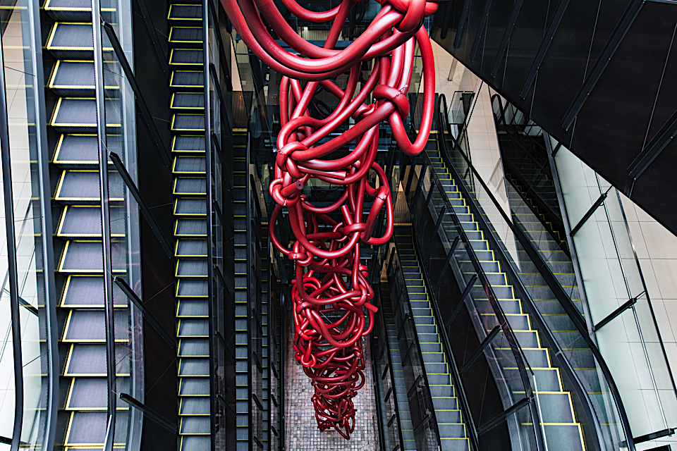
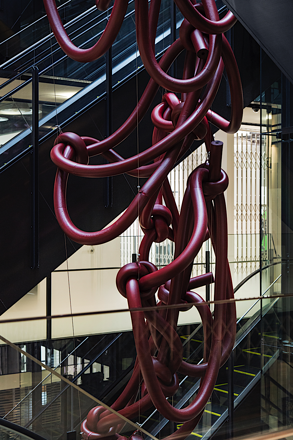
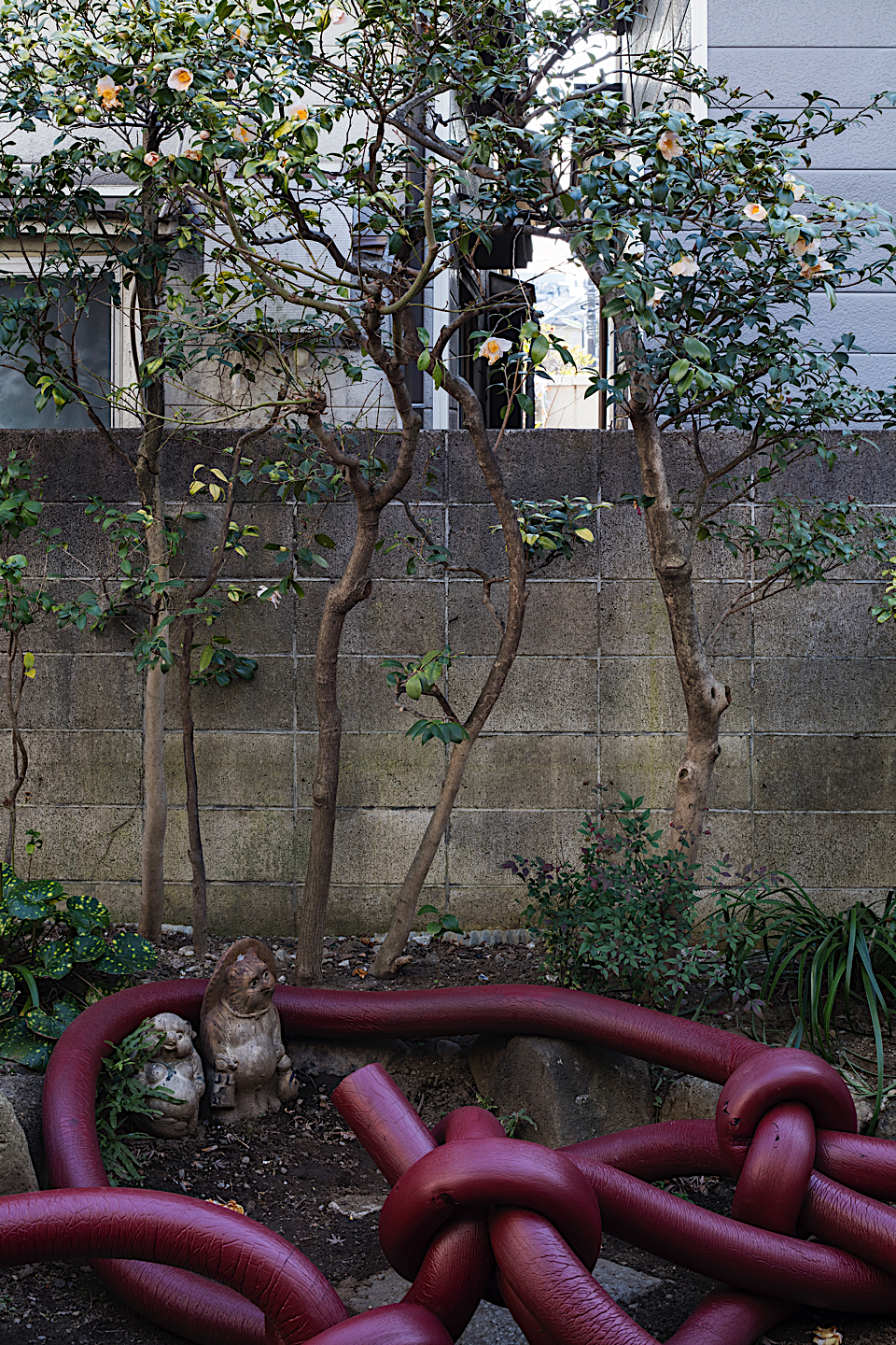
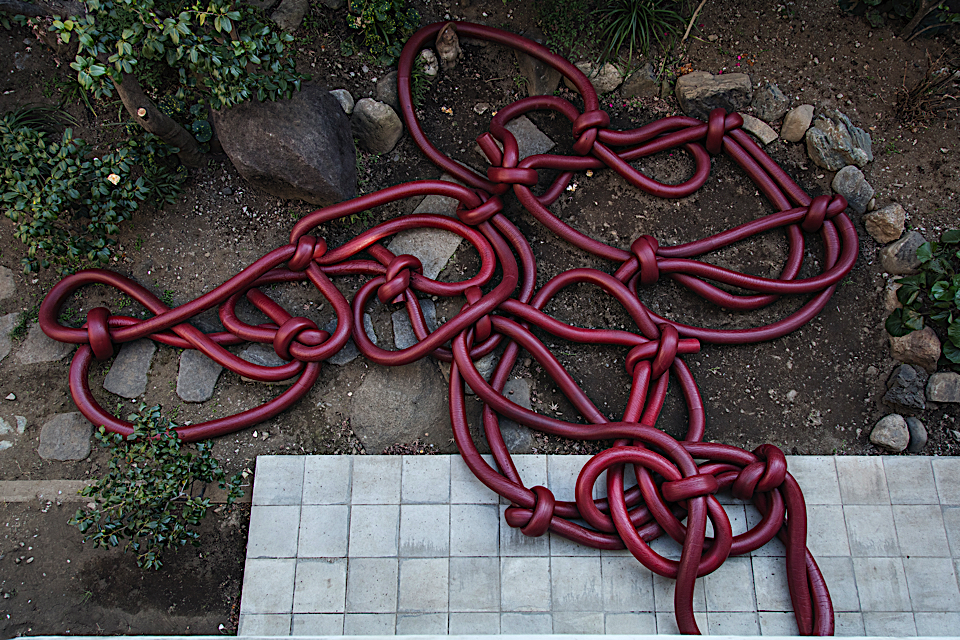
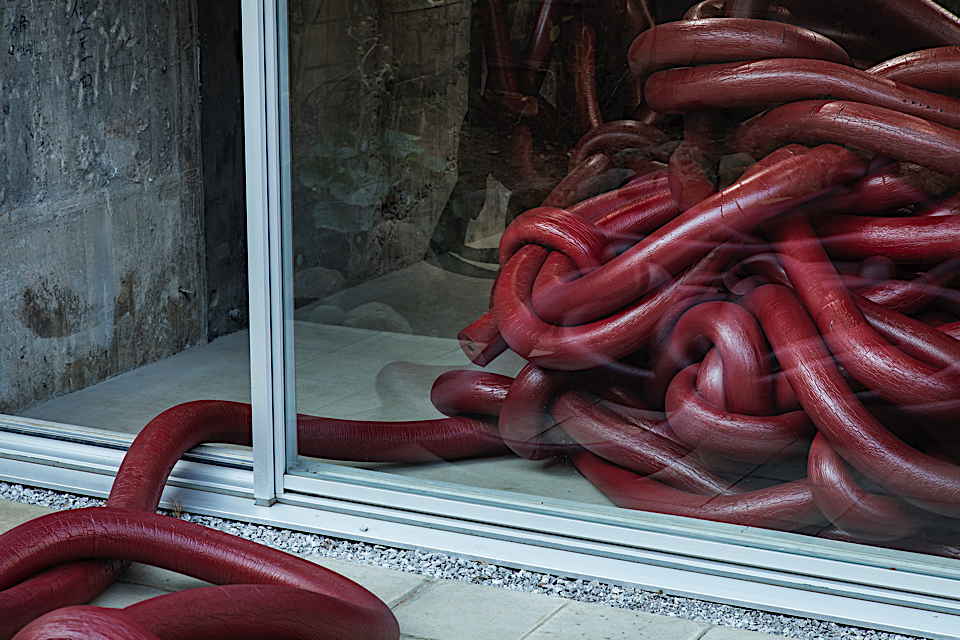
Here is how Rikako explains her story and inspiration behind her installation: “Anish Kapoor is said to be an artist of dichotomy, and his works convey the concept of dichotomic existence such as happiness and sorrow, life and death, beauty and ugliness, and good and bad, that reflects life and religions in India. In addition to the aspect of dichotomy, I felt a sense of masculinity in Kapoor's work, perhaps because of the massive impact of the large object erect against gravity. Since I also found that his philosophy has some affinity with the Eastern philosophy of Yin-Yang, I conceived an idea to create an installation that would counter the strong existence of his work with reference to the concept of Yin-Yang. Just like the way Kapoor's work is closely related to life and religions in India, my idea is to express dichotomies reflected in life and religions in Japan, with a focus on reality that I face as a woman. “ “In Early Jomon period in Japan, people started making clay figurines of women, which indicates the beginning of the Mother Goddess worship. However, in the Middle Jomon period, people started breaking the clay figurines they made. According to a theory, an act of cultivation of crops that started around this period did harm to the earth or the bodies of Mother Goddess, and people wished to grow crops out of the bodies by breaking them. In my view, the clay figurine, which accepted the act of breaking and natural course of all existence, is associated with the woman's womb signifying the receptive nature of the female gender. (…) A womb can conceive a life, regardless of whether a woman wishes or not. On the contrary, humans think and make decisions between good and bad, or whether to keep or kill a life. (…)” “What I created as an homage to Kapoor is meant to be broken clay figurines –– or my silent determination to accept dichotomies of all existence, humbly presented to the artist with my prayers. The will and voice of my body told myself to behave like a womb without questioning good or bad, while constantly transforming like water –– and our efforts resulted in this ever-transforming installation created through the continuous act of tying. “ Rikako is known for using the female body as inspirational sources for her installations, which for some might be experienced as provocative or even disturbing. It is the search for the natural truth in her art that makes audience react differently when interpreting her work and for some her “Musubi” installation might reassemble tangled blood vessels. For Rikako the connection with the female body in her latest installation is strong : ‘There is blood that is seen every month, there’s monthly pain, there’s pregnancy, abortion, childbirth, and various occurrences that happen within a woman’s body. Because there is pain, there is relief. Because there is discontent, there is happiness. Because there is death, there is life. While being unconscious, you become conscious. The woman’s body is wrapped in this experience of Yin-Yang, so it became the basis for this piece. (...) Although the audience will interpret the work in various ways, my goal was to create a piece where you can tangibly come in touch with this natural truth. “ The intended message behind Rikako’s natural stance work is that of human existence coexisting with the natural world. Her main message is :“I want to question what is nature and what are humans. Although humans exist as part of the natural world, they also behave in unnatural ways in both good and bad. Nature always exists as a dichotomy. If there is light, there is shadow. If there is happiness, there is sadness. If there is life, there is death. If there is consciousness, there is unconsciousness. If there is city, there is nature. I want the people who live only believing the truth of one side to pause and consider that the other side also exists, but that either side can not exist without the other.” Amanda Andersson 
rikako nagashima
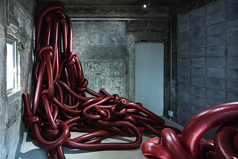
“The commonly used Japanese word for "bear/give birth to", umu can alternate with a word musubu according to a traditional definition, which is a word commonly used for " tie together ". Originally, the word musubi (tying / a knot) comes from a word musu (to grow / to develop) combined with a word hi (mythical power), and the act of tying together signifies people's wishes for succession and prosperity of life. (…) Since ancient times, people pray to Musuhi gods for succession of life in Japan. Generations of musu-ko (born boy = son) and musu-me (born girl = daughter) were born from the body of the Mother Goddess (earth), and as a consequence, we all came into existence today. The circle of human life in this world –– multiple repetitions of lives being tied together and separated, being born and dying –– is exactly like the way how the womb has accepted everything beyond what is good or bad. At the same time, there are also numerous women who made difficult decisions not to join this circle under various circumstances.”
waldemar strempler

Strempler seems to capture true emotions in every collage that he makes. Even though he mixes several references in his work, most of them still feel timeless. Trend Union used one of his works for the invitation of the AW 2019 lectures. His work got to be the face of this new season, because it was the perfect match for the themes in the trend books. To know more about the artist behind this storytelling work, we asked him some questions.
How did your background in being an art director influence your work?
I don’t know if maybe the influence even went in reversed sense.
It’s complicated to quantify or describe the quality of impact.
In any case my profession as an Art Director did allow me to develop artistically, but also to be free and independent of any pressure for success.
What attracts you the most about using mixed media in your artwork?
Any media has its own characteristics, its own laws, as well as its appeal, I like to experiment and I wish to work free and independent in the process of creation - Therefore I could never limit myself to one media only.
By usage of multiple media it might give the possibility of accidentally creating effects that have a strong artistic impact. So this is something that I find very interesting.
Why is the aging process and destruction important for you work?
The process isn’t actually that important to me. I do however have affinity for materials that tell their own story thanks to aging and destruction. Materials that somehow have a past life. Including tracks of usage such as tears, wrinkles, stains, or bleached out writing.
Can you describe the process of creating an artwork?
In the beginning - actually still - there is a certain reverence for the empty page and a certain anxiety before I do the first stroke. Sometimes I’m simply going trough a messy pile of different materials in my atelier, as that is mostly the first step. If I am finding something interesting during this process, one thing might lead to another, or not. It’s anyhow always important to me to allow work rest for some days or even months. Sometimes even years later, my critical view falls onto the work, and I either like, rework, overdraw, or even abandon it.
What would you like people to think when they see your artwork?
This is not that important to me. I work for myself and want to stay independent from something like a ”taste of an audience”. So for me it’s completely all right, if someone falls into astonishment, pleasure, gets inspired or even repelled. Although there are a few people who are especially important to me as well, as their opinion. Whenever those people discuss my work I listen carefully.
Is there a particular work that stands out or is your favorite, and why?
I don’t have a favorite work. There are however some works, which I’d rather not sell, which I like to have around me. Why? No idea! Mostly these are pieces, which I look at after the process of creation, and ask myself: Was it really you, who did that?
What does the future hold for you?
Who knows? ”Höhere Wesen befahlen: rechte obere Ecke Schwarz malen!” Polke’s work title translates to ”Higher beings commanded: paint black right top corner”. To put it with other famous words: "In this world nothing can be said to be certain, except death and taxes” (Benjamin Franklin)
stremplerart.tumblr.com


weaving connections

Tanya Aguiñiga is a Los Angeles based artist, designer and craftswoman. For more than a decade now Tanya has helped lead the way in a flourishing movement of using fiber and weaving in art and design. She is a multi-talented artist who is pushing the boundaries of what art and materials can be. She regularly creates large scale, woven installations for museum and gallery exhibitions as well as for interior design projects, and she continues to produce a line of woven accessories which are sold around the country.
At the core of her practice however, is a consistent connection to community, to her roots, as well as with those around her. As she says in her biography, “she investigates how craft disciplines connect our lives through culture, tradition, material, function and community.”
Whether a public performance enacted to bring attention to the unfair practices in the fashion and textile industries in Los Angeles, a private commission for an upscale hotel, or an installation for a museum exhibition, her work conveys a sense of warmth, strength, color, and connection The twisted, sculpted, structural threads create an open network, a sense of give and take between viewer and artist. Her use of felt, a laborious, time consuming technique involving hours of wetting, patting, and shaping, is also about the importance of process, of connecting to materials and to the object.
Tanya has worked with artisans in Chiapas Mexico to help them develop their craft to create better economic opportunities, and in a series of Border Art Workshops from the early 2000s, she worked with underprivileged children and families living near the San Diego-Tijuana border, where she herself grew up.
Her most recent project is Ambos (Art Made between Opposite Sides), created to “re-contextualize borders and generate a localized hub for international collaboration.” Throughout the month of August 2016, Ambos took over an empty storefront at the border between Tijuana and San Diego and held creative workshops, artist interventions, collaborative events, and performances meant to draw attention to the sense of connectedness along a border, as well as honor the 30-year old artisan market which is under threat of closure. One event, titled Border Quipu/Quipu Fronterizo, took as its inspiration the ancient Andean/pre-Colombian communication and organizational system called the quipu that was made through weaving and knotting. The Border Quipu engaged the daily commuters who make their way across the border by asking them to take two strands of string and tie them in a knot. These were then tied to others and so on to create a large-scale border wall-hanging Quipu. Ambos recently presented some of the artwork made during August at the Mexican Consulate in Los Angeles.
Not bound by conventional categories of practice, but open to explore the possibilities of many, Aguiñiga seems to move fluidly between each project as if they are all seamlessly interconnected, establishing an artistic practice that continues to innovate.
Blaire Dessent
Blaire Dessent is an art, design and lifestyle writer and the founder of The Vitrine, a project based business with a focus on producing pop up shops, events and editions with contemporary artists and designers. www.blairedessent.com and www.thevitrine.com

Hold, Photo: Courtesy of Volume Gallery, Chicago

Swaddle Stool Boots.Photo: Courtesy of Volume Gallery, Chicago

SHEvening installation. Photo by Gina Clyne Photography

AMBOS Photo by Gina Clyne Photography
Ace Hotel, Los Angeles. Photo by Tanya Aguiñiga Studio

Ace Hotel, Los Angeles. Photo by Tanya Aguiñiga Studio
bari ziperstein

Bari Ziperstein is part of a vibrant and growing community of Los Angeles makers; Multi-talented and multidisciplinary artists, designers, craftspeople, architects and overall creatives who are experimenting and challenging the definition of what their individual fields can be. Ziperstein’s primary medium is clay, but she moves fluidly moves between making art, design and objects. She studied fine art at Cal Arts in Los Angeles, and regularly exhibits her work in galleries in public art projects. About five years ago she began to focus on her line of design objects called BZIPPY, which features her signature style of building modular, brutalist style vases and lamps that are as sculptural as they are functional, as well as a line of architectural jewelry and accessories. In the same 6-months Bari might have an exhibition in a gallery, participated in a design project, and had a booth in the Echo Park craft fair, yet all of these pieces fit together under one cohesive artistic and creative practice. Here Bari discusses her connection to LA, growing up scouting flea markets with parents who collected vintage objects, her formative education at Cal Arts, and her interest in suburban house fences.
There is a growing movement of creative people across Los Angeles who are establishing successful careers, a sense of community, and having fun across multiple fields: visual art, architecture, design, fashion, craft. How has living and working in Los Angeles affected your work?
I’ve been living in LA since 2002, while attending Cal Arts for grad school. Los Angeles has always been a place for me to try to understand and I am surrounded by inspiration daily from my former commute to the studio across the city: it’s politics and diverse neighborhoods divided by class, its shifting architecture, the hand painted signs of local business, to the extreme desert landscape.
When you were at Cal Arts and studying fine art, did you have an interest already in making jewelry or housewares or did that develop later through other interests and experiences?
My history with objects has always been there – but making specific design products for a design audience started to run parallel with my fine art practice about 5 years ago. It seemed like a natural progression where my fine art was teetering between those worlds for so long.
While at Cal Arts, I was deeply invested in large-scale site-specific sculpture and conceptual art. But running parallel was my childhood history of being raised by a father who was an obsessive collector and a mother who loves to shop. My father, Robert (Zippy) collected ceramic cookie jars, boomerang 1960s lamps, and always dressed head to toe in vintage – usually adorned with a fun bakelite pin. Traveling the country and visiting flea markets with my parents is where I first learned about aesthetics and ceramics.
Has experimentation always been a part of your approach?
Yes, it has – I can get bored so easily and it’s a challenge to always stretch my engineering and technical skills (and I) often fail many many times before achieving what I want. When in the studio, the design works have a collage aesthetic where they combine ceramic, walnut, and rope in unexpected ways. The rope acts as a drawing material in space – allowing me to form a visual line with this very soft material.
There is a strong architectural element that runs through your work as a visual artist and as a designer. References to totemic structures, geometric forms, a feeling of protection are seen in many of your vases for BZIPPY, in the Breast Plates series as part of your jewelry line and also part of your visual art project titled, “Decorative Protection.” Can you talk a bit about the influence or interest in architecture in your work?
My artistic practice draws attention to the way various built environments, ranging from architectural to consumer-oriented constructions, relate to desire and aspiration. It’s within these ideas that the works play with the huge subject of architecture and start to break it down – in terms of shifting its scale and allowing the architecture be disembodied from it’s original influence.
Having recently moved to the East side of LA, closer to my studio, I’m focused on the iron fences that populate my new neighborhood. Those very decorative, protective fences were the focus of my fine art research for many years – looking at how specific 1980’s home décor advertising from LA urged residences to install ‘non-prison looking bars’ for their homes. My new home doesn’t have decorative bars on the property, so now the question is how does my family become a part of a new neighborhood with out becoming the women in the AD who sees safety only behind iron gates? The research is no longer on paper, it’s in the lived experience as a LA resident in a diverse community.
I love your term primitive futurist to describe your series of Terracotta pots, in which there is a strong influence of ancient forms and patterns, particularly pre-Colombian. Can you talk about this term a bit and inspiration behind this series?
It’s a term that I co-opted from my mentor, filmmaker Pat O’Neill’s, sculptures – where there is a combination of the object having a raw quality to it but its design and patterning looks futuristic or science-fiction. This raw quality can be seen in the unglazed terra cotta surfaces to the influence of Native American / pre-Columbian pottery forms.
You have made several public art projects, for museums as well as participated in workshops and events such as the EP Craft fair. How does engaging with the public inspire or influence you?
Working on public projects is such an interesting experience – as the rules and guidelines are always set up in advance to meet the needs of a specific community or county and city arts agency. But it’s so freeing to have those set guidelines and then stretch / play with them beyond their expectations. Having to negotiate with a new community directly and to research their culture in a thoughtful / celebratory way while not being apart form that community is a tenuous line to walk. But it’s one that is very full filling – and very different than the often solitary way of working in the studio.
When setting up shop at the Echo Park Craft Fair – it so much different – and it’s more about engaging with my design clients face to face, showing a new collection and selling product. And the wonderful social aspect of being a part of the Craft movement in LA.
How you find a creative balance within your various projects?
This is ongoing and never ending – do I have balance? I’d say no at this moment in the traditional way – but it all seems to work out as different deadlines approach, and family obligations/time is needed to nurture that personal life as well. Four years ago I consciously made a decision to focus on the design line getting off the ground and being sustainable. Now that the business is running well, I have some space to think about my fine art practice and produce new sculptures. It’s a different mindset when thinking about making a solo sculpture show than working production. One is like a desk job and the other is like being in a research laboratory.
What is your favorite time of the day to be in the studio?
Late late evenings are the best but very rare these days with a toddler at home. It’s great to see the accomplishments of the day on the shelves and the quiet of the studio with our assistants. A lot of my experimentation needs to be done alone with lots of caffeine and a full satisfying vegetarian meal.
Blaire Dessent
Blaire Dessent is an American in Paris working as a cultural writer, copywriter and translator with a specialization in the cultural and lifestyle industries including contemporary art, design, fashion and beauty. She is also special projects manager for American design at Triode, a leading design showroom located in the 6th arrondissement in Paris.


 circletop_collection")
 SingleOval_TC1")
sublime imperfections

Lorenzo Passi is an artist who interacts with glass in a very special way. His work is based on an intense enquiry on materials, stemming from the determination to restore their expressiveness and fluidity.
After an initial experience with Venetian glassworks furnaces, Lorenzo moved to Finland to further his learning process. There he acquired the skill of mastering the expressive and irrepressible power of glass, thereby entering into a creative symbiosis with its fluid nature. He then returned to Venice, where, thanks to the Finnish experience, he elected not to acquiesce to stereotypes of form and function, but to strive his utmost to overcome them. He realized that his interests did not lie in the direction of traditional production, but in composition. His intention was that of leading fluid matter to an undefined point, unplanned and not previously established. And, in pursuing this aim, Lorenzo and glass became accomplices. Like in a dance wherein one’s partner is a material substance, the creation of form proceeds from an entente between artist and matter itself. And this form is not liable to classification within conventional geometry or in the traditional figure of the container-vase. Lorenzo Passi finds his ideal of beauty in form imperfect. He worships multifaceted and not fully polished surfaces that allow him to distance himself from limiting contents and patterns.
His experience in Finland at the Nuutajärven Lasikoulu Glassworks School brought him to address glassblowing in a more personal way: “A harsh climate” – he says – “presses you to think about how nature may be stronger than you”. This awareness encouraged his wish to seek and experiment, to express the interplay of equilibriums. By grafting different materials together, he acknowledged the utmost power of glass, and by respecting its fragilities he converted it into form.
Through this creative process of matching different materials, in which glass is partnered with pieces of old metal, he sought, among the marks left by time, the imperfections which tell and carry a tale within themselves. And, by this process, he became aware that his enquiry was directed towards the rediscovery of memory: in those pieces of old metal, a narrative is found – his own narrative, dwelling within him, and breathed by him unto matter. By blowing glass into metal, Lorenzo makes two different materials explore one another. Glass flows spontaneously into the free space within the metal, wherefrom it flows outward, inevitably, and gets “caught in the game”. Thus the relationship between the two materials is born: its flavour is one of friction, encounters-and-clashes, anger – but at the same time sweetness, poetry, and melding.
Text by Magda Di Siena and Michela Codutti


simon hoegsberg

The Danish photographer Simon Hoegsberg, known for works such as ‘The Thought Project’, ‘Faces of New York’ and the world’s perhaps widest photograph ever made entitled ‘We’re All Gonna Die’ (it’s 100 meters wide), recently launched on his website a new photo project that has been 5 years in the making.
The project is called « The Grocery Store Project - 2067 images of connectedness”, and is a visual examination of human life as it plays itself out on a busy sidewalk in front of a supermarket in Copenhagen.
Over a period of one and a half years (between 2010 and ’11) Simon spent 159 afternoons sitting on a bike rail in front of the supermarket, taking 97.000 photos of people walking toward and away from the camera.
In the project’s 2067 images people kiss, think, listen to sound on smart phones, smoke cigarettes, communicate, carry their child, talk on cell phones, drink soda, beer, coffee, water, and blow their noses. The images are arranged in 457 sequences that cross each other in horizontal and vertical lines, like words on a scrabble board. Seen from a distance the connecting sequences form a composition that looks like a map of sorts, or an organic structure.
Zooming in on the structure it becomes apparent that the images in every sequence are of the same person, shot on different days. In one sequence a woman wearing a purple t-shirt and no jacket is walking together with a man; in the image next to it she is walking alone, this time carrying a blue bandana with white butterflies on it and a woolen jacket. In a third image from the same sequence her chest is bare underneath a yellow and red sports jacket, and the glasses she’s wearing are different from the one’s she is wearing in the two other images. The three images are taken on three different days within a period of one month and 20 days.
The Grocery Store Project provides an opportunity to study how we humans present ourselves to the world, consciously and unconsciously, in the present moment and over time. It’s a visual celebration of a life form that does its best to bloom and to create the perfect conditions for itself, relentlessly, despite all challenges, set backs, and the destruction it constantly runs into. Seen from space, one could argue that humanity is a great piece of art, full of patterns that emerge and disappear.
The Grocery Store Project is a humble attempt to praise the artwork and ponder its unfathomable nature.


faceless

Lady Glittersky, 2009, C-print, 121 x 92cm © Thorsten Brinkmann, VBK, Wien 2013 and VG Bildkunst Bonn 2012- UNDERCOVER AW 2006/2007, Collection "GURUGURU“
FACELESS is an exhibition exploring a phenomenon present all around us: the fashion of facelessness that first appeared in the creative arts at the beginning of this century and has remained popular since then. The exhibition reminds us of the impact that media-generated images can have on the creative arts and the ways in which they respond to public images, pop culture, and the mainstream in general. The first part of the exhibition showed the appeal that hiding, veiling, or masking the face exerted on art and fashion after 9/11.
FACELESS continues the survey in a more participatory approach. The focus is on interdisciplinary works and lectures, performances, and workshops that convey how we can survive without losing face and at the same time revolt.
In addition to some one hundred works by internationally renowned as well as young, up-and-coming artists, including Marina Abramović, Jill Magid, Jeremy Bailey, Bernd Oppl, Andrew Norman Wilson, Thorsten Brinkmann, Asger Carlsen, Shahram Entekhabi, David Haines, Ren Hang, Ute Klein, Nienke Klunder, Slava Mogutin, Mustafa Sabbagh, Jan Stradtmann, and Levi van Veluw, FACELESS features masks by designers such as Maiko Takeda, Maison Martin Margiela, Jun Takahashi for UNDERCOVER, Katsuya Kamo for Junya Watanabe’s COMME des GARÇONS and many more. The exhibition successfully merges art and fashion in the context of a subject that is of collective urgency and importance.
For artist/curator Bogomir Doringer, FACELESS was chiefly inspired by the sociopolitical consequences of 9/11. As the value of facial identifiability has risen, abstracted forms and representations of faces have become increasingly common in artistic production. Bogomir Doringer, for one, has been exploring the theme of facelessness in fashion and art for years. “Our unstable identity yearns for a return to the mask,” he says. “Like in times past, we are attracted to wearing masks as a form of protection or camouflage, as a prop, or just for entertainment.”
“As much as a face and an expression can give away about us,” says co-curator Brigitte Felderer of the University of Applied Arts Vienna, “we have plenty of creative potentials at our disposal for making these tale-telling surfaces illegible, even invisible, without running the risk of suffering social death.”
FACELESS in Brussels until February 8th 2015
www.facelessexhibition.net
Artists: Marina Abramović, Martin Backes, Jeremy Bailey, Jonathan Barnbrook for David Bowie, Aram Bartholl, William Basinski, Marc Bijl, Zach Blas, Heiko Bressnik, Thorsten Brinkmann, Ondrej Brody & Kristofer Paetau, Mark Brown, Asger Carlsen, Cracked Labs, Ben DeHaan, Sofie Groot Dengerink, DENNATON (Jonatan Söderström & Dennis Wedin), Nezaket Ekici, Arthur Elsenaar, Shahram Entekhabi, Caron Geary aka FERAL is KINKY, Hrafnhildur Gissurardóttir, David Haines, Ren Hang, Adam Harvey, Sabi van Hemert, Ursula Hübner, Damier Johnson aka REBEL YUTHS, Katsuya Kamo for Junya Watanabe COMME des GARÇONS, KATSU, Brian Kenny, Ute Klein, Nienke Klunder, Jakob Lena Knebl & Thomas Hörl, Miodrag Krkobabić, Mirko Lazović, Theo-Mass Lexileictous, Vanessa Lodigiani, Zachari Logan, Manu Luksch, Jill Magid, Maison Martin Margiela, Alberto de Michele, Bob Miloshević, Jelena Misković, Slava Mogutin, Andrew Newman, Veljko Onjin, Bernd Oppl, Tanja Ostojić, Marco Pezzotta, Gareth Pugh, Eva-Maria Raab, RAF SIMONS, Ana Rajcevic, Daphne Rosenthal, Tarron Ruiz-Avila, Mustafa Sabbagh, Olivier de Sagazan, Daniel Sannwald for WOODKID, Bryan Lewis Saunders, Frank Schallmaier, Hester Scheurwater, Tim Silver, Jan Stradtmann, Sergei Sviatchenko, Jun Takahashi for UNDERCOVER, Maiko Takeda, Marc Turlan, Levi van Veluw, Ari Versluis & Ellie Uyttenbroek, Viktor & Rolf, Philippe Vogelenzang & Majid Karrouch, Daniel Vom Keller, Martin C de Waal, Addie Wagenknecht & Stefan Hechenberger, Anne Wenzel, Lucy Wood, Bernhard Willhelm, Andrew Norman Wilson, and Marcus Zobl. Some of the participating artists are living and working in the art studios at the MuseumsQuartier as part of the quartier21/MQ Artist-in-Residence program.

Still from “Gravity”, 2007 © Nezaket Ekici

Deer No. 7 from series “Deers”, 2007 © Veljko Onjin - Bernhard Willhelm, SS 13, 3D: Geoffrey Lillemon, Photo: Petrovsky&Ramone

© REBEL YUTHS

Jill Magid_I can burn your face - 2008

Fag Face Mask – October 20, 2012, Los Angeles, CA, from „Facial Weaponization Suite“, 2011-present © Zach Blas - onee, 15.2 min, 2013 © Ben DeHaan

Still from “The FACELESS Project” © Manu Luksch

From series “Less”, 2004 © Sergei Sviatchenko- Resonanzgeflecht #6, 2009 © Ute Klein

Pixelhead © Martin Backes

Atmospheric Reentry, 2013 © Maiko Takeda, Photography: Bryan Huynh- RUN, 2010 © Brian Kenny

Still from “Him and Her”, 2008 © Daphne Rosenthal

Alberto de Michele 'quien lo vive quien lo goza. la mascara de la maldad'
alexis vasilikos
")
photo by alexis vasilikos
Alexis Vasilikos is an Athens-based Greek photographer and the co-editor of phasesmag.com. His work explores the presence of the sublime in everyday life and is an intimate contemplation on the nature of emptiness. His images have a contemplative quality, they show us the serendipities of life and the essence of signs. By viewing his work our life seems suddenly to be more magical.
We choose to feature a part of his series called "Yoga" and for you to get to know him better, we asked Vasilikos a few questions:
Why is this series called Yoga and the focus is on 2 ?
Because this is where the journey of seeking begins, there is a sense of two in us , a separation, an idea that something is missing , so we are searching for union and "yoga" means union.
All of life can be seen as this journey of yoga and strangely the end of yoga is the realization that there have never been two from the very beginning there has always been only the One, but because concepts exist in relation to their opposites in order to understand and experience yoga.
We need to examine what is duality ? And where is duality ? Is it in the essence of things or it's only superficial ? Does it even exist when we stop paying attention to thoughts ?
This kind of questioning has inspired this series .
Your favorite qualities in a man ?
Peace, stillness, bliss, but these are not really qualities of man these are the qualities of pure consciousness.
Your idea of happiness ?
Happiness is our true nature but the mind makes happiness look as if it is the result of something, "if i do this then i'll be happy".
This very idea is the cause of misery as Papaji said "You need nothing to be happy but you need something to be sad" .
If not yourself, who would you be?
If by "self" you mean my form then i would probably be another form but is myself the form ? We have to find out , this is the great opportunity :are we who we think we are ?
Your favorite poets ?
Rumi, Basho, Kabir.
What is your present state of mind ?
If i think about it , it appears to be something if i don't think about it , what is it ?
Your favorite motto ?
Forget about the motto !
www.alexisvasilikos.net
www.phasesmag.com
")
photo by alexis vasilikos
")
photo by alexis vasilikos
")
photo by alexis vasilikos
")
photo by alexis vasilikos
")
photo by alexis vasilikos
")
photo by alexis vasilikos
")
photo by alexis vasilikos
")
photo by alexis vasilikos
")
photo by alexis vasilikos
")
photo by alexis vasilikos
")
photo by alexis vasilikos
")
photo by alexis vasilikos
")
photo by alexis vasilikos
")
photo by alexis vasilikos
the art of assemblage
 Kate Elliott")
Lorenzo Vitturi l Installation Image 2014 (c) Kate Elliott
In conversation with Lorenzo Vitturi on his recent project, Dalston Anatomy.
Italian born Lorenzo Vitturi, previously a cinema set painter and designer crosses the genres of photography, installation and sculpture. Capturing the colourful vibrancy of Ridley Road market in East London before it falls victim to gentrification.
In his own words a ‘Visual Anatomist’ building makeshift sculptures in his studio from objects found in the market, from rotting vegetables and discarded miscellaneous items. He erects striking totems, strangely beautiful and creature-like some doused in pigment or chalk. A chaotic collision of colour and decay.
He combines these with surreal portraits of local characters, and accompanied by Sam Berkson’s poem formed of fragments of conversation from the street. Dalston Anatomy is a stunning ode to the spirit and humanity of a neighbourhood that is fast disappearing.
Why was it so important to capture the vibrancy of the market before it falls victim to gentrification?
I've always been really interested in people, or in this case neighbourhoods that are really close to a change or transformation. I come from Venice so I’m really interested because of what has happened there, the city has changed a lot and I’ve been a victim of this process, as soon as I moved to Dalston in London I recognised the same symptoms. I arrived 7 years ago into the middle of this transformation, witnessing it as it happened.
I sense an affectionate humour as well as a melancholy in your sculpture do you agree?
Yes I perfectly agree. I think that irony is a really important element of Dalston Anatomy, and of myself too. It's an important ingredient of the project. Dalston itself is ironic. Gentrification has a lot of negative aspects but at the same time the place is such an energetic, multicultural environment. This mix creates quite a unique atmosphere - and irony is a good ingredient to represent this and is part of the essence of myself.
How important is Sam Berkson’s poem, and the layering of voices within the work?
Sam Berkson is really important because I didn't want to have any critique writing about my pictures and my work, and also I prefer to find someone who could do something similar to what I had done but instead using words, I found Sam was the perfect person. For someone who really doesn't know Dalston, they are able to gain a physical impression of the place, and is transported there.
There are little hidden stories within the photographs such as the chalk used on the faces, what does that symbolise?
There is not any narrative in the work, not a single story but instead every picture and every material that you find in the image has some sort of hidden tale. The yellow chalk I used to cover the face of the Western African woman - they told me in the market it is a chalk they sell to the pregnant African women as a painkiller. These little stories teach you more about the different cultures of the market.
Do you have a vision of a picture before it comes to life, or is it more of an organic process?
I think the best pictures that I produce are always really harmonic; there is always a balance between randomness and also visualization. Sometimes I will have a clear vision, I go to the market and find the item of the day and I mix it all together and it becomes a result of random actions and discoveries plus what I have in my mind.
Who was the most memorable character you came across in the market?
Mr. Hunter the guy in the ‘plastic blue’ series. He is a Jamaican Rasta, a prophet, and a storyteller. When we meet he always tells me his vision, he has a really unique perspective of the universe. I really remember this as a happy moment.
What was the most peculiar item you found for sale on the market?
That is really a difficult one as I found so many incredible things. There is one; it’s an African stock cube, it was reminiscent of Cristo the Artist, who made packages of buildings, it looks like a miniature Cristo. Occasionally you find these little pieces of art but actually they are daily objects. Our culture is different - we have very precise packaging and branding but in contrast these are handmade, beautiful special things.
How have the local residents of the market reacted to your work?
Well it took me quite a while to explain what I was doing and to get the trust of the community, there are a lot of photographers taking pictures and people are quite fed up. I started to take the pictures back to show the community and explain what I was trying to do, and after 3/4 months they started to understand, and get to know me and they all seem really happy.
Dalston Anatomy is at the Photographers Gallery, London until October 19th
Emma Trotter
thephotographersgallery
Emma Trotter is a trend researcher and blogger living and working from London with eyes on the world.

Lorenzo Vitturi l Multicolor #1, 2013 l Hairy orange, yellow balloons and rotten camote #2, 2013

Lorenzo Vitturi l Yellow Chalk #1 & 2, 2013

Lorenzo Vitturi l Pink #1 & 2, 2013

Lorenzo Vitturi l Plastic Bue #1 & 2, 2013
archeological materialism

Erika Verzutti Cemetery with Fringe, 2014 - Galeria Fortes Vilaça | Art Basel 2014
During the Art Basel fair in 2014 Erika Verzutti caught our attention with her Cemetery with Fringe installation. The Brazilian artist Verzutti is based in Sao Paulo, where she works as a material archeologist from her in-house studio. Verzutti gives a new meaning to the use of color cards by making still life color harmonies. For the creation of Cemetery with Fringe she composed sculptures together within in a blue/grey toned color composition where the pieces seem to be dug up during archeological field research. Interpretations of roman forks and knives are topping off the foreground of the still life whereupon fossil inspired sculptures are presented on floor and pedestals.
The amount of color used in Cemetery with Fringe is absolutely stunning and all of the sculptures and stones fall completely within the same coherent philosophy. The different blue tones are combined with grey bricks, charcoal pieces, even metal tones. The hues used by Verzutti even provoke a nostalgic reference to seacoasts, where grounds of stones and ceramic drift ashore the coastline. Verzutti used drawings, which she sealed on stone and cement pedestals to uplift her own fossil sculptures. Her egg shaped parts triggered my imagination to think of which historical creature has laid its eggs a few thousand years ago on the place of the archeological dig.
Verzutti is inspired by the Brazilian horticulture and her sculptures can often be referred to as interpretations of tropical fruits and flowers, inhabiting an ambiguous space between representation and abstraction. Her use of ethnographical studies is combined with her inspiring sense of color and shape and this is what makes her drawings, paintings and sculptures incredibly inspiring and even romantic.
Willem Schenk

Erika Verzutti Cemetery with Fringe, 2014 - Galeria Fortes Vilaça | Art Basel 2014

Erika Verzutti Cemetery with Fringe, 2014 - Galeria Fortes Vilaça | Art Basel 2014
aki inomata
 AKI INOMATA")
photo (c) AKI INOMATA
Born in Tokyo in 1983, the Japanese artist Aki Inomata studied at MFA Inter Media Art, Tokyo University of Art. Her artistic project explore different concepts : adaptation, change, protection and architecture; all of them are inspired by natural resources.
She is fascinated by the capacity of animals to use the environment to produce wonderful creations in order to protect themselves. The “Girls Girls Girls” project was a long process as it is based on the interaction between living things - female bagworms- and pieces of cloth. Aki Inomata cut in little pieces a serie of women’s clothes, she gave them to the female bagworms and let them built with that fabrics their protective case.
As Aki Inomata explains “Male bagworms leave their protective cases when they become adults, and become moths. However female bagworms remain in their protective cases for their whole lives and wait for the male bagworms. This reminded me of my own experience of being approached by hundreds of men, whilst the few men that I was interested in often didn't even glance at me.Though the gender issue is meant to have changed in our generation, why is it that women still make much more effort than men concerning their appearances, and always wait for the men to approach them? I spent two years raising the bagworms and making this piece.
I made it to be premiered in a exhibit at a department store, which sells lots of women’s fashion goods, as a kind of commentary on clothes and women’s fashion.”
This piece tells us a lot about the relation between human and nature and explores the connections between biology, human technic and craft.
Sophie Hérolt Petitpas
Sophie Hérolt Petitpas is a french journalist free lance found of design and lifestyle. Sophie is also passionate by astrology and its mythical and symbolic aspects. Curious and sensitive, she loved linking and describing her trend hunting with the eyes of mythology in her blog.
 AKI INOMATA")
photo (c) AKI INOMATA
 AKI INOMATA")
photos (c) AKI INOMATA
 AKI INOMATA")
photos (c) AKI INOMATA
julien salaud
, 2012")
Julien Salaud : Aviation (enfant 2), 2012
In Julien Salaud’s work there is a whole pantheon filled with animals depicted in different ways, such as drawing, etching and sculpture. It is generally accepted that his work examines the connections between man and animal. That is indeed one side of his work, but transformation is really the core of it: wood animals skins or insects turning into something else with additional beads, nails, feathers or rhinestone.
Julien Salaud lives and works in Orléans - France. He is represented by Suzanne Tarasiève art gallery in Paris.
Where does your interest in working with stuffed animals come from?
In early 2008 I did two tiny sculptures made of bones, feathers, wood pieces and some seeds that I brought back from French Guyana. One of them looked like a stuffed parrot from a specific angle. I was then studying Arts at Paris 8 University and when my professor saw it, she recommended the reading of Steve Baker’s The Postmodern Animal, which is about taxidermy. Baker states that the works of Thomas Grunfeld, by referring to ancient chimera, carries imagination rather than reason. Meanwhile I discovered the work of Chantal Jègues-Wolkiewiez, an ethno astronomer who previously studied Lascaux cave paintings. She demonstrated that the zoomorphic paintings from The Hall of the Bulls correspond with the sky map at the time. Taxidermy occurred in my work at the same time with the piece les Animaux stellaires. These are both some application of Baker’s book and Jègues-Wolkiewiez investigations. And taxidermy was also a good way to think about death and the way I’m intrigued by the concept of it.
Do you think studying biochemistry at the University influenced your choices as an artist?
Definitely. The first years I studied hard science and I unsuccessfully attempted to develop logical thinking for myself… Later on my first job consisted of gathering data regarding the impact of human activity on the wildlife in French Guyana. I was not really passionate about it to be honest, but I really enjoyed spending entire days tracking the animals. In the end it took me ten years to admit that I was neither compatible with science, nor with its way of studying the world through order and logic. I then focused on Arts – the one and only continual thing in my chaotic process – without actually giving up the things that interest me for my work. I’m thinking about the ones dealing with environment or nature for example.
You make pieces that require time, meticulousness and people to help in the process. How do you usually work?
There are different kinds of beauty. I suppose the one I am interested in is like a fruit: I am not following a logical analysis, and I am not trying to have some concept. I am rather into contemplation, which implies taking some time. So if I want the audience to be aroused by contemplation, I have to take some time to be able to create an object that will provoke the same effect. Until two years ago I was still able to work on my own. It may take several months to finish a piece, like the Constellation du cerf (harpe) II. Since the end of the year 2011 the rhythm has increased, and I was no longer in the position to work on my own, I had to call for assistance to make sure the work would be ready on time…
And I have been working with various people, friends or art students since then. Last summer we were like twelve people working in my garden to prepare exhibitions scheduled in October! Working among a team is somehow very inspiring. Works can exist in a way that you would never achieve on your own. In addition to that, working with different people is never a one-way thing. Twenty four hands worked with a lot of patience and precision on the piece entitled Printemps (nymphe de cerf) during two months and a half. I then witnessed the consequences of the creating process on other individuals than myself. It almost convinces me to do workshops-exhibitions where the visitors could also be involved in the making.
In a way I do think that the best way to understand a work of art is to participate in the creative process.
You are also working with various media, such as drawing, painting, and sculpture of course. Does it allow you to express the same things in different ways? Is it important for you to work with all these media?
Working with various media feels like getting some air or taking holidays. It balances the whole thing you know. I think I would get bored if I was only into drawing or sculpture.
In my case these two media work well together: some drawings from my notebook will transform into sculptures and sculptures will become sketches sometimes. When I cannot make a drawing evolving into a sculpture or the opposite – because it would not match – I take pictures. So changing media is definitely a way of expressing several aspects of a same thing. But there is another possibility too: different media could also alter the artistic process. In that case what comes before and what comes after is totally different, visually speaking and regarding its contents. They are aligned with each other though.
I have experienced it once at the moment. But I keep on working with different media hoping that some metamorphosis would happen someday.
Adeline Wessang was born in 1977. She graduated from l'Ecole du Louvre in Art History, then specialized in contemporary art at La Sorbonne. She wrote reviews for magazines and curates exhibitions on an occasionally basis. In 2004 she was invited to curate a show at Tate Liverpool for 'A Secret History of Clay'.
She launched www.noblahblah.org in 2008. Currently working at Palais de Tokyo, center for contemporary art located in Paris.
 II, 2011")
Julien Salaud : Constellation du cerf (harpe) II, 2011

Julien Salaud : Les trois temps de la constellation du chevreuil, 2011
")
Julien Salaud : Vieux Piraï Emplumé (2008)
recycled beauty

lemonade
There is a peculiar curiosity in looking at the contemporary world using art’s classical themes and codes. In a way, it gives us the possibility to compare and contrast, and situate us in a particular, familiar tradition. The still life is one such artistic canon which has stimulated artists in all eras. A style particularly replete with symbolism (from Vanitas to the Resurrection and images of wealth), still life has evolved by reflecting the latest popular customs and socio-economic climate – making it all the more compelling to track trends and changes in habits through the way this subject has been treated throughout the centuries.
In their series "Recycled Beauty", photographer Laurie Frankel and designer Diane Gatterdam have tackled the still life tradition. The atmosphere is reminiscent of the stark simplicity of Willem Claeszoon Heda’s (1593-1680) paintings: neutral backgrounds, a post-meal mess enhanced by rich textures: glass, metal… and their contemporary equivalent, plastic. Despite similar components, however, it is not abundance and lavishness that the series points to, but rather to mundane, unremarkable elements of contemporary daily life. While old masters would use props such as candles to draw attention to the ephemerality and perishability of life, Frankel and Gatterdam reverse the concept: “These photos highlight the extraordinary amount of disposable items in our lives we use for an instant but then live on for years, while nature renews itself in a seamless continual rhythm." The plastic, packaging and wrapping paper may be crushed and stained, but never wither – and unlike the toppled silver and glass tableware of Heda’s paintings, the once used containers will not be picked up and put away to be used again at a later feast.
Necessarily, the installations call attention to the notably absent humans. Through the use of stark and delicate compositions clearly pointing to a revered art tradition, Frankel and Gatterdam bring us face to face with fascinating images of the permanence and strange beauty of our ‘trash.’ Like the still lives of hunted game, where the artists succeeded to veil the cruel death by elevating the animals to art, here the packaging is not seen as disposable but is looked at for its formalist qualities: the glistening transparent plastic, the crumpled napkins, the singular shapes of glass containers (filled with dirty water, or broken). If still life can still reflect the habits and reality of contemporary humans, then Recycled Beauty shows our society starting to ponder questions of the after-life of the consumption process and the inherent (yet hidden) refinement of plastic and packaging in general, raising questions of why it is that we treat such potentially durable and captivating objects with such contempt.
Mathilde Leblond
Mathilde Leblond is a UK-based trendwatcher with a passion for creativity, beauty and the future. For Trend Tablet she contributes posts about some of the most arresting artists and creators which she scours the internet to find out about.

Butterfly

Fly in the milk

Onion Box

Solar Batteries

Black Radish
architectural air

photo by André Grossmann
An overbearing colossus appears on the horizon among hundreds of other giant industrial monuments while arriving in the productional heart of Germany. “Big Air Package” by Christo is an installation in the Gasometer complex of Oberhausen, a colossal gas silo which derives from the industrial characteristics of the Ruhr area in Germany. Where usually you would recognize the work by Christo from miles away due to the enormous packed surfaces, this time only a big poster covers the exterior of the silo, trying to grab the attention of the millions of car drivers passing by.
The Bulgarian born artist Christo Vladimirov Javacheff is known for his large scale projects, from packaging the Reichstag in Berlin or the Pont Neuf in Paris, Christo’s and Jeanne-Claude’s work always had one thing in common; influencing rural, urban and domestic landscapes using huge quantities of fabric. The contextualizing nature of their work is applied to the interior of a building this time.
The Big Air Package in the Ruhr area of Germany is the first installation by Christo after his wife and work partner Jeanne-Claude passed away in 2009. Remarkably the art piece is covering the invisible, content of a building, instead of wrapping the exterior as seen in Christo's previous works. Although they have been creating Air Packages since 1966 this latest work of art has a focus on the experience of entering the intervention.
A message which we interpreted as an ode to Jeanne-Claude. The installation is a mesmerizing play between air and architecture, between the existing building and the temporary intervention. An enormous textile cocoon, held under pressure and kept in place by a bulky rope which is wrapped around the package, is positioned in the core of the historic gas silo and covers a large percentage of the storage space. Reminiscent of the gas that was once stored in the space.
When entering the cocoon visitors are welcomed in a serene space, every possible sensory perception transforms into a mesmerizing experience. Sound is being echoed, vision is dazzling due to the delusion of endlessness, the smell in the big bubble can be described as something you remember from your youth and the climate is calm and windless.
“When the Big Air Package was finally installed, it was absolutely unexpected what I saw. The fabric very much transports the light. You are virtually swimming in light when you are inside the Big Air Package. The inner space is probably the most unique aspect of all the Air Packages that we did since 1966.When experienced from the inside, that space is almost like a 90-meter-high cathedral.” Christo states.
W. Schenk & J. van den Langenberg
Jules van den Langenberg recently graduated at Design Academy Eindhoven. He initiates-, curates- and exhibits projects in which applied art and design are used as a medium to cultivate culture. Jules approaches the world as a library full of potential, with an inexhaustible resource: humans and their skills. Within this wonderland of opportunities the young -Willy Wonka like- artistic industrialist travels to meet people and researches the social- and cultural impact of all that is man made.
Through associative thinking Jules develops narratives and concepts which form fundaments for publications, exhibitions and self initiated projects as well as commissioned works. Jules regularly shares with us some of his discoveries and « coup de coeur ».
For this specific article he went on a field trip with Willem Schenk, a young fashion professional. It’s the anthropological approach to fashion that fascinates him. Being able to see connections within society and distil the essence of the Zeitgeist brings meaning to everything we see and do. Therefore it intrigues him to investigate the reasons behind the way we act, create and dress ourselves. While finalizing the course Fashion & Management in Amsterdam, Willem has worked in Paris as a research assistant for MoBA13. Currently the UK is his new home, where he's continuing his studies at the Nottingham Trent University.

Left photo by André Grossmann - Right photo by Wolfgang Volz

photo by Wolfgang Volz

photo by Wolfgang Volz

photo by Wolfgang Volz

Christo in his Big air Package. Photo by Wolfgang Volz
ryan gander

Make everything like it’s your last, digital prints Decaux panel, 2013
Make every show like it’s your last. The title Ryan Gander picked for his current show at Le Plateau in Paris sounds like some advertising motto. In a way, it could also recall Steve Jobs’ famous quote: ‘Live each day as if it was your last‘. The title induces that when people are committed to a creative process, such as artists, they are expected to be genuinely brilliant each time they produce a work or a show. The whole concept is about imagination, a notion that is widely asserted in the show.
In the main lobby, the audience is welcomed by some advertising light box by JC Decaux, the same you can find around the streets of Paris. Behind a black curtain, the visitor is welcomed by a monolithic sculpture made of mirrored glass which stands in the middle of a darkened room. He then could expect something to happen, such as a video projection as the set up recalls the ones generally used in contemporary art exhibitions, but there is nothing going on. He may wonder if the work is broken, he does not even know if he is facing a work of art or not. Those kinds of questions is what Ryan Gander is interesting in as an artist exhibiting work in a show: making objects that remain ambiguous to the spectator.
In the next room a short video is screened, its title, Imagineering, which combines the words ‘imagination’ and ‘engineering’, was inspired by Walt Disney who believed that imagination could allow everyone to fulfil their own dreams. The video running time is less than a minute and it is very similar to a typical British TV commercial. It was commissioned by Ryan Gander to a professional advertising agency to promote creativity in Britain, as if the actual client was the British government’s Department for Business, Innovation & Skills. Gander says he was very interested in the idea of promoting a concept, something that was not a product or an object. So the video is at the same time a TV commercial and a work of art or only one of these two options. There are multiple readings in the work of Ryan Gander and it is up to the audience to decide.
Then the visitor steps into a narrow hall in the dark and discover a framed glass window on the left wall. It seems to lead into some forest, a place the artist refers to as ‘Culturefield’, a territory where creativity is experienced without any intellectual or conceptual boundaries. Tank with ‘Entrance to a clearing‘ is fiction, it is not real, it suggest something else, it says ‘use your imagination‘.
The next room is empty, except for a pair of eyes emerging from a white wall and staring at the visitor who passes by. They adopt various expressions such as curiosity, boredom, anger, confusion, concentration or happiness; the ones that exhibition goers usually experience when confronted to an artwork. With Magnus Opus, the spectator becomes the one who is watched.
Adeline Wessang
Make every show like it’s your last – Ryan Gander
Le Plateau - Paris . Curator: Xavier Franceschi
Ryan Gander is an artist based in London and Suffolk, UK. He is represented by GB Agency in Paris, and Lisson Gallery in London.
Adeline Wessang was born in 1977. She graduated from l'Ecole du Louvre in Art History, then specialized in contemporary art at La Sorbonne. She wrote reviews for magazines and curates exhibitions on an occasionally basis. In 2004 she was invited to curate a show at Tate Liverpool for 'A Secret History of Clay'.
She launched www.noblahblah.org in 2008. Currently working at Palais de Tokyo, center for contemporary art located in Paris.

Left : The Useless Machine with Blowing Curtain, mirrored perspex, electrical components, curtain, 2013. Right: Tank with ‘Entrance to a clearing’, metal, glass, wood, artificial plants, lighting, 2013

Imagineering, video HD, sound, 2013

A lamp made by the artist for his wife (Thirty-first attempt), homewares and DIY materials from BHV, 2013

Magnus Opus, animatronic eyes, sensors, computer, 2013

I is… (ii), marble resin, 2013. Image by Ken Adlard
All pictures: Courtesy Ryan Gander Studio
post natural history by vincent fournier

Sophie Hérolt Petitpas is a french journalist free lance found of design and lifestyle. She is also passionate by astrology and its mythical and symbolic aspects. Curious and sensitive, she loved linking and describing her trend hunting with the eyes of mythology in her blog.
Born in Ougadoudgou (Burkina Fasso) in 1970, Vincent Fournier kept from his childhood, the sense of imagination, the taste to explore uncommon and mysterious worlds, places where everything can be possible, imagine or recreated. That’s why, his work is inspired by the mixed of scientifical researches and different forms of utopia. His interest for Science is not linked specifically with the technical aspects but with his esthetical and storytelling dimension. They gave him a great material to imagine new beings mixing future, utopia and real scientifical knowledges. His photos play with reality and perception, truth and false, alive and artificial. He doesn’t want to give us one answer but let the observer imagine his own interpretation.
His last project, Post Natural History is both, an exhibition and a splendid book, which reveal with grace and perfection this approach of this creative mixed between art and science. “My intention is to reinterpret this idea of cabinet of curiosity but by being valid a journey in the time rather than in the space. As during the period of the Renaissance, where we returned strange creature of distant and unknown countries, my images show species newcomers of future”. Vincent Fournier used a very creative “neologism” to describe his creatures, “a collection of “upcoming living species”. These animals are inspired “from the current researches on the synthetic biology and there create or reprogrammed by the Man for his own needs and also so they can adapt themselves to the biological changes of the planet”.
A sort of neo Darwin theory coming out the future. The originality and beauty of this works is this impression at the first sight, to look an old zoological book or a collection from an antique cabinet of curiosity, but when you observe the details, you can see unusual members, shapes, colors and you are transported in another world. This is few examples explained by Vincent : “We re-know a cat, a lizard, a poppy, a dragonfly but looking closer, we realize certain differences. The Ibis has legs in metal to resist to extreme temperatures. The dragonfly possesses a transparent glass belly in which luminescent sensor measure the rate of pollution. The Rhino beetle is provided with the GPS (Global Positioning System) integrated into its metallic antenna”.
Engraved on a plate in brass, these explanations “scientist” accompany every image, exactly as on a didactic board. The result is simply amazing and Jules Vernes would have probably adored this book.
Sophie Hérolt Petitpas
Post Natural History box set of 20 photographs in limited edition of 50 copies Editions Be –pôles .
This work is presented to the Galerie Ravestijn in Amsterdam.
Acte 2 in Paris.
Part of the exhibitions Biodesign at Rotterdam Museum September 27th 2013 - 5th January 2014


RHINO BEETLE (Oryctes transmissionis )Insect adapted to continuous tracking

TREEHOPPER (Hemikyptha botulI)Pollutant-sensitive insect

WEEVIL (Entimus jumpis)Highly-adaptable jumping insect

PANGOLIN (Uromanis supraclimatis) Climate change-tolerant mammal

ROBOTIC JELLYFISH DRONE (Cyanea machina) self-activates above 30°C to transport freshwater from rivers to dry remote agricultural


ROBOTIC JELLYFISH DRONE (Cyanea machina) self-activates above 30°C to transport freshwater from rivers to dry remote agricultural
miyuki yamanaka

Camilla Ginevra Bo' is an Italian architect and freelance journalist. She gained her degree in architecture in Rome, spending two years of the course studying in Paris. After she graduated in 2011, she returned to Rome to pursue a career in art, design and fashion criticism. Whilst in Rome, Bo' completed the fashion editing and styling course at the European Institute of Design. She also began writing about art and design for the Italian Association of Architecture and Criticism and on her personal blog. In September 2012 Camilla moved to London to study Art Direction for Fashion at Central Saint Martins. Since completing the course she joined SHOWstudio: The Home of Fashion Film as the Gallery Assistant and she is now working as a freelance contributor for different magazines.
"Summer diary" by Miyuki Yamanaka is a diary to document the death of her mum. More than that, a tribute to life.
While many individual images are stunners (the shocking death portrait for example) the book make it clear these images were meant to be seen together and viewing them any other way is like taking a single line from a long poem.
The sky plays a key element in this project and acts as a handhold. It constantly appears and disappears like a breath of fresh air. The sky is the only element able to connect everyone to the mother, the symbol of family.With a disarming lucidity, Miyuki tells me about the agony and resignation in front of something there's no way to fight for. She tells me about an inner force that she didn't believe she could be able of, totally unexpected and surprising.
This work that stands in the tradition of japanese aesthetic is particularly spectacular for its disarming simplicity.
Everyone can look at the sky but few know how to paint the sky in a so universal way. Miyuki transforms the reality that surrounds her into art, a reality that is no longer the simple nature, but the complicated world in which we live.
When you showed me the diary for the first time, I thought about how strong you must have been to shoot what was happening. Why did you choose to document one of the hardest moment in life?
Over there, in that moment, there was no time to think. I never had this urge to document this event, I was just clicking the shutter. I didn't clearly understand why I did it. So I kept all the films in a drawer to let them sleep for a while. Then I gradually understood what it was… I wanted to tell the fact that nature of life is like this, at least mine. It was hard but natural and in a positive way.
Emerge a job done with great discretion, not screamed but collected in a good period of time. Why did you wait 3 years to let it out?
For 2/3 years I was digesting the event and not sure this would be something I'd like to share with someone else. I also wanted to wait and see how the form of my family was changing; grandma was getting emaciated, cousins got pregnant, getting to know about my dad as a person. I never had this strong relationship with my local place and family except for my childhood. And then when I saw the sky in London 2012, everything came to the point.
The sky is the key element of the project. What does it mean to you?
Looking up to the sky, I can feel all the things are connected and that I am just a part of it. It's about invisible things. There, in the sky. Mom is now, in a way, closer to me. How I explained on the cover, we will eventually go back to the nature again. I feel my mom is part of me. She is everywhere; in the water I drink, in the air I breath. The fact to understand that the death is a natural event make me feel more calm and stronger. We tend to rely on tangible things but what I want to observe is something we cannot to see, which causes us pain but also gives me great pleasure.
Listening to you it seems to be a positive message out of the miserable events in life… how did you arrive to this?
Nothing would be the same; space, people... and you. Everything is just temporary. It was such a shock to realize that it's certain I'm dying someday. What is important and what is not to me, it became more clear now, and how important simple things are in life.
Born in Nara, Japan, after 8 years in London, she recently came back to her home country to develop some intimate projects… I can see her so far from here, walking silently, pondering, surrounded by nature. Because it's nature her only way.
Camilla Bo’


mathias sterner

photo by mathias sterner
Photographer Mathias Sterner was born in Kalmar, a town on the Swedish east coast. He is educated at Gamleby photo academy, and after having spent a year in Paris post graduation, he moved to Stockholm. Nowadays Sterner divides his time between Stockholm and London, and has contributed to magazines such as Dazed & Confused, Tank and Livraison.
He draws his inspiration from Nature: from the shapes and patterns of landscapes and forests. Sterner also loves the inspiration he finds in renaissance painting and sculpture. These combined influences can be seen in his sensitive and intriguing imagery, where he beautifully makes light, form and textures come together.
The images Mathias took for Dazed Digital in the fashion story "The Beautiful Fall" features the designs of the talented Japanese fashion student Chiaki Moronaga.
Photography: Mathias Sterner
Stylist: Elisabeth Fraser-Belle
Hair: Christos Kallaniotis at Terrie Tanaka using Pantene pro V
Make-up: Nobuko Maekawa using MAC
Model: Yana at M and P models

photo by mathias sterner

photos by mathias sterner

photo by mathias sterner

photo by mathias sterner
ernesto neto

Louis Vuitton / Jérémie Souteyrat
Ernesto Neto is a contemporary artist from Brazil, considered one of the absolute leaders in the country's art scene. For the artist, it is important that the viewer should interact with his work, engaging multiple senses and exploring a multi-sensory experience.
Inspired by Brazilian Neo-concretism, a movement in the 50s and 60s that rejected modernism and its geometric abstraction, Neto's work resembles living organisms and an organic architecture. As described by the artist, his work is an exploration of the body's landscape from within.
His work is primarily exhibited in large exhibitions, where the abstract installations grow and often fill the entire space. Pourous and stretchy nylon or cotton fabrics create a skin around wooden skeletons or hang from the ceiling like tear drops. These materials are often filled with spices, inviting the spectator not only to touch the work but also smell and sense it. In other works, the material is used to make organic structures itself.
Neto has been awarded Chevalier de L'Ordre des Arts et des Lettres for his installation at the Panthéon in Paris called Leviathan Thot. In 2009 the artist exhibited at New York's Park Avenue Armory, filling the 5,100 square meter hall with a maze-like structure.
His latest installation is for the Louis Vuitton store in Tokyo, where visitors were invited to walk on and interact with a suspended pathway made from his stretchable material.
Ryan Moritz

Louis Vuitton / Jérémie Souteyrat

Louis Vuitton / Jérémie Souteyrat

Louis Vuitton / Jérémie Souteyrat

Louis Vuitton / Jérémie Souteyrat
kim kyoung soo

Courtesy Kim Kyung Soo / Galerie Paris-Beijing
When Vogue Korea asked Kim Kyoung Soo, a renowned fashion photographer to realize a series of fashion portraits that would re-actualize the traditionnal Korean costum (Hanbok), he also decided to realize his series Full Moon Story. His models are elegantly staged, wearing somptuous Hanbok, with their haircuts and make-up done perfectly. There is a serenity, poetry and softness which emanates from the pictures that astonishes and instantly puts the viewer in a contemplative state of mind.
As he said : "During the National traditionnal festivities called 'Chuseok', many Korean people used to wear the hanbok. I wanted to show this typical ambiance with both a lyric and modern touch. I wanted a neutral stage; only shadows and reflections mattered to me: Colours, faces and models were enhanced by cold and light tones creating an almost surreal feeling."

Courtesy Kim Kyung Soo / Galerie Paris-Beijing

Courtesy Kim Kyung Soo / Galerie Paris-Beijing

Courtesy Kim Kyung Soo / Galerie Paris-Beijing
estelle hanania

photo by estelle hanania
While pursuing her graduate degree at the School of Fine Arts in Paris, Estelle Hanania spent her free time in the photo lab, experimenting with the large-scale color prints for which she has become renowned. She decided to pursue a career behind the lens and the payoff was immediate : a month after receiving her degree, Hanania won the photo prize at the 2006 Hyères Festival.
Since then, her photographs have appeared in Vice, The Wire, Exit, Sang Bleu and Capricious, among others, and she has been commissioned by fashion brands including Maison Martin Margiela, Opening Ceremony, Damir Doma, Issey Miyake and Zucca.
Her pictures brings us in a parallel and fantasy world, the same world you're going when you're listening to Tchaikovsky's Swan lake.
Full of grace, her creatures seem to be there for ages, and we're witness of an incredible scene through Hanania's eyes. Documentaries is an artistic form that inspires her a lot, it reality has a stronger impact on her and when it is directed by an inspired person that can be amazingly strong.
The sharp realness of her photographs makes a startling contrast to the ethereality of their subjects : burning hands, glittery crystals, spookily-real human scarecrows, and men dressed as eery, totem-like birds.
It seems that she is searching for a form language to reconnect with the ancestors, trying to get back to the origins. A primary language which is hidden inside everyone of us, but which we have forgotten, finding the magic in the common things, with a certain naivety of a childish glance.
She likes to be in an unknown environment and loose her mark for a while to get that innocent and fresh look. Fortunately this position seems to suit her, she's still entertained and has an huge inquiring mind, so she's not giving up this naive look and will surprised us a lot more.
Caroline Aufort

photos by estelle hanania

photo by estelle hanania

photos by estelle hanania

photo by estelle hanania

photos by estelle hanania

photo by estelle hanania

photos by estelle hanania

photos by estelle hanania

photo by estelle hanania
esther voisin

photos by esther voisin
Esther Voisin is a photographer based in Paris and in the USA. She specializes in still-life, portrait, and editorial photography.She uses black & whites as well as colours. Several of her books have been published in Paris and are sold in the Centre Pompidou and the Palais de Tokyo, among other places.
For you to get to know her better, we interviewed her for Trendtablet:
Which color touches you the most ?
White, peaceful and strong.
What is the first thing you do in the morning?
I open my eyes; from my bed I look through the window and see the sky and palm trees. The light and colors set the tone for my day. It's same image every day with different hues. A joy.
Which song lets your imagination carry on away somewhere ?
"Out of this world" by John Coltrane
What's your favorite food/meal?
Anything with veggies, grains, olive oil and parmesan.
What is your favorite moment of the day ?
Dawn & sunset
Do you remember the first picture you ever took?
No, I don't. But I have a feeling it was still-life.
In what kind of mood are you into those days?
Secretive & creative.
What do you feel is influencing photography and photographers in a big way today?
The Art market, and the overload of information and images we ingest every day from the virtual world.
Some of your favorite references ? (photography, art, movies, literature.....)
This is a long and ever-growing list, but I would say that my favorite references in art, literature, photography, cinema, and music are rooted in the contemporary art/cultural movements. The avant-garde movement, counter-culture, independent culture, the abstract and minimalism.
Anything with an innovative, visionary and unique voice, and a rebellious scream.

photos by esther voisin

photo by esther voisin

photos by esther voisin

photo by esther voisin

photo by esther voisin

photo by esther voisin
scheltens & abbenes

photo by scheltens & abbenes
When I first saw a serie of pictures of Scheltens & Abbenes, I though "That's amazing, a fashion shoot, without girls and so elegant, so beautiful, so refreshing !" Then I looked at their website and I saw Art, commissions and editorial series of pictures. There is just a few photographers who try to be fashion and fine art photographers and make it with that success and talent.
They fascinated us by their methodical arrangements of assorted objects to create new ones. Even if it's really a strict and considerable precise work process, for a really geometric outcome, we feel liberty and poetry when we look at it. They show us a new way to see objects and photography. Just as Charles and Ray Eames introduced a new way to see design years ago. The similarly between them is not just to be visionary, even in the way of working you can see it : Eames used to say "Art resides in the quality of doing, process is not magic" and "Design is a plan for arranging elements in such a way as best to accomplish a particular purpose."
Their last serie "Detail in Reverse" show us one more time the magic touch they have: create,with the immaterial process of photography, objects by illusion.
They transformed common household draperies or stacked goblets made of cheap, reflective plastic or basics tins in pictures of sacred and decorated vessels."After all, anything created solely for the camera is a projection. If the various props used here appear to be of great monetary value while in fact being nearly worthless the viewer will come away deceived. But it is up to the viewer to explore his own projections and transform his own disillusion into an analytic quest for the true nature of the photographic. To this end, the artists really offer more than enough clues in the form of tapestries which bring optical illusion and the reversal of handicraft as a counterpoint to the fore." Very well explained by Frank van der Stok on their website's introduction.
If photography is just about capture moments to keep them, it is the best demonstration!
Caroline Aufort

photo by scheltens & abbenes

photo by scheltens & abbenes

photo by scheltens & abbenes

photo by scheltens & abbenes

photo by scheltens & abbenes
lucie and simon

photo by lucie & simon
Living in Paris, Lucie & Simon, a duo of a french and a german photographer, have been working together since 2005.
Lucie & Simon’s projects are conceived as series, which all outsmart our perception of reality by staging a quirky view of daily life. From urban or family solitude to existential wanderings, their compositions capture different moods of man’s silent melancholy, focusing on the narrow chink between our existence and the world of dreams. In an enigmatic universe rekindling the memory of Edward Hopper’s paintings, each character seems totally absorbed by the timelessness of dreams.
The silent world is suddenly endowed with an oppressive eloquence. Is it a poetic day after an apocalypse? A fantasy of huge cities became quiet where few survivor are going for a walk in intact remains of a dead civilization.
This serie of about thirty pictures comes with a seven minutes film. The spectator get absorbed in desert places, wandering about the way we are living in our current world…
Subject and text by Caroline Aufort.

photo by lucie & simon

photo by lucie & simon

photo by lucie & simon

photo by lucie & simon

photo by lucie & simon

photo by lucie & simon
tomás saraceno

Photo by Tomás Saraceno & David von Becker
Tomás Saraceno’s “Cloud Cities” — most recently featured at the Hamburger Bahnhof in Berlin — is a collection of geometric, inflated shapes that challenge our notions of space, place, gravity and future.
Each of the cloud city-pods is suspended in the air at various heights, and is dotted with succulent plants or lined with symmetrical string patterning. Two of the pods in this pseudo-biosphere are accessible to the public. Guests may climb a ladder to tread upon the diameter of the sphere or choose to rest on the moss-covered floor of the dome.
Saraceno’s installation is driven by his interest in utopian theory. He works in different media and is interested in our present and future living environment. He draws inspiration from soap bubbles, dust particles that float in the air, spider webs, and visionary figures such as Buckminster Fuller.
Tomás Saraceno was born in 1973 in Tucuman / Argentina. He currently lives and works in Frankfurt am Main, Germany.
His next exhibition will be in New York at the Met.
Text & subject by Beth Lauck

Photo by Tomás Saraceno & David von Becker

Photo by Tomás Saraceno & David von Becker

Photo by Tomás Saraceno & David von Becker

Photo by Tomás Saraceno & David von Becker
jim hodges

Photos by David Regen. Jim Hodges - Untitled, 2011.Granite, stainless steel and lacquer.75 x 248 x 301 inches installed. Copyright Jim Hodges - Courtesy Gladstone Gallery, New York and Brussels
Jim Hodges’ latest, two-part exhibition has opened at the Gladstone Gallery in New York City — mounted across both gallery spaces in Chelsea. For the last two decades, Hodges has utilized a broad range of materials — both precious and commonplace — to transform quotidian objects into reflective sculptures. Merging the personal, political and universal, Hodges seeks to evince the immemorial; timeless discourses of identity, loss, mortality and love.
Using manipulated, mirror-like elements — inspired by his recent trip to India — Hodges features a greater focus on color, saturation and performance. His artwork creates a space for introspection, investigating notions of time, movement, and imagination. Employing organic shapes and synthetic materials, Hodges’ sculptures exemplify the importance of cross-disciplinary creation and analysis.
Employing organic shapes and synthetic materials, Hodges’ sculptures exemplify the importance of cross-disciplinary creation and analysis. Jim Hodges was born in 1957 in Spokane, Washington and received his MFA from Pratt Institute in Brooklyn, NY. He was recently appointed to serve as the Acting Director of the Graduate Sculpture Department at the Yale University School of Art for the 2011/2012 academic year.


michel rajkovic

Michel Rajkovic - Photo by Julie Rey
There are places in the world that carry and transform you, lights that enchant and transfix the mind, landscapes that evoke memory, illusion and imagination.
The work of Michel Rajkovic begins in such a setting. His photography does not reveal landscapes as we perceive them. Rather, he seeks to convey the mystic grandeur of the land he inhabits. The seas reveal his calm demeanor, the clouds above disclose the rare moments of solitude that define the breadth of his work.
With considerable patience, Rajkovic captures a kind of dream-crossed twilight; an elusive, yet tangible rendez-vous between the worlds of past, present and future.Opening the door to imagination, Rajkovic unearths the parallels between mind and matter. In a remarkable quest for the inner worlds of outer space, Rajkovic indelibly returns to the land until the ephemeral traces of the natural world are authentically illuminated.

photo by michel rajkovic

photo by michel rajkovic

photo by michel rajkovic

photo by michel rajkovic

photo by michel rajkovic

photo by michel rajkovic

photo by michel rajkovic

photo by michel rajkovic

photo by michel rajkovic

photo by michel rajkovic
valentino fialdini

Self Portrait by Valentino Fialdini
Valentino Fialdini is a photographer born in Sào Paulo in 1976. We would like to introduce you to his exhibition "Lego".
For you to get to know him better, we interviewed him for trendtablet. Which place do you love best? My house - The sound that carry you? Jazz - Your favorite meal? Risottos - At what moment of the day do you feel great? The time I wake up
What is your favorite material? Creativity - The color that moves you the most? Nature - Your first gesture in the morning? Turn the alarm clock off before it rings - Which smell/perfume give you emotion? Food in the owen

photo by valentino fialdini

photo by valentino fialdini

photo by valentino fialdini

photo by valentino fialdini

photo by valentino fialdini
agathe philbé

autoportrait by agathe philbé
I was born in France in 1982 with spanish origins. I studied litterature and
philosophy for 2 years, and started photography a few years later. I learnt
all the technical things I had to learn in San Francisco and New York, before
moving back to Paris. I now shoot for a wide variety of clients -magazines,
design and communication agencies, start-ups, etc- and for myself.
I am attracted to natural light playing on moving bodies, waters or trees;
it makes me feel alive in the most genuine way, and this is what I try to
capture and share when I take photographs.

photo by agathe philbé

photo by agathe philbé

photo by agathe philbé

photo by agathe philbé

photo by agathe philbé

photo by agathe philbé

photo by agathe philbé

photo by agathe philbé
Sometimes after a storm, the wind suddenly disappears and the water seems softer than ever. There is so much room in this renewed silence -it melts with the ocean itself.
The water was so cold that I forgot how cold I was when swimming in the waves; then I came back to Paris and got sick for a few days, but I think it was worth it. Spring cleaning.