TREND WORDS
a dialect in design
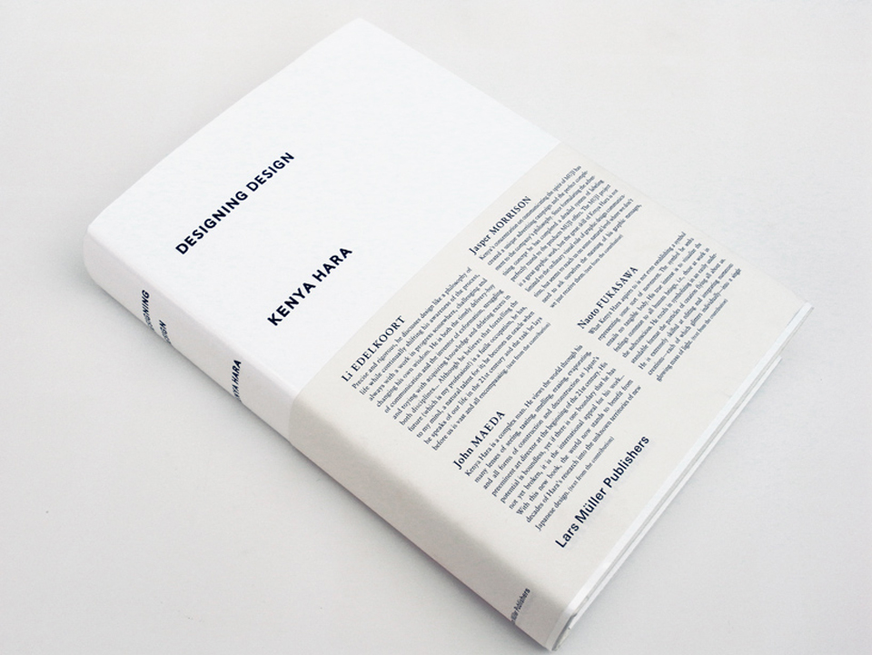
“A Dialect in Design”, Lidewij Edelkoort discusses the essential creative language of Japanese art director and designer, Kenya Hara. The text was a preface to his 2007 book “Designing Design”. Over the years, Hara’s work has explored tactility and shape in ways that can take your breath away, always embodying the unique spirit of his native country.
He is a person of character.
He is a tall man made of rigor and severe good taste. He has no age.
He acts as an agent of tranquillity and is dressed like a priest in dark apparently simple yet superbly cut clothes, or on weekends, like a monk in hooded sweatshirts over soft drawstring pyjama pants. He is an arresting person with piercing all-seeing bird-like eyes that observe the world from behind intellectual round-rimmed spectacles.
For an instant, one could be mistaken and think him to be a swiss modernist designer of the last century; all red and white and angular.
Yet he is all the contrary, all white and red with a softer edge.
Precise and rigorous, he discusses design like a philosophy of life while continually shifting his awareness of the process, always with a work in progress somewhere, challenging and changing his own wisdom. He can be considered as much the timely delivery-boy of communication as the inventor of exformation, struggling and toying with acquiring knowledge and deleting excess in both disciplines.
He is a truly japanese creator grown from shadows and darkness, his soul bleeding from the scars of recent history, concerned with the roots of his culture and the DNA of its design discipline, and promoting its existence in the face of the other emerging asian countries. Therefore he focuses on the island’s own special values and strives for the survival of paper, print and recently also that of textiles; infusing tradition with contemporary content.
He is inventing a dialect in design, blending global ideas with local and regional colour and taste.
He is an idealist about the identity of nippon culture.
He becomes a samurai in his pursuit of nothingness, an acupuncturist to cure visual excess. He preaches contentment with emptiness and simplicity and sees Japan as an extreme hybrid that absorbs all other influences, neutralising all chaos, hovering alone on the edge of Asia.
Being an utopian he believes in a future without artifice, imagining a Japan that liberates itself from the bond of the american and now asian dream, coming to terms with a new economic and aesthetic maturity. Like kindled spirits, we both believe in a better world with spiritual and humanistic values.
He is literally in touch.
He is a teacher of texture, a leader in the field of tactile experiences, inspiring colleges and disciples to invent new textures and to employ surprising matter, a feast for the fingers as much as for the eyes. Soft-fingered yet strong-willed he has trained himself and a generation of designers in sensory perception putting Japan at the forefront of the design of new matter with new touch.
He is a colour escapist because he knows that by avoiding colour tactility can and will speak up. He designs in white to say snow, space, float, trust and rest, to whisper. As if white has become the skeleton of his body of work.
Again and again, he will express and explore the joy of humble design into the life of the everyday. As a sculptor of basic things, he uses in his major design projects materials such as paper, cardboard and textile to convey honesty and reliability. He designs paper to feel like snow and embosses it to look like ice, he dresses sign systems in freshly laundered cotton and continues to use whites for wrapping, storage, ceramics and architecture imprinted with the impact of red; red flame, red seal, red type, red sign, red heart, red dot…
This is the design of dignity; a whispered value system penetrating the human mind through all the senses. Emotion is tossed into the process by connecting the dots, by assembling the figurines, by connecting the past with the future and by fusing high-and low technology, as in embroidering paper to create new posters. The abstraction of paper and its timeless tranquillity make him believe in a future when books will carry information with the appreciation and added value of touch, weight, smell and memory. For him, paper is food, white is a concept, print is a process and design is oxygen.
As an architect of brand strategy in a truly contemporary and collaborative way, he teaches his clients to reconsider and redirect in a softer and almost more natural mode, more fluid also, with the whole process running like a river, shifting in perception silently; without any apparent effort. He pushes his partners to work with excellence and introduces them to the best thinkers, photographers and designers; he is a networker avant la lettre, stimulating his peers to ever-newer explorations in the field of the design of emotion.
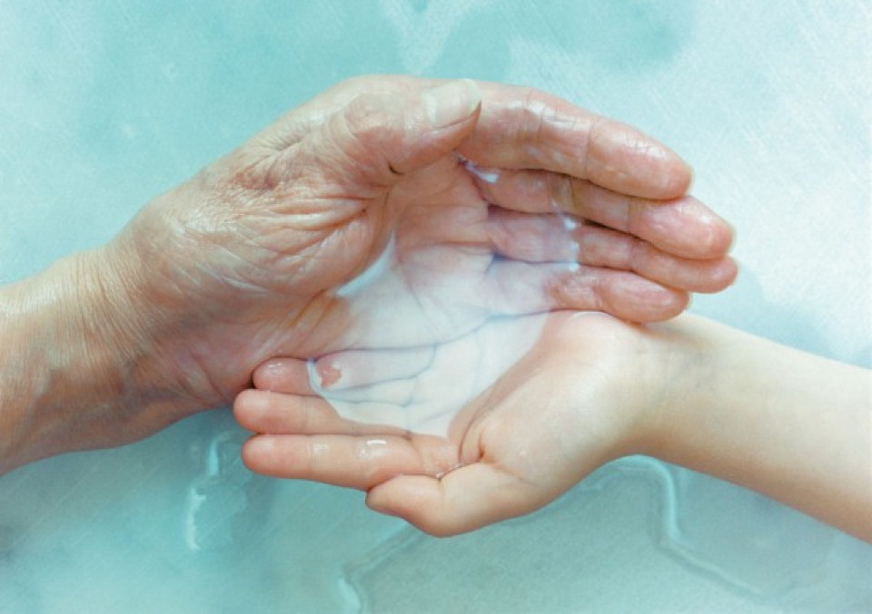
As a prophet in the wisdom of nature, he resorts to small ideas and examples to let nature speak. He will transform the contemplation of a vast and empty horizon to invite us to experience freedom of choice and liberation from the bondage of consumerism and he will imagine our own human hands as a vessel to drink water, as if being the first and most perfect example of the discipline of design. He is in fact a perfectionist with an eye for the imperfect and the decayed, the depleted nature of things, the random beauty of the changing seasons also.
Although he believes that forecasting the future (which is my profession!) is a futile occupation, he has in my eyes a natural talent for it; he becomes a prophet when he speaks of our life in the 21st century and the task he lays in front of us is vast and all encompassing.
He sees the japanese aesthetic and way of life as a role model for the western world with its modesty, symbolism, tradition and darkness, discarding over-consumption to experience another joy, the joy of being a spiritual individual at one with the sun and the moon, the river and the city, the forest and the animals, including ourselves. The emergence of the growing well-being industry can be seen as an early sign of this philosophy.
As an artist while drawing hieroglyphics, characters, scribbles or letters, his typography looks like raindrops, rice grains, snowflakes and butterflies… conveying the poetry in nature by a delicate rhythm alone. Therefore he also seems to have a particular liking for dots, which is no surprise to me. Only recently I discovered why the dot is so powerful and prominent at this point in time; I found out that the dot is narrative when it represents apple, wheel, balloon and moon, as well as it is abstract when saying stain, drop, pebble and moon, and therefore has become symbolic of the major movement of the future which will merge everything contrasted today: young and old, minimal and decorative, healthy and naughty, ecology and technology, craft and industry, natural and synthetic, abstraction and narration. The dot hereby perfectly embodies the idea of the hybrid and is almost symbolic of his body of work.
I can therefore only think of him in his own terms; his terms of archaic form, heightened touch and escapist colour; seeing a snow white, absorbent, slightly irregular, soothing and immaculate blank piece of paper punctuated with a burning and passionate red heart in the form of a perfect circle; his national identity is embedded in his body and rooted in his soul.
Lidewij Edelkoort
Paris, January 2007

Designing Design by Kenya Hara- Lars Muller Publisher


