PORTRAITS
multi-local by sia hurtikarl degel
by Sia Hurtigkarl Degel
Sia HurtigKarl Degel is graduated from the department Man and Identity at Design Academy Eindhoven. She is generally intrigued by the relation between societal developments and human identities. We asked her some questions about her graduation project ‘Multi-Locals’ and her view on cultural identity and the future of identity.
Can you tell me about your project 'Multi-Locals'?The Multi-Locals is a series of wearable props featured in an editorial campaign. The campaign is designed to celebrate multi-locality by translating answers to the question “where are you a local?” into materials and shapes.Images of former homes, places in the local streets, snapshots from the native nature or personal objects recalling memories. These are all examples of visual references which people use to describe the feeling of being a local. Each story, photo and location are materialized into wearable props and featured in a portrait. Covering human in its own story, hiding the original identity and revealing the person as a multi-local.The stories of The Multi-Locals are given back to the local communities as a series of street posters and an online archive. The purpose of the street posters is to accumulate curiosity towards the unknown and to create a new dialogue about the complexorigin. A dialogue based on compassion.
How did you come up with the idea of making a project about the future of identities?As the world becomes gradually more interconnected our human identities become increasingly complex. I am extremely inspired by this complexity; how cultural contrasts appear, how we maintain traditions, how we form groups and how we shape an identity based on our experiences through life.Living abroad additionally made me more aware of how these changes shaped my own identity. The relation to my origin is indeed affected by the different environments I have been a part of – and felt like a local within. I have become a multi-local myself.The moment I started to identify myself less with my origin as a Dane, I realized how little a nationality tells about a person and how much nationality matters to our perception of one another. An interesting paradox since nations only exists because humankind agreed upon them. National identity – or nationalism, is the root of a great deal of fear in modern society. Believing that one nationality has more rights than others. In my opinion, nations are an illusion and I wonder how future identities would evolve without them.
What was your main inspiration for this project?The starting point of my project was defiantly rooted in a personal point of view. The Multi-Locals actually started with the working title: ‘I am embarrassed by my own country’ – based on my discard of the current integration policy in Denmark. A policy which has changed the country radically over the past three-four years.The political incitement was followed by a need to express myself politically within my profession – in the language of design. A tactile, colorful and visual language. It was my greatest aim of this project to use textile design as the language to voice a political debate. A debate which is most often voiced verbally or in writing. The visual language can bring something completely different to the table. Furthermore, I believe this issue needs to be communicated in many different ways in order to change the dialogue of future identities and complex origin.
Can you describe your (creative) process for this project?I have a long-lasting love for the traditions of masks and their rituals. The beautiful craft of the masks, the tribal culture and the almost magic transition which the masks embody, for example, the transit from boy to man. This fascination ran alongside my political interest and in the end, it became the end product and the end goal of the project.The Multi-Locals is based on a range of interviews with people I did not know in advance, which meant a great deal of research in order to start the process.
The creation of the masks came fairly natural to me as hands-on work with materials and colors is a strong design skill of mine.Each image from a location led to a color, a texture or a shape which formed the masks. Especially the visual contrast between the different locations triggered my imagination.
I always work with a large range of materials and my work approach almost seems like a stylistic method as I let the pieces grow intuitively along the process.
What is your goal with this project? What kind of statement do you want to make?The goal is to create a tribe which you can identify with – no matter origin or nationality.Furthermore, the aim is to shift the way we talk about identity. It is a standard way of getting to know one another to ask “where are you from?” but the answer to this question tells nothing about the person in front of you. More so, it stigmatizes the individual.I believe there is a need for flexible narratives and novel questions to ask in order to describe modern identities “where are you a local?” instead of “where are you from?”. This minor change in a usual question opens up the dialogue and leads to curiosity towards the unknown.
Interview by Isabeau van Maastricht
by Sia Hurtigkarl Degel
by Sia Hurtigkarl Degel
by Sia Hurtigkarl Degel
by Sia Hurtigkarl Degel
bless

BLESS is a visionary substitute to make the near future worth living for.
She is an outspoken female – more woman than girl. She’s not a chosen beauty, but doesn’t go unnoticed. Without a definite age she could be more between her mid twenties and forties. B. hangs around with a special style of man. She has no nationality and thinks that sport is quite nice. She’s always attracted by temptations and loves change. She lives right now and her surroundings are charged by her presence. She tends to be future orientated.
BLESS is a project that presents ideal and artistic values by products to the public.
BLESS came to fame in the winter of 97/98, when the models of a Martin Margiela fashion show wore BLESS wigs made out of fur. Heralded as one of fashion’s most innovative designers, the Paris and Berlin-based duo (Desiree Heiss and Ines Kaag) quickly refused to capitalize on one milieu.
Constantly investigating the boundaries of style, BLESS slides from fashion to beauty, interior decoration to art exhibition, collaboration with other brands to stylized advertising. Their production, which sits on the fine line between art object and design, high function and high fashion, is always unique and marked by the recycling and adaptation of unexpected items put to use in a totally new way.
BLESS have exhibited internationally at the 1st berlin biennale (1998/99), Musée d’Art Moderne de la Ville de Paris (1999), Centre Pompidou (2000), Manifesta 4 (2002), Palais de Tokyo (2003), Moderna Museet, Stockholm (2004), Museum Boijmans Van Beuningen, Rotterdam (2006), Kunsthaus Graz, Austria (2010) Chicago Architectural Biennial (2017) and most recently in New York Fashion Week.
Their collaborations with other brands range from Adidas to Levi’s, Nike, Mikli, Droog and Artek over to the jewellery designer Bucherer.
BLESS will head a new two year Masters programme of Fine Arts, Design & Interior Architecture at Sandberg Instituut, open from 2018-2020 only. The temporary programme, Challenging Jewellery, focuses on building a persuasive collective. One that could be defined as both a corporate association and a movement, driven by a common interest in ‘team spirit’ and the relevance of the silent side of the beauty. The initiative is driven and operated by way of a fully-functioning company structure.
The Temporary Programme challenges the subject of jewellery on a fundamental level – how it relates to our present time. The approach represents an attempt to think big on a small scale, and presumes an ability to understand ‘micro-working’. The input for Challenging Jewellery is based on intergenerational dialogue. An advisory board, comprising four key figures in the realm of jewellery and design, ensures this will be done in a solid cooperation with the relevant fields. The visiting tutors and guests – varying from theoreticians and curators to contemporary architects, designers and artists – guarantee a continuous renewal of viewpoints on and insights into a discipline manifest in traditions, historical design and theoretical connotations.
bless
sandberg


designing resistance in poland

How a simple poster became a viral symbol of protest
Luka Rayski is a Polish artist, illustrator, and designer. In 2016 he was asked to contribute a piece of work on the subject of democracy to a project called Demokracja Ilustrowana (Democracy Illustrated). The poster he designed has rapidly become the ubiquitous symbol of the resistance against the expanding influence of the far right in Polish politics. Rayski’s design brilliantly deconstructs the word konstytucja (constitution) highlighting, in the colors of the Polish flag, the words for “you” and “me” hidden within it. This simple, universal message of unity has proved to have broad appeal across a huge cross section of the Polish population.
Christian Petersen: Can you give a synopsis of the current political situation in Poland for people that might not be aware?
Luka Rayski: There’s many similarities to the current US situation. Far right populists came to power and they’re dismantling the rule of law. The nation is divided in two. The half of the country my friends and I are in is scared shitless, scared that we might lose freedoms and rights the generation before us fought for.
CP: How you you describe your own political interests?
LR: I don’t have a favorite political party. I only have a couple of least favorite ones. I’m a proud EU citizen. I read and think about politics a lot.
CP: How young were you when you first became aware of the concept of “politics”? Was there a specific event?
LR: In 1991, when I was 9, I was spending the summer at the seaside in Poland when the Soviet Union collapsed. I had no idea what it meant, of course, but I remember seeing my parents and their friends bent over the new map of Europe that came with the newspaper. They were very emotional and I knew that whatever was going on, it was more than important.
CP: When did you first recognize the concept of “graphic design”?
LR: Both of my parents and my only sister are graphic designers so it was always hard for me to imagine life without that concept. However, all the distinctions such as drawing vs. painting, art vs. design, bother me. I believe categories sometimes limit your freedom.
CP: When did you first start to experiment with graphic design?
LR: I did stuff since I was a kid. I started working with clients around 2002. I’ve been working freelance since then.
CP: Poland has an incredible, unique tradition of design and illustration. Why do you think that is? What aspects of that tradition have influenced your own work?
LR: It’s true! My guess is that during the communist era (WWII–1989), state censorship pushed artists of all genres to be smarter than their censors. A lot of thinking had to be put into the work so it could outsmart them. Designers had to “smuggle” ideas into their work. You have to develop great skills to be capable of delivering a speech with your mouth shut. And so we have a paradox: captivity has fueled freedom of expression.
CP: Can you name a few of you favorite polish designers/illustrators?
LR: There’s too many! Henryk Tomaszewski’s posters and drawings are brilliant. His student and my stepdad Mieczysław Wasilewski obviously had the greatest impact on me. From my generation, I want to name Edgar Bąk, a friend and an outstanding graphic designer who, along with Marianna Grzywaczewska, runs Demokracja Ilustrowana and helped preparing the grey background version of the poster.
CP: When did you first make work that you would define as “political”?
LR: Everything is political. There’s no escape from that. Every time you go out and interact with other people, it’s political. Same with putting your work out into the world. In the more strict meaning of the word “political,” I never make anything that would try to support any group in political power specifically. I think of the konstytucja poster as my emotional commentary on politics.
CP: When and why did you decide to make the konstytucja poster?
LR: It was in the summer of 2016, when Marianna Grzywaczewska asked me to contribute to her project called Demokracja Ilustrowana. The invited artists were asked to design a poster on the topic of democracy.
CP: Can you explain a little about the idea behind the poster and its specific graphic layout?
LR: It’s quite banal—it’s the word “konstytucja” (constitution), syllabized: kon - sty - tuc - ja, with “ty” (you) and “ja” (me) highlighted. I feel like it’s self-explanatory. “You” and “me” are IN the constitution, duh.
CP: How did you distribute it?
LR: That’s the most amazing part of the story! It was all team work—it started with my friend Mateusz Halawa who fundraised and printed tons of the poster. The first night, in front of the Senate we discovered that instead of taping it to walls it worked much better if we handed it to people.
CP: When did you first start to realize that its popularity was spreading?
LR: That first Friday night at the Senate demonstration, we distributed seven thousand copies within a few hours. The next day my friends were ready with three times that. Every day more copies were being printed thanks to the generosity of regular people. Then the Gazeta Wyborcza (a daily newspaper) put it on its back cover—which was another 50,000 copies. We decided to give the poster a Creative Commons Zero License, meaning anyone can do anything they want with it without asking for permission. Last time I checked we had 12,000 downloads of the print-ready .pdffrom demokracjailustrowana.pl. It spun out of control.
CP: Why do you think it’s been such success? Why have people embraced it so strongly?
LR: The “constitution,” “you,” “me” pun is very capacious. It appeals to hipsters, elderly people, working class, middle-class, intellectuals, all kinds of people. Nobody is excluded from the message it carries. The design and colors are very modest, and the format, A3, is in a nice dialogue with the human body. It’s a perfect “shield” for a protester. I was lucky to be given a chance to contribute to the cause, but first of all I’m grateful to the many people who made this possible: Marianna Grzywaczewska and Edgar Bąk from Demokracja Ilustrowana and Mateusz Halawa, who started and coordinated the entire action. The printing house people (who wish to remain anonymous) are real heroes. Their contribution fills me with hope in people.
`CP: Have there been any negative reactions to it?
LR: Some. Some people started posting hateful remixes of the poster—such us “prostytucja”(prostitution). It only ensured us that the design is powerful enough. Most of the hate mail made us laugh.
CP: Have you worked on any posters since that one? Do you plan to make more?
LR: I made a few, and I plan on making more : )
CP: Would you say that there a movement of similarly minded designers/illustrators/artists in Poland?
LR: I’m not sure, I see it as a rather fragmented community but I think it’s for the better. During the recent protests there has been a wave of really cool designs visible in the streets—many of them masterful and interesting, but very different from each other. Diversity!
CP: I don’t think that there’s such a strong living tradition for political art and design in the west anymore. Why do you think that is?
LR: I’m not sure I agree with you on this. I lived in NYC for a couple of years and many artists I met consider themselves activists. Maybe Poland is still far behind the west; our democracy is more fragile and our discourse here is more dramatic. Our slogans are more general and thus capable of uniting larger parts of society. In the US, where the constitution seems pretty unthreatened, there are many divisions on the left, and many controversies regarding topics such as identity politics. Some of those problems are lightyears ahead of Poland.
CP: What else are you working on?
LR: I am preparing my first solo show on Polish soil! The opening is in November in Szydłowski Gallery in Warsaw. It’s going to be just paintings. I’m very excited.
Christian Petersen
This article was previously published on ArtSlant


siba sahabi

Siba Sahaby photography by ©ANNEMARIJNE
Through her work Siba Sahabi (b. 1979) shows how cultures can influence one another and how this exchange can lead to new expressions. She translates cultural heritage into contemporary design through an interpretation of both historical forms and concepts. She creates a wide range of centrepieces—from objects for the table such as vases and lamps to large-scale interior items such as room dividers.
For you to get to know her better we interviewed Siba Sahabi
Could you describe yourself as an artist in one word?
Poetic
What are the key elements of your work?
There are three key elements in my work: building bridges between Europe and the Middle East through design, making experimental applications of materials and techniques and the last one is finding interdisciplinary collaborations.
Through my work I show how cultures can influence one another and how this exchange can lead to new forms of expression, with a particular focus on the cultural influences of the Middle East on Europe. These two regions have been interacting with each other for millennia e.g. through trade, conquests and migration. And this is how ideas, knowledge and stories were passed. Once they were introduced into the other culture they were often adapted and refined. Think of the chess game. It was developed in Persia/India around the 4th century and was introduced in the 11th century to Europe via Italy and Spain. And it was in Spain during the 16th century when the most powerful piece, the queen, was introduced. This expansion of the chess game is still relevant today.
Most of my work is handmade and produced by myself. I admire crafts because the imperfection of handmade objects gives each piece a unique personality. I play with the perception on how we see material and how we expect it to be applied. My partition screen for example is based on elements made out of a mix of resin and chalk and look like concrete. And it takes a second glance to understand that my iconic vases are not made from clay but from felt.
I work on regular bases with photographers, cinematographers, composers, dancers and choreographers. I started to work with the media of film and photography because I wanted to express the context of my designed objects. Working with these media gives me the possibility to visualize my research in a narrative way. Collaborations are like a conversations; they evolve through the input of different ideas and perspectives.
Why are you so interested by rhythms , mathematic and construction?
I am fascinated by the history of art of the Middle East because it has developed based on different values compared to the European history of art. In respect to Allah - and his perfect creation of the world - the images of humans do not play a prominent role in Islamic art. And the central perspective had been absent for centuries in the Middle East. This is how other forms of arts like calligraphy, architecture, textile art such as Persian carpets have been far developed and highly regarded. In the Middle East there doesn't exist a hierarchy between to the so-called 'applied arts' and the 'fine arts'.
Distinguishable elements of Middle Eastern arts are geometric patterns which form intricate and complex structures, including a wide variety of tessellations. These patterns are often perceived as 'abstract' from a Western perspective because the 'Western' eye is used the central perspective that forms a relation between the position of the viewer and the motive of an image. To me Middle Eastern geometric patterns—which can be found for example at the famous Alhambra Palace in Granada—are an endless source of inspiration. For my wall devider and chess set I have translated a selection of geometric elements from two dimensions into three dimensions.
What is your last project about?
My series of side tables are named after the Greek mathematician Euclid of Alexandria—also known as the Father of Geometry. In 300 B.C., Euclid described in ‘Elements’, his treatise of 13 books on mathematics and geometry, the construction of a solid called ‘polyhedron’. My three side table are based on this particular solid, composed of flat polygonal faces, sharp corners and straight edges. Each side table is constructed out of four elements that consist of seven triangular sections which form both the surface and the legs. Through this geometric construction, the visual aspects of mathematics are translated into contemporary design.
Where do you find your inspiration?
There are different ways in which I find my inspiration: It can be while traveling, reading or visiting museums. Once I discover a story that triggers my imagination, I give myself the freedom to play with the historical material and finally translate it into a contemporary design. And design to me means interacting with the relevant themes in an attempt to express cross-cultural exchange both in space and time.
How do you begin a new project ?
I read and collect as many images that I can find about the specific topic that caught my attention. I then translate intuitively my first ideas into sketches and models. I prefer to model using paper instead of computer programs because this approach forces me to simplify the shapes.
How would you describe the relationship between colors, shapes and light in your works?
I love the (non) color black. Especially when working on geometric shapes with straight lines and sharp conners. Once the light hits the different surfaces in various angles it creates a natural palette of dark grey and black hues.
I have worked intensively on forms that evolved from circles: my felt vases are based on rotations. In the last years I've usually started my first sketches adapted from triangles.
What is your favorite place on earth?
There is one site in Southern Spain which I consider as the most striking and inspiring monument I have ever seen: the Mezquita of Córdoba. The complex building (mosque/cathedral) combines Middle Eastern and European architecture in its most beautiful form of expression.
Cecile Poignant

Mudejar by Siba Sahabi photography by Lisa KLappe

Mudejar by Siba Sahabi photography by Lisa KLapp

Al Andalus by Siba Sahabi photography by Arjan Benning

Euclid by Siba Sahabi photography by Lisa Klappe

Euclid by Siba Sahabi photography by Lisa Klappe
the green goddess

Her irresistible smile is her best business card, Angèle Maeght Ferreux is the chef of the moment in Paris. With her crown of flowers as a toque, she is unstoppable: she writes cooking books promoting an healthier diet, she owns a mini countertop « la Guinguette d’Angèle » which allows Parisian to enjoy her delicious organic, locally sourced and gluten free recipes and she has a catering service for professional.
Angèle Maeght Ferreux is the great-granddaughter of Aimé Maeght the famous post-war art dealer and friend of Matisse, Miro and Giacometti. As a child, she lived in Paris on the left bank in Saint germain des Près and spent her summers in Saint-Paul de Vence, the stronghold of the Maeght,in Provence.
At 17 she decided to go to San Francisco where she finished her high school years and discover organic food and local production.Then she went to Australia where she learnt the virtues of fasting through the ’green tea Monday’ only green tea on Monday. She quickly realized the importance of diet on health : «I became interested in gluten which is so much talked about today and the impact of genetic transformation of wheat since the 50s when stronger varieties were created but more complicated to digest. »
Back in Europe she keeps on cooking and decided to become a naturopath. In 2012, she creates a catering service to broadcast her innovative fairy cuisine. Soon, she was spotted by the Haute Couture brands and hired for the biggest shows of the Fashion Week in Paris: Chanel, Louis Vuitton, Isabel Marant … For the opening of Inès de La Fressange’s new boutique it was a thousand pieces to deliver at once, and five hundred the day before at Christian Louboutin: vegan cheese cakes, mini sandwiches and her famous Primavera Roll, a spring roll made only with vegetables and flowers … Today, everyone want her services and she had to expand her team which now has ten people (all girls).
Her unique signature is exactly what was needed in the organic/ gluten-free trend: a magical and girly twist bringing flavors and good mood!
For you to get to know her better we interviewed Angèle Maeght Ferreux :
Can you describe your cuisine in a few words?
Joyful, delicious, pretty, gourmand.
What is the encounter that changed your life?
There are so much .. Pierre Rabhi, first through his books, he has completely revolutionized the way I see life .. And great friends which direct me with kindness and accuracy ..
Why choose organic?
It’s obvious when cooking for abetter health not to introduce food contaminated by toxic agents or endocrine disruptors such as pesticides. It would be absurd ..
Do you have iconic products?
I have a lot! When traveling, to avoid the food served in the plane I always have a miso soup in powder that I drink throughout the trip, I drink clay every morning to protect me from all food poisoning .. I spent like that three months in India without any worries!
Your recipes are composed like paintings, is colour for you an important medium?
Exactly! It is full of meaning, values and benefits ..! The more colorful the food is the more it contains antioxidants!
Your recipes are composed like paintings, is colour for you an important medium?
Exactly! It is full of meaning, values and benefits ..! The more colorful the food is the more it contains antioxidants!
Which recipe are you most proud of?
My latest raw kale chips with bbq sauce are delicious !
Why did you name your mini counter Guinguette?
Primarily because my grandmother used to have one on the banks of the river Marne, but also because I like the fact that in a Guingette we dance, we laugh, we’re outside, it’s the weekend, we are together and we eat together in the best atmosphere! Pure joy !
Where do you unearth your products?
I travel a lot for always tracking down novelties over the world, but sometimes it’s in my own country that I find treasures (like a Burgundian beekeeper who gives me the best propolis)
Could you give us some recipe ideas:
- For breakfast?
Le « miam ô fruits » (recipe from France Guillain) It’s a crushed banana mixed with a good raw oil rich in omega , and fresh fruits. It fills all the daily nutritional requirements and has a very low glycemic index = no sudden feeling of being totally shattered.
- For a quick meal?
Roasted buckwheat in pancakes, topped with avocado, seaweed tartar,fresh herbs and seed sprouts! It’s healthy and quick to do: a must!
What is always in your fridge?
Good raw oils, fruits and vegetables, fresh pollen, a bio nail varnish, aloe vera, a bottle of sea buckthorn juice.
A new food trend you want to share?
The chaga! It is an extraordinary Chinese mushroom , an anti aging remedy. And also the acai berry which is a very good antioxidant I discovered in Brazil and I’m crazy for ..
What does your day looks like ?
None are alike .. I can get up at 5am to go to my suppliers or work before going my courses of Naturopathy, or hang out in bed until noon … I can run anywhere from meeting to meeting or stay the all day in my kitchen .. My constant is the unknown, and I like it …
What is your favorite place on earth?
A bed or walking anywhere.
You’re more of a morning or an evening person ?
I love mornings !
I prefer waking up with the birds singing than sleeping with the music too loud stuck in my ears ..
I love to see the sunrise and enjoy the early start of the day.
What are your future plans?
I would like to open a new tavern soon, with tables! I will organize in fall the first Healthy food festival in Paris, I am writing a new book, a guide step by step to reduce the gluten from your diet, I made my range of delicacies (Kale chips, energy Balls .. ) which will be exclusive to the Bon Marché in July and August .. And I would like to buy a land to produce directly my vegetables!
Cecile Poignant


diane pernet - a shaded view

photo: Havier Hassan
Diane Pernet is a world-renowned fashion critic and video journalist based in Paris. Previously a fashion designer, she now acts as documentary filmmaker, talent scout and fashion blogger on her site A Shaded View on Fashion, which since its inception in 2005 has become a must-read in fashion and creative industry circles. As one of the most famous faces in fashion, she has also been captured on the other side of the movie camera through cameo appearances in Robert Altman’s film ‘Prêt-à-Porter’ and in Roman Polanski’s ‘The Ninth Gate’. Business of Fashion credits Diane with both “the advent of fashion blogging” and “spearheading the fashion film genre.”
While contributing to some of the most highly-acclaimed fashion media, including online editions of Vogue and Elle, in 2008 Diane launched her groundbreaking festival called ASVOFF (A Shaded View on Fashion Film). Through ASVOFF, she is often considered to have incubated ‘fashion film’ from its infancy to the popular medium that it is becoming today. ASVOFF is not only a competition of short films about fashion, style and beauty but also a travelling international event showcasing feature films, documentaries, conferences, performances and installations. Inspired by the word “fetish”, Diane also curated a selection of films for Li Edelkoort’s Fetishism in Fashion biennale in 2013.
The journey leading to the creation of the Diane Pernet Paris perfume collection took over two years. Triggered by a surreptitious encounter between Diane and Celso Fadelli, the art fragrance editor and founder of Intertrade Europe Group, the collaboration blossomed into four distinctive fragrances thanks to a combination of passionate dedication and mutual intuition.
The scents explore the moods, sensations and recurring memories that echo throughout Diane’s life: SHADED, WANTED, TO BE HONEST and IN PURSUIT OF MAGIC. And the spiders that adorn the bottles, designed by Mario Salvucci, are now also a collection of necklaces and brooches.
A fashion insider and global style icon, Diane Pernet can be spotted instantly by her enigmatic look. Committed to a steadfast personal style, she dresses in sheaths of black and is shrouded by a headpiece faintly reminiscent of a mantilla topped off with signature sunglasses which veil the eyes. This unique approach to her own wardrobe has carried over into the “shaded view” that Diane pursues in both her personal life and in her career. Despite existing in the shadows, Diane is widely respected as an independent voice in fashion who is constantly at the forefront of underground talent, analysing, connecting and promoting the creative forces that take the industry forward.
ASVOFF 8 will be held at the Centre Georges Pompidou in Paris from December 2-6, 2015
SERENUS ZEITBLOM OKTETT

Eight Berlin-based musicians have together under a name taken from the novel, Doktor Faustus by Thomas Mann. To every performance, each brings their own ideas and instruments, and together they create a live collage of structure and improvised chaos, order and disorder. The result is music for abandoned airports and oil refineries. It’s awkward and rounded, and according to bass player, Andreas Dzialocha, hopefully empty.
An interview by Sophie Joy Wright
How would you classify the music of the octet?
The Serenus Zeitblom Oktett consists of musicians from pop, free improvised and contemporary music to name it somehow. We aim for a highly artificial but organic live and studio sound. The octet is accompanied by a ninth member, the Klanggestalter. Every instrument is being amplified and processed by filters and live algorithms, neutralizing the difference of acoustic and electric instruments, resulting in a new type of chamber music. Our violinist said once that we do music for ‘abandoned airports’. I like that metaphor!
You mentioned free improvisation – this is very important to your music. How do you develop your complementary collaborative instincts as a group, or is this brought on an individual level to then fit into the group?
Again there is a good mix of strong improvisers and musicians with a more ‘structured’ music background in the octet. What I like about this is that we don’t try to find a common ground. Personally, I try to find a way into a music that does not rely too much on either of these things; no specific melodies nor elaborated harmonies in a classical sense but also no improvisational communication systems to get used to. This music we’re searching for is very empty in a way. The development comes from talking about these things but of course mainly when we make music together. Our common ground gets emptier with each concert, which is great!
Where have you performed recently?
« Huset » in Copenhagen last October, as part of a festival for contemporary music called ‘Sonic Festival’. The club vibe fit nicely with our sound and the whole festival atmosphere. I miss this in Berlin a little bit; contemporary music is so highly valued in Copenhagen. I’m a fan of « serious music » but you should be able to drink a beer to it.
Your scores look pretty different to serious sheet music. Where do the signs and symbols come from? It’s almost like an abstraction of a score; a very playful abstraction…
There was no active choice throughout the writing of this piece. With every page there was a new approach to the problem of how to communicate an idea. I think this playfulness in it is the result of trying to invite everyone to find himself inside the piece. I thought of symbols and words that are open but still concrete enough to start a conversation. With these symbols you have to think before you start, its not a musical note you know were to put your finger at when you see it. Sometimes I would laugh at myself because I think maybe some of it comes from my time at school when I used to draw comics all day.
Do you maybe see/smell/touch things that contribute to the sounds you create?
Very rarely. Sometimes there are these moments when you see something extremely complex which overwhelms you completely but you still can grasp parts of it, for example a huge oil refinery with all these millions of pipes or a fast train that is passing. Then I sometimes think about music.


philippe airaud

Philippe Airaud is a French jewelry designer, since 1990 he has worked with major houses: Yves Saint Laurent, Calvin Klein, Baccarat, Christofle ....His creations are always beautiful and timeless elegant pieces.
Recently, Airaud created his own collection of jewelry: 0.88. These jewels are made of a discreet gold wire and will become quickly your fetish jewelry!
The concept is based on the extreme resistence of the gold thread : 0, 88mm is its diameter. For Airaud : "This concept has no gender , no age, it expresses the link and celebrates simplicity."
For you to get to know him better we interviewed Airaud:
Your favorite material ? Natural & Technical - High & Low.
The color that moves you the most ? Emerald green.
Your favorite motto ? Logic will get you from A to B but imagination will take you everywhere.
Your first gesture in the morning? Peeling fruits for my smoothie.
Your favorite occupation? Wondering & doing...
The sound that carry you? Now it's "Curtains" Timber Timbre .Your favorite meal? Artichoke in all its forms.
At what moment of the day do you feel great? When i’m inspired which can be any moment of the day.
Your favorite heroes in fiction. I haven’t found yet!
What is your present state of mind? Optimistic, productive ethic & being myself.

Philippe Airaud 0,88 Nuts

&n bsp;
bsp;


a conversation with janice poon
Food can be considered one of the most innovative and evolving industries of our time. The Internet and globalization can be thanked for that, with individuals having a wider and more exotic range of options to chose from. The popular media driven “food porn“ phenomenon is a perfect example of our society’s approach to food. We eat with our eyes and consequently demand a constant flow of novelty and good aesthetics... when these are met, it’s quickly documented and dispatched across social media, allowing for a new type of promotion.
„The chefs are becoming improved masters in their craft, surpassing designers in their ambition with creativity“ – Lidewij Edelkoort
Other industries have adapted to these movements and new careers are quickly emerging in the field. To illustrate this Chloe Sos from Trend Tablet got together with Janice Poon to get more insight into her work and on other phenomenons of our time.
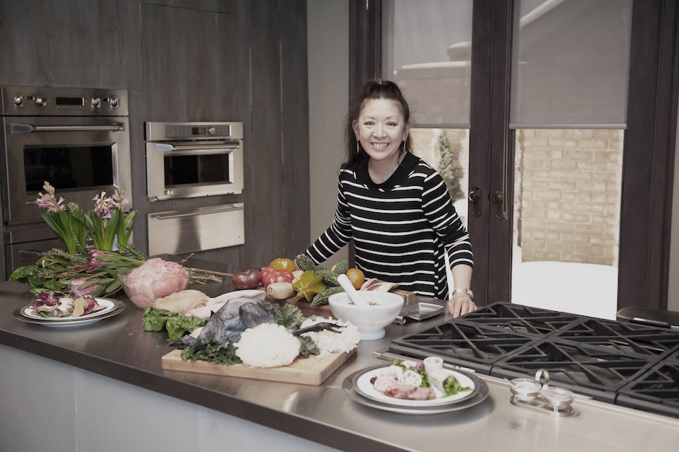
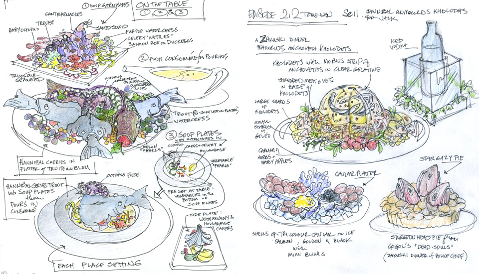
Janice Poon’s talented creations in the Hannibal tv- series have seen a fan base emerge, inspiring food lovers to mix food and art. Her designs go well beyond what you see on screen. A real community has been interacting, gathering new inspirational recipes and organizing “Hannidinners”, blogspots dedicated to her creations and many more.
How did you get involved in food styling? Did you start off with a love of food or with a design background and later discover food as a raw material?
Love and respect for food was a constant context in my family background and art was always my personal preoccupation. It was natural to combine food and art in my everyday life but I didn’t consider blending the two professionally until, as an advertising art director, I was exposed to food styling.
Your food styling has a painterly aspect to it, would you say that you are directly inspired by traditional forms of art, like painting?
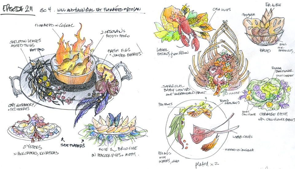
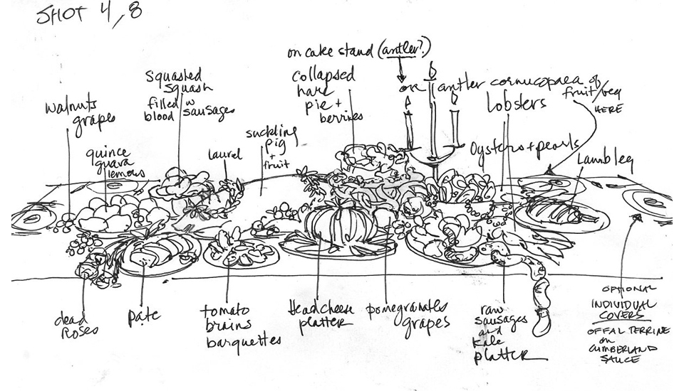
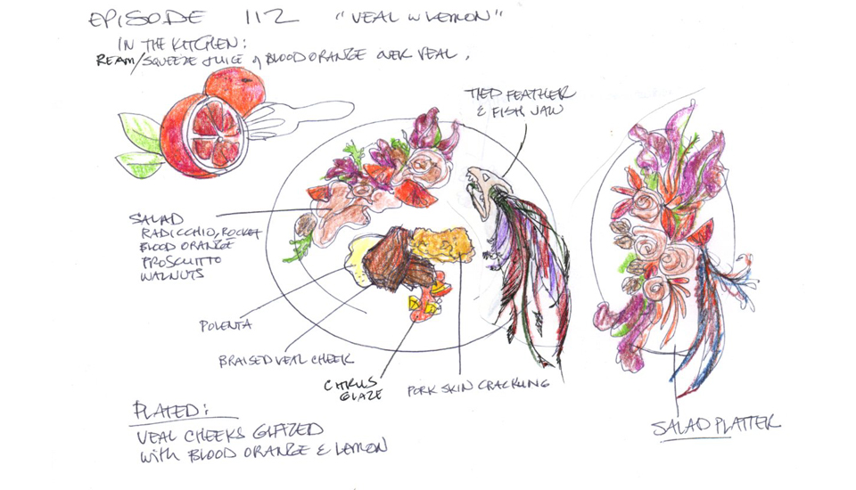
The anthropological aspect of food has always fascinated me and art is a telling record of society’s attitude to food. By emulating art of a period, one can project a visceral but subtle sense of this mood. For my work with Hannibal, I try to capture the lush, decaying eroticism of the still life oils of the Dutch Golden Age with its all self-conscious status symbols. In the upcoming season that tells of Hannibal’s youth, I feel I will start leaning toward the emotional meat paintings of Francis Bacon for inspiration.
When you start a piece, do you have the end result in mind? How much of your work is on impulse or „feeling your way through“? The sketching begins almost as soon as I finish reading the draft script for the episode in production. In series tv, we have to produce a new episode every 8 days so there is neither time nor budget to actualize multiple ideas. I work out my concepts in drawings until I arrive at what I think will be the most cinematic solution for the script. The “impulse” aspect of my design comes at the very last moment, as I am setting up the plates to go to camera and get my first look at any new elements the set decorator is using and the colors and textures the wardrobe master is using for the scene. As the colors in your work are very complimentary, do you work with color palettes, and if so, how do you formulate these? The Hannibal sets are done in a moody palette of burgundies, grey-blues and, of course, blood red. For the food, I tend to go with brighter version but I always have to soften the colours because my constant background colour - the plates - are bright white which, in digital filming, often overpowers. The apps for finding color palettes on your phone are fun but I prefer to go with my instinct - it’s faster and I don’t have to worry about dropping my phone in the deep-fryer! How do you work with the textures in food, is it important to you? Do you manipulate or embrace them? Colour, shape and texture are all that survives the translation from reality to the flat image so I need to really exaggerate these elements in order to achieve the appetizing (or in Hannibal’s case - unsettling) effect the viewers would get if the real plates of hot aromatic food were placed before them. Food has become art, and society has embraced it whole heartedly, what is your opinion on food porn? How did we get here? What can you see for the future? For those who treat their life as their canvas, food has always been art. Now, this elevation of food has become so mainstream that media had to invent a term for it - food porn. This can only be a good thing. Especially in a coming age of population explosion and climate change. It speaks of a future where people have a greater respect for food, where it comes from, how it is produced and why we need to share it.