
MILAN THE SALONE
common sands #Milan 2018
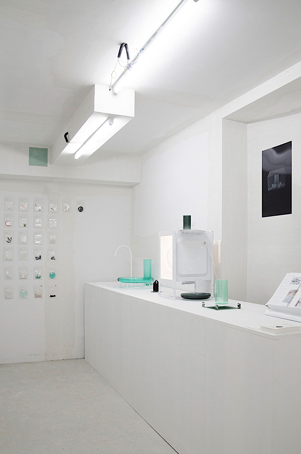
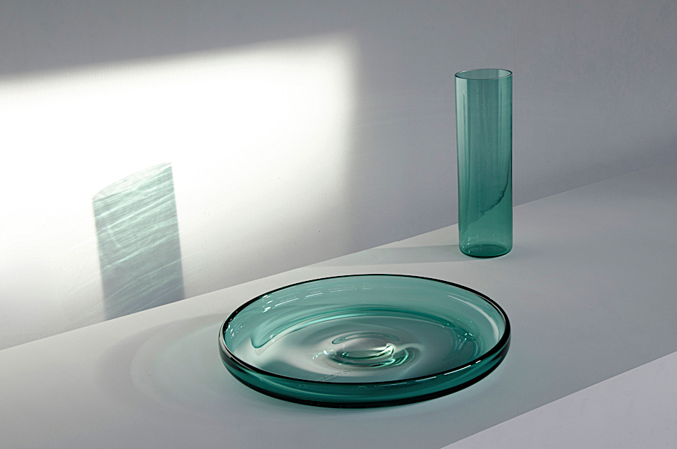
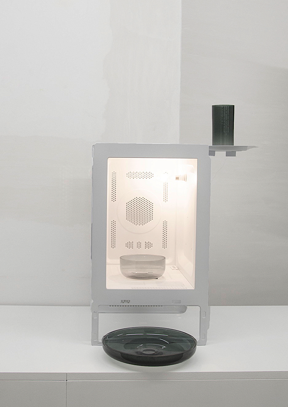
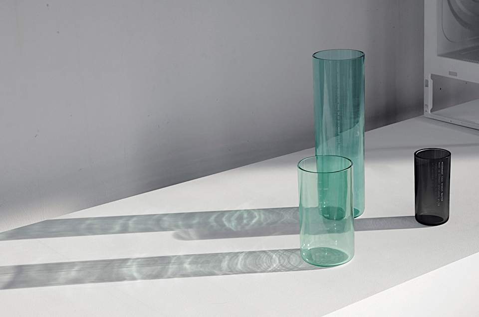
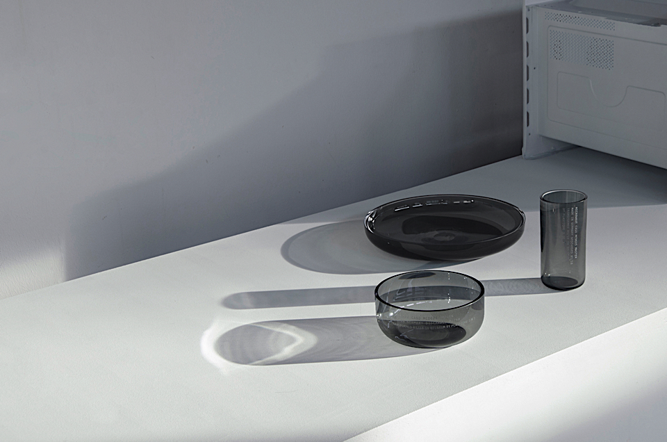
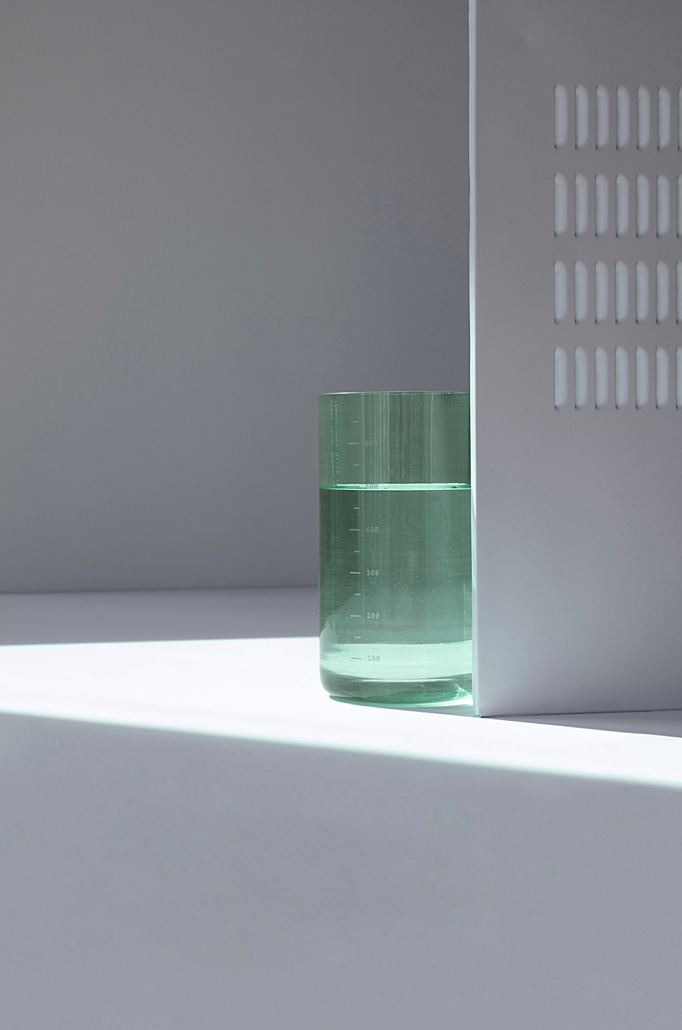
Behind Studio Plastique are two young souls : Theresa born in Germany and Archibald born in Belgium both were graduated in 2016 from Design Academy Eindhoven. During the latest Salone in Milan, Studio Plastique presented “Common Sands” at Ventura Future / FuturDome. « Common Sands » is materialized by glass objects retrieved from discarded electronic household devices. This concept is particularly interesting as the challenge today lays in finding new applications for local resources; not in unearthing new materials. Studio Plastique is asking a lot of questions through this project : How could we handle resources differently? Can we give them back visibility and value? How could we change our relationship to resources ? How can objects be made with consciousness for the resource? In terms of importance for our civilisation, one resource tops everything: sand. We enjoy it on our beaches, but few know it makes our electronic devices function, our homes light and warm, our communication fast, our energy more sustainable. We are surrounded by sand without even noticing. When looking closer into the processes sand goes through to become glass, microchips, solar cells, or aerogel for example, one enters a world of such sophistication and complexity that it leaves one in awe. Common Sands uses the silica components present in kitchen appliances as their primary material. The collection of glass vessels materializes the presence of sand. The size of the glass vessels relates back to the quantities of sand used in the various kitchen appliances.The glass that is obtained, carries the story of its processes making it rich in content and context and moreover creating a new application eld and market for this particular waste material. All these glasses tell a story, and aim to restore a relation between source, resource, product and user. Studio Plastique is making an attempt to close cycles, to bring back a human scale to the alienation of our resources.
living together #Milan 2018
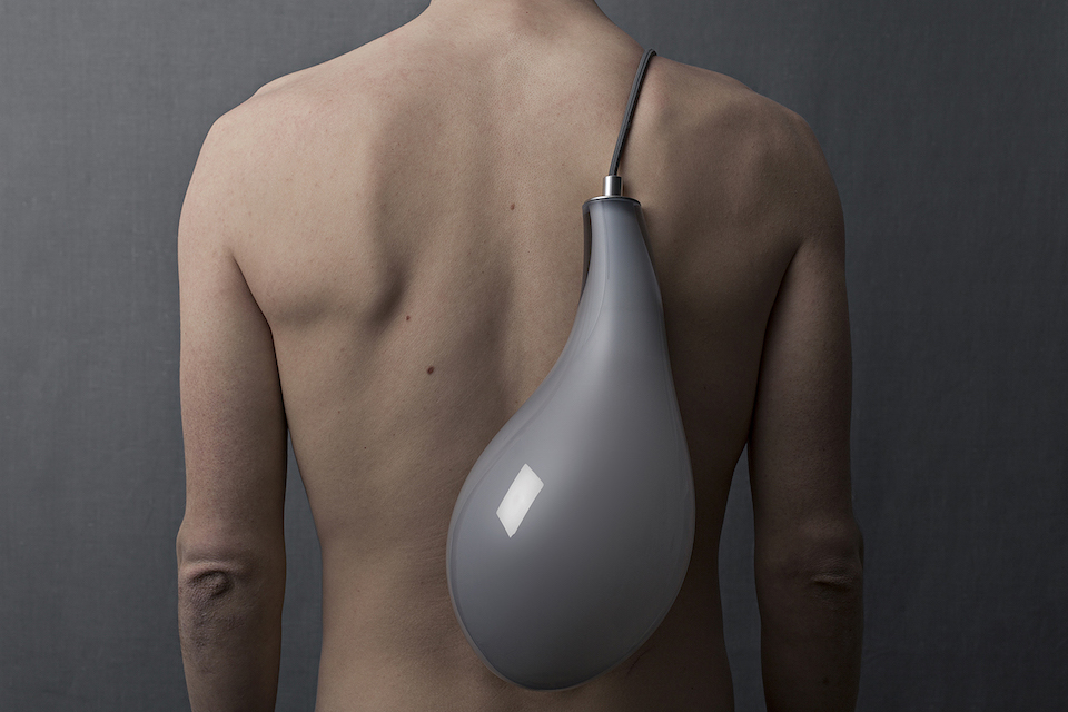
photo by ulrika kestere
At Salone Del Mobile Milano, Swedisch design studio ‘Stoft’ showed a selection of their new work. Amoung them the ‘Leech’ collection, a collection with leech-like lamps in mouth blown glasses. Talking to one of the industrial designers of Stoft, Joel Herslow, we learn more about Stoft and their collection Leech.
Can you tell something about the concept of the Leech collection? What is the story?
The Leech lamp clings firmly onto our walls, creating a symbiotic relationship with its user. By letting it feed on us – it gives us light in return.
The living together of two unlike species dependent on each other for survival is the concept of symbiosis. In a world where competition drives evolution, symbiosis might seem foreign. But without people the electric light would be the first thing to die out. On the other hand, in the society we have created for ourselves we are utterly dependent on that same light. It affects us biologically and emotionally, and occasionally we even use light as a metaphor for life.
Leech can be mounted on walls, be hung from the ceiling or placed on any flat surface as a table lamp. Each lamp is unique in its form and the color will vary slightly because of its handmade nature.
What is your starting point behind your work?
Our work always starts with something that inspires us and that we want to express in our product. It almost becomes like a script, a storyline that we keep as the core of the project. Alot of the time we don’t know what the outcome of the project will be, we let the story set the perimeter and lead us to the end result.
Where do you source your inspiration from?
I think we collect inspiration along the way, different starting points or seeds that lie waiting before they can start to grow. A great interest to all of us to visit the producers and learn everything we can about the different crafts. But I think what makes us different is that this is not enough for us to motivate the starting of a new project. Because at the same time as we collect inspiration and stories about the craft, we get inspiration from other directions.
It could be what’s happening in the world, natural phenomena, questions in our society or personal memories that we feel we want to communicate. So this is when it happens for us, when two or more stories in a very natural way find each other, that together create two or more layers to the product. Instead of having many ways of illustrating a concept, it becomes narrowed down since we want to communicate more things, and we know how the product must look to communicate these stories, in order to be honest.
Can you tell something about the process of the Leech collection? What materials are used?
From the idea of making something that can be both beautiful and a bit gross at the same time, leech started as doodles on a paper. From our experience of mouthblown glass we knew that if put in to skilled hands glass can almost get the appearance of something organic. Knowing that, glass was the natural choice of material. The Leech-like glass lamp is mouth blown in Bergdala, Sweden, designed to embrace all the natural and organic qualities of the mouth blown glass. Every lamp is unique, something we value a lot and makes that feeling or something organic all the more real.
What are the key elements of your work?
I would say our work is an extension of the story we want to communicate with our projects, and so draws its appearance and shape from what inspires us. That could be a traditional craft, a material or an old children’s tale. We do believe in the function of the product as well, so the result is usually a blend of the poetic and the functional.
Interview by Isabeau van Maastricht
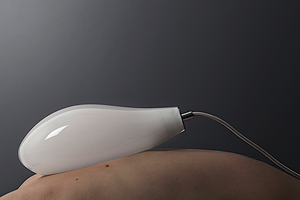
photo by ulrika kestere
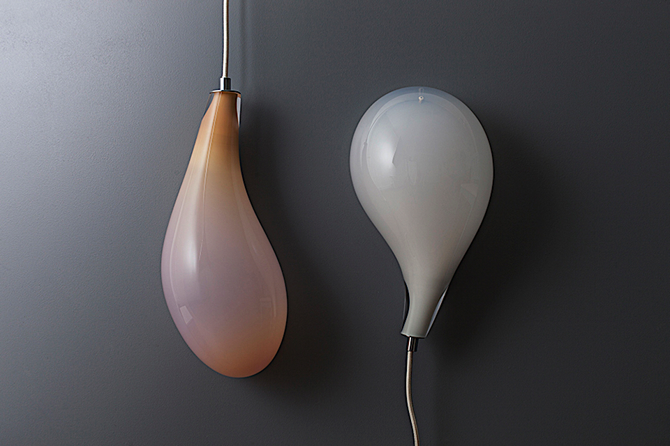
photo by ulrika kestere
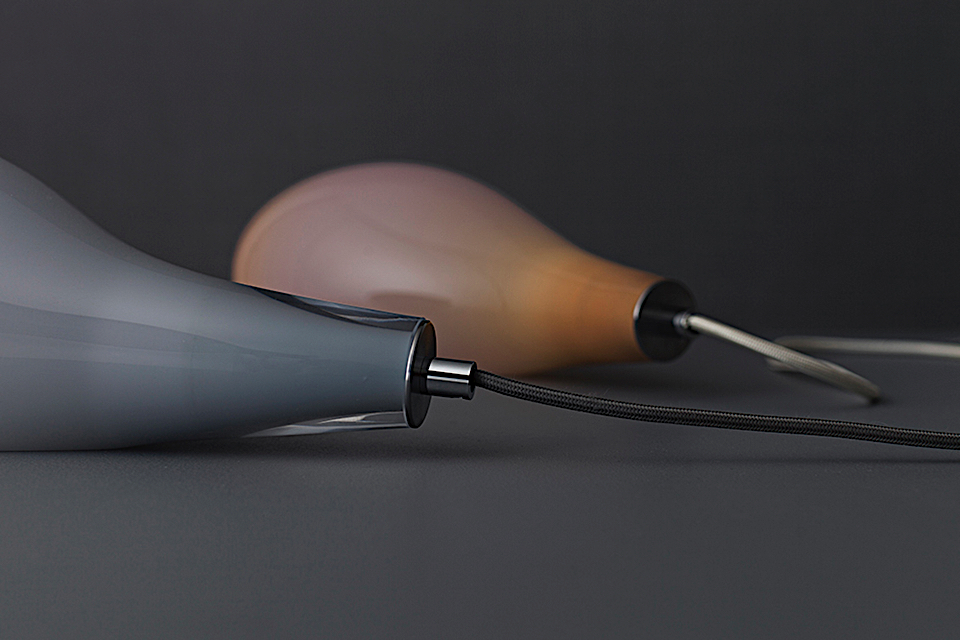
photo by ulrika kestere
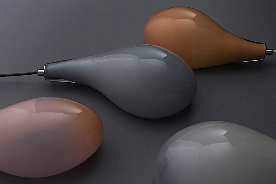
photo by ulrika kestere
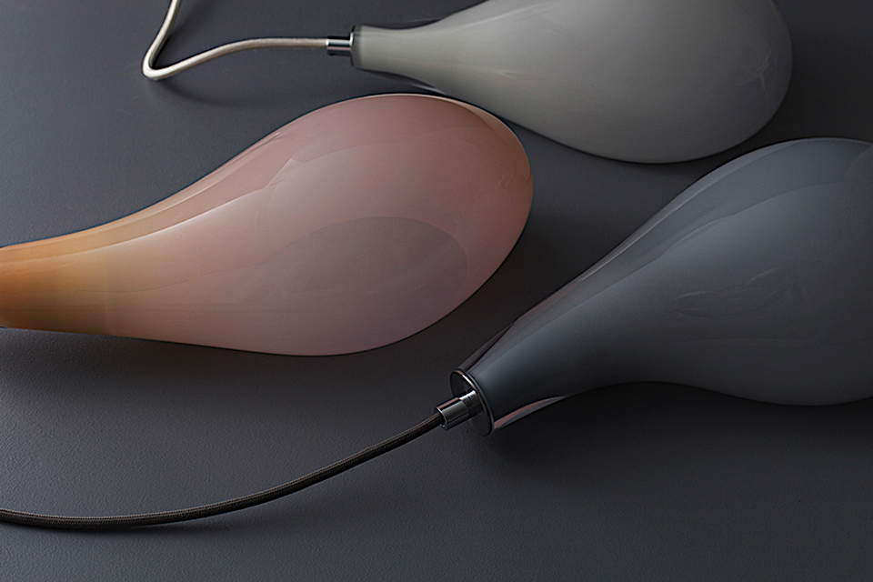
photo by ulrika kestere
secrets spots #Milan 2018
FUORISALOTTO - Sergio Colantuoni House
Just when you think that the Milan Fuorisalone (one of the most important and famous design event in the world) had nothing to surprise you anymore… It suddenly changes your mind! If on one side, as a citizen of Milan, I can easily say that this city is becoming more and more an interesting and international place to live and to visit, during the Design Week the city becomes a hub of joy, creativity, and culture engaging with the visitors in a very special way. From the daily events all over the city to the “social” aperitivo, dinner and parties, the “Fuorisalone” is for me the week of the year in which everything becomes extraordinary and unrepeatable. There is a uniqueness to the events happening over the Fuorisalone, residing in the secret spots and new locations that let people explore the city in a way they never would. One of the most incredible peculiarity of this week long event is that almost every venue is free to everyone to access everyday, although, some locations needed a thorough search before being accessed. I wouldn’t excess, by calling them “secret locations”, but they surely needed an RSVP before being accessed, making them exciting places to explore. These events were set in restricted areas or private houses, capturing more interest and attention in any of its visitors for their being away from anyone’s attention. FUORISALOTTO - Sergio Colantuoni House It’s really hard to describe Sergio Colantuoni’s work. He is such an eclectic and ironic man that we can just say he is “creative” in everything he does (advertising, fashion design, visual design, styling and much more). His house, that he opened on appointment during the fuorisalone, reflects his personality in every detail. As he says “ This house is made of a lot of perfect set because is what I m good at. All together is a mess”. INHOUSE - NOT AN EXHIBITION Another private house opened to the public during the week was Samer Aleameen’s apartment. Alameen is a Lebanese designer with a past long experience in advertising. In 2016 He launched his design brand during the design week. His house is a place full of light and plenty of selected pieces, designed by him and other creators, and set not as a showroom, but for their real purpose and use in house. TRAM CORALLO - Cristina Celestino Not a secret location at all, this was a real a historic tram from 1928 running thought Brera District, but accessible only by booking. It was one of the most unconventional location I’ve ever experience and also a useful sitting break between hundreds of places to visit. Cristina Celestino is a very well know name by now in design field, so much that she was a Design District Ambassador. Her project was inspired by the theme of the journey, theaters and cinemas, and realized with unique partners as well as important brands that stand for their Italian excellence and craftsmanship. CLUB UNSEEN - STUDIOPEPE “Club Unseen is the manifesto project by Studiopepe,a secret space with a contemporary atmosphere.” Studiopepe duo strikes again creating a beautiful, soft and comfortable place where I was invited to join the suspended 70’ Atmosphere and wonderful cocktail prepared by invisible bartenders.
ALCOVA A former “panettone” factory became one of the most interesting location of this edition. This big, ex-industrial abandoned spaces where the perfect venue for “Alcova”. Born from the idea of Valentina Ciuffi, founder of Studio Vedét, and Joseph Grime of Space Caviar, Alcova hosted works form artists and designer from Netherland, France, Germany, Georgia and Italy. A good reason to explore NOLO, Milan’s rising neighborhood in everyone’s mouth. THE DINER Within the concealed railway arch depots of Milan’s central station, Surface Magazine created a pop-up restaurant to celebrate its 25th anniversary. In collaboration with architect David Rockwell and creative agency 2x4, The Diner was a glimpse of American design aesthetic and iconography, “a coast-to-coast journey through the United States”. It wasn’t just an installation, but a real diner, serving customers for the duration of the whole week, around a 14 meter long bar, illuminated with pink neon lights. CRISTASEYA Cristaseya, the lifestyle French brand founded and designed by Italian designer Cristina Casini, chose an unusual location to set its installation. Cristaseya cannot be considered a classic fashion brand as it ranges over art, design, objects, ceramics and much more. In fact, the band presented a limited edition plates collection, made in collaboration with the artist JP and hand made in Vietri (In the South of Italy). Where? Well, of course in a typical Italian Trattoria (Trattoria Torre di Pisa, Brera), a place where it was possible to look at the hundreds of different plates designed while enjoying a cacio e pepe in them! SIX GALLERY By now a very well known place for Milanese people but, as it opened last September, the Gallery took part design week for the fist time in 2018. Placed in a hidden courtyard of a former ancient monastery. Founded by designer Mauro Orlandelli, together with the architect duo "Quincoces- Dragò", Six Gallery includes bistro Sixième and a flower design studio "Irene", by landscape architect Irene Cuzzaniti. This place was magical itself but for the design week was stunning because of a gold wheat field ceiling and bamboo setting inspired by African desert. Hoping that some of these upcoming locations will be open and exploited also during the year… lookout for upcoming surprises in the coming years of the event. See you next April in Milan! Chiara Apperti Fashion Designer and trend researcher, Chiara lives trying to catch every kind of inspiration. Based in Milan, five years ago she founded a lifestyle magazine with her best friends.
INHOUSE – NOT AN EXHIBITION
TRAM CORALLO – Cristina Celestino
CLUB UNSEEN – STUDIOPEPE
ALCOVA
THE DINNER
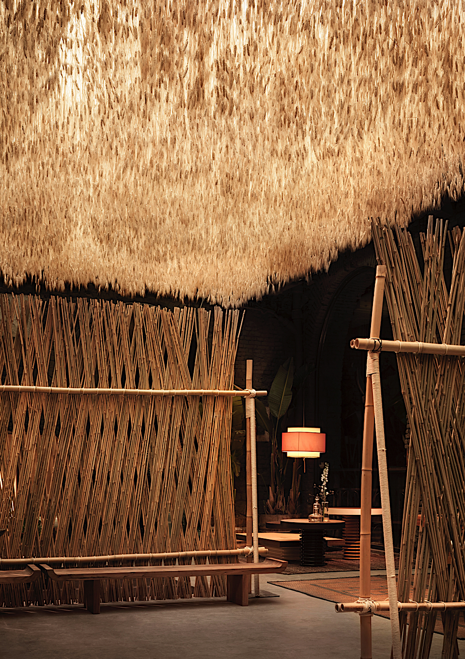
SIX GALLERY photo by Alberto Strada
softwear #Milan2018

Google debuts at Salone del Mobile 2018 with Softwear, an installation that brings to life the sensorial experience of hardware as envisioned by Ivy Ross, Vice President, Hardware Design at Google and curated by leading trend forecaster Lidewij Edelkoort. The exhibition will be on view at Rossana Orlandi, April 17 - 22.
In 1998, Edelkoort conceptualized Softwear, a lifestyle trend that would blend with technology and enable a completely new way of being, where they were so harmonised that they became interwoven into the everyday. The fusion of the two creates a cozy form of nesting that equates well-being with working from home. Twenty years later Google and Edelkoort are introducing Softwear, an exhibition that explores the seamless integration of Google’s hardware products within the contemporary socio-cultural landscape that brings Edelkoort’s 1998 forecast to life.
Softwear takes place across three rooms in a ground floor apartment at Rossana Orlandi’s celebrated Milan gallery. The first room includes a new lifestyle audiovisual and exhibition catalogue produced by Edelkoort and her team. The second room features six one-of-a-kind wall hangings by Dutch designer Kiki van Eijk, who Edelkoort commissioned to create the textiles. Woven at Tilburg’s internationally renowned TextielLab, they are based on collages of hand-cut textiles from Google’s human centered products. The third room presents elements from an actual domestic interior which illustrate Google’s thoughtfully designed vision of the fusion of technology and lifestyle.
Softwear’s incorporation of textiles, tactility, and wellness challenges the role of hardware at home, prompting a conversation about the future of technology and its integrated presence in our lives.
Rossana Orlandi
Via Matteo Bandello, 14, Milan
17–22 April, 2018
Press release, visuals & enquires
Jane Hong & Andrey Furmanovich
Nadine Johnson & Associates, Inc.
models: Lia Catreux @Wanted, Billie Causse, Wassim Chentouf @Urban Talents, Eden @Boutchou, Julien Ladel @Wanted, Chihiro Niuya @Wanted, Leslie Sauvage @Sport Models, Damien Wargnier @Wanted & Sweety the dog


waste no more #Milan2018
 design by Sigi Ahl")
Venetian Bauhaus (2017) design by Sigi Ahl
Eileen Fisher has dedicated her career to challenging the ways of the fashion industry; with the announcement of Vision2020 in 2015, the company took a bold step in reaching its ambitious environmental and social goals which include materials, chemistry, water, carbon and conscious business practices. DesignWork is the company’s latest initiative; a creative exchange between makers who felt and stitch consumers’ used garments into captivating wall hangings, upholstery and accessories for interiors, hospitality and public space.
During the 2018 Salone del Mobile in Milan, DesignWork is being displayed for the first time on the international stage. Curated by Lidewij Edelkoort and Philip Fimmano, WASTE NO MORE takes place at Ventura Centrale’s vaulted tunnels. This striking setting is recomposed like a temple to sustainability; critiquing consumption and shining a light on the emerging circular economy.
Fisher notes how “Textiles and apparel have a huge environmental impact — and our industry’s current model is unsustainable. We’re using up natural resources faster than they can be renewed. We’re making more and more stuff. And after each season, we toss out the old and move onto what’s next. Where does this mountain of used and unsold clothes go? Roughly 85% becomes waste in a landfill — including many of the items donated to charity.”
The installation confronts visitors with the reality of society’s discarded clothing, while demonstrating the inherent aesthetics of recuperated materials in contemporary design. Displayed on freestanding walls within the space – standing firm like astute ecological warriors – the zero-waste works have been developed by longtime collaborator and artist Sigi Ahl, in partnership with a dedicated team at EILEEN FISHER’s sorting and recycling facility in Irvington, New York.
Edelkoort observes how DesignWork blurs the boundaries between design, textiles and activism, fueling a new creative momentum for the company, calling it “A lifestyle brand found in the debris of overconsumption. When waste becomes wealth and culture, the circle has come around twice, empowering new ventures, gifting the world with true beauty.” Fisher expands upon how fashion’s modus operandi can be disrupted by providing renewable solutions: “What is new is how we’re scaling our systems to create a truly sustainable business model that’s circular by design.”
WASTE NO MORE
April 17 – 22, 2018
Ventura Centrale
via Ferrante Aporti, 19
20134 Milano
opening times: 10 AM to 8 PM daily (until 6 PM on April 22)
A press preview takes place on Monday, April 16 from 3 to 8 PM.
Media enquires & visuals via Jan Rothschild
Download the Media Kit
eileenfisherdesignwork.com
")
Pillows (2017–18)
 design by Carolina Bedoya")
Red Squares (2017) design by Carolina Bedoya
best of #Milan2017

formafantasma
This was my 10th Milan Design Week, a special anniversary to celebrate.
In the last 10 years the Fuorisalone has become more important and known than the official Salone del Mobile in many ways.
First of all for the incredible multitude of spaces and neighborhoods that got involved in this event, that completely invades the city for the entire week. I’m one of the many inhabitants of Milan that see in the Design Week the most funny and inspiring moment of the year, apart from being a moment to explore the city with new eyes, taken by its whimsical and otherwise closed to the public spaces.
It’s always a challenge to make a list of the places that stood out the most during the Fuorisalone. Here are my 5 favorite installations of this year’s edition:
Formafantasma – Spazio Krizia
The winner of the press choice for the Milano Design Award was all about giving to light the power to create space out of the ethereal sobriety of a white space. Colored glasses and metallic circles show how light can become an untouchable element of furniture, to create dimensional collisions within the same room.
Louis Vuitton – Objets Nomades
In the set of the incredible Palazzo Bocconi, Louis Vuitton asked the most wanted designers of the moment, such as Nendo, Marcel Wanders, India Madhavi, Raw Edges and Patricia Urquiola, to bring to life with a series of objets nomades the history of the iconic luxury brand. Shadow patterns, mirrors and suspended egg chairs made of this iconic Milanese building maybe the most outstanding exhibition of this year’s Fuorisalone.
Paradiso Terrestre
The main takeout I’ve taken from the Paradiso Terrestre installation shows how a good industrial and entrepreneurial strategy can give new energy to an old and abandoned brand. The man behind it is Gherardo Tonelli, who recreated a whole collection out of the heritage left from the company founder Dino Gavina, to create a modern corner of paradise
Nobody & Co – “Superfollies “
Beside the Gallery of Modern Art, Nobody & Co has created the most surprising installation of this edition, inside the secret Giardino delle Arti, a nineteenth century garden of 2000 square meters with 49 different trees species. Studio Toogood installation created the “wooden little house”(follies) in which were placed the design pieces, to create a space where design integrates with nature.
IKEA Festival – “Let’s make room for life”
Faye Toogood strikes again inside Ikea Festival, the exhibition presented by Ikea in the space of Officine Ventura (Lambrate). A white and messy area made of a strange remix of iconic Ikea pieces called Enfant Terrible. Situated just at the entrance of a large warehouse in which Ikea presented new collaborations with designers such as Tom Dixon, or the famous design company Hay.
Live music concerts, yoga lessons and workshops made Ikea Festival the parce to be during this Fuorisalone.
Bonus: Dimore Studio
If you read my guide of the past fuorisalone, you know that I’ve already talked about Dimore. It’s a mistake for a writer to do an encore, unless the space isn’t worth talking about. This year Dimore decided to create 3 different spaces. Apart from the Brera apartment, where music and colors create the characteristic Dimore alternate universe, there was the Casa degli Atellani, where is the famous Vine of Leonardo da Vinci, and the extremely local and exotic Circolo dei Reduci e Combattenti. An oxymoron of lives and an encounter of styles that extended the already rich and variegated patchwork of Dimore.
Chiara Apperti
Fashion Designer and trend researcher, Chiara lives trying to catch every kind of inspiration. Based in Milan, four years ago she founded a lifestyle magazine with her best friends.
www.modalitademode.com

formafantasma

formafantasma

Vuitton

Vuitton

Vuitton

Vuitton

paradiso terrestre

paradiso terrestre

paradiso terrestre

nobody & co

nobody & co

nobody & co

nobody & co

ikea + toogood

ikea + toogood

ikea

ikea

dimore

dimore

dimore

dimore

dimore
how to change the world of design #milan2016

SIXTEENTH CENTURY CLOISTER + JAPANESE DESIGN
"You put together two things that have not been put together before. And the world is changed. People may not notice at the time, but that doesn’t matter. The world has been changed nonetheless " Julian Barnes, Levels of Life
What image do you visualize if you close your eyes and think about these three words: Japanese manga, a sixteenth century cloister and furniture design?
Well I visualize on of the most impressive exhibition that I saw during the last Milan Design Week. I was running from a place to another to visit as much events and exhibitions as possible when I crashed into NENDO exhibition “50 manga chairs”. I thought about a Julian Barnes quotes (read on the top) because, regardless the beauty of some ideas and projects showed during this design week, the real value for me was the incredible ability to find and adapt the locations in which placing exhibitions.
The real pleasure was to have the possibility to be in some hidden places of my city, that I sometime take for granted.
Here 5 of the “match” that I loved the most
SIXTEENTH CENTURY CLOISTER + JAPANESE DESIGN
Nendo installation of “50 manga chairs” is the consequence of working on furniture design using the symbolic nature and flatness of manga comics. The effect of this kind of abstract projects made of metallic materials placed in an ancient cloister was really powerful.
GARAGE + LONDON DESIGN STUDIO
Garage Sanremo is one of the youngest location of Milano design week. This year this garage (this is a real one in the city center) hosted Herringbone collection, a project of tables created by London design studio Raw Edges. They realized colorful zigzag pattern on pieces of wood dipping them into oblique buckets . This space became a sort of laboratory where people was allowed to interact with the exhibition!
ALBERGO DIURNO + YOUNG ITALIAN DESIGNERS
Ninety years ago opened the “Albergo Diurno Venezia”, an underground “daytime hotel” that offered public baths, spas, barber shops, manicures, etc…
Thanks to FAI (Italian foundation that restore and open to the public fine examples of Italy's artistic and natural heritage.) It is now possible to visit this incredible place designed by one of the most talented milanese architect (Pieto Portaluppi). The exhibition, called Vestae, fitted with the location as it was dedicated to body care.
The Creative Academy, the Fondazione Cologni and Eligo (a new brand promoting historic Italian production) cooperated in this project.
PALAZZO LITTA + BELGIAN DESIGN
Palazzo Litta is one of the most beautiful example of Baroque architecture in Milan and the organisations that support Belgian design made a really good choice three years ago selecting this location.
This third edition was focused on the theme TRADITION& TECHNOLOGY: 13 designers and companies, proposing projects commissioned especially for the event and seen for the first time during the Salone. The proof that Modern design perfectly coexists with tapestries, stuccos and original seventeenth-century paintings…
PRIVATE APARTMENT * SELECTION OF BRAND AND DESIGNERS
Now try to imagine an abandoned luxury apartment full of amazing design pieces selected by one of the best consultant agency in Milan … Photos will help!
See you next Fuorisalone …
Chiara Apperti
fondoambiente.it
nendo.jp
raw-edges.com
www.p-s.it
belgiumisdesign.be
Fashion Designer and trend researcher, Chiara lives trying to catch every kind of inspiration. Based in Milan, four years ago she founded a lifestyle magazine with her best friends.
www.modalitademode.com


GARAGE + LONDON DESIGN STUDIO

GARAGE + LONDON DESIGN STUDIO

GARAGE + LONDON DESIGN STUDIO

GARAGE + LONDON DESIGN STUDIO

ALBERGO DIURNO + YOUNG ITALIAN DESIGNERS

ALBERGO DIURNO + YOUNG ITALIAN DESIGNERS

ALBERGO DIURNO + YOUNG ITALIAN DESIGNERS

PALAZZO LITTA + BELGIAN DESIGN

PALAZZO LITTA + BELGIAN DESIGN

PALAZZO LITTA + BELGIAN DESIGN

PALAZZO LITTA + BELGIAN DESIGN

PRIVATE APARTMENT + SELECTION OF BRAND & DESIGNERS

PRIVATE APARTMENT + SELECTION OF BRAND & DESIGNERS

PRIVATE APARTMENT + SELECTION OF BRAND & DESIGNERS

PRIVATE APARTMENT + SELECTION OF BRAND & DESIGNERS
hungry eyes #milan2015

Interview series PROOFFLab Magazine curated by Studio Makkink&Bey - Mario Minale - Photo by Lonneke van der Palen
We are happy to share an interview series by PROOFFLab Magazine:
PROOFFLab Magazine, curated by Studio Makkink&Bey, is a new professional magazine that aims to define the future working culture. During the Salone del Mobile chief editor and curator Jules van den Langenberg portrays various Milan exhibitors in a series of short interviews about their work. “Counterbalancing the object centred press kits, that mainly feed us with contextless products, we decided to focus our eye on people in their Milanese exhibition surroundings. Capturing work-related postures and activities in a series of still life images by young photograher Lonneke van der Palen.
Keystones by Studio Minale-Maeda
An interest in the effects of consumerism and the possibility of mass producing objects with cultural qualities lies at the base of the Keystones project that Studio Minale-Maeda pre- sented at Atelier Clerici in the centre of Milan during Salone del Mobile. We found Mario Minale working on his laptop, using his ‘Keystones’ bench and table in the Italian palazzo: “Keystones reduce the design of a piece of furniture to a single connector – a compact piece that can be 3D printed on-location.
The keystone holds together the various components of a given piece of furniture, which need mini- mal fabrication, either through basic tools or ready materials like from a home improving store, without the need for joinery skills. Only the most essential part of the furniture needs to be shipped, the rest can be made from the materials at hand. The project investigates the potentials of multi- directional material translations, from digital to analogue to building-block construction, open-source schematics ranging from Gerrit Rietveld drawings to the online Lego community, and novel forms of distribution such as down- loadable design.”
Chief editor Jules van den Langenberg versus designer Chris Kabel
First thing you do on a regular workday?
Revel in the calm before things get going, then something challenging that gets your brain focussed.
What’s the best part about being a designer?
You know how things work and can imagine changes.
Who or what are the keystones of your life?
My curiosities that drive me.
How was your first experience with 3d printing?
Very disappointing: unit mismatch so everything was too small, broke and got lost. I found it fascinating as an idea but I thought it is a terrible material, without qualities, only suited for gimmicks. That tension motivated me to keep exploring.
If you could sing a duet with anyone, who would it be?
I’d want to be in an early 1980s DC punk band - naive, hon- est, pure rebellion - the promise of taking the future into your own hands.
If you had a tattoo, where would it be?
Somewhere where I cannot see it myself and where it changes shape, like on my elbow.
What’s your favorite plastic product?
Anything modular-systematic-mass produced, as precise as possible: a lego brick, a disposable coffee cup.
If you had one superpower, what would it be?
On good days: knowing the future, on bad days: mass-ma- nipulating people.
Last thing you do on a workday?
Finish with energy left to go on the next day.

Interview series PROOFFLab Magazine curated by Studio Makkink&Bey - Chris Kabel - Photo by Lonneke van der Palen
Glazed Brick Bench by Chris Kabel & St. Joris for Label Breed
A new label that focusses on establishing and guiding col- laborations between designers and manufacturers invited designer Chris Kabel to work with ceramic tile producer St. Joris, resulting in a modulair bench which was exhibited in Ventura Lambrate in Milan; “Ceramic house St. Joris and designer Chris Kabel have combined their skills and production techniques to create a bench using glazed brick. By perfectly cutting the brick to Chris’ specifications, St. Joris has manufactured benches that fit together to make unique shapes. Kabel is always looking for new techniques and materials to apply to his designs in startling, eye-catching ways.
The team at St. Joris has worked together for years to become experts in crafting incredibly complex bricks in colors and forms that inspire the building process. Mixing experience with the latest tech- niques, St. Joris ensures that each brick is hand created with individual attention and first-class craftsmanship.”
Feast your hungry eyes on images of the project
Chief editor Jules van den Langenberg versus designer Chris Kabel
First thing you do on a regular workday?
Shower with Dr. Bronners Peppermint soap. The mint in there is so strong it wakens up your skin like a birch beating sauna massage.
What’s the hardest part about working with an industrial producer?
That I never really have enough time to hang out in the factory for a longer period of time, to get bored, talk to the employers, discover hidden treasures, operate the machines, make trivial things of the leftovers or the failures etc.
Under what kind of roof do you live?
A very long one, it’s part of an appartment block from the 30’s along a wide canal in Rotterdam.
If you could sing a duet with anyone, who would it be?
A hummingbird? Im such a bad singer I’m afraid nobody wants to sing with me…
What’s your favorite brick building?
An ancient ruin very near the house where i grew up (ruin of Brederode in Bloemendaal) its this beautiful combina- tion of iron walkways that transverse a very 3 dimensional landscape of bright red completely eroded bricks walls that once were the more than 1m thick walls of the fortification/ castle built by a 13th century lord that once ruled that part of holland.
If you had a tattoo, where would it be?
Tattoos are really not my thing but if I had to choose it would be the color and shape of a freckle on a place that that only i can locate. Especially in summer it would be invisible because then they pop up everywhere on my body.
Last thing you do on a workday?
Kiss my love goodnight.

Interview-series-PROOFFLab-Magazine-curated-by-Studio-Makkink&Bey---Aliki-van-der-Kruijs---Photo-by-Lonneke-van-der-Palen
Daylit by Aliki van der Kruijs at Dutch Invertuals
Collective Dutch Intertuals presented several new projects of various designers on a remote location during Salone del Mobile. Contextual designer Aliki van der Kruijs joined the collective and presents her project ‘Daylit’ within their Body Language exhibition. In general van der Kruijs’ work ex- plores the relationship (context) between colour, culture and environment with a specialisation in textile. Nature is mate- rial and subject at the same time.
During the master Applied Art at the Sandberg Institute (2012) Aliki juxtaposed her graphic- and fashion design background into a practice where textile as information-carrier plays a fundamental role. “Equally versatile as the precious rays of the sun, the textile objects I developed for Daylit consists of a monolayer of microscopically pieces of glass and are treated by hand with transparent ink to emphasize the retro-reflexive quality. Because of its rhythmic texture, the product will look unique from every angle, allowing the onlooker to bathe in a glow quite like sunlight.”
Feast your hungry eyes on images of the project
Chief editor Jules van den Langenberg versus contextual designer Aliki van der Kruijs
First thing you do on a regular workday?
Make a pot of tea.
What’s the hardest part about being a designer?
Earning enough money to pay all the bills.
What role does context have in your work?
I need and use the context to react upon, to turn around, to make links in between and with the given information. The context is the starting point to build a framework from where I design.
What’s your favorite weather type?
Bright blue skies with big white cloud formations on a medium windy day.
If you could sing a duet with anyone, who would it be?
Tina Turner.
If you had a tattoo, where would it be?
On my right underarm near my elbow.
How often do you check the weather forecast?
Rarely. I more often listen to weather talks in public between people.
If you had one superpower, what would it be?
To fly.
Last thing you do on a workday?
Close my laptop and clean my desk.

- Interview series PROOFFLab Magazine curated by Studio Makkink&Bey - Thomas Eyck - Photo by Lonneke van der Palen
Thomas Eyck presents ‘Bottom Ash Observatory’ by Christien Meindertsma
As publisher and distributer of characteristic and exclusive contemporary design products Thomas Eyck presented the latest work of Christien Meindertsma at Gallery Rossana Orlandi during the Salone del Mobile. We found Eyck flip- ping through the book Meindertsma made for his t.e. label: “ In her encyclopedic book Bottom Ash Observatory and the 6 limited art prints, Christien Meindertsma takes the reader on a 160-page expedition through a bucket filled with 25 kilos of bottom ash, showing the astounding rich- ness and value of this material. The contents of this bucket are the residue of 100 kilos of incinerated household and industrial waste: the “waste of waste.” By sieving, drying, laser-analyzing and separating tens of thousands of pieces by hand, Meindertsma succeeded in extracting numerous materials. She melted down the 12 most valuable materials – including zinc, aluminum, and silver – to pure cylinders, creating a line chard showing the richness of the bottom ash.
The process of adding value to waste by separating it is rapidly innovating, and Meinderstma illustrates where this rich urban ore deposit can lead us.The author commissioned photographer Mathijs Labadie to capture every step of this process in minute detail. As his telescope-style lens zooms in on the bottom ash, the chunks of material assume the appearance of comets and meteorites. The buckets contain- ing the sieved bottom ash take on the guise of planets, while even the cylinders of the valuable materials are planetarium- like in their mystique and grandeur.
The precision with which Meindertsma and Labadie record the dissection of the bottom ash harkens back to the eighteenth-century travel narratives depicting newly discovered raw materials with scientific accuracy – complete with tip-ins and fold-out illustration. In 2015, of course, we no longer need to set out on a journey for new materials – our challenge today is to find new uses for local resources. This book demonstrates the infinite versatility of the resource that is bottom ash.”
Chief editor Jules van den Langenberg versus design publisher Thomas Eyck
First thing you do on a regular workday?
Smoke a cigarette.
What’s the hardest part about being a design publisher?
Answering all the emails.
Do you separate your trash?
Yes.
What’s your favorite second hand object?
A cookie can, made from earthenware with a silver lid. When visiting my grandmother as young child I was always waiting when she would give me a cookie out of this can, which she backed herself. In fact the main reason for my visits.
If you could sing a duet with anyone, who would it be?
Stromae.
If you had a tattoo, where would it be?
On my breast.
What’s your favorite waste of time?
Smoke a cigarette.
If you had one superpower, what would it be?
The power to stop smoking.
Last thing you do on a workday?
Smoke a cigarette.

Interview-series-PROOFFLab-Magazine-curated-by-Studio-Makkink&Bey---Ecal-02---Photo-by-Lonneke-van-der-Palen
The selfie project by Kevin Gouriou and Calypso Mahieu at ECAL exhibition Photo Booth
A line of Chinese visitors is blocking the way in the ECAL Photo Booth exhibition space, anxietiously awaiting their turn to try out various new selfie tools. At their own risk visitors install their smartphones on archery like constructions and take pictures of themselves. ECAL student Kevin Gouriou talks about the renewal of the cult of the selfie: “I worked on the Selfie project with the young and talented photographer Calypso Mahieu, from the beginning we wanted to create something mechanical, in movement, to interact with the process of taking a picture. As you know in photography the idea of speed is important. The first machine we made is The Reducer. A crane, that moves from down to up to create a vertical panorama of you. The idea came after having watched the movie Léon, The Professional (with Jean Reno and Natalie Portman) where Mathilda is introduced thanks to a vertical panorama.
Playing with this vertical panorama, and the speed of the crane, we discovered we could transform the picture. The second machine is The Vortex. An installation that makes your phone turning using a drill as motor. The result is really funny, the speed of the drill distorts the image creating a vortex (or washing machine!) effect. I have to say that I have been surprised to see the enthusiasm of the public for this machine. The last machine is a collection of guns, to shoot pictures using different movements (rotation, zoom, trigger). Recognizing the popularity of the selfiesticks, that you can buy almost everywhere, we wanted to propose new ways to take selfies, and we wanted to play of course. With The Shotgun, you really shoot your selfie thanks to a trigger, The Spyangle shoots a picture around the corner, with The Zoom you surprise (sometimes scare) your friends with the unexpected movement of your phone, The Rotator makes a 360° picture or video. The DIY fabrication of our machines makes the machine more understandable for the user, also the plans for building the new selfie tools is available on our webpage.”
Feast your hungry eyes on images of the project
Chief editor Jules van den Langenberg versus ECAL design student Kevin Gouriou
First thing you do on a regular workday?
I ride my bicycle!
What’s the hardest part about being a design publisher?
Staying yourself.
How was the collaboration process between you and photography student Calypso Mahieu?
We spent a lot of time fighting, the research was really long and demanding. Ending with taking the picture with a smartphone was unexpected. When we finally both agreed on this, the fun part has started! We have found a good rhythm and way to work with our different skills, to build the machines and communicate on the project.
What’s your favorite type of selfie?
The failed selfies. Last easter holiday I went to Le Mont Saint-Michel (France) with a friend, we made a successful unsuccessful selfie where we don’t even see the monument!
If you could sing a duet with anyone, who would it be?
Marylin Monroe! Since I’ve watched “Some like it hot”.
If you had a tattoo, where would it be?
Under my foot, so I could see it when I run on the beach.
Whats the most positive thing of the cult of the selfie?
The self-mockery. It’s important to not take it too seriously!
What needs to be improved?
Finding a way to not look stupid doing a selfie maybe!
Last thing you do on a workday?
I ride my bicycle!

Interview-series-PROOFFLab Magazine curated by Studio-Makkink&Bey-Photo-by-Lonneke-van-der-Palen
Rugs by Dienke Dekker for Kinnesand Swedish/German textile producer
Kinnesand presented various new rugs and curtains in Milan, however the adventure they undertook with young textile designer Dienke Dekker should be considered as their bravest and most interesting investment. Dekker has a strong emphasis on experiment with materiality and techniques, focusing mainly on textiles. A year of intensive yarn design and weaving led to four new rug designs: ‘Tassel’, ‘Bond’, ‘Flux’ and ‘Twist’. They are part of Kinnasand’s ‘Faces’ collection 2015. “A fusion of modern and nomadic, the new carpets in the Faces collection push the boundaries of carpet design. Characterised by a strong graphic approach, they unite tactile, intricate surfaces and intriguing contrasts between different colours, yarns, materials and proportions ‘Bond’ integrates different proportions of yarns to create new colour spectrums. Woven in tightly combed bunches using two differently coloured fine woollen yarns, BOND features a graphic colour gradiation that plays across its surface.
‘Flux’ incorporates the best of two worlds. FLUX has a rich melange body consisting of different naturally coloured wool yarns and hand-dyed, delicate fringes. These feature a striking colour gradiation and are dyed according to the tie-dye technique - an ancient process that captures the full beauty of the dye. ‘Tassel’ incorporates the best of two worlds. FLUX has a rich melange body consisting of different naturally coloured wool yarns and hand-dyed delicate fringes. These feature a striking colour gradiation and are dyed according to the tie-dye technique. ‘Twist’ offers a charismatic interplay of minimum and maximum effects. TWIST has a bold geometrical grid with a black-and-white melange edge. It is constructed in two layers with a thin and crispy, bright-coloured yarn randomly twisted with a thick, felted wool yarn.”
Feast your hungry eyes on images of the project
Chief editor Jules van den Langenberg versus textile designer Dienke Dekker
First thing you do on a regular workday?
Opening the curtains.
What’s the hardest part about being a designer?
Haven’t noticed any yet, I enjoy my job very much.
How did the commission with Kinnasand start and what was the work process like?
Isa (creative director Kinnasand) saw my graduation work in Milan 2013 and contacted me. Short after we met and just started. I do a lot of hand work as weaving and painting and once in the time we meet and discuss how to continue. Isa has always a bright and sharp look on things so her feed- back is very helpful and valuable to me.
What’s your favourite material?
I can’t choose! Depends on the context.
If you could sing a duet with anyone, who would it be?
Annie M.G. Schmidt (if she was still alive) or could it also be a textile duet? Than it would be with Daniel Costa!
If you had a tattoo, where would it be?
I don’t want to adjust my skin.
Which textile hand craft techniques do you master?
I don’t master anything yet, but I have experience in weaving, knotting, knitting and yarn making.
If you had one superpower, what would it be?
Travel in time.
Last thing you do on a workday?
Having tea.

Interview-series-PROOFFLab-Magazine-curated-by-Studio-Makkink&Bey- Camille-Photo-by-Lonneke-van-der-Palen
Encore Custom Carpets by Camille Riboulleau
Walking through the Ventura Lambrate area we meet Camille Riboulleau who developed an intriguing carpet production method using only yarn and velcro. His ‘Encore’ project enables on site producing woolen carpets: “the project Encore questions the format of our raw materials. The industrialisation of a material is responsible for its shape and therefore influences its use. The finished object is always a consequence of the starting format. As a designer, I like to question this starting point- the material and its format- and wonder how simple the end result could be. Leaving the question of the technique aside, I allow myself to play with the material as I pick it up at the factory.
As a child I multiply the entity to a mass: the surface. I realised once I had my first prototype that this way of making a sur- face would leave us a lot of freedom concerning the shape and the adaptability to our homes. The starting point of this project is an industrialised thread, but the result is a very versatile woolen surface made for our homes.
What we call a carpet is after all a surface, we consider this woolen thread as a micro surface, wich we accumulate with- out limit. Encore does not belong to a system anymore. Carpet Repeat isn’t rectangle but can extend and adapt to our homes. Instead of buying a carpet in a shop with a defined format, Encore can be made on spot and follow your wishes. Endless woolen or cotton threads from the roll are used to create the shape. The surface holds together thanks to a felting technique, without any other material.s As an endless matter, repeat can also be extended to wall surfaces or interacts with the architecture as a self standing space divider. An object that can extend to the domestic space and become a micro architecture, the carpet isn’t a carpet anymore, but a surface to play with in our interiors.”
Feast your hungry eyes on images of the project
Chief editor Jules van den Langenberg versus designer Camille Riboulleau
First thing you do on a regular workday?
Drawing!
What’s the hardest part about being a designer?
Step aside and look at my work from another angle, with another pair of eyes.
How did you develop the project?
The project started one afternoon playing with an endless woolen thread, developped intuitively by playing with different languages. I rarely draw before I do, I have something in my head and I try it, often this spontaneous way of action is fruitful for me.
What’s the ideal context for your carpets?
I want to create a context with my carpets, I want them to grow over the walls and ceilings, to be a micro architecture. the goal of the project is to work « sur mesure » with the architecture and the furniture of my clients.
If you could sing a duet with anyone, who would it be?
I sing in front of my work when i have achieved something particularly new.
If you had a tattoo, where would it be?
It would cover my entire hand, as if I dipped it.
If you had one superpower, what would it be?
To duplicate myself, so I could do much more with the same brain.
Last thing you do on a workday?
I don’t know what a workday is, its a broken rhythm, I cannot really stop.
Chiara’s best of ! #milan2015

MAX LAMB
Year after year the Milano Design Week keeps growing, invading more and more areas of the city. I crossed Milano far and wide , trying not to miss the most important exhibition and this is my very best of fuorisalone in 5 points.
Exer-cise in seat-ing - An empty garage in the heart of the city was the perfect location for this kind of “primitive” exhibition of the British designer Max Lamb. An experimental variation on the same theme, the chair, focusing on the importance of the materials and on their transformation makes his work processual, as was “ Arte Povera”
Mind Craft - A new selection of the best Danish craft, the exhibition featured the works of nineteen Denmark’s leading designers and craftpeople. As the theme was “in Between” the curators, GamFratesi, transformed the amazing Chistro di San Sempliciano in Brera, in a magic floating place using a mirror floor. A perfect match between mind and craft, design and location.
Cos x Snarkitecture - Cos has collaborates with the Brooklyn-based studio Snarkitecture to create an installation ending with a new concept store A peaceful place to really have a moment of relax during this hard week . A white cavern made of pure ribbons was what I call a great results with a small but good idea.
Dimore Studio Gallery - The apartment of my dreams. A place that you would’t leave anymore. Emiliano Salci and Britt Moran celebrated the 10th year of presence at the Milano design week with the exhibition PALMADOR 2015, six exclusive pieces plus a new collection of fabrics. Poetic.
Nendo - Works 2014-2015 - One of the most famous names in design, Nendo presented at the Museo della Permanente in Milan a minimal and ethereal set-up (in classic Nendo style) that showed many projects developed in the last year. Breathtaking: 12 bottles that represent many types of rain .. which of course in Japanese each one have a specific and unique name!
Chiara Apperti
Fashion Designer and trend researcher, Chiara lives trying to catch every kind of inspiration. Based in Milan, four years ago she founded a lifestyle magazine with her best friends.
www.modalitademode.com

max lamb - exercises in seating

mind craft

mind craft

Dimore Studio Gallery

Dimore Studio Gallery

cos

Nendo

Nendo
the school of cool #milan2014

Windblower ECAL/Victor Férier, Ludovica Gianoni, Danièle Walker. Photo by ECAL/Axel Crettenand & Sylvain Aebischer
Presenting several projects of their students, from graduates at the official fair to a few locations in the city center, ECAL was by far the strongest presenter of its educational institute during the Salone del Mobile. This new school of cool specifically impressed me with their 'Delirious Home' exhibition in which Bachelor students of Industrial Design and Media & Interaction Design collaborated on product concepts for a futuristic 'smart home'. Their take on it led to a series of playful objects that are presented in a domestic setting, the projects focus on interaction and have a dadaist wittiness to them. Curators and ECAL teachers Alain Bellet and Chris Kabel introduce: "Oh please, no more smart home appliances. No more fridges that order stuff they think we want. Or rather, fridges that we programmed to order the things we thought we wanted but we don’t. We are fine. Really. We better consider this utopian ideal as a comedy and draw inspiration from it!
Technology – or more precisely electronics – is often added to objects in order to let them sense us, automate our tasks or to make us forget them. Unfortunately until now technology has not become a real friend. Technology has become smart but without a sense of humor, let alone quirky unexpected behavior.
This lack of humanness became the starting point to imagine a home where reality takes a different turn, where objects behave in an uncanny way. After all ; does being smart mean that you have to be predictable? We don’t think so!"
All objects thrive on interaction and via a short video the projects are presented in use, amongst them a Windblower fan that starts turning by blowing in an identical smaller fan at the other end, your breath is amplified. And a Broken Mirror that uses a flexible reflective membrane stretched over a circular structure, which alters when you approach it from the front, your reflection appears.
Jules van den Langenberg
www.ecal.ch
Jules van den Langenberg graduated at Design Academy Eindhoven and developed himself as design curator and exhibition maker through self initiated projects and freelance works. Jules initiates-, designs-, curates- and exhibits projects in which applied art and design are used as a medium to cultivate culture. Through associative thinking the young Willy Wonka develops narratives and concepts which form fundaments for a variety of curatorial projects.
www.julesvandenlangenberg.nl

Ostinati ECAL/Iris Andreadis, Nicolas Nahornyj, Jérôme Rütsche. Photo by ECAL/Axel Crettenand & Sylvain Aebischer

ECAL Director Alexis Georgacopoulos looking in project Broken Mirror ECAL/Guillaume Markwalder, Aurélia von Allmen. Photo by ECAL/Axel Crettenand & Sylvain Aebischer
the tree of life by bokja #milan 2014

Tree Of Life by Bojka at Spazio Rossana Orlandi
Located in a former tie factory on Via Matteo Bandello in the Magenta neighborhood of Milan, Spazio Rossana Orlandi is a design shop, a gallery and a beautiful courtyard cafe. It’s always one of the highlight of Milan Design Week where people love to come.
Beirut-based Bokja was born in 2000. Huda Baroudi and Maria Hibri collect materials, ideas and moment.The company is first and foremost a design and craft studio. They combine the histories of their workers and materials to create designs with a voice. Every product is made by hand with meticulous attention and love for detail. Bokja aims to blur the line between art and design to add a touch of color and texture to any interior.
During Milan Design Week, they present a new line of furniture called 'Good Things'. For this new collection no vintage fabrics have been used, all the textiles were produced in their atelier. Through a combination of machine and hand embroidery, digital printing, fabric manipulation, and hand painting, the fabrics evoke an instantly familiar and comforting feeling.
Bojka also created a ‘Tree of Life’ based on ancient traditions of hanging wishes on a tree. The "Tree of Life" was handcrafted in their atelier from manipulated fabrics of recycled silk and delicate strands of thread and exhibit for the first time at Rossana Orlandi's place. This tree is an interactive invitation to visitors to add ribbons with things that made them happy written on each one.
What a poetic creation. Enjoy!

Tree Of Life by Bojka at Spazio Rossana Orlandi

Tree Of Life by Bojka
"untold" curated by rossana orlandi #milan 2014

JACOPO FOGGINI - Photo Tatiana Uzlova
Staging contemporary furniture, lighting and accessories in Museo Bagatti Valsecchi’s armour-clad halls, Rosanna Orlandi took Fourisalone by storm this year. As her second showcase in this dramatic setting, the Milanese gallerist – known as the mother rather than queen of limited edition design – sought out to juxtapose modern works with old world classics. Providing enough space for each piece or installation to breathe, the exhibition was a far cry from her own multi-level gallery on the other side of town – a maze of convoluted rooms and courtyards brimming with designer and brand displays, equally abuzz during the week-long event.
Climbing up an imperial flight of stairs, visitors were greeted by the latest iterations of Wonmin Park’s Haze Series – multi-coloured planes combined into geometric furnishings, exploring monumentality but also the visceral quality of semi-translucent surfaces. Further on, in what appeared to be the museum’s central ballroom, Jacopo Foggini’s textured Brilli chandeliers hung on an impressive rigging – presenting these oversized oveurs on eye-level. In back bedroom chamber, a luggage-inspired murphy bed by Nika Zupanc played a visual game with its canopied predecessor already in place. The exhibition also featured work by Jamie Hayon, Maarten Baas, Formafantasma, Os & Oss, Gaetano Pesce, Nacho Carbonell and James Plumb.
Adrian Madlener
Adrian Madlener, a recent graduate of the Design Academy Eindhoven, is a designer turned journalist. Originally from Belgium, he grew up in New York where an early interest in architecture exposed him to a wide range of creative disciplines; everything from contemporary dance to fine art, and eventually design. During his studies in Eindhoven, Adrian discovered that his true calling lays within design theory, history, and criticism. Though writing is his best design tool, he still gains great satisfaction from sketching, modeling, and experimenting with material. The critic should create to critique.

Wonmin Park - Photos Tatiana Uzlova

OS AND OOS - Photo Tatiana Uzlova

MARCEL WANDERS - Photo Tatiana Uzlova

NACHO CARBONELL - Photo Tatiana Uzlova

DYLAN DON & JAIME HAYON - Photo Tatiana Uzlova

NIKA ZUPANC - Photo Tatiana Uzlova

FORMAFANTASMA LOBMEYR - Photo Tatiana Uzlova
marcel wanders: phone home #milan 2014

moooi new collection presentation at via savona - photo nicole marnati
Attending the opening of the retrospective exhibition of Marcel Wanders at the Stedelijk Museum in Amsterdam earlier this year made it impossible for me to wander through the Moooi presentation in Milan without experiencing the resemblance of what I saw in the museum. The wave of critiques from the design world and several international critics on Wanders' oeuvre on display in the biggest design museum of The Netherlands was mainly based on taste. Some Dutch critics accused Wanders of spreading kitsch while creating drama themselves with their bold and decoratively sculpted headlines in newspapers. It is however the lack of contextualization of Marcel Wanders' work which is making the museum exhibition feel as if you're walking the fairgrounds of Zona Tortona, a notion that is thoroughly described in a carefully constructed article by Alica Rawsthorn.
Any retrospective exhibition asks for a curator and its subject to travel back to the beginnings of the oeuvre in question, which in Wanders' case leads to a small town in the south of The Netherlands where he grew up as the son of an entrepreneurial family. His grandparents founded a shop in Boxtel which was passed on to Marcel's mother who managed it with his father. Their local department store 'De Bijenkorf - A. van Kol' supplied the inhabitants of the village with products ranging from toothpaste, cleaning utensils and tableware to domestic appliances, small furniture and lighting. The store literally formed the base of the Wanders-van Kol family as they lived and worked at the same address, having the store on street level and their home on the first floor above. Half a day of inquiries in Boxtel makes apparent the family was quite notorious for their uncanny behavior. Some elderly locals tell me the window displays were talk of the town back then, rich in choice and a demonstration of one of the first 'curated' department stores in the small town of Brabant. These local 'Selfridges' stood out.
So you can just imagine how Marcel spent his childhood constantly being surrounded by stuff, being unconsciously educated about how humans relate to things and the variety of objects that exist in the world. The knotted chair, egg vase and snotty vase amongst others are works in which Wanders' transforms form languages of the past into a new vocabulary. His signature concept makes sense as he must have noticed people's hate-love affair between wanting the latest models yet feeling comfortable with the old state of things, while hanging around in his parents shop.
Marcel must have an enormous variety of objects catalogued in his head, and passing through the commercial space on a daily base in his childhood clearly had an impact on the surroundings and objects Wanders' creates nowadays. Moooi and his offices are the contemporary form of what has been his natural habitat for a long time.
With the arrival of Beatrix Ruf as new director at the Stedelijk Museum, who knows what kind of program might follow in the years to come as a counterbalance to the commercial agenda- and decorative design on display in the current exhibition. Wanders is one of many icons in the field of Dutch design, surely the next person to enter the notorious stage in Amsterdam will be of completely different beginnings. For now the mayor of the village Wanders was born and raised in awaits Marcel to come back home and celebrate his oeuvre exhibition with a satellite show in Boxtel. M.W. phone home.
Jules van den Langenberg
Jules van den Langenberg graduated at Design Academy Eindhoven and developed himself as design curator and exhibition maker through self initiated projects and freelance works. Jules initiates-, designs-, curates- and exhibits projects in which applied art and design are used as a medium to cultivate culture. Through associative thinking the young Willy Wonka develops narratives and concepts which form fundaments for a variety of curatorial projects.

Young Marcel Wanders photo by Felix Janssens, Brabants Dagblad

Left - Snotty Vase Pollinosis.Right - Moooi Random Light EO Box photo by Erwin Olaf Art Direction by Marcel Wanders

partment store de Bijenkorf from A. van Kol in Boxtel - photo from the archives of Heemkundekring Boxtel

moooi new collection presentation at via savona - photo nicole marnati

Mother and Grandparents of Marcel Wanders portrayed between 28 march 1928 - photo from the archives of Heemkundekring Boxtel
reflections by belgium is design #milan2014

Carretero Contrast Angle - Photo courtesy of Victor Hunt
There is no doubt that Belgian design was on the radar during Salone del Mobile. With both Flemish, Wallonian and Brussels-based governments paying closer attention to their creative scenes in recent years, one wonders if industry-ruling Dutch design hasn’t over-run its national border. With Eindhoven less than 18km away from Belgium, and Hasselt – one of the country’s thriving hubs – another 37km, the verdict might already be in.
Publishing its own map that pinpointed national design representation across town – Belgium is Design held two of its own collective exhibitions. As one made its mark in the throngs of Salone Satellite – pushing up against the actual fair – another Triennale Di Milano-mounted showcase explored a specific curatorial theme.
Reflections not only surveyed Belgium’s rich offering of small studio-base practices but also highlighted the country’s glass production heritage. Mirrors have resurged in recent years and factor prominently in collections such as Antwerp-based Valerie Traan gallery or Brussels-based Victor Hunt but also act as a versatile format – incorporating other essential elements and poetic references. Maarten de Ceulaer’s Aller-Retour storage unit features a coat hanger while one of Damien Grenay’s contributions explores the myth of Narcissus. Reflections did not shy away from also presenting the latest from major brands like Delvaux.
Standing out from the rest, Sylvian Willenz’s Shadow champions advanced eco-friendly mirroring technology. Playing on the 3D illusion of 2D composition, the wall-mounted vignette tests depth and perception. Nearby, Alex de Witte’s The Big Bubble moves away from mirrors but still reevaluates glass as a contemporary material. Large oversized light-bulb-like bubbles distort visual impressions and creates spatial awareness. Topping the bill, Julien Carretero’s celebrated Contrast Angle Lamp combines different metallic finishes with colours and texture through concave and convax forms.
Adrian Madlener
www.belgiumisdesign.be
Adrian Madlener, a recent graduate of the Design Academy Eindhoven, is a designer turned journalist. Originally from Belgium, he grew up in New York where an early interest in architecture exposed him to a wide range of creative disciplines; everything from contemporary dance to fine art, and eventually design. During his studies in Eindhoven, Adrian discovered that his true calling lays within design theory, history, and criticism. Though writing is his best design tool, he still gains great satisfaction from sketching, modeling, and experimenting with material. The critic should create to critique.
www.adrianmadlener.com

Damien Gernay - Photo courtesy of the designer

Left - Maarten de Ceulaer - photo by Nico Neefs - Right- Shadow by Sylvain Willenz- image courtesy of Objekten.
the white shirt #milan2014

COS X NENDO Photo courtesy Cos
During the Design week in Milan we look for a lot of informations, new talents and innovative design. It is a noisy but necessary experience. Sometime, a peaceful installation give us some rest. "Cos by Nendo" was one of these moments : a minimal and monochromatic installation was enhancing the brand 's values in a very silent way. A great example of fusion between Japanese minimalism and Scandinavian simplicity.
For the third time , Cos, the fashion brand was in Milan. This year with an exclusively installation and a temporary concept store both designed by Nendo, the Japanese Design Studio.
Nendo's concept was "re-imagining the everyday to create a small ‘!’ moment." This ‘!’ moment was made with simple white shirts and stacked steel frames.
Oki Sato, Chief Designer of Nendo said of the collaboration, “I feel that Nendo and COS have a lot in common. The simplicity, the way we both concentrate on details, and the way we deliver richness. Richness, not in terms of high status, but about enjoying life, and giving people a small smile.When you look at a white shirt from COS it explains so much, so I decided to let the shirt do the talking.The smartly ordered shirts are crisp, classic white until they fall inside the steel cube frames, at which point they take on colour as though the space itself has dyed them.'
Karin Gustafsson, Head of Womenswear Design at COS said, “We love the understated aesthetic and clever craftsmanship and design of the installation. It is interesting to see the white shirt become a canvas in this installation, we like the geometric construction and how it shifts the colours of the shirt and the tactile tonal colour palette.”
At the temporary concept store a selection of COS pieces and items by Nendo were featured. For Oki Sato there are no borders between design and architecture : "They both exist to make our lives comfortable and beautiful."
And we can still shop online.
Cécile Poignant
www.cosstores.com

COS X NENDO Photo courtesy Cos

COS X NENDO Photo courtesy Cos

COS X NENDO Photo courtesy Cos

COS X NENDO Photo courtesy Cos
museum muses #milan2014

Eye-shadows based on color swatches of Adam Kruseman portrait - design by Asnate Bockis & Rogier Arents
The notorious collective Droog has evolved from platform for Dutch design into a design studio that is led by founder Renny Ramackers.
During the Salone del Mobile Studio Droog presented an ambitious installation commissioned by the Rijksmuseum, the largest museum of The Netherlands, in which their archive is revived through objects and space.
Most likely the installation is meant to attract an international- and younger audience to the museum, however the winners of the Rijksstudio Award, designersduo Asnate Bockis and Rogier Arents, despite only being presented 'en passant' in a small publication on a table in the exhibition, make the most profound impression of all works presented with their winning entry for the competition in which designers were asked to send in an idea for a product based on the museum collection.
The young designers developed a make-up line inspired on five women, a topic that has inspired artists for centuries. They carefully selected muses from the Rijksmuseum collection form a bridge to a contemporary series of beauty products; the user applies foundation like a sculptor and models the volume of her head, then uses several pencils to draw the silhouette of her face like a draftsman and finishes the composition as if a painter by using colored powder pallets.
Femininity and beauty as the icons of art. The designers chose three personalities and applicable color schemes based on paintings of women in the museumcollection. For instance, a sober powderpalet enables the contemporary woman to make up like the 'woman reading letter' from the Johannes Vermeer painting anno 1633.
In the coming months the designers will work with the museum on developing the concept and sketch design, possibly in collaboration with a make-up brand, in order to have the products available in the museum stores soon.
Jules van den Langenberg
www.rijksmuseum.nl
www.rogierarents.nl
www.asnatebockis.nl
Jules van den Langenberg graduated at Design Academy Eindhoven and developed himself as design curator and exhibition maker through self initiated projects and freelance works. Jules initiates-, designs-, curates- and exhibits projects in which applied art and design are used as a medium to cultivate culture. Through associative thinking the young Willy Wonka develops narratives and concepts which form fundaments for a variety of curatorial projects.
www.julesvandenlangenberg.nl

Face foundation cream set based on color swatches of the Artus Quellis sculpture - design by Asnate Bockis & Rogier Arents

Make-up pencil set based on color swatches of Leendert van der Cooghen portrait - design by Asnate Bockis & Rogier Arents

Eye shadows based on color swatches of Jean-Etienne Liotard portrait - design by Asnate Bockis & Rogier Arents

Eye-shadows based on color swatches of Johannes Vermeer painting - Design by Asnate Bockis & Rogier Arents
master edit by erica & faye toogood #milan2014

Photos courtesy of Studio Toogood
Celebrating fashion derived from hard industry rather than the fashion industry itself, Erica and Faye Toogood’s Master Edit collection reinterprets emblematic garments worn by honest tradesman through a rich plethora of material experimentation and shape exploration.
Weeding through the jungle that was Salone del Mobile, Fourisalone and an ever-growing attention to interdisciplinary models, Studio Toogood showcased it’s dynamic approach through furniture, ceramics and couture. As always, the maverick London-based practice's concept-based designs pushed the limits of tactility, form and craft – ultimately communicating a well-rounded story with strong validation on all levels.
Next to Studio Toogood’s recently debuted Roly Poly Assemblage #4 furniture series – monumental fiberglass-cast daybeds, tables and chairs, extrapolated by a focal point geometric compilation weaving – Erica and Faye Toogood revealed their Master Edit coat collection. The beige to black gamut was displayed on a equally industry-inspired scenography.
Beyond glamorized craft culture – cottage industries – the sister design duo reevaluated the sturdy attire worn by tradesman today and in the past – beekeepers, roadsweeper, chemists, mechanics, milkman and couriers. Playing against the paradox of mass production and individuality, Erica and Faye equate the ‘treadmill’ of fashion’s season-based turn out with hard industry.
With such a straightforward aim, the duo developed a bespoke series of cloaks, trenches and topcoats. Each piece evokes a different occupation through distinctly cut shapes and laden material combinations. Fascinated by the value gained through ware and tare, Erica dipped oil-rigger iterations in black rubber and allowed a mechanic-inspired piece to crackle over time.
Adrian Madlener
Adrian Madlener, a recent graduate of the Design Academy Eindhoven, is a designer turned journalist. Originally from Belgium, he grew up in New York where an early interest in architecture exposed him to a wide range of creative disciplines; everything from contemporary dance to fine art, and eventually design. During his studies in Eindhoven, Adrian discovered that his true calling lays within design theory, history, and criticism. Though writing is his best design tool, he still gains great satisfaction from sketching, modeling, and experimenting with material. The critic should create to critique.

Photos courtesy of Studio Toogood

Photos courtesy of Studio Toogood

Photo courtesy of Studio Toogood

Photos courtesy of Studio Toogood
liquid stone #milan2014

CaCO3 Detail - photo by Floor Knappen
Milan was filled with marbles this year, the decorative stone made everyone whisper of the return of Memphis, however few designers achieved in mesmerizing with eclectic usage of materials.
A new form of anti design was present in the works of designers duo Thomas Vailly and Laura Lynn Jansen who showcased their 'CaCO3 - Stoneware' project in the Dutch Invertuals exhibition during Salone del Mobile.
An intriguing project in which they researched if stone could be cultivated into a desired shape. Inspired by geological processes of stalactites’ growth, their stone objects are grown around structures, drop by drop. The fragile skeleton, a 3D printed structure, is left to petrify for weeks in specially chosen thermo-mineral springs with high amounts of minerals – Calcium Carbonate CaCO3. The natural geological processes reinforce and randomly thicken the ethereal structure and give birth to geologically engineered stoneware, fossils of a new kind.
Sottsass and company, who fought against the idea of products developed purely based on function, would have enjoyed Vailly and Jansen attempt to launch a contemporary form of playfulness in the production of characteristic objects.
www.vailly.com
www.lauralynnjansen.com
Jules van den Langenberg graduated at Design Academy Eindhoven and developed himself as design curator and exhibition maker through self initiated projects and freelance works. Jules initiates-, designs-, curates- and exhibits projects in which applied art and design are used as a medium to cultivate culture. Through associative thinking the young Willy Wonka develops narratives and concepts which form fundaments for a variety of curatorial projects.
www.julesvandenlangenberg.nl

Left: photo by thomas vailly - Right : photo by Floor Knappen

Thomas Vailly & Laura Lynn Jansen at Dutch Invertuals - photo by raw color

Left :Thomas Vailly & Laura Lynn Jansen at Dutch Invertuals - photo by raw color - Right - Stoneware - photo by Floor Knappen
re-use by rENs #milan2014

rENs + Desso photos by Lisa Klappe
The power of creativity can give products a new life. Exciting new concepts and designs are imagined from existing materials or products.This year in Milan we saw recycled marble dust used for homeware, reclaimed oak from old barns used for stool by Endo for Emeco and the poetic "re-vive" collection by rENs for Desso.
The Dutch design team have recently worked on a number of projects developing the concept of using red dye to refashion existing products. For rENs this colour sends a signal about the problem of waste.
With Desso the carpet manufacture, they launched a rug collection - re-vive- transforming out-of-date carpets into new, vibrant products. By re-colouring them rENs provide unique shades and effects for each rug. It avoids the products come to an end and possibly finish up as waste.
The hand crafted process gives each rug its own identity and renewed creative life. In via Lambrate the Dutch design team was doing live performance to a fascinated audience.
This is a new sustainable model for business and manufacturing where smart design can recycle, reuse and remanufacture, imagination is used to find better ways to make things.
Cécile Poignant

- re-vive by rENs and Desso photo by Sanne Veltman

rENs @vialambrate photos cecile poignant

rENs @vialambrate photos cecile poignant

rENs + Desso photos by Sanne Veltman
decentralized design & production #milan 2013

Minale Maeda Inside Out Furniture - Photo by Marit Kramer
Jules van den Langenberg recently graduated at Design Academy Eindhoven. His fascination for cultivating culture led to the establishment of a nomadic production house, a traveling studio in which Jules initiates and curates design processes. The young -Willy Wonka like- cult industrialist works on the development of two projects in the context of Dutch Design. Besides this he is developing his skills as designer of dialogues / cultural entrepreneur / design curator through freelance works in exhibition making, concept development and spin-doctoring. In October Jules' nomadic production house will be present at Dutch Design Week 2013. During Salone del Mobile in Milan, Jules shares with us some of his discoveries and « coup de coeur ».
Included in the NOMADISMI exhibition at Altai Gallery, Studio Minale-Maeda's Inside Out Furniture points out one of the characteristics of the current third industrial revolution; decentralized design- and production. The designersduo consisting of Kuniko Maeda (Japan) and Mario Minale (Italy) developed a range of furniture pieces that can be produced on any location in the world where a drill, wood saw, 3d printer and some wood are available. Thus enabling consumers of their design to arrange production themselves on a local level. Drifting away from the concept of having power on a central location to making users the authority. Mario Minale introduces explains: "designed specifically to be downloadable in order to reduce environmental issues related to transport, costs of stock keeping and explore collaborative design and distribution, this furniture can be edited in size and materials, is made on location or can be self-made by downloading the blueprints. The concept was to turn the pieces inside out to make construction simple and transparent, while brackets and structural details become distinctive features. The connections are 3d printed to suit various sizes of wood, and the crafting is minimal requiring only cutting to length and drilling of standard wooden plate and beam materials."
This sense of nomadic production is embedded in the work of several other contemporary designers and artists. Amongst others design studio Unfold, founded by Claire Warnier (Belgium) and Dries Verbruggen (Belgium), which is renowned for it's projects on ceramic 3d printing. The designers have further developed their reseach of producing porcelain pieces with a clay extrusion printer, and the implications this production method has on design and manufacturing, in a project titled Statigraphic Manufactury.
"Stratigraphic Manufactury is a new model for the distribution and digital manufacturing of porcelain, which includes local small manufacturing units that are globally connected. One that embraces local production variations and influences. A set of digital 3d files of designs presented last spring in Milan by Unfold have been e-mailed to various manufacturers around the world who have acquired the 3d printing production method that Unfold pioneered and open sourced in 2009. They were instructed not to alter the digital files but were free to incorporate personal and local influences and interpretations during the production" states Unfold.
The psychical results of the experiment made by an international group of 'printer producers', or should we say 'printer craftsman', were presented at the Istanbul Design Biennial. Following the principle as defined by Unfold, Jonathan Keep (UK), Eran Gal-Or (Israel), Tulya Madra and Firat Aykac (Turkey) and Mustafa Canyurt (Turkey) and Claire Warnier and Dries Verbruggen themselves(Belgium) showcased their efforts of transforming the 3d files into tactile pieces of porcelain.
The small alterations in the making, simply occurring because of the usage of different human brains and hands, resulted into a range of porcelain items that illustrate the individuals by whom the pieces were locally produced. A beautiful display of how the concept of decentralized design- and production, recently added to the vocabulary of design, could function in a world that is becoming a network of small-scale authorities.
This article marks the end of the Salone del Mobile 2013 review series by Jules van den Langenberg. We hope you enjoyed the serie!

Minale Maeda Inside Out Furniture - Photo by Marit Kramer

Startigraphic Manufactury Istanbul

Startigraphic Manufactury Istanbul

Startigraphic Manufactury Istanbul

Startigraphic Manufactury Istanbul
Everything-you-can-pack-neatly-in-a-bag-for-a-week-away

photo by Stefano 'Mr. Tuft' Carloni
Jules van den Langenberg recently graduated at Design Academy Eindhoven. His fascination for cultivating culture led to the establishment of a nomadic production house, a traveling studio in which Jules initiates and curates design processes. The young -Willy Wonka like- cult industrialist works on the development of two projects in the context of Dutch Design. Besides this he is developing his skills as designer of dialogues / cultural entrepreneur / design curator through freelance works in exhibition making, concept development and spin-doctoring. In October Jules' nomadic production house will be present at Dutch Design Week 2013. During Salone del Mobile in Milan, Jules shares with us some of his discoveries and « coup de coeur ».
Within an immense environment of a reconstructed 19th Century Railway Station at MOST, in the Museum of Science and Technology, Tom Dixon and Adidas presented a preview of their collaboration project during the Salone del Mobile. This reveal marks the beginning of a two-year partnership during which four new product collections of apparel, luggage and footwear will be launched, the first hitting global retailers in January 2014. The Milan Museum encapsulates the history of industrial travel and design, creating an appropriate and dynamic backdrop for the presentation of their project.
The capsule collection 'everything-you-can-pack-neatly-in-a-bag-for-a-week-away' provides the contemporary global citizen with a utilitarian yet aesthetically pleasing set of clothes that is based on flat packing, expandability and multi-functionality. A workwear wardrobe full of grayish pastels combined with intense blues and yellows in which the skills of industrial designer Dixon and the qualities of sportswear company Adidas merged.
"Premiering new typologies of bags and apparel, the base of the collection comprises two travel bags typologies – the hard and the soft – an experiment in capsule thinking in which luggage unclasps, unzips and unfolds to reveal multiple layers. Inside, the bags reveal a complete kit of parts for our week long stay in Italy – neatly, crisply and compactly folded with maximum efficiency to provide a complete wardrobe for every possible occasion." states Tom Dixon.
Noteworthy pieces from the collection are the Multi Purpose Suits, the Flat Pack Shoes and the Down Coat Sleeping Bag.
To be flat-packed in your travel bags, the light weight Flat Pack Shoes are made of a firm base to which a textile is attached that is flexible enough so it can be bend around your ankle. The ingenious construction of the shoe is presented in Milan by showcasing the few elements that need to be assembled to construct the footwear. Worn as a comfortable second skin, the 'Down Coat Sleeping Bag' enables its user to stay the night spontaneously. The coat's double function lining can be unfolded- and transformed into a sleeping bag.
Both enabling a nomadic lifestyle.

photo by Stefano 'Mr. Tuft' Carloni

photo by Stefano 'Mr. Tuft' Carloni

photo by Stefano 'Mr. Tuft' Carloni

photo by Stefano 'Mr. Tuft' Carloni

photo by Stefano 'Mr. Tuft' Carloni

photo by Stefano 'Mr. Tuft' Carloni

photo by Stefano 'Mr. Tuft' Carloni

photo by Stefano 'Mr. Tuft' Carloni

photo by Stefano 'Mr. Tuft' Carloni

photo by Stefano 'Mr. Tuft' Carloni
craft means investing time in something #milan2013

Jules van den Langenberg recently graduated at Design Academy Eindhoven. His fascination for cultivating culture led to the establishment of a nomadic production house, a traveling studio in which Jules initiates and curates design processes. The young -Willy Wonka like- cult industrialist works on the development of two projects in the context of Dutch Design. Besides this he is developing his skills as designer of dialogues / cultural entrepreneur / design curator through freelance works in exhibition making, concept development and spin-doctoring. In October Jules' nomadic production house will be present at Dutch Design Week 2013. During Salone del Mobile in Milan, Jules shares with us some of his discoveries and « coup de coeur ».
The Rossana Orlandi premises were once again filled with numerous Dutch designers, established names such as Piet Hein Eek and Scholten & Baijings and members of the younger generation like BCXSY and Wonmin Park all presented their latest works.
Also present since a few years at Orlandi's haven is Dutch publisher and distributor of contemporary design products Thomas Eyck who invited Dick van Hoff to work on a series of products for his t.e. label. Eyck, a sensitive businessman, is known for his careful process of product development in which the union of material and design is essential. He commissioned van Hoff to design a series of products based on leather. The outcome of a years work is a collection that consists of a chair, a daybed, a firewood bag and a brief case, a triple-bag and a lunch set. "The designs are archetypes that capture your heart, they are robust in shape with subtle detailing. Dick van Hoff draws existing dogmas into question and offers new ways of going through our daily routine. As he calls it: “decelerate to accelerate”. The products invite you to refresh your mind: have a lie down on your daybed and on leaving the house take your bag and lunch box along to enjoy nature on the chair which sits you right down in the grass." states Thomas Eyck.
Van Hoff is known for his steady stream of exquisitely crafted and rigorously produced objects for both his own studio and other companies. Through his own work and as tutor at Design Academy Eindhoven, Dick van Hoff has played a major role in shaping the future of a post- Droog Dutch school of design thinking. His promotion of fine craftsmanship coupled with industrial techniques has forged a revived interest in the modernist principals of form, function and appropriateness. Paired with Thomas Eyck's vision on the production of the pieces, according to who production should take place in The Netherlands to keep producers involved and easily accessible in person, the latest t.e. series is the outcome of a collaborative result. Materials and techniques have been chosen with the outmost care and for this occasion specialists at “De Buffel” leatherworks and “Kuperus & Gardenier” carpentry produced the pieces.
Remarkable is the attention that went into the construction of the pieces in which van Hoff took the behavior of the leather over time into account. The leather surfaces of the chair and daybed are therefore made in such a way that after a period of usage, in which the material will become softer and loose tension, it can be re-stretched over the wooden frames using leathers straps and black metal buckles. Material and design make sense.


the family of fun #milan2013

Pussel project - Apparatu
Jules van den Langenberg recently graduated at Design Academy Eindhoven. His fascination for cultivating culture led to the establishment of a nomadic production house, a traveling studio in which Jules initiates and curates design processes. The young -Willy Wonka like- cult industrialist works on the development of two projects in the context of Dutch Design. Besides this he is developing his skills as designer of dialogues / cultural entrepreneur / design curator through freelance works in exhibition making, concept development and spin-doctoring. In October Jules' nomadic production house will be present at Dutch Design Week 2013. During Salone del Mobile in Milan, Jules shares with us some of his discoveries and « coup de coeur ».
In the domesticated jungle called Salone Internazionale del Mobile meeting the Mañosa family was a welcome breeze of down to earth design methodology. The warm hearted Spanish family have established their company called 'Apparatu' and work on self initiated- as well as commissioned projects in ceramics. Xavier Mañosa, son of the family (designer) works with his father (experienced ceramist) and mother (glazing expert) on creations out of clay. The collaborative efforts of the family are represented in the 'Pussel' project that is displayed throughout the stand of Spanish furniture label Kettal. Their small scale modular ceramic objects compliment the furniture and bring a sense of liveliness to the environment."Pussel began as a game between 12-year-old Xavier and his father. Together they created a ceramic modular shape that you could stack together mixing different colours. This game, measuring a metre and half, was mutated over time by Xavier Mañosa, who took his references from children’s modular puzzles, where shape, colour and materials intermingle with their various functions as lamp, vase and candle holder.
An object made in Barcelona using entirely traditional methods with painstaking detailing and finishing. Made from high-temperature ceramic and blown glass." Apparatu states.
That funk is running in the family becomes apparent in the 'Scotch Club' project that is also presented at the fairgrounds, presented at Spanish lighting label Marset. The Scotch Club ceramic collection, consisting of severals lights, is designed by Xavier Mañosa in collaboration with design studio Mashallah and is the result of a long-distance creative correspondence between Berlin- based Mashallah and Mañosa’s studio in Barcelona. It began with the creation on the computer of a geometric mass, which was then broken down into discrete polygons to be printed on paper and faxed to Barcelona. Upon receipt, Mañosa applied a coat of resin to stiffen the paper and reconstructed the original shape, from which he produced a plaster mould to facilitate the manufacture of the ceramics. One could say the finished product represents the fruit of the nervous tension between the digital and the handcrafted worlds: designed on a computer, transmitted by the technologically obsolete fax, and finally produced in a kiln.
The Scotch Club ceramic collection takes its inspiration from a discotheque, with a design reminiscent of the widely popular revolving disco ball. Its 72 faces reflect light from the interior in all directions, casting elegant, complex visual patterns around the room. "Towards the end of 1959, in Aachen, Germany, the now-famous "Scotch Club" had its opening night. The owner, seeing that the patrons were growing bored, asked a journalist to announce the songs as they were played; this was the birth of the discotheque as we know it today." Xavier explains.

Pussel project - Apparatu

Scotch Club project - photo by Jara Varela

Scotch Club project - photo by Jara Varela
cluttered up clouds #milan2013

photos by Studio Maarten Kolk & Guus Kusters
Jules van den Langenberg recently graduated at Design Academy Eindhoven. His fascination for cultivating culture led to the establishment of a nomadic production house, a traveling studio in which Jules initiates and curates design processes. The young -Willy Wonka like- cult industrialist works on the development of two projects in the context of Dutch Design. Besides this he is developing his skills as designer of dialogues / cultural entrepreneur / design curator through freelance works in exhibition making, concept development and spin-doctoring. In October Jules' nomadic production house will be present at Dutch Design Week 2013. During Salone del Mobile in Milan, Jules shares with us some of his discoveries and « coup de coeur ».
The focus on work, in domestic context as well as for the office- and public space, can be felt all over Milan. Several brands and design labels are presenting worlds in which a new nature of work is manifested. The PROOFFLab series, initiated by PROOFF, presented the first results of a study concerning sound and space. As artistic directing office of PROOFFLab, Studio Makkink & Bey invited the Belgian collective Jij's and Dutch design studio Maarten Kolk & Guus Kusters to work in a so called 'tandem'. Both started the design process from the topic 'acoustics'.
Designers Kolk & Kusters, distillers of nature's poetry, managed to blend multi-functionality with aesthetics in their project titled 'Cloud Boxes'. “Thinking about acoustics we realized quickly that silence wasn’t our goal in this project. It isn’t that bad to have sound around you when you’re working. It starts to be disturbing when sound becomes noise. Taking away sound doesn’t create silence; it just changes your definition of noise. We imagined our perfect solution should be like mist; a low-hanging cloud that doesn’t make the world around you disappear, but takes the sharp edges off and makes everything a little softer.” explains Guus Kusters.
In the PROOFFlab space five boxes are presented that are made of semi-transparent latex and that can be opened by stretching the material. The small, medium and large Cloud Boxes are made to store office clutter and damp sound as well as visual noise. Blurred silhouettes of color are visible inside the storage units and allow people to navigate intuitively through their office tools.
“We tried to leave the functionality of the boxes quite undefined. We made three different sizes according to the different scales of office clutter. All boxes can be opened from multiple sides, so people can play with the functionality of them. The large Cloud Box for example can be opened from four different sides. This gives one the opportunity to give each side a different function; one side could contain general office accessories, the next side binders of a specific employee, another side cleaning supplies and so on. The medium sized Cloud Box can be placed on a desk or in an existing cabinet fading your administration, calculator or desk lamp. And small version can contain small things like pens, phone charger or your personal stock of tea bags. The handle inside makes it easy to take with you if you don’t have your own desk.”
As the 'Cloud Boxes' project is a study within PROOFFLab it should be concerned as the fundament on which similar or other ideas can be developed. The studies could be used as meaningful conversation pieces and can eventually be translated into actual products for the PROOFF label that aims to give form to the contemporary- and future work landscape.
maartenkolk-guuskusters.tumblr.com

PROOFF@Tortona Design Week 2013

PROOFF@Tortona Design Week 2013

PROOFF@Tortona Design Week 2013

PROOFF@Tortona Design Week 2013

PROOFF@Tortona Design Week 2013
mass-browsing art and design #milan2013

Rafael Roozendaal
Jules van den Langenberg is recently graduated at Design Academy Eindhoven. His fascination for cultivating culture led to the establishment of a nomadic production house, a traveling studio in which Jules initiates and curates design processes. The young -Willy Wonka like- cult industrialist works on the development of two projects in the context of Dutch Design. Besides this he is developing his skills as designer of dialogues / cultural entrepreneur / design curator through freelance works in exhibition making, concept development and spin-doctoring. In October Jules' nomadic production house will be present at Dutch Design Week 2013. During Salone del Mobile in Milan, Jules shares with us some of his discoveries and « coup de coeur ».
Walking through the crowded streets of Via Tortona, with pop-up exhibitions all around, I noticed the mass-browsing that is going in Milan. The enormous amounts of design on display is as inspirational as it is overwhelming. I suddenly feel in need of a digital layer over the analogue fair. A zone in which we could pre- and post-discover the efforts of the exhibitors. A place where everyone could be curating the curated. This traveling between reality and virtuality reminded me of the BYOB (Bring Your Own Beamer) one-night exhibitions, an initiative and concept of visual artist Rafaël Roozendaal, where artists are invited to bring their own beamers and show their own work, exploring the medium of projection. Conceived as an open idea that anyone can borrow, the first BYOB took place in 2010 in Berlin and so far 124 editions took place in a variety of cities all over the world.
Amongst others Rafaël's artistic practice consists of websites and installations. In his works the artist is looking for a weird state of mind, somewhere between boredom and fascination. "It is the point of view of an observer, quietly enjoying what's around" explains Rafaël. He uses the internet as his canvas which means that he attracts a large online audience, over 40 million visits per year.
"I always loved this idea of an artwork that exists continuously and on demand, anywhere in the world. Isnt that magical? You type a magic spell, (domain name), and there it is, right in front of you! I feel blessed to live in this time, it allows me to make a lot of works yet remain completely mobile. I enjoy moving around, wether its a short trip or living somewhere for a longer time. I like seeing how different countries and cultures operate. Most humans have the same needs but we all find different solutions." When a digital artpiece is bought the buyer becomes owner of the domain name. "Domain names can't be forged, they are one of the internets few scarcities. This makes them valuable. The name of the collector is then listen in the title bar."
In 2012 Rafaël collaborated with Calvin Klein on an installation in which art, technology and fashion blend, the 'Without Hesitation' installation in Tokyo functioned as context in which an event took place. "Calvin Klein was interested in presenting their collection together with art, to create an interesting and meaningful event. I think the worlds eyes are more and more pointed to technology and art, it is an exciting field. CK wanted to benefit from that energy, and I was happy to be part of what they do. They asked me to make something related to my previous art exhibitions. With their budget, I was able to work on a much bigger and more professional scale. I hope there will be more fashion collaborations in the future!"

Rafael Roozendaal

Rafael Roozendaal

Rafael Roozendaal

Rafael Roozendaal

Rafael Roozendaal

Rafael Roozendaal
trends report -2- #milan2012
MACHINE PROUD. Some designers are collaborating with their machines, inviting them into the design process and proudly telling their story. The revival of industrial production is burgeoning.
Tom Dixon appropriately chose the Museum of Science & Technology as the venue to show his work, including TRUMPH’s enormous machine performing live for the public and cutting out his designs. Other designers used wheels, spokes, nuts and bolts to create production-line settings, demonstrating live like scientists growing new matter. Innovative form-shaping techniques included the use of magnets by Jólan van den Wiel in his ‘Gravity Stool’.
Research by Anaëlle Madec - Text by Philip Fimmano


KNIT & WEAVE. We live at a time defined by connectivity and networking, and this is reflected by the importance of knitting and weaving techniques influencing the design scene. Interwoven into the fabric of the object, these items evoke a sense of warmness and the handmade, even when produced on a serial level.
Lara Knutson incorporates glass particles into her fibres when knitting her vases and recipients, giving her work an iridescent quality when light shines upon it. Kwangho Lee continues to masterfully knit objects, and this year unveiled two halves of a chair in different materials, one of which is made of leather strands partly dipped in an electric blue coating. Peter Marigold incorporated knit fibres into a monumental wooden work he produced with the Hinoki-Kogei furniture company for the Japan Creative exhibit.
Weaving was also an important trend yet again in Milan, presented by Éléanore Nalet working in textile for Ligne Roset, Siren Elise Wilhelmsen working in felt, and Lukas Dahlén working in wood.
Research by Anaëlle Madec - Text by Philip Fimmano


trends report -1- #milan2012
Despite 2012 being a year where the usual Salone stand-out moments were rare and far between, many new products and concepts formulate a fresh picture about where design is headed: life is in the details.
Trend Tablet takes a look at the different trends that emerged this year in Milan, the many sums of which make an interesting whole.
Research by Anaëlle Madec - Text by Philip Fimmano

TAKING SHELTER A nomadic current is influencing lifestyle, ignited by people’s free and wireless existence, but also nourished by the revival of outdoor sports, utilitarian fashions and luxury camping.
Katrin Greiling’s daybed that uses a quilt for shelter was shown at Kvadrat; the Danish weaver invited contemporary designers to celebrate their most famous textile, ‘Hallingdal 65’ by Nanna Ditzel.Also featured were Marti Guixé who buffered his sofa with upholstered walls, Jonah Takagi who created a canapé over a daybed, and Mermelada Studio who made a funky textile tepee.
At Wallpaper’s ‘Handmade’ exhibition, Louis Vuitton stayed true to its travel roots, unveiling a luxurious tent fit for the most elegant of nomads.


TRANSFORMING MATERIALS The sustainable idea of recycling has become ingrained in the work of today’s designers; but also an ethos that consumers everywhere respond to. As the movement matures, designers seem to be interested in investigating new tactilities and surfaces, researching how to transform materials and reincarnate them several times.
The use of paper and pulp continues to entice: this year, Ontwerpduo launched a small versatile shelving unit made of paper planks and Studio Pinwu created frothy furniture and an elegant conic lampshade. Concrete’s aspects were represented in pulp by many designers, including ett la benn in their ‘Spin Making’ still life series.
Jo Meesters encrusted seeds into his earthy recipients, allowing them to sprout like magic beans over time; poetically incorporating nature into the design process. Used coffee powder was converted into spiritual domes, pressed out by Raul Lauri and revealing the beautiful strata of its layers. Human hair too became a material to study, as mixed with glycerine and sodium sulphate by Thomas Vailly and rolled into a cup, jug, mirror and lamp.
Plastic shopping bags were reinterpreted at the Polyfloss Factory and by Plastic Fantastic, as shown at the Supercylcers collective exhibit of sustainable techniques (curated by Sarah K). Wood shavings and other waste collected from the Royal College’s workshops was converted into archaic-looking pencils by Ariane Prin. Plastic resins were transformed into new kinds of marble and granite, as seen notably in the work if Studio Swine, Silo Studio and Hilda Hellström.
www.ettlabenn.com
www.supercyclers.com
www.jomeesters.nl
www.teteknecht.com
www.rlauri.com
www.studioswine.com
hildahellstrom.tumblr.com


back home #milan2012

After studying in Milan and abroad, Antonio Aricò began his career at Deepdesign creating concepts for Barilla, Nivea, Lavazza and Skitch; yet this friendly and cheerful designer found that a certain fulfilling element was missing in his life. Following a chance meeting with Lidewij Edelkoort in 2008, he was inspired to follow his intuition and return to his southern Calabrian roots, spending time with his grandfather Saverio Zaminga to learn the art of furniture making and rediscover his identity, taking the appropriate time needed to develop an interesting collection that was shown in Ventura Lambrate during 2012's Salone Internazionale del Mobile.
The 'Back Home' collection includes benches, chairs and side tables made from wenge wood and beech, which the designer has dressed in various stains and wax finishes. Their rounded simplicity is dry yet humorous; in their lighthearted originality and generosity, they bring a fresh perspective to an otherwise saturated chair market.
Also on offer are a bookshelf unit and desk, unique lamp propositions, accessories and the 'Welcome Tree Carpet', a textile rug which gives plants the opportunity to become the centre of attention by incorporating a niche into its weave.
Created with passion and savoir-faire, Aricò's furniture is an inviting, casual and unpretentious rendition of contemporary artisan woodworking. As if nurtured by the 'Watering Kettle Can' that Aricò developed in 2011, his new work is the blossoming growth after a lengthy gestation period in which the designer has successfully merged his authenticity with a love for materials and nature; translating the handmade into a slick and stylish family of products. Aricò hasn't started a movement yet, but his is definitely part of one.
Text by Philip Fimmano

photo by fedele zaminga

photos by fedele zaminga

photos by fedele zaminga

photos by fedele zaminga
WWIII / Furnication #milan2012
WWIII / Furnication, is an exhibition of 12,5 years of collaboration between Lensvelt and Atelier Van Lieshout.
Visit it during the Salone del Mobile @ Via Privata Oslavia 1, Ventura Lambrate, Milan.
the conceptual concept car #milan2012

photos courtesy Mini
Whenever designers are asked to “do” a concept car, the implicit idea is to choose a colour, design a new textile and invent a few trims to co-brand the vehicle in order to create sales traffic; a purely marketing-driven strategy which so far has never proven to generate more income. Most of the time, luxury houses and fashion designers are requested to envelop the car body with a corporate ribbon or to change the interior into a mobile vanity case for driving females.
Therefore it is rather remarkable that when Adrian van Hooydonk, head of design at BMW, approached the designers Scholten & Baijings to formulate a new vision of the hugely successful Mini, he gave them carte blanche to do whatever they wanted; a statement about their relationship with the car, a product that somehow reflected the car, an installation around the car… everything was possible, it was an open invitation.
Van Hooydonk knew little of what was going to happen, he clearly underestimated what he was doing. Throwing such a bone to the two designers was not a wasted effort and straight away, Carole and Stefan went to work gnawing at the bone, toying with the bone, and treating the bone as a fetish object to understand its ritual properties, until the Mini was stripped bare – at once nude and beautiful.
Like eager kids, they tinkered with the car and took it apart to the very last detail, undressing the Mini as if it was an onion and peeling away layer after layer: from the coloured layer to the protective layer, to the textile layer, to the final motor layer, until the car became of a strangely powerful essence, able to accept and endorse the different design interventions that would reconstitute it. The extreme minimalism of the Mini became palpable. Bare and fragile, the little car stood in front of them, endearing to them with its entrails and inner workings, begging them to be clothed in a better dress and coloured in a different colour; to be given some accessories also, inviting them to be audacious in their reflections on what makes a car for the future.
With their signature curiosity, the designers started to ask elementary questions such as why is a wheel a wheel and produced in so many facets, why is the door as heavy as it is, and why does colour have to be solid? Why do windows have views and why are the fabrics neutral? Why does a car still seem to be the same car after so many decades? They grabbed their chance and decided to draw a sketch they didn't have to test drive, to narrate a draft that didn't need to tell stories, to master a blueprint that didn't need to be realised. They created a one-on-one sketchbook for a car where the process was the design laid bare. For the sake of research, they chose for abstraction.
Colour was going to be given through material and texture, details were going to be singled out for their design beauty, wheels were chosen as icons, the interior would be folded out of one piece with a personalised interface for sound and display.
The bumpers would be subjected to fluorescent pigment, thus behaving almost as art objects.The doors would be reconstructed from gold-sprayed crinkled cardboard, and all safety belts woven in gold and soft pink geometrics. Furthermore, concerned with space and efficiency, the designers created huge nomadic pockets that can be attached with magnets for storage, and become luggage at the same time. Needless to say, these items profit from the same colour accents that are distributed throughout the rest of Scholten & Baijings’ design process: the inner door is gold, the outer hue a greyish blue, the bumper a vivid fluorescent and the dashboard powder-coated in bright red, as if their Mini is a woman putting on some blush. The outer shell is transformed with porcelain lacquer, perforated by a myriad of tiny little holes to create an organic system of ventilation and to experience fragrance from the sides of the road, influencing and enhancing driving pleasure.
The chairs are streamlined and made ultra-thin, to give a much bigger sense of space in such a little car body, covered in woven canvas designed using fluorescent accents and soft grey leather that is embroidered with metal yarns so that it looks like armour. All textiles and samples were executed in the designers’ own ateliers, where all ideas are creation. Scholten & Baijings firmly believe that the design process is not just a thought process yet also a work in process, enabling them to learn from making and the using of hands.
They do not follow the rules yet question them in order to come to innovation.The steering wheel is moulded in a single piece of broken white, bone-type plastic while the wheels are completely reinvented to become solid, made within one process using transparent synthetic matter and rubber tires; why had the tire industry never been questioned so ever before?
Herein lays the strength of the project: in one continuous process of observation, the status quo of what a car and its components are is investigated, delivering reflection and research for years to come. Scholten & Bajings have defined their Mini as a driving laboratory, a cutting edge vehicle on the road to other yet unknown destinations. Honk! Honk!
Lidewij Edelkoort, april 2012
The exhibition is located at Via Festa del Perdono 7, Milan 20122, until april 28.

photo courtesy Mini
front design @ rossana orlandi #milan2012

design by Front
Booo! (a design studio based in Eindhoven) has invited Nacho Carbonell, FormaFantasma and FRONT to innovate new concepts for LED light bulbs. These inexpensive yet fantastic products were shown today at Spazio Rossana Orlandi, offering aesthetic forms which in themselves become lamps.
Front's bulbs were embodied in one poetic bubble-blowing version, morphing into new organic shapes every few seconds.
Text by Philip Fimmano, april 2012
wood, bamboo & pulp #milan2011

Wood, bamboo & pulp continued to be major materials of choice at various locations throughout the city.
This sustainable thread quietly wove its way through the city’s Fuori Salone events, notably in Gijs Bakker’s selection for Yii at the Triennale and the Design Academy Eindhoven’s impressive exhibition curated by Ilse Crawford.
Wood was even turned into a washable textile by young Academy graduate Lenneke Langenhuijsen, while cork was transformed by several innovative designers for Amorim and Experimenta Design at their Materia exhibition in the Brera. April 2011


weaving #milan2011
A revival of basket weaving is in the air, with grass and straw being intertwined by several designers. Craft collectives collaborate with young designers to bring a hand-made quality to products, while new ways of knitting cord and crocheting textile emerge.

photo by innovo design

photos by anaëlle madec

photos by anaëlle madec
 photo by anaëlle madec

- photos by sophie lattes
patricia urquiola #milan2011
Patricia Urquiola is with no doubt the star of the last salone del mobile 2011 in Milan. She was omnipresent, presenting great work for Cassina, Morosso, Kartel and a beautiful glass project called All Ambiq.

photo anaelle madec

photo sophie lattes

photo anaelle madec
2011-05-18 06:34:29